Welcome to your brand new blog at University of Oregon Sites.\n \n To get started, simply log in, edit or delete this post and check out all the other options available to you.\n \n For assistance, visit UO Blogs General Help or contact the Technology Service Desk (techdesk@uoregon.edu; 541-346-4357).\n \n
|
|||||
|
Design Concept:
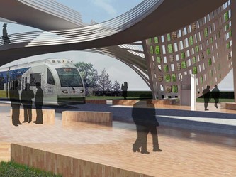
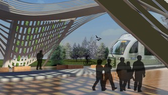
Develop the Max platform located at Civic Drive into a space for the residents of Gresham by creating a community run chestnut orchard. Our design aims to embrace the aesthetic of the orchard grid to formulate new distinct urban/rural spaces along the infrastructure of the max. Then, formalize these spaces for the community by incorporating uses such as seasonal markets, public spaces, max platforms, and trails. Design Considerations: Site Design: I believe the true nature of Gresham is rural in character given its past history. The site design of this project pays particular attention to these patterns by proposing the chestnut orchard in close proximity to the public max platform. User Needs: Pragmatic needs of a max platform are always contingent on occupant safety, comfort, and visibility. Beyond the pragmatic, this design strives to provide the occupant with an “rural” ecological experience framed by the trees of the adjacent orchard. Practical things like seating, shelter, and the experience of waiting have been crafted into the landscape as a series of landforms and canopies. Materiality: We chose the materiality of the station to express the relationship between the temporal landscape and the more permanent shelters and enclosure as designed. For example, the pattern of the trees is expressed and heightened in the materiality of the concrete shoring walls that surround them. The chestnut trees will reach maturity in about 30 years, this means that the permanence of both materials (ie trees & concrete) will become more apparent over time. Light and Shadow: Perhaps ironic, the full extent of the canopies of shelter and tree interplay wasn’t realized until just after the final model was produced. We began to see a lot of potential in the patterns of light refracted to the station ground via the canvas canopy. The trees also began to play with this lighting effect by providing a gradation at the areas around the station, this began to blur the lines (or shadows) between our manmade shelter and the organic canopy of trees. Sustainability: Our project articulates the ecological blight of the chestnut tree and attempts to reintroduce it to 6.5 rural acres in Gresham. Our intent was to make the sustainability aspects part of the projects ethos rather that applying sustainable features to a shelter made of extruded aluminum. What does it mean? How will this shape my education? Given the opportunity, I would do a collaborative studio project again. I find that many things done creatively in practice are always highly collaborative with others. Make more models – take more time to make models along the was and test ideas. I found this helpful during the light shade studies. Play in the shop – spend more time experimenting with tools and processes that I’m unfamiliar with. The results I got out of the hop this studio were exciting to me, I need to keep this momentum of experimentation going. Design Concept: The design concept for the Gresham max station was developed from the initial site visit. When the studio worked on developing appropriate shading devices for the Gresham City Hall, I discovered that Gresham as a city didn’t have a symbol to represent itself. The city didn’t have something to say “this is what Gresham is”. During the visit I also discovered that Gresham was latching onto the idea of green/sustainable design. With these two discoveries I decide that the design for the max station needed to incorporate vegetation and possibly preserve some of the current undeveloped land, and become a symbol for the city. Site Design: The site design developed as a canvas to express my ideas of bridging the green from the south to the north side of the tracks. Although the foundation of the plaza and park development was based off my main idea, I wanted to create spaces where people would want to gather and come to on their free time. I also looked at the phasing that would occur on the site, and how the spaces I created could appropriately function over time. With future development I looked at how new buildings could be placed within the site and how they could interact with the station, plaza, and park. User Needs: The user needs for the station were really easily spelled out, because of Tri-Mets station requirements. Originally I had some intuitional user needs developed but because Tri-Met had so many requirements it far surpassed the ones I had created. In the time given I mainly focused on creating a covered shelter that would be an inviting and pleasurable space, where people would feel protected from the rain, wind, and feel safe while waiting for the max. Material Study: Throughout the design development I looked at the different parts of my design and assigned materials to each part by looking at what that form wanted to be. So each material in the projected reflected its natural abilities, for example the columns where the arches landed on, needed to be very minimalistic but at the same time have the ability to resist a large compression force. Steel seemed to fit the description for my column needs. Since my design revolved around vegetation, I also looked at Oregon’s native plants and tried finding plants that would best fit my design. Sustainability: Sustainability on the site originally looked at water shed and the high and low lands. Once I discovered that the plaza area was a low land on the site, I started developing a way to treat the runoff that would occur with the new development. Although I did not have enough time to represent my ideas in the final, my water treatment looked at having a bioswale in the plaza were most of the runoff on the site could be drained into. I also looked at having a cistern underneath the plaza that could collect the runoff from the ground and nearing buildings, and store it as irrigation for the proposed plant material. Light and Shadow: With the opportunity of creating a lighting/shading device at the beginning of the term, I was able to experiment with different objects and forms that laid a foundation for the rest of my studio design. I found that a simple repetitive shape would not only cast an interesting shadow but also have the opportunity to become an elegant from. With this discovery, my final design tried incorporating simple but elegant forms that would cast shadows, reflecting the time of day and season. Next Steps in Education: This term I found that as a designer I work the best when I feel my creation is not only meeting the needs of the program but that it is aesthetically pleasing. With the opportunity of creating three different projects this term I found that all the ideas that allowed me to create a beautiful form, where the ones that I went with. Much of my design process struggled with creating an end result that was experientially and aesthetically pleasing. I also found that many of my ideas could easily pass reviewers if they felt the project was beautiful and could enhance the site. Overall I found that people want to see projects that standout from the norm and make a statement.
Site Design
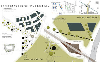
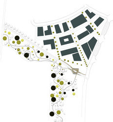
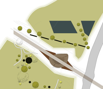
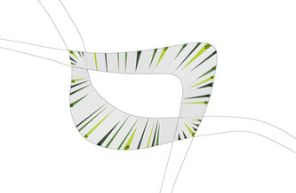
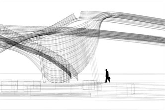
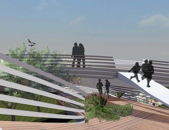
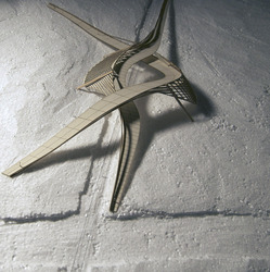
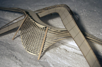
The crux of my project relied heavily on site and the existing context. With the City Hall Max stop only a quarter of a mile away and new development along the intersection of Civic Drive and the Max line, I wanted this stop to not only impart the infrastructure of a waiting area, but also embody a gathering of community. The distinctive wooded site to the south of the Max line provided a natural landscape that I treated as an amenity for the community, but also an opportunity to retain and engage local habitat in the developing neighborhood. The nearest park to this Civic Drive neighborhood is 1.06 miles away and while this community is rated 75% “very walkable,” it is still heavily dominated by auto traffic. In desiring to foster a relationship between both sides of the tracks, I designed two looping structures that hold the two divergent ecologies on either side, to the north, a formal park space and to the south, a natural habitat area. Each form holds to their corresponding environment; the tighter curve to the south clutches the natural habitat and walking paths; while the more open curve to the north is a slower-paced move connecting to the Max path destined for Portland. Together these woven structures meet above the transit stop for a brief opening and opportunity to switch paths. Users Material Assemblies Sustainability Light & Shadow What I learned… Well, I did it…made it to the end with a design! You can see my boards under “my work” tab, listed as my Fall 2009 studio work. I have posted the boards, as well as some model photos. Enjoy!!!
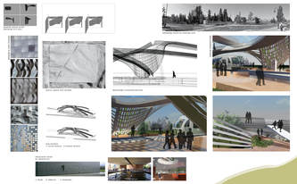
With the theme of the studio being Shaping Light, I was intrigued by looking into the way light can bend, move, and change shape. I started the quarter with the idea of taking cardboard and laminating it together with a flat surface on one side, and an organic shape on the other. The organic shape undulates from being thin to thick and creates an illusion from either side of the panel that this solid element is in fact permeable and light penetrates in varying shapes depending on the angle you are viewing it. I liked how it was the user that interacted with the object and that is how the light is transformed, rather than the object transforming the light. Trying to transform this into a concept for the Transit Station at Civic Drive, I wanted to focus on the idea of bending light and having the user experience the shaping of light rather than the object making a static shadow. I wanted to see how the angle of view would create interesting light opportunities both for the users and the station. In the site design, Zach and I created a sunken plaza to the north of the station platform. It is a large plaza that steps down 5 feet. We have also concentrated on creating context for the plaza to support, and a bioswale to the west of the plaza. When I started my design, the site design changed slightly. Connecting the plaza more directly with the bioswale, I created a feature at the west end of the plaza where the plaza steps down into the bioswale and a boardwalk rests about 5 feet above the steps. It plays on the idea of multiple views of the same thing, from above and from next to it. I also wanted to connect the plaza with the station platform, but still keep some security for the platform and separation of space. Playing with how the platform touches down to the plaza, gracefully and naturally landing in a trough of water to leads to the bioswale. The plaza also has small water features that dig into the ground and lead water run-off from the streets and sidewalks down into the troughs and into the bioswale. The steps of the plaza alternate from concrete pavers to grass pads where people can layout during a sunny day. The station shelter design is comprised of three major elements. The first and most important part are the panels that line the edge of the platform and the plaza. The metal panels are lined with plexi on the sides and are kinked in one corner to bend light as it comes into the station. The reflective nature of the metal will reflect and illuminate the station in unique ways as well. The panels are large yet moveable by the human hand, which was something I really wanted to include in the station. I wanted something that users could move and adjust to their liking, both for entertainment purposes and light purposes. Like my panel study, the panels are not necessarily what shapes light, it is the users who move the panels around the pin that create the light patterns and unexpected angles. At night the panels illuminate along the plexi sides which create a dynamic wall of strip lights from afar that kink or stand straight. It creates a way to shape light at night even when there is no natural light to play with, as well as safety and security on the platform with lighting the station. The next element is the roof. Steel beams lay atop the platform and much like a literal translation of the panel, it starts flat and kinks upward towards one end. Much like a frequency wave, it flows open upwards towards the sky and ends standing straight up. Depending on where the train enters, the roof opens up to the train, and gradually flattens back down at the end of the platform where the train leaves the station. The last element is the columns of the station shelter. Made of wood for a natural element that grounds the platform to the plaza, they are large and one piece from beam, to column to ground. Placed at every 14’ the columns vary in angle of the beam piece due to the changing roof plane. The column that stands straight up on the westbound platform entry stands as a beacon of entry for the platform and holds a sign for the station name. The columns stick out onto the plaza side and dig into the plaza ground where the trough of water leads to the bioswale. The columns are one of the main direct connection of the platform with the plaza, even though people are still able to move the panels from the plaza side. This term helped me force myself into learning new computer programs and use materials I’ve never used and construct something I have never constructed before. It was a learning process throughout the whole term and I would hope that I can use these techniques in the future in other studios and work. I know I still want to learn a little more into Rhino and its rendering engines you can use, because I had some difficulty finding my comfort zone in that area. SCHEME Community members of Rockwood have an interest in providing a transforming the “brand” of Rockwood by creating a plaza and light rail stop that will create a sense of place. Trimet is planning on co-locating light rail platforms in the center of Burnside at 181st, adjacent to the site of Rockwood’s cultural marketplace plaza. This term I took a rough stab at the plaza design, then shifted my focus to the platforms themselves. The purpose of this design is to provide shelter from wind and rain for patrons of Trimet in Gresham’s Rockwood station, while also shaping light and nature to create a distinctive place. Transparency was a the major driver in the design. Transparency was operationalized to provide maximum visibility for safety and to not be an obtrusive visual element in the environment. The work attempts to subtly suggest a transition between hard scape and more dense vegetation. SITE The platform site is urban, greatly constricted, wedged between the eastbound and westbound lanes of Burnside. As mentioned it is just North of the Cultural Marketplace site. A major finding of the site investigation was the direction of the winds. The most intense winter winds come from the east, while year round winds (except December) blow from the North. Spring and summer winds come out of the south and southwest. There is additional wind created by the cars on Burnside to the North and South side of the platforms. The architectural intervention against the wind was to completely wall the platforms off from Burnside with a 200ft curtain of glass, which also functions as a safety, only allowing entrance to the site at crosswalks on the east end of the platforms. SUSTAINABLE DESIGN The natural landscape was integrated directly into the platform by creating punctures in the platform with plantings to help absorb storm-water runoff. Transparency was again a consideration for the variety of plant to be used. For this reason the native vine maple was selected, as the trunks are thin and allow for visibility. The selected ground cover, Corsican mint, also maximizes visibility, providing a lush dense green carpet while blocking no view whatsoever. Corsican mint is also favored for durability and its potential appeal for children. It is a “steppable” sedum and emits an mint odor when touched. Additional site consideration was a swath of dwarf cherry trees that will come alive for a week or two out of the year when the pink petals are activated by the winds of the train. Dwarf cherry trees were the logical option, as the spread of their branches will not encroach on the hardware of the trains. STATION Each platform is divided in half lengthwise. One half is an unobstructed space devoted to boarding and exiting the trains. The other half is a waiting area where seating is provided, tickets can be purchased, and shelter from the wind can be had. These two spaces are divided by wind screens with a “path of light” meandering around them, in and out of each area. Nine feet above the platform a glass roof plane stretches the length of the platform, punctuated by openings through which the vine maples can reach and grow. The openings are more frequent on the west end of the platforms. LIGHT AND SHADOW In the early part of this studio we investigated light and shadow by creating light modulating screens. My particular focus in this investigation was the dynamic shadows that are cast by the parallax effect of two planes. This is achieved in the project by placing opaque or semiopaque panels on the two different planes described earlier. These panels are art objects which I describe in more detail below. DETAILED MATERIAL STUDY This term I began to use Rhino, a digital 3d modeling software, and Rhino CAM, computer aided manufacturing software to produce a prototype an art panel. Rhino CAM interfaces with a CNC (computer numeric controlled) router. The CNC router then carves from a stock material the object from the Rhino model. The wood stock that I chose for this investigation was teak. In addition I looked into using a wood called purple heart, but unfortunately the CNC router was down and I was unable to use this beautiful purple wood. For the purposes of this project a translucent material may have made a more interesting choice in terms of how the panels play with light, however the tactile appeal of carved wood is compelling. The design of a Trimet train shelter is a lot more difficult than I had imagined. There are many rules and regulations to be aware of and abide by, in order to create a functional and pleasant place. Along with adhering to the typical transit shelter design elements, I developed a few design guidelines based on site visits and existing context. CLEARLY DEFINE A PLATFORM. For clarity, it was absolutely essential to define waiting area. Through transparent materials and a linear design, I aspired to distinguish the platforms from the surrounding plaza at the north. There was a lot to accomplish this quarter. Investigating, designing, and producing credible drawings and ideas was quite a challenge. A good challenge. Through our class field trips and guest speakers along with my own investigative research, I have learned a lot this quarter that can be directly applied to my architectural education and career.
Wednesday night was our final studio review. I received some insightful and critical feedback. The following blog entry summarizes my findings and explorations of this term. As a first step in developing a design for a new Rockwood transit station and plaza, Drew and I conducted some site research and analysis. Before deciding on four site plan alternatives, we considered the following issues: connectivity, access, transparency and views, sun angles, and wind. It was important to us to address both our clients’ values and requirements. Trimet was looking for a safe, transparent, functional and durable transit station. The community of Rockwood hoped for an interactive and playful station that would reference the site’s history and serve as a landmark and gateway to their neighborhood. To look at our initial site analysis, click here. As a next step, I created a study detailing possible material transitions, addressing Trimet’s desire for smooth, industrial and transparent materials such as glass and steel as well as the community’s wish for tactile, natural and interactive materials. I referred back to the generated matrix throughout the term when considering material choices and form.
I decided to use rock as a main material for the Rockwood transit shelter. It references the community’s history and its geographic proximity to a former excavation site. Also, it can be used in a variety of ways: It can be rough or smooth, processed or natural. Furthermore, glass, which is made from sand, is also a form of rock. Below are some precedent images showing how rock can be used in different situations. The first image shows Peter Zumthor’s Therme Vals, where a local processed stone was used for the baths in the foreground. In the background, the roughness of a mountain can be seen. I was interested in this contrast and the versatility of stone as a building material. The second image shows an entrance to a chapel in Chur, Switzerland. The same stone has been used in different ways: rough along the walls and processed and smoothed out for the steps.
My initial idea of using a tall rock formation at the east end of the platform, to create a gateway and anchor for the station, was not perceived well during my midterm review. It was found that it obstructs views, creates dark corners and is unsafe. I then looked at different options to break up the large stone volume into smaller or less tall formations. The following image illustrates this process.
While rock was to be the main material used for the base of the platform design, I decided to use glass for the shelters’ walls and roofs. I intended to avoid using a material that would compete with the rock’s solid and heavy presence. While wanting the glass canopy to be lightweight, I also intended for it to be easily maintained. Furthermore, the slope of the canopy diverts the rain water to a series of planters behind the shelter. The water helps irrigate these plants. I was also interested in using the shelter as a light source for the platform. Therefore, in addition to using regular street lights, I intended the glass walls of the shelter to be back lit; during the day by the sun, at night electrically. This will not only make the rock glow, but also showcase the movement of the plants behind the glass. In addition, there might be smaller accent lights embedded in the rock itself.
The following images show excerpts from my final presentation and design proposal.
Most of my reviewers agreed that I had developed a strong design concept, that was heavily based on my initial site and materials research and analysis. It was mentioned that I should have continued working on my initial design idea, of the tall rock formation at the east end of the platform. It was felt that it better communicated my design intentions than my current proposal. Throughout the term, I found it difficult to both stay true to my design intentions as well as Trimet’s pragmatic requirements for security and functionality. Most reviewers agreed however, that as a student one should be able to peruse poetic and less pragmatic thoughts and ideas. While my photo collages did help viewers understand my design intentions better, I should have also considered modeling (physically or digitally) the rock formation for the whole platform. This might have helped people understand the continuity of the stone, showing it disappear and resurface. Since my concept stressed the idea of transitions, it was also found that I should have explored and illustrated the meeting of the stone and glass in more detail. My goal for next term will be to get better at using digital modeling and rendering programs. I have enjoyed working on a smaller scale project such as the transit station. I was able to get more detailed in my design approach as well as my graphic illustration of my ideas. I enjoyed working in Adobe Illustrator, creating abstract diagrams as well as more technical drawings such as elevations, site plans and sections. Throughout the term, I have been able to explore ideas of light and shadow. I will definitely consider the importance of these phenomena in future design explorations. |
|||||
|
Copyright © 2025 Shaping Light – Gresham - All Rights Reserved Powered by WordPress & Atahualpa |
|||||


