From January 21 to April 8th, the UO art faculty members will be showing their work in The Long Now, an exhibition at the Jordan Schnitzer Museum of Artfrom January 20 to April 8 in Eugene. Selected works by six art faculty members will be shown at the White Box in Portland from January 24 to March 24. To highlight the artists behind the art, I’m having conversations with several of the faculty in the show to hear more about their practice.
This conversation is with Sylvan Lionni, a painter visiting the UO for the 2011-2012 school year. Lionni’s has been shown in New York, Washington, D.C., Boston, Berlin, Vienna, Stockholm, and Sydney. He has upcoming shows at Kansas Gallery in New York and Stene Projects in Stockholm. The interview below has been edited for clarity and length.
Dave Amos, A&AA writer: What kind of art do you do?
Sylvan Lionni: As tempting as it is to define other artists, I don’t want to do it to myself. Once you say ‘I’m this kind of artist’ you take away a whole range of choices and you limit yourself to just doing that one thing.

DA: Where do you get your inspiration?
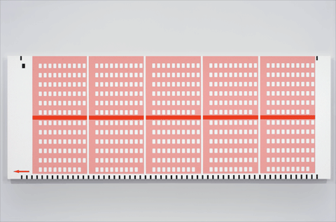
SL: I really love minimalism and geometric abstraction. When I was fifteen I fell in love with Mondrian and then later Frank Stella and this whole group of artists. At the same time, I had this problem with the arbitrary nature of painting. Why is this yellow and this green? Why is it this big instead of that big? That’s a problem that’s inherent with abstraction. You’re always going to run into that when making an abstract painting and I could never get over that. My solution was to find things that make me feel the same way that the art that I love feels, and then make those things. That’s what I do. It’s walking down the street and seeing something. You go into the deli and see the lottery tickets and, oh, that means something and that can connects to this and they look like buildings (above).

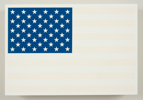
DA: Some paintings, like the faded American flags (above) have an obvious socio-political message. Others, like your painting of the dot stickers seem less obvious. Is there commentary or meaning behind all of your work?
SL: That’s a tough thing, meaning in paintings. I go back and forth on it. There’s the tendency in the art world to want to make a sound bite about your work to make it more saleable or to make you seem smarter. It’s always a bit of a problem. The flags — maybe I shouldn’t have made the flags. Right after September 11th and everyone had flag stickers on their cars. Then a couple of years went by and they had all been bleached by the sun and it seemed like a good metaphor for something. Art with messages, ugh. I don’t want to make propaganda.
DA: As someone who doesn’t study art, I have this idea that I need to figure out the meanings of paintings.
SL: F— that.

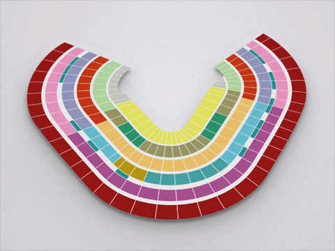
DA: The paintings of the stadium diagrams (above). They weren’t meant to look good, but when you paint them like you did, they look great.
SL: Exactly. Meaning in art is a good way to get into making something. You have to go through those mental gymnastics to make something, but in the end it’s better without it. If you’re looking for meaning in art, I don’t know.
DA: Do you paint your work by hand? It seems like it would be painstaking.
SL: No no no. I draw everything on the computer. Depending on the piece, I’ll have a big sticker printed and then paint over the sticker and then peel the sticker off. Like those stadium paintings, if I sat there and tried to tape one off, it would be a nightmare. I just draw it with a computer.
DA: What’s your overall process?
SL: I make a lot of drawings. Walking around, I make mental notes. That’s interesting, or that would be good. I take a picture of it. I make a lot of drawings; I draw them all on the computer. Most of them I throw away because there’s nothing there. The ones that I think are kind of interesting; I’ll Photoshop them onto a wall, just to see what it would be like as a painting. I always have a folder of 30 ideas and maybe each will have 10 drawings that could possibly be paintings. It depends on if it’s for a show or something, or what I have money to make, as they can be really expensive.
So finally I get to a point where I have to make something new and I decide. There’s always the problem of what kind of panel, or stretched canvas. If it needs a sticker I get the sticker printed. I paint the background color. I put the stencil on, paint over it. That could take a long time. If it’s four colors its quick, if it’s fifteen it takes longer. I have to tape off each area over the stencil, paint, peel the sticker, and I’m done.
DA: You have a couple of pieces directly on to a wall. Could you tell me more about those?
SL: I did a couple of wall paintings. I did one for a show in Washington, D.C. I used to show at a gallery there. That was the carpet from ‘The Shining’ that was from a specific frame from the movie just with the boy taken out. I like the idea of making a painting of the floor on the wall. I don’t know, I just thought that was fun. The whole thing with ‘The Shining’ was interesting to me, too.

DA: Some of your pieces don’t come from the every day (like “Red Shift,” above). What’s the thinking behind it?
SL: I was always so afraid of making an abstract painting. I could never justify decisions to myself. At some point, I said to hell with it. I should do it because I’m afraid of doing it.
DA: It’s refreshing to hear. In my first architecture studios I had a hard time justifying my decisions. I would ask questions like, ‘Why should I put a window here instead of there?’
SL: This is the first time I’ve ever taught. I was explaining to one of my students last week: take out everything in the painting that you want to be there and leave the things that need to be there. If you want to put a window there, it’s probably going to suck. If you need to put a window there it will probably going to be really good.
Art is supposed to be ugly. People have this idea that art is supposed to be beautiful, but it’s not true. I’m not saying I make ugly paintings — I wish. Cocteau said, ‘Fashion is what’s beautiful today and ugly tomorrow. Art is what’s ugly today and beautiful tomorrow.’ You look at photos of the people in the 70s today and they look ridiculous. You look at Picasso when he made the Les Demoiselles d’Avignon and people were like, that’s not even a painting, that’s hideous. That’s what you are supposed to do.
