BRAND AWARENESS
The brands I chose are influenced by my personal knowledge of the brand/company and the history of how they came to be. There are tons of fantastic logos floating around and to me, what distinguishes some from others, are the histories behind the image, or what it means to a certain place, person, etc. Meaning! Value! Lexicon words!!
Nike
In all reality, I know how cliché it is do research the Nike logo, but it is something that I am very interested in, not only for the simplicity of the logo, but for the history and products of the company. Carolyn Davidson created the simple “swoosh” design in 1971, for $35. The swoosh reminds me (us?) of the winged goddess of victory from ancient Greece. It is one of the most recognizable logos in the world, and has earned its right as an icon for anything sports related. I also wanted to expand on this logo because of its ‘offspring’ logos. Since the beginning of Nike as a shoe company (Blue Ribbon Sports, initially), the company has evolved into a multidimensional sportswear and equipment company, selling … everything. There are logos for separate divisions of the Nike family, all incorporating the Swoosh. I just find it interesting that not many companies have expanded on this type of branding. Nike has come out with ACG, or All Conditions Gear, which is associated with more extreme conditions like cold or wet weather, having its own logo; 6.0 for surfing, snowboarding; they have the Jordan line, after one of its first sponsored athletes. There is also a separate Nike Golf logo! I know you may know most of this, but I had to make note of how this company has pushed its branding identity. The logos are very dynamic as well, some use a scripted font while another uses bolded letters next to regular lettering, and still others use shapes. The Jordan logo is the athlete himself and is associated with Nike without even incorporating the swoosh, whoa. Color is another thing, as most of the logos have been in any color you can think of. Is it true that Nike makes the best gear, clothing, shoes, hats? I don’t know. Probably not, but it sure looks good. And the logo is easy to see, recreate (with copyrights of course!), and share with others. It is a dynamic brand, and is always using innovative ways with its branding to continue being at the top of its game. Literally.

I had to include my alma mater as part of this assignment because I love what they have done with their logo and branding. Being there for five years, the last two of them had seen the change of typeface and the addition of a new logo to the universities repertoire. Grand Valley is located in West Michigan, Allendale, in an area with large valleys and mini ravines cris-crossing through the hills and flatlands. This may not look like an astounding logo, but it has come a long way; sports logos are always trying to be dynamic and exciting. When GV started, it was a mere college, and now has grown to one of the biggest Division two Universities in the mid-west, dominating the sports scene. I say this because, when I see the new typeface and logo, I see where the school is heading with its image. The updated logo (created when GV made the change over from a college to a university), is still a well accepted logo, with a predominately round shape and the letters seamlessly fitting together to make an image that alters between text and shape. It is very simple and direct, uncomplicated and unique. Very recognizable. The font used is very readable as well. The updated version incorporates a new typeface that was introduced around 2009, and makes for a an exciting change of pace. The text is slightly leaning forward in anticipation of movement, and the sans serif letters have some serif surprises here and there—very engaging!! The new image logo representing the “GV” is very recognizable and simple as well, making it easy to see the development ant the maturity of a school as a whole (it gets bigger and bigger every year).
![]()


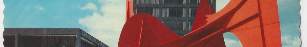
ArtPrize
ArtPrize is a 19 day event held in the downtown area of Grand Rapids MI, specifically 3 square miles that is an open call for artists to show their work. Art comes from around the world and pops up in every corner, and it’s all free and open to the public. I really like this logo because the blob shape is actually out of context, meaning that it is a thing transformed into something else. And even if you don’t know what it is, it is still a very unique shape that attracts the eye. The shape comes from the image of a sculpture by an artist of the Grand Rapids area named Alexander Calder. He created the first mobile, a kinetic sculpture that delicately balanced weight with suspended components. He also created stationary sculptures know as stabiles. This image comes from the latter. His sculpture, La Grande Vitesse, has come to be the symbol of the city and as such, was a perfect counterpart to the ArtPrize venture. It embodies the city as a whole, and having it rotated to a vertical extend changes the idea of it and makes it more of a designy feature that is still recognizable. Very cool, very attractive, and very good representation.

![]()