Brand Awareness
I chose to focus on brands/logos from three art organizations in Montana (Missoula, Billings and Bozeman).
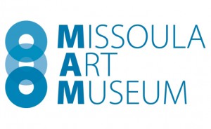
Logo Analysis: Missoula Art Museum
I have always been very intrigued by the Missoula Art Museum logo. I really took to Vigon’s phrase in “Marks of Excellence” in regards to the type of design he was doing. He made a reference to “complex simplicity,” and I thought of that as I was dissecting the MAM logo. The shapes and design are very simple, especially if you consider the “image” and the “text” (the text can also be read as an image) as separate pieces. But together it is very complex, and like any good work of art it, combines several elements to create a successful composition. There is repetition in the text as well as the emphasis on threes. “MAM” definitely stands out, along with the round shapes, and the letters following the acronym are simple yet they provide complexity in the design. The letters are so close together that they read more as an image than as text. The sans serif typeface gives the design a sophisticated and stated look, but the variety in the way that the type is portrayed (thin, thick) as well as the rhythm created by different lengths of stacked text gives the design a very contemporary aesthetic as well.
The round shapes on the left are effective in the design as a whole because they repeat the text that is broken down into thirds. I love how dynamic the shapes are. The overlapping creates interest in how the lines intersect and how different color values are formed. What I found interested is that I naturally try to separate the ovals with my eyes into three separate parts, and this need to do so creates a lot of tension in the design. The three ovals automatically made me refer to a CD which reminded me how the MAM is really starting to integrate technology into their programming. It also serves as a reminder of community, connection and intersecting ideas. Ideas that start as separate parts but that come together as a whole.
The design is also effective because it can be separated into two parts. The text can stand alone, as well as the “image” element. It can also incorporate changes in color very well. I have viewed this logo on vellum, colored paper and white paper. The overlapping in the ovals transfers very well each time and it is even more interesting when used in other contexts because the way the overlapping is portrayed is variable and dependent on the material. I have even seen the three ovals removed from their identity as a logo, and instead incorporated as part of a separate image.
There are many strong elements of the logo, but I would like to see more space in between the image and text. It seems squished.
Logo Analysis: Yellowstone Art Museum
I am not as positive in regards to the Yellowstone Art Museum logo which is intriguing because it uses a similar form, almost the exact same text, and very simplified color. The text inside the circle is off-center, which is a nice touch, but there is too much consistency in width of all of the text as well as the width of the circle. It could be more dynamic if some of the text was enlarged. It also feels very static as there is one long line of text at the bottom that grounds the design and likely limits where it can be placed. The circle itself, on the other hand, has much more flexibility in placement and use. The color and tone contrast in the text is nice but this same effect was not achieved with the relationship between the circle and the text inside. Because the text inside the circle does not overlap or break its barrier it feels very constrained and because of this, it does not properly communicate the ideas of the museum as effectively as it could. The round edges of the type makes the text more humane and more comfortable but it also relays as slightly childish. Overall, the design does have some elements that could be very successful but it needs further exploration in order to develop a design that is stronger in composition and flexibility.
Logo Analysis: Emerson Center for the Arts and Culture
The Emerson logo is interesting to me because it developed from a logo contest that was established by the center a few years ago. Prior to that, the Emerson had an outdated logo that solidified their identity in the community as an outdated, conservative, family-oriented art center. The installation of this new logo has paralleled a new direction in their programming towards becoming a more progressive center for arts and culture in Bozeman, Montana. Again we see a sans serif typeface that provokes a more contemporary and sophisticated identity. I love that the “e” is left lowercase. It maintains a humanized element, not to mention the letter is just more visually interesting because of the repetition in the second “e” and the repetition of curves throughout the text. The juxtaposition of the sharpness in the image at left with the curves in the text is visually stimulating. The colored text at the bottom ties these two elements together and adds a simplistic touch of color, creating further variety in the logo composition. Imagery of mountains is common in the Bozeman area as the city is surrounded by five different mountain ranges, but I enjoy how subtle and contemporary that reference is here. It is still slightly cliché but it works. The “arrow effect” created by the image forces your eye to move from the image though the text. This is also a logo that can be dissected into parts, displayed in a variety of contexts and on a variety of materials, and used with a variety of colors because it maintains its identity without color dependence.


