Logo Design Awareness

For this assignment this logo is popping up first to my brain. The reason I chose it is its appealing color, besides my father works here. So I am familiar with it. “Chinaunicom”, as it s called, is a kind of telecom operators in China, just like “at&t” or “verizon”here. Let’s look at its color, red, the most highlighted color and the shining one. At the same time, its color could represent a warm, lively and energetic meaning. In China, red could symbolize happiness and good luck, and it could increase the affinity of the cooperate image and gives a sense of strong visual impact, coinciding with the position of the “Chinaunicom”, “innovative, dynamic and stylish”. The look of this loge called “Chinese Knot”, in Chinese, t the “knot” and “unicom” has the similar meaning, they all express communicate free, connect free (连结,连通). This meaning match up with the following text appropriately ” Let all freedoms connected”. The handwriting style of text is the water jet, which is the most inclusive and cohesion one, is the symbol of the nobility and sedate. In addition, the red “i” represent “information”,and “me”, the similar pronunciation with “love 爱” in Chinese. Without choose the Capital letter, “i” seems more affinity and active than the cold majesty “I”. One of the successful reason of this loge is that in every Chinese Spring Festival, people will hang the Chinese Knot, advertise for the “Chinaunicom”. So this logo is very common is China.


Second logo I wanna introduce is the “sina weibo”, a kind of social website , belongs to sina network company. The former picture is the logo, the latter one is the company logo and the application of this logo,which help you to understand the logo of “weibo”. First of all, the fast way to let you know about “weibo” is that “weibo” sounds like the Chinese Twittwer, a popular social wesite and app in everyones’ computer and smart phone. The same, what attract me is its red color and cute small look. In advertising, red is a common color, indicate amazing, popular and appealing. Through the hint of the latter picture we can know that this red logo seems like not only a torch but an eye. The eye ball is the part of the letter “i”, making this logo more lively and active. The torch, showing to the latter picture, could represent passion, motion, and love, which could reflect on the mascot, derivative of logo. This “eye” embody the core of “weibo”, using the figurative way to convey the idea of “the world in you eyes, arousing people’s curiosity about the world of web, stressing the function of this website and making it easy for people to remenber its name. The two yellow lines represent the signal, means communicate or social through their weibo platform. The text besides the picture is a straightforward explanation of its name, sina weibo, with its domain name: weibo.com. This design reflects easy and open spirit, red and black logo with white background makes it easy to print or post at anyplace. And they always use their logo to make a cutie doll to be their mascot, represent the company image.

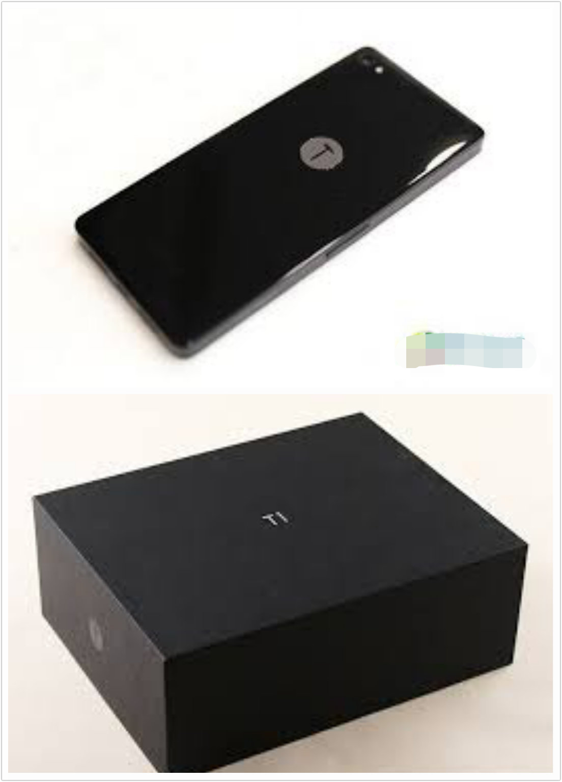 http://www.smartisan.com/
To be honest, the final one is one of my favorite logo. In my mind, a good logo should has a impressive story about this company or the founder. Smartisan is the such one. The same, the second picture help you to get a better understanding of this logo, cause this a Chinese brand. Just like Iphone, Smartisan is a cell phone brand in China, a new one. The black background gives people a sense of nobility, brief and refreshing feelings. Apparently, this picture seems like both a small hammer and the letter “T”, reflecting the name of this phone, T1, and a story about this founder. Briefly introduce, this founder named Luo Yonghao, was an English teach before, then research the development of mobile phone, called himself “artisan”. His experience give him a tip to called this phone “Smartisan T1”. A hammer is a tool of the craftsman, he wants to create a perfect product with a hammer, reflecting the builders spirit,an craftsman’s skill. Mr.Luo has used a hammer defeated the Siemens brand, thus he want to tell us: a hammer can beat a brand, a hammer can also create a brand. As his define and design, appearance of the phone is very beautiful, with an exquisite workmanship and innovative design, just like its slogan: Be born to pride. Finally, what can we find from the second sample picture is this brief and small logo give itself enough flexibility to adorn the cell phone. I think it is a successful and impressive logo. Not to mention, I chose it.