Reasons: For this assignment, I chose three brands that are fairly significant to me and my experiences. The first logo I picked is that of University of California at Davis. I went to UC Davis for my undergrad and it was a very significant part of my life for many reasons. The next logo I selected is from Marvel Comics. I love Marvel, and I admire their business model of reaching beyond their original comic audience. The last emblem I picked is that of the California State Fair. I have been to the state fair a number of times, and it makes me nostalgic for California.
Logo #1:
University of California, Davis
UC Davis is my alma mater. I love this school. It is where I truly figured out who I was and what I wanted to do with my life. I had great times there, not only learning, but meeting some amazing lifelong friends.
![]()
The logo represents UC Davis in many ways. It directly says (in multiple but professional looking scripts) UC Davis, Aggies (the mascot) on the bottom of the logo, literally underlining the picture itself. The UCD mascot is the Aggies (the Agriculturals) which is represented by a mustang, named Gunrock. The mustang is in the middle of the C for California on the logo. There are multiple representations of the name of the school and the mascot, reiterating their importance. The school colors are also very obviously displayed. Each UC has a variation on the yellow and blue combination. UCD has one of the darkest set of colors with a somewhat goldenrod color combined with a medium navy. Both of those colors are very important to the logo.There is also a fair bit of shading on the horse to give it more character and detail. The logo itself has a white border around it making the whole shape a rectangle. When the school prints T-shirts and sports uniforms (including football helmets, various jerseys, and many other items) the words on the logo can be left out in favor of just the image as it does represent UCD quite well on its own as a recognizable symbol.
Logo #2:
Marvel
I love Marvel characters and their recent movies. I enjoy learning more about the entire universe they have created and brought to life. It is also a very recognizable and well known logo.
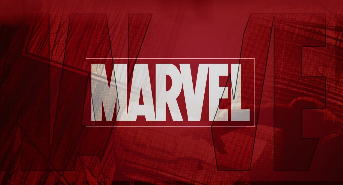
This logo is very self-explanatory. It literally spells out MARVEL. The brand is well known and recognized. It does not say Marvel Comics or Marvel Studios, but so many people know the name that many just recognize the name and know in general what this product is associated with. They have a few logos, many simpler than this that have been around many years. I chose this version of their logo because it is the one that runs before Marvel movies. I became a fan of the company through the movies. It is a simple logo, MARVEL in a bold large type. It is white so as to stand out against the red background. The unique part of the movie logo is that the extra black images you can see in the back of this image are, when actively animated, like flipping through a comic book. It goes back to Marvel’s original business, comic books. Now that they have expanded they have branched out a bit with their logo, making it come to life. But, they are true to form with the bold white lettering, a thin white border, and the bold red background. The logo appears before movies, on comic books, on toys, and innumerable collectors’ items.
Logo #3:
California State Fair
The fair is a well-known event but its logo is not as famous. To me the logo/mascot does not necessarily fit with my idea of the fair. But when its various symbols are broken down they do make sense.

The text portion of the logo is somewhat basic, but gives vital information; it gives the event names and its dates. The bottom of the text shows what they are offering “food, family, and fun.” They are advertising the event, rightly so, as a family friendly event where large groups can meet to eat and have fun on rides and playing games. The color of the script is bold and stands out, the font is basic and very readable. The image of the yellow bear with a simple cartoon border represents California. Though different colors, the California flag also has a bear and a star. This version, with different colors than the flag, has a much “cuddlier” looking bear holding a purple cartoon star. This logo clearly ties into other California iconography by pulling from the state flag, and uses bright colors to draw attention to it. The logo is used online in adds, on T-shirts, and on flyers for the event.