Tagged: ggplot

p value demonstration

We’ve got two short pieces of code to work with today.

https://www.dropbox.com/s/loawliymkl2tex7/p%20value%20demonstration.R?dl=1

The first is the demonstration

#########################################
# PLAY WITH THE VALUES YOURSELF
#########################################
# set the probabilities for your set-up
alpha <- .05 # the probability of a sig result given that the null is true (confidence level)
beta <- .8 # the probability of a sig result given that the null is false (power)
p_null <- .5 # how likely is the null hypothesis to be true?

p_sig <- alpha*p_null + (1-beta)*(1-p_null) # the probability of a significant result (regardless of whether the null is true or not)

p_null_given_sig <- (alpha*p_null)/p_sig # the probability of the null hypothesis being true, given that you've got a sig result

And the second is the plot

# see how your inferences about the null hypothesis following a sig result should change based on how probable the null was

betas_to_try <- c(.1, .3, .5, .7, .9) # the shape of that curve depends on the power of your experiment

plot.data <- data.frame(alpha=.05, 
 power_level=gl(k=15, n=length(betas_to_try), labels=c(betas_to_try)), 
 p_null=seq(from=0, to=1, length.out=15))

plot.data$beta <- as.numeric(as.character(plot.data$power_level)) # making a numeric version of the power factor, to use in the calculations below 
plot.data$p_sig <- with(plot.data, alpha*p_null + (1-beta)*(1-p_null))
plot.data$p_null_given_sig <- with(plot.data, (alpha*p_null)/p_sig)

library(ggplot2)
ggplot(plot.data, aes(x=p_null, y=(1-p_null_given_sig), color=power_level)) + 
 geom_line() +
 xlab("Probability of the null") +
 ylab(NULL) +
 ggtitle("What's the probabilty the null is false,\ngiven a significant result?")
Interactive Embedded Plots with Plotly and ggplot2


Largley lifted from this r-bloggers post

install.packages("devtools")  # so we can install from GitHub
devtools::install_github("ropensci/plotly")  # plotly is part of rOpenSci
library(plotly)

py <- plotly(username="jflournoy", key="mg34ox914h")  # open plotly connection
# I'll change my key after this, but you can still use: plotly(username="r_user_guide", key="mw5isa4yqp")
# Or just sign up for your own account!

 
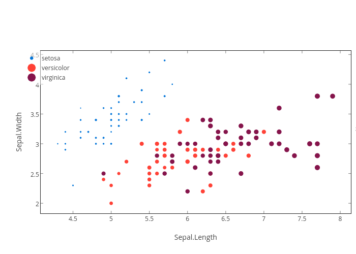
gg <- ggplot(iris) +
    geom_point(aes(Sepal.Length, Sepal.Width,color=Species,size=Petal.Length))
gg

#This looks a little object-oriented like python  
py$ggplotly(gg)

You can embed code like this (which you get from the plotly ‘share’ dialogue):

<div>
<a href="https://plot.ly/~jflournoy/16/" target="_blank" title="Sepal.Width vs Sepal.Length" style="display: block; text-align: center;"><img src="https://plot.ly/~jflournoy/16.png" alt="Sepal.Width vs Sepal.Length" style="max-width: 100%;width: 797px;"  width="797" onerror="this.onerror=null;this.src='https://plot.ly/404.png';" /></a>
<script data-plotly="jflournoy:16" src="https://plot.ly/embed.js" async></script>
</div>
Sepal.Width vs Sepal.Length

You can also directly embed a plotly plot using a code chunk if you set plotly=TRUE for the chunk, and include session="knitr" in the call.

#Set `plotly=TRUE`
py$ggplotly(gg, session="knitr")

There’s a wide world of plotly fun just waiting out there.


Picking Pretty Plot Palates


The default colors for ggplot2 are pretty lovely, in my opinion, but sometimes you want more control. Or maybe you’re just procrastinating some less appealing work. Whatever the reason, sometimes you find yourself wanting to test new color palates for your plots. Here’s an easy way to do that. I’m using color brewer, which is an awesome color tool for all of your programming needs, not just R. It includes some palates that are specifically designed to be colorblind safe, printer friendly, and/or photocopier friendly.

library(ggplot2)
library(RColorBrewer)

# pick a palette
display.brewer.all()

plot of chunk unnamed-chunk-1

# you can call them by name 
colors <- brewer.pal(9,"Spectral") 
colors <- c(colors[1:3], colors[7:9]) #take just the 6 colors from the two ends (they're brighter)
# how to check out a color palette
n <- 6 # the number of colors to plot
pie(rep(1,n), col=colors, main="Well, that's lovely!")

plot of chunk unnamed-chunk-2

pie(rep(1,n), col=brewer.pal(11,"BrBG")[1:6], main="Mmm toasty")

plot of chunk unnamed-chunk-2

pie(rep(1,n), col=brewer.pal(6,"Blues"), main="Let it go, let it go!")

plot of chunk unnamed-chunk-2

Here’s how R is saving your colors (these are the ones I saved from Spectral):

colors
## [1] "#D53E4F" "#F46D43" "#FDAE61" "#ABDDA4" "#66C2A5" "#3288BD"

How to use your pretty new palate in ggplot2:

# making up some very plausible data predicting attractiveness from your R expertise and your hair style
n <- 6*50
R.Skillz <- runif(n, min=0,max=12) 
Hair.Style <- rep(c("bald", "french bob", "rapunzel", "mohawk", "clown hair", "whale spout"), n/6)
Attractiveness <- abs(ifelse(Hair.Style=="whale spout", .8*R.Skillz, 
                         ifelse(Hair.Style=="clown hair", R.Skillz - .1*R.Skillz^2, 
                                ifelse(Hair.Style=="bald", -.1*(R.Skillz-6)^2+5, 
                                       ifelse(Hair.Style=="mohawk", .3*R.Skillz + 3,
                                              ifelse(Hair.Style=="french bob", .2*R.Skillz-1,
                                         .2*R.Skillz + 3))))) + rnorm(n, sd=.5))
df <- data.frame(Attractiveness = Attractiveness, R.Skillz=R.Skillz, Hair.Style=Hair.Style)

You need a different argument depending on if you want to apply your colors to points/lines or filled-in stuff like bars.

# use scale_fill_manual() for filling in bars
library(dplyr)
means <- summarise(group_by(df, Hair.Style), mean=mean(Attractiveness), var=var(Attractiveness), n=n(), se=sqrt(var/n), ci=se*qt(.975, df=n-1))

ggplot(means, aes(y=mean, x=Hair.Style))+
  geom_bar(stat="identity", aes(fill=Hair.Style)) +
  geom_errorbar(aes(ymin=mean-ci, ymax=mean+ci),
                  width=.2,                    # Width of the error bars
                  position=position_dodge(.9)) +
  labs(y="Attractiveness", x="Hair Style") +
  theme(axis.text.x = element_text(angle = -45, hjust = 0), legend.position="none") +
  scale_fill_manual(values=colors)

plot of chunk unnamed-chunk-5

# use scale_color_manual() for points and lines
ggplot(df, aes(y=Attractiveness, x=R.Skillz, color=Hair.Style))+
  geom_point() + 
  scale_color_manual(values=colors) 

plot of chunk unnamed-chunk-5

# Note that stat_smooth needs "fill", so if you want to control color for both points and the error on stat_smooth, you need scale_color_manual() and scale_fill_manual()
ggplot(df, aes(y=Attractiveness, x=R.Skillz, color=Hair.Style))+
  geom_point() + 
  stat_smooth(aes(fill = Hair.Style)) +
  scale_color_manual(values=colors) +
  scale_fill_manual(values=colors)

plot of chunk unnamed-chunk-5


R Graph Catalog

This is Shahar’s distance contribution to R Club. (Thanks, Shahar!)

This catalog allows you to choose which graph you like best and gives you the code for that graph. You can also filter by things like Good vs. Bad graphs, type of graph, and different features that you might like to include (like subscripts and multiple plots).

http://shinyapps.stat.ubc.ca/r-graph-catalog/