How to find exactly what I am looking for (Journal 10)

Instead of having a guest speaker come in for class today, we took a mini field trip to the computer lab above the library in the Architecture and Allied Arts building, Lawrence Hall. Our activity was a scavenger hunt, where we were looking at online resources available to us as University of Oregon students.

Something interesting that I learned was how to order a book that isn’t in any UO library through Summit and ILL (Interlibrary Loan), which happens through the Interlibrary borrowing system.

media-circulation-desk

Here’s a picture of me borrowing a library book!

When looking for articles, I found the best and most credible sources were all peer reviewed. That means that beyond the publishers, experts in the field have gone over the paper and edited it, making it as accurate and noteworthy as possible.

Lastly, I learned how to create an annotated bibliography. An annotated bibliography is a list of citations to books, articles, and documents, where each citation is followed by a brief paragraph describing the text and its relevance to the topic of interest.

This weekend I emailed Dean Walton, a librarian here at the University of Oregon science library. After he presented in class, I immediately became interested in 3d printing. I am looking to incorporate 3D printing into my final project, and I think Dean could be a great resource for making that happen. I am waiting for his response. Until next time!

Dean Walton

Dean Walton

All of the information on Summit and book borrowing can be found Here.

Talking with Dr. Richard Taylor (Journal 9)

Today, we visited the Center for Advanced Materials Characterization (CAMCOR) here at the University of Oregon. As I walked in, I was told to stomp my shoes on a sticky mat to remove all of the debris my Nikes had attracted on my walk over. After stepping off the mat and almost losing a shoe to the gluey rubber, I felt large fans blowing in my face, which I later learned were put in to blow all of the loose dust off people before they entered the laboratory. This place clearly knows what they’re doing, I thought to myself.

As a class we sat in on an exclusive talk with Dr. Richard Taylor, a British scientist who specializes in Jackson Pollock paintings. During his early morning talk I managed to keep my eyes open, unlike some of the class, because I was so interested in the topic. What impressed me the most about Dr. Taylor’s presentation, besides his work in seven countries and more than 250 publications, was that he knew what he wanted to do with his life at only nine years old! As a young boy growing up in England, he found a Jackson Pollock book at a yard sale, was intrigued by the random lines on the pictures of his canvas’ in the book, and hasn’t looked back since. Originally at college in the UK for science, he also enrolled in art school because he wanted to pursue fractals in Pollock’s works. What amazed me most, was how although Pollock died at such a young age of 44, people like Dr. Taylor still have such a complete grasp on his techniques and works, which really shows a true dedication to his work. He is now one of the leading scholars on Pollock, and it was an honor listening to a private lecture from him.

blue-poles

Blue Poles by Jackson Pollock is valued at $600 million, painted in 1952

After Dr. Taylor’s lecture, I took a tour of the CAMCOR facilities, and I was very impressed, to say the least, with their hundreds of millions of dollars worth of technology. They clearly took the whole picture into account when constructing the building, because they had everything from sound proof walls, to colored LED light strips that were scientifically proven to relieve stress.

GIF file of a Jackson Pollock inspired painting

GIF file of a Jackson Pollock inspired painting, click to view

One topic in his presentation that inspired my project for this class was Jackson Pollock’s idea of the splatter paint technique. As I’ve stated in recent posts, my idea for my final project is to combine CabSpotting by Peter Richards and Contained by Daniel Miller and produce a heat map representing the density of people on the university of Oregon campus at different times of the day. I have been wondering how to color coat my heat map, and listening to Dr. Taylor talk about splatter painting gave me the idea to make my heat map using the splatter painting method. It’s an idea that is for future thought, but I got really excited when it came to my mind.

The article about Dr. Taylor’s work that we read the other night was a little confusing, and I got frustrated with all of the complicated terms in it. However, listening to Richard’s talk after reading the article really cemented the information and knowledge I gathered from the article and made sense of it. I look forward to more guest speakers who have the same charisma, expertise and passion for their work as Dr. Richard Taylor does, and I hope to listen to one of his talk’s again soon.

Jackson Pollock’s Fractals (Journal 8)

When Jackson Pollock started splatter painting in Long Island, New York in 1945, nobody knows whether is was out of pure genius, or out of mockery towards the traditional idea of art. Whatever it was, it worked and has captivated, motivated, and inspired millions of people all over the world. Art critiques and enthusiasts all over the world have studied Pollock’s work immensely, and through analysis and research have confirmed that Pollock’s work do in fact contain fractals. One layer of a fractal is color. Colors in fractals have a pattern that repeats in smaller and smaller increments forever. Another component of fractals is shape. The shapes, for example, in Pollock’s splatter paintings are part of revolving patterns that keep getting smaller and smaller.

A study showed that as Pollock’s painting career went on, his paintings kept rising in Dimension level:

fnhum-05-00060-g003

As his career went on, Pollock started to include more dimension in his paintings

Fractals clearly have an esthetic appeal. If they didn’t, Pollock’s paintings wouldn’t be selling for millions of US dollars. To test exactly how appealing fractals are, in 1994 the Pollockiser was made, a mechanical arm that simulated Jackson Pollock’s brush whips on a canvas. In a study done of those paintings made by the Pollockiser, over 90% of people preferred paintings with fractals over images without fractals, proving just how beautiful and natural they are.

The Pollockiser

The Pollockiser (left), The Pollockiser’s creations (right)

Although the use of scientific experiments to define how beautiful a piece of art is can be unconventional and almost ridiculous, the results aren’t meaningless either. The findings that fractal images are more pleasing than non fractal images can be apparent not only in conventional art, but also in architecture, archaeology, and most importantly, the environment, which is where fractals originated. Many fractal images have been found throughout history, including the Nazca lines in Peru, early Chinese paintings, Leonardo da Vinci’s Deluge, and the Eiffel Tower in Paris. Jackson Pollock may not have invented the fractal, but he sure left his impact and impression on what a fractal is, and what it means to society, whether we are aware of that or not. I truly admire his work, because splatter painting is awesome!

Two Questions I have for Dr. Richard Taylor:

  • Could you tell the difference between a painting that was painted by Jackson Pollock and a painting that was painted by the Pollockiser? Can you tell right away, or does it take a while?
  • What is your preferred D-value in a Jackson Pollock painting? Why?


Project Ideas (Journal 7)

For my project, I thought I could combine Contained by Daniel Miller and Cabspotting by Peter Richards, while making it relevant to the University of Oregon campus as well.

Contained, by Daniel Miller

Contained, by Daniel Miller

CabSpotting, by Scott Snibbe

CabSpotting, by Scott Snibbe

Lillis Business Complex, University of Oregon

Lillis Business Complex, University of Oregon

What I had in mind would be to track the flow of people in different areas of campus at different times (Cabspotting influence), and then make a 3D printed color coated model of what parts of campus (Contained influence) have the most people at what time. I think that, while it would take a lot of work to gather the data, I’m up for the challenge. I could do a great write-up as well as have a great visual with my 3D printed University of Oregon campus, printed with the help of Dean Walton in the science library here at the UO. 

Some questions that I have:

  • Would it cost any money for me to access the 3D printer here at school?
    • Would anyone be able to help me use the technology?
  • How would I track the flow and consistency of people?
    • Cameras?
    • Friends helping me posted at stations throughout campus?
  • Would I need to clear any copyright issues regarding 3D-printing the UO campus?
  • How big do I want my model to be?
  • Can I make a heat map straight from the 3D printer, or would I have to paint the buildings after accordingly?

I can’t wait to get started!

Artists that Interest me (Journal 2)

Some artists that interest me:

  • Horst Hörtner, who set a new world record in 2012 by having the most drones airborne simultaneously. He extends the science behind the technology of electronic drones by having them make beautiful formations in the air, which can be seen as art. A recap of the prject can be found Here. I really admire Hörtner’s drive to be the first person to have that many drones in the air at the same time. In the video, he says that no one has even tried flying that many, which shows his courageousness and spontaneousness to do something awesome.
Drone 100, by Hort

Drone 100, by Horst Hörtner

  • Chico MacMurtrie, who built Organograph,  a 75 foot tall sculpture in San Jose, California that represents “the intangible mechanisms that govern the earth’s carbon cycle and displays how humans are changing that cycle, causing the planet to warm”. A video can be found Here, with a visual below:

    Organograph in San Jose, CA

    Organograph in San Jose, CA

  • Carol LaFayette, who uses digital technology to explore what nature has given us. In her 2011 project titled Snakecam, she secures a camera on her right wrist connected to a DVD monitor on her left wrist, and sticks her left wrist down hollowed-out tree stumps in the forrest. Although this is freaky to me because I wouldn’t like a bug crawling on my arm, I think her work is really cool and I want to learn more about it. The Snakecam video can be found Here.
Snakecam, by Carol LaFayette

Snakecam, by Carol LaFayette

All of these artists interest and inspire me a lot, and I can’t wait to do some more research on them and their work!

Art + Science NOW (Journal 1)

Reading this article by Stephen Wilson, I was very intrigued at all of the cool and interesting art and science projects that were mentioned. The main themes that I got from the article were these:

  • Experimentation
  • Someone can be both a scientist and an artist
  • Both science and art are always evolving, and therefore always changing the specific influence each has on the other

One of my favorite project that Wilson mentioned was the CabSpotting project, where taxi movement in San Francisco was observed and recorded, and then transferred to the form of a heat map showing the popular spots. I especially liked that one because I’m from San Francisco, so I could recognize all of the places that had the most Taxi activity. The dataset can be found below.

CabSpotting, 2005 (San Francisco)

CabSpotting, 2005 (San Francisco)

The main purpose statement that I thought Wilson was trying to get across with this article was that science and art influence one another, and the more they clash, the more their definitions will be controversial.

Some topics that I want to learn more about that were mentioned in the article include:

  •  The Aphrodite Project, which made shoes for sex workers, equipped with GPS and cellphone technologies so they could send their location and messages in emergencies
  • Have artists updated historically sanctioned forms and media such as sculpture or dance? And to what extent?
  • What CabSpotting areas of San Francisco were most popular? And how do they compare to my expectations of the results?

Some topics that I wanted to know more about include:

  • Cave art and Cavemen
  • Stonehenge
  • Leonardo da Vinci and other renaissance creatives
  • Anthony Van Leeuwenhoek, inventor of the modern microscope and developer of cells
  • Linda Dalrymple Henderson

Principles and Elements of Design (Journal 6, Part 2)

In the last article, Joshua McClurg-Genevese explained the fundamental concepts of design, including the stuff that a webpage user might not necessarily think about including resolution, font, and web-safe colors. In his next article titled Principles and Elements of Design, he takes a look at the elements of design, which are the aspects of a webpage that the user actually sees, such as color scheme, layout, and proportions. He has prepared reviews of 8 different website themes, each one categorized by a certain aspect that separates that theme from the rest. Now, here are my reviews:

  1. First, addressing the aesthetic of balance is the Centerfold theme. It is an almost perfectly symmetrical layout, with its light colors and small text not providing any distractions.
  2. Next is the Manhattan Edition theme, teaching us how a webpage uses rhythm. The sense of movement in the sky combined with the texture of the graffiti font and the black smoothness on the bottom of the page make for a great layout.
  3. After that is the Museum theme, showing us how to include proportion in a webpage.  This theme shows us a foreground and a background, which is used to help define symmetry and visual weight, and can often create a sense of tension that focuses the eye. The use of black and white silhouettes makes it easier for the user’s eyes to adjust and focus on certain parts of the page.
  4. Next we have the Pretty in Pink theme, showing the Dominance factor in a webpage. The dominance is apparent in the color scheme, with the contrast between the hot pink and white forcing the user’s eyes towards the text on the pink.
  5. After that comes the Sub:lime (no, not a typo) theme, giving us a lesson on how to incorporate point into a webpage. It is apparent in the pixelated image or two halves of a lime at the top of every page under this Sub:lime theme. Sub:lime is a good example of how the elements of design can build upon each other to create a composition
  6. Subway Dream points out line, which is characterized by both length and direction. This theme exemplifies perfectly how you can focus on a single element of design and extend it to create a definite sense of unity in the composition.
  7. Then we have the Hedges theme. It shows form with the use of different 3D shapes forming images such as trees, letters, and people.
  8. Last, we have the theme El Collar de Tomas which shows us the use of color in a webpage. All over the page warm, almost pastel-like colors can be found. Although it gives the impression that many different colors are all over the page, only three hues: red, orange, and yellow can be found. Through the manipulation of value and position in space, El Collar de Tomas makes the simple look astonishing.

My favorite theme out of the 8 McClurg-Genevese reviewed was definitely Hedges. I liked it the best because it had the most contrast between the top and bottom of the screen. The green on the top wasn’t jumping out at my face, and neither were the details and images all over the page.  Hedges nicely shows us how to create form through a simple extension of point and line.

Learning about these themes and the specific components of webpages has taught me a lot about my own web page, and I am going to research more on how to make my blog the best it can be!

Joshua McClurg-Genevese’s full review of the different designs can be found Here.

Designing for the Web (Journal 6, Part 1)

In Designing for the Web by Joshua McClurg-Genevese tells us about some of the things that make the web, the web. He takes us through many steps to achieving a successful, attractive, and useful webpage. He starts off by telling us about some of the constraints a website can have, either due to lousy technology or uneducated humans using the website. I think this McClurg-Genevese article was assigned so that us as a class could get a better understanding of how to make our blog pages more attractive to the user, from the inside out.

One observation that caught my eye was this graph (below), breaking down the current browser tends in the world, with IE standing for Internet Explorer:

Screen Shot 2016-01-20 at 8.03.17 PM

What I found interesting about this chart was that it’s from 2005. Now, I know that when this article was written in 2006 it might have still been accurate, but today it would be totally off. From what I’ve noticed just by being around in 2016, everybody uses Google Chrome, a browser that came out in December of 2008, three years after this study was conducted. The research did after seeing this chart and being surprised matched my observations today, with a study showing that today Google Chrome is used as the default browser by almost 60% of internet users.

If I had to choose one thing that I took from this first article, it would be how important it is to do user research on the people who visit your site the most. There are many ways to find out who the intended audience of your site is, through surveys, interviews, focus groups, field studies, and usability testing to name a few. Even the slightest tweak or update to your site to make your user’s experience better will help you in the long run of your site.

Although I did learn a lot from this first article, the tricky tech lingo left me with some unanswered questions. What is the difference between screen resolution and image resolution? What are web-safe colors? How is a PNG different from a GIF?

First Google Images result when I searched “PNG image”


First Google Images result when I searched "GIF image"

First Google Images result when I searched “GIF image”, click for movement


I guess I have some research to do!

Thinking “Outside the Box” (Journal 5)

Today, Lisa Frankel came in and taught us about a number of things. The main idea that I learned from her presentation was that perception shouldn’t be confined to a certain definition, or boxed inside an idea of what the answer to a problem is supposed to be, assuming there even is an answer (there may not be sometimes). She taught us how to think “outside the box”, both in a literal sense and figurative sense.

In preparation for today’s class we were asked to try and complete the 9 dots exercise, where the goal is to connect all of the dots in a 3×3 dot square using only 4 straight lines. The square (below) came with the instructions “Connect up all nine dots with four straight lines, without lifting the pencil off the page”.

Now, before you look below at the answer, try it out…

Get it? If you did, you did better than me and you’ll be feeling like this lucky guy on Jeopardy!

If not, well..our ship has sunk:

At first, I couldn’t wrap my head around the puzzle. It seemed impossible, and it turns out it was with my mindset. Without more specific directions, I assumed that my lines had to stay inside the box. This is where I was literally not thinking “outside the box”. However, after getting frustrated to the point of Googling the answer, I learned that I had assumed wrong and by thinking “inside of the box”, I was limiting my success. The answer, shown below, clearly has lines extending outside of the box that my mind confined me to.

Although this was merely a fun puzzle that played with the brain, it pointed out something else which I had never thought about before. It showed me that I wasn’t thinking “outside of the box”.

Thinking outside the box is something that I want to incorporate into my final project. I want to show people something that they haven’t seen before, something that intrigues them. Although I’m in the preliminary/brainstorming stages of my project, I am confident I can show the viewer of my project multiple things within just one visual. I feel that way because more and more I played with perception images and optical illusions, the more I was able to have more of an optimistic view on things, and the more I was able to see multiple things in just one image. This is also another aspect that i want to incorporate into my final project. I am working to take a more open view on life, looking on the outside with different perspectives to different situations. As part of thinking “outside the box”, I now question the assumptions and biases I have been brought up to think of as second nature, and that mindset is bringing me new ideas every second. I would say I can’t wait for the future, but the future is already here, so I leave you with this: I can’t wait for what’s next.

Art as Research (Journal 4)

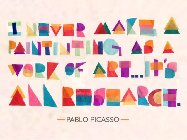
In Art Practice as Research in the Classroom, Julia Marshall and Kimberley D’Adamo discuss the art-based research model, which stresses artistic thinking, creative process, conceptual skills, and research over technical art making skills. It promotes a natural and substantive integration with the academic curriculum, as well as engaging in activities that emphasize thinking and learning skills. This process leads to more creative minds, and eventually a whole generation who thinks outside of the box. At Berkley High School in in Berkley, California, D’Adamo teaches her art class students the DARC model when writing about art pieces, which stands for describe, analyze, reflect, and connect. For describe, students are supposed to report what the piece looked like, down to the details and any other aesthetic qualities of the art. Analyze calls for a student to report on what they learned from their research on the piece, including the artists intentions and cultural context from when the piece was made. Reflect is where the student reports on what the piece means to them personally. Lastly, connect is where the student looks at both the observed piece as well as their own past and current works and makes links between them, possibly gaining inspiration from one artist to another. The DARC model is a great way to have students build on their prior knowledge as well as it allows them to be influenced by other art around them. This idea that Pablo Picasso expressed (below) that art is all research is shared with D’Adamo, and one that she teaches to her classes to expand their mindsets.

“I Never Made A Painting As A Work Of Art…It’s All Research”             -Pablo Picasso

The Success of D’Adamo’s program at Berkley High School made apparent to everyone else the potential of it if it was spread to more schools. It transforms students into learners and then to researchers, which is the collaborative path every single student should be on.

Read more on Kimberly D’Adamo’s work with students, including her work with the Bridge Program here.