Regarding my chosen brands and why I prefer their logos…
I’ve decided to start with a logo that uses both vague imagery as well as text. Not only do I enjoy supporting the craft beer world of the Pacific Northwest, but I’m strictly drawn to more independent, small batch, local companies, such as Viking Braggot. What I like best about the graphics used as they are not ‘spelled out’ for the viewer, but a rather more fragmented, contrast forward design. Not only are the graphics sparse, but the companies name works with the logo to complete the image of the Viking. The Viking image is influenced by the fact that this start-up company uses the traditional modes, that were pioneered by the great Norse seafarers of old, to create a beer that mixes honey in with contemporary and modern beer influences, creating a true signature brew. This is also represented in the logo as the type-face is modern, and easy to read but the entirety of the image rings back to an older day where one might have seen this logo swinging above a cobblestone street egging the passerby inside for a pub break and a good pint.
http://www.drinkviking.com
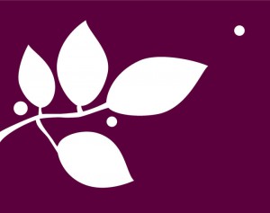
I must begin this entry by declaring that this is the logo for a Literary Review magazine I use to work for. So, my opinions may be best prefaced by the fact that I spent many a day gazing at this very logo. The logo in question is that of The Grove Review, a literary magazine based in Portland Oregon and specializing in poetry, short stories, art and interviews including such work from Paulann Peterson and Carl Adamshick among others. The color of this logo always appealed to me and I enjoy a block color background. I feel it best to approach a brand without a variety of colors all vying for my attention. The color choice is not perhaps my ideal pick, but it stands out and is a mutually acceptable hue, if not a bit bright for my taste. I understand that a literary review, with such a forested and green name like “The Grove” must have an image in the logo that reflects something of a natural theme, but had I been in the brainstorming meeting for this particular logo, I wouldn’t have raised my hand right away. Although the Beech Tree type branch does articulate the theme, I feel the berry type adornments act as a confusing ornamental design that distracts from the name. Particularly considering that the name is not featured in the logo itself, I feel a viewer could get somewhat misled by the image. Thus, adding the name to this image would solve that problem and in a basic, bold faced type, would answer a lot of interested queries.
http://thegrovereview.org
Drawn is a design company that I currently work with and not only do I highly applaud their professionalism but their print work and authentic branding practices are top game. Of course, one would expect, a company of such high quality design work would have an awesome logo, and Drawn is a centerpiece to that argument. Hands down, this is one of the most fine, most simple, logo I’ve ever come across. Although it only represents the company name, that pretty much explains it all. The brand name is in cursive, old type, and the logo is easy to read and is beautifully presented. The fact that the logo leans to the right encourages one in a more pleasant mind frame and propels the feeling of ideas and inspiration moving forward. Additionally, the companies business cards, logo paper and all self-promoting goods are softly embossed with a small, personal pressing stamp that can be easily applied and makes such an impact! Altogether this logo has it all and it greatly represents the fine craftsmanship that you will receive when working with this company!
www.bedrawn.com
Additional example:
I know we were asked for only 3 logo choices, but I was reminded of this one from a coffee shop in Paris and had to add it in. I bring it up and add it to this assignment because to me this represents a modern move in logo production. This looks fairly amateurish and almost as if created on the fly using only sparse, available clipart. But, that is what this company is all about! It is a true hipster spot in the city of lights and spending too much time on a logo and design is counter productive to the irony of such a genre. I wanted to add this just to represent that sometimes the most simple and easy to create logos can still have an enormous impact and bring the type of audience (et beaucoup d’argent) into a company’s branding plan!
http://euell.fr/Boot-Cafe-19-rue-du-Pont-aux-Choux-75003-Paris


