Brand Awareness
1.BUST BUY
Bust Buy is a famous American multi-channel global retailer and developer of technology and electronic products and services. I choose these brand because I just got my laptop in it. I quiet like its yellow background, I think it bright and attractive enough to make people easy to identify. The “yellow tag” logo of the Best Buy was first introduced in 1989. The yellow color represent joy and optimism .And its figure is just like the tag emphasizing its price advantage. This version of logo was launched in 2008 using Klavika typeface, giving it a fresh and contemporary look.
2. McDonald’s
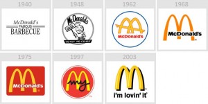
The Golden Arches are the symbol of McDonald’s, the global fast-food restaurant chain. They were incorporated into the chains’s logo in 1962, which resembled a stylized restaurant, and in the current Golden Arches logo, introduced 1968, resembling an “M” for “McDonald’s”. I choose this logo because I think this logo is concise and meaningful enough for a logo for people to remember, and its AD music is easy for people to remember either, I think this is important to a fast-food restaurant.
3. CHIPOTLE
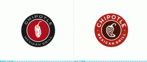
The reason why I choose Chipotle is that I just bought it as lunch. Its logo is a circle with a abstract chilli in the center with its brand above it and some specific explain below it. This logo is very simple to identify what product it is, straightforward to its target customs. Compare to its logo before, I think the new one is more catchy, and the red background is more suitable for its spicy food.


Recent Comments