
Iron and Resin is a company that I support, admire, and enjoy through photographs, advertising, clothing, graphics, brand,and lifestyle they promote. Iron and Resin began in 2011 down in Ventura, California. The brand was the brain child of a couple surf industry veterans, Thom Hill and Jackson Chandler, who sought to create something of hand made quality in the mass produced, big box world in which we live. Having grown up in the surf/skate/motorcycle culture of the 70’s, the founders created a vintage, hand crafted inspired company that embodies the culture in which they were raised. 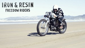
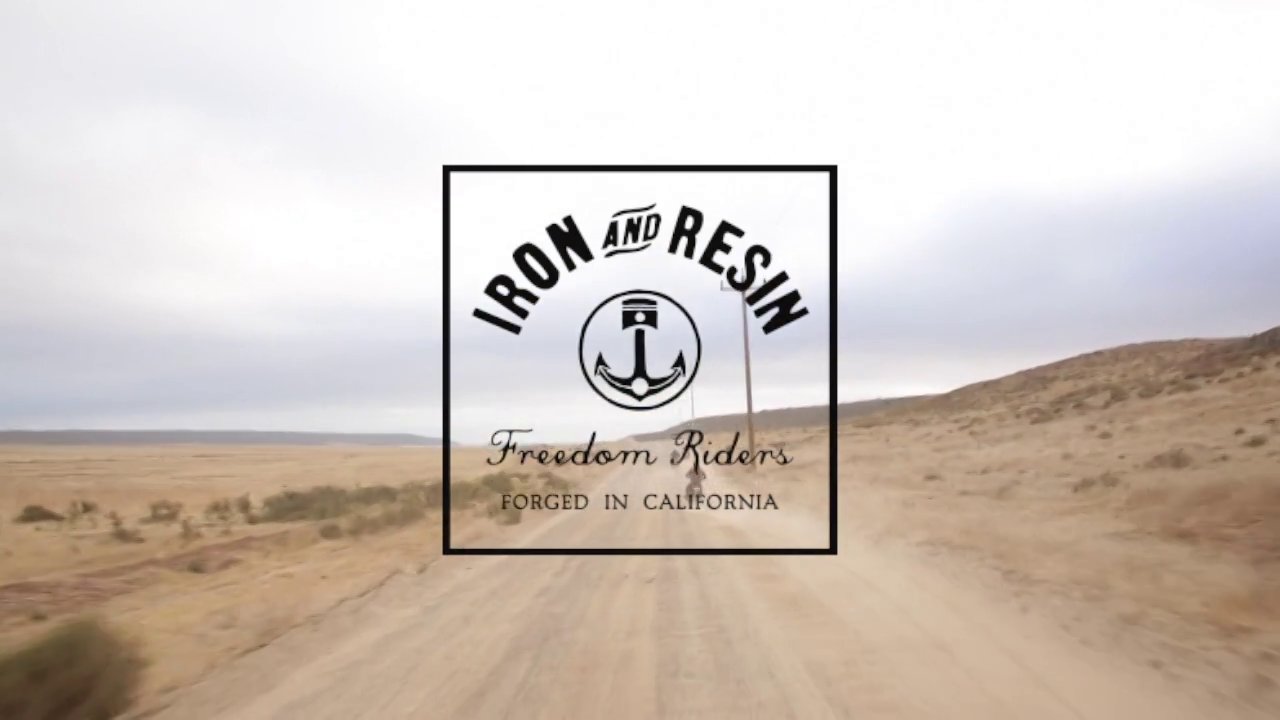
The company promotes the outdoor lifestyle, with a means of vintage vehicle and motorcycle transportation to the most secluded camp and surf locales. When hearing the name Iron and Resin, one can’t help but think of surfing and motorcycles with hand built undertones. The primary logo of the company displays what they embody by combining an Anchor, to represent surfing/water, and a piston, to represent motorcycles. The designer added a risky element to the type and logo by roughening the edges. This provides desired vintage and hand made look for which the company strives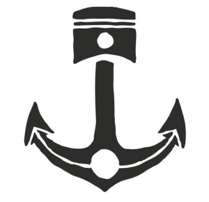 . The logo produced by the company has many variations and is displayed subtly, for the most part, throughout their extensive product line. The mission of providing quality USA made goods, inspired by surf and motorcycle culture is clearly displayed through the logo. I would suggest possibly taking out the smiling negative space on the anchor. Though the company wants to convey happiness, it would make the logo asymmetrical, leading the eye from top to bottom. I mocked this in photoshop and was quite pleased with the result. Find out about the history of Iron and Resin through the website Iron and Resin and I&R Blog


NBC designed the original peacock logo to represent the new color programming in 1956. It was not until 1979 that they adopted the peacock logo full time. While I am not much of a television viewer, I chose this logo for a few reasons. NBC was established in 1926, as a radio broadcasting company.  While 90 years is an incredible amount of time for a business to survive, they also have had an incredible amount of rebranding. The rebrand from radio to television was inevitable. While the transition rebrand was successful, there are many times since the initial rebrand that the company deemed to be unsuccessful, providing another change. I find the most current logo to be a little too high gloss, having too much embossing with too many highlights. NBC’s mission is, “to create and deliver compelling content to entertain, inform and shape our world” (NBCUniversal, 2016). I find that the logo provides a high gloss imagine showing a variety of programming. While this displays what NBC provides, it does not align with their credo. The high gloss, highlights, and embossing of the logo displays a corporate, polished feel out of the early 2000’s. The logo conveys entertainment, which needs to be high gloss I assume, but almost a tabloid type of entertainment, false in a way. This may be a skewed viewpoint, due to the output media produces today. Recommendations for changes to a logo for such a broad reaching company are quite difficult. I would prefer an older iteration of the the logo,
  as shown on the right. I feel this is a better combination of the extensive history of NBC and mission statement the company is conveying today. Below is the NBC logo history. A great amount of knowledge on the history of NBC can be found at NBC.
![]()


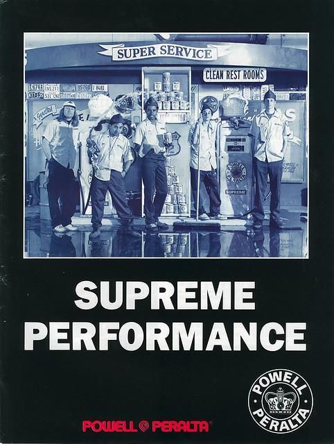
Powell-Peralta Skateboards not only has a rich pioneering history in skateboarding, but also pioneered advertising methods and techniques in the counter culture/”action” sports movement that are still in use today. Started by George Powell (an Industrial Engineer by trade) and Stacey Peralta (a pioneering skateboarder from the Z-boys out of Venice) in the late 1970’s. They came to prominence when they created the legendary Bones Brigade, which included a few young kids named Steve Caballero, Rodney Mullen, and Tony Hawk. These three have shaped not only the sport of skateboarding today (inventing basically every trick and influencing equipment design), but also every other “action” sport, and even a substantial part of pop culture. Stacey was the man behind the marketing of the brand and appointed Craig Stecyk III, the man who made the Z-Boys icons, to Creative Director of Powell-Peralta. Stecyk created the genre changing logos that spanned a decade, but also shaped advertising and branding in everything from sports to art to fashion.
While narrowing down the hundreds of logos that have made an impact on me, I thought to my childhood. My childhood and much of my adult life has revolved around lifestyle sports and activities. Of these “counter-culture” brands, Powell-Peralta Skateboards made the largest impact and created the most genre shaping and inspirational logos. The company logo is clean and reminiscent of the late 70’s disco era when the company began. I find the simplicity of the layered P’s, curved lines, thicker stroke, and the vintage look very appealing. The logo that they created has never been changed, though the company has obtained legendary status. The logo is cemented into association with the company and The Bones Brigade, so rebranding would be a monumentally difficult, ill-advised task. As seen in the logos below and in the company founders history, they are a company of contrasts, and therefore the logo works great with the graphics produced by Stecyk.
The company became genre shaping, not with “Powell-Peralta Logo” but with the hundreds of logos, graphics, and ads that followed. While these are used for board graphics, ads, or various other media now; during the 80’s they represented the company and culture. Many of these graphics have become an inspiration for various companies, groups, and bands that exist today. I have included many of the logos below, some of which incorporate the brand logo. The websites of both Powell-Peralta and The Bone Brigade: An Autobiography present a wealth of information on the logos and history of the company. View more at Powell-Peralta and at The Bones Brigade


Sources:
Iron and Resin. (2016). Retrieved from Iron and Resin website http://ironandresin.com
Joshua Minnich. (2014, Spring). Iron and Resin. Retrieved from Joshua Minnich portfolio website http://www.joshuaminnichdesign.com
Joshua Noom. (2016). Iron and Resin. Retrieved from Joshua Noom portfolio website http://www.joshuanoom.com/iron-and-resin/
NBC Universal. (2016). Our History. Retrieved from NBC Universal history website http://www.nbcuniversal.com/our-history#decade_10
NBC Universal. (2016). Our Credo. Retrieved from NBC Universal career’s website http://www.nbcuniversal.com/careers
Logopedia. (2016). NBC. Retrieved from Logopedia website http://logos.wikia.com/wiki/NBC
Bones Brigade. (2016). Bones Brigade: An Autobiography. Retrieved from Bones Brigade website http://bonesbrigade.com
Powell-Peralta. (2016). Powell-Peralta. Retrieved from Powell-Peralta website http://powell-peralta.com
Skately. (2016). Powell-Peralta. Retrieved from Skately website http://skately.com/library/brands/powell-peralta
