Exploring Map Projections and Data Classification Systems in the Context of Geographic Analysis
Part 1: Exploring Map Projections:
- What information does the Source tab provide?
The ‘Source’ tab reveals a collection of relevant information about the data source of a feature class. Among this information, we find the following: the spatial extent of the geographic data, a description of where the feature class information is stored (in our case, we find a path to the shapefile’s location in the R: drive), the type of data contained in the file and the type of file that is being accessed. Additionally, the source tab provides information about the datum and coordinate system at use.
- What is the coordinate system of this layer?
Before being projected in ArcMap, the US State boundaries shapefile provided for us on the US Census website is georeferenced with respect to a geographic coordinate system, the GCS_North_American_1983.
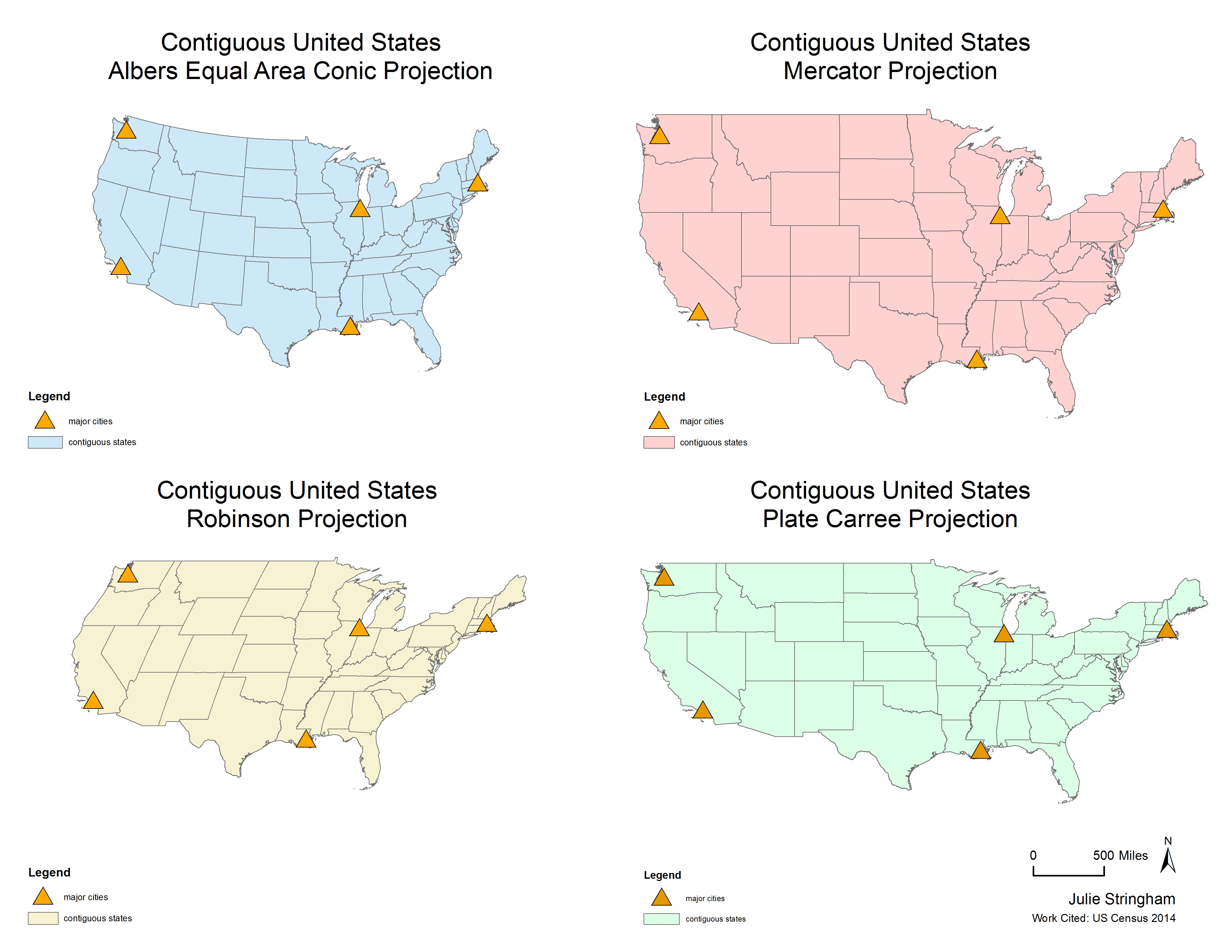
- Compare and contrast the four projections. How does the shape of the continental US change with each projection?
As seen in the map product above, different projections cast distinctly different representations of the continental US with regard to shape. Both the Mercator and Plate Carree projections cause the states to appear larger with respect to the other projections. In Particular, the Plate Carree projection alters the states’ shapes by elongating them, whereas the Mercator projection exaggerates the states both laterally and vertically so that the shape remains truer to form, but as a result states seem disproportionately large. By contrast, the Robinson and Albers conic projections change the angles on which the states are projected – the Robinson projection distorts the shape in a lateral direction, whereas the Albers projection produces a concave shape where the west and east coasts of the states curve slightly upwards. These angular distortions cause the contiguous US to seem smaller in comparison to the Plate Carree and Mercator projections.
- How does the position of the cities in relation to each other appear to change between projections?
In the Plate Carree projection the four cities seem further apart from one another with respect to horizontal distance, whereas the Mercator projection guides them further apart both vertically and horizontally. In the Albers projection, the cities appear to be closer together, but cities that lie on the coasts (especially the west) appear further north in relation to other projections. The Robinson Projection, on the other hand shows the northernmost cities as sitting further east (on this projection, Seattle appears to be east of LA).
- What properties does each projection distort?
The Albers conic projection distorts distance, shape and direction while preserving area. It should be noted, however, that this conic projection is constructed by using two standard parallels that run horizontally in the northern hemisphere. This means that the northern hemisphere may be projected with minimal distortion in relation to the other projections shown above.
The Robinson projection is neither equal area, nor conformal – it distorts direction, distance, shape and area to create an aesthetically pleasing projection. Distance is only comparable locally, and on opposite latitudes. Area and shape distortion remains low between the 45th and -45th latitudes, but increases once this bound is exceeded.
The Mercator and Plate Carree projections both compromise area and distance to preserve shape and direction. This distortion in both projections is unmistakable at higher latitudes. The Mercator projection is able to conserve angles, making it a conformal projection, but only at the expense of preserving area – the Mercator projection exaggerates area towards higher latitudes.
- Use the measure tool to measure the planar distance between cities. How does this distance change between projections?
We find that the Mercator projection places the cities at the furthest distances from one another, especially in relation to vertical displacement while the Plate Carree projection follows in at a close second with respect to lateral displacement. Generally, when measuring the distance between two nodes, the Plate Carree and Mercator projections represent them as being at a further distance from each other than the Albers and Robinson projections. To give an example of this disparity, when measuring the distance from Seattle to New York, both the Robinson and Albers projections depicted the distance to be only 75% of the distance that the Mercator and Plate Carree projections imply.
Part 2: Exploring Data Classification Schemes and Freshwater Extraction in the Contiguous US

- What variables does this dataset contain?
The selected dataset contains information relevant to ground and surface water extraction in the continental US per day. In particular, the following fields are found in this dataset:
ID: a unique ID number
STATE: the name of the state
POP: number of residents who are perceived as users/extractors of groundwater
FRESH_GW: the average amount of subterranean saline extracted (gallons per day)
SALINE_GW: the average amounts of subterranean fresh water extracted (gallons per day)
FRESH_SW: the average amounts of surface freshwater extracted (gallons per day)
SALINE_SW: the average amounts of surface saline extracted (gallons per day)
FW_TOTAL: the total amount of freshwater that is extracted (gallons per day)
SW_TOTAL: the total amount of saltwater that is extracted (gallons per day)
TOTAL_TOTAL: the total amount of water that is extracted (gallons per year)
All numerical values are rounded and represented as positive integers.
- What classification methods did you use? How does each classification method bias the interpretation of the data?
The map products above allow us to compare the equal interval, quantile, and natural break data classification methods.
The equal interval classification defines the categories based on the range of values, so that all categories have an equal range of values. This classification method has categorized few states in the higher tiers of water-extraction drawing out the states that record the largest amount of freshwater extraction, and has highlighted features with outlying values.
The quantile classification system works to divide the number of features evenly into five categories. Though this map gives the illusion that the majority of the United States is extracting large amounts of groundwater, this may not be the case; the data classification system forces features into one of the five tiers based not only on how many gallons of water the state’s populous extracts, but also regarding how many features exist in each category.
The natural breaks classification method is a ‘clustering method’ that seeks to find the smallest average deviation within each class, while maximizing each class’s deviation from other class’s averages (Jenks). Visually, this classification scheme minimizes the effects of anomalous or outlying data. The data paired with the classification scheme creates a balanced landscape with regards to aesthetic. The majority of states appear to be in the middle tier, although their groundwater extraction values may not be numerically represented as such.
Additional Work Cited:
Jenks, George F. 1967. “The Data Model Concept in Statistical Mapping”, International Yearbook of Cartography 7: 186–190. 3 October 2015. Web.
U.S. Geological Survey, 2014, National Water Information System data available on the World Wide Web (Water Data for the Nation). 3 October 2015. Web.