
1) What information does the Source tab provide about the states shapefile?
The source tab gives some basic information about the source for the shapefile, including: where it is located in the computer, the coordinate system and Datum used, and where the Prime Meridian is centered.
2) What coordinate system is this layer in? Is it a geographic or projected coordinate system? What is the difference between these two types of coordinate systems?
Coordinate system: GCS North American 1983 (a geographic coordinate system)
Geographic Coordinate Systems are based on a mathematical/geometric representation of the earth and are global or spherical.
Projected Coordinate Systems begin with a geometric model of the earth, but then map it onto a flat surface. The x and y coordinates (longitude and latitude) are flattened out into a grid for 2D presentation. The way that these coordinates are flattened, or projected, changes the way that a map looks: how large areas are, the angles of lines, and distances between points.
3) Compare the different projections. How does the shape of the continental US change with each projection?
Plate Carree: In this projection, each degree is drawn at an equal distance from each other, creating a perfect grid. The United States ends up looking stretched out horizontally. The lines of latitude and longitude are straight, which creates a lot of 90 degree angles in the state boundaries.
Mercator: This projection also has straight lines of latitude and longitude, but while the longitude lines are evenly spaced, the lines of latitude are farther and farther apart as they get farther north. This is to preserve the shapes of the northern areas, even if their sizes become exaggerated. The US still has a straight-across northern boundary, but the states do not look stretched out.
Robinson: This is a really odd projection. The United States looks like it was printed (starting with a Plate Carree projection) on a sheet of taffy and then skewed to one side. All of the lines of longitude are slanted, but the lines of latitude are still straight. This projection works much better for the entire world rather than showing a single country.
Albers: This projection is the only one of these four which uses curved lines of latitude. This creates a slightly curved northern boundary to the United States. The lines of longitude are also slanted, fanning out from the center of the United States. This creates more of a feeling of looking at the United States as it would appear on a globe.
4) How does the position of the cities in relation to each other appear to change between projections (give an example of some cities)?
The positions of Portland, OR and Seattle WA in relation to each other change quite a bit between all four projections. In the Mercator and Plate Carree projections, these two cities are aligned vertically with each other. In the Mercator map, they are much farther apart than in the Plate Carree map. In the Albers and Robinson projections, Seattle is skewed to the east (more so in the Robinson projection).
Another example is the relation between Denver, CO and San Francisco, CA. In the Mercator, Plate Carree, and Robinson projections, San Francisco seems much lower than Denver. In the Albers projection, San Francisco and Denver appear to be across from each other.
5) What spatial properties (i.e. shape, direction, area) does each projection distort?
The Mercator projection distorts the size as the map extends away from the equator. For example, the width of the southern edge of Arizona is actually nearly the same width as Montana. The Mercator projection makes Montana seem much wider than Arizona.
The Plate Carree projection is popular because of its one to one correlation between the spherical and Cartesian planes. It distorts both the shape and size of the areas mapped.
The Robinson projection also distorts the size and shapes of its maps, opting for some sort of visually appealing mash-up of projection types. The distortion increases as you move away from the center of the map or away from the equator.
The Albers projection retains area without deformation, but outside of the projection’s focus (chosen by the mapmaker), there is considerable distortion of shape and size. Within the focus area, the distortion is minimal, which makes it a great choice for mapping mid-sized areas where the rest of the world’s appearance doesn’t matter so much.
6) Use the measure tool to measure the planar distance between cities. How does this distance change between projections? Create a table with your findings.
| Planar Distances in Miles between Portland, Houston, Chicago, and New York City | ||||
| Albers | Mercator | Plate Carree | Robinson | |
| Portland <-> Houston | 1829.8 | 2337.5 | 2178.7 | 1479.4 |
| Portland <-> Chicago | 1752.5 | 2443.9 | 2431.8 | 1748.2 |
| Portland <-> New York | 2448.7 | 3404.9 | 3390.6 | 2467.1 |
| Houston <-> Chicago | 938.5 | 1155.9 | 987.9 | 1047.0 |
| Houston <-> New York | 1418.0 | 1749.1 | 1666.9 | 1569.6 |
| Chicago <-> New York | 717.5 | 961.5 | 959.0 | 719.2 |
7) What variables does this dataset contain?
FID; Shape; STATEFP; STATENS; AFFGEOID; GEOID; STUSPS (Postal state abbreviation); NAME (name of the state); LSAD (Legal/Statistical Area Description); ALAND (area of land); AWATER (area of water)
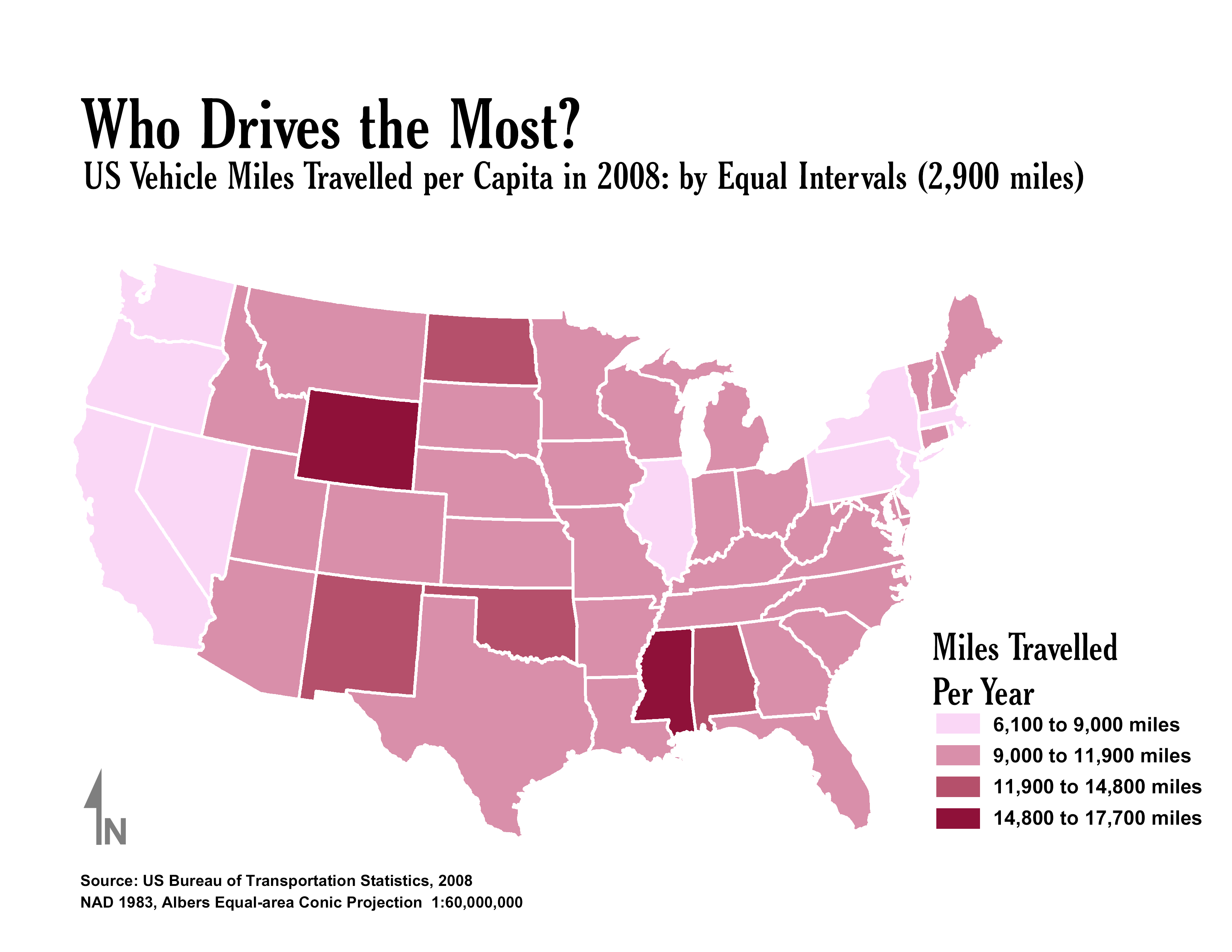


8) What classification methods did you use? How does each classification method bias the interpretation of the data?
Equal Interval: This classification method lumps most of the states into a single category. It is easy to see which few states have the most and least miles of travel, but leaves the rest in a single category.
Quantile: This classification has a pretty even spread of states (as it is designed to!) But this also makes it impossible to tell which are the really stand-out most and least traveled states.
Standard Deviation: I like this classification for this data set, as it shows a good spread, but also gives a little more information than the equal interval classification. However, the biggest downside of this classification is that without doing extra magic with ArcMap, there are no correlations between the amount of deviation from the mean and the actual miles traveled. If I was just given the Standard Deviation map, I would have no idea how far anyone actually travels.