Andrea Kennard AAD ePortfolio
AAD Adventures
Category: AAD 610_14
When I found out that I would be designing a logo and rebranding an organization for this class, I was filled with self doubt. I didn’t have any experience in any of the Adobe programs, let alone any design experience, but I learned so much from this whole process. It was such a fulfilling experience to play around creatively in a new medium. Music has really been the only art form that I’ve felt any connection too, but graphic design presented a new and exciting challenge that I felt like I responded well to. I never expected to enjoy it as much as I did and whereas I know I won’t go into a graphic design field, I know that I’ve amassed some skills that will aide me if whatever organization I end up working for needs someone with the skill set I’m obtaining in this course series. My knowledge of marketing has expanded as well. I can’t go around without noticing logos and typeface, wondering what kind of creative strategy went into it all. I feel about a hundred times more confident in the Adobe programs than I imagined and have been able to apply those skills to projects outside of this class as well. This class was incredibly useful and I gained some serious knowledge in both marketing as well as design and technology. I eagerly await MMC II.
1. What is your organization or company. Give background history including who, when, and why it was founded.
I chose a summer music festival in Beaumaris, Wales that I had an internship with in the summer of 2013.
From their Website:
“The Festival started in 1986 following a concert in the town by Anthony Hose who had founded the Buxton Festival. He was very attracted to the town and felt that its situation, facilities and history made it the perfect setting for an arts festival…Regular performers have been the Welsh Chamber Orchestra (conducted by Anthony Hose), the Beaumaris Band, the Poetry Trio and the Monteverdi Singers.”
2. What do they do or make – describe the products and services and what makes them unique.
The Beaumaris Festival is a weeklong festival of classical music, jazz, seminars, theatrical events, poetry readings, and art exhibitions. The festival is located in the small, seaside town of Beaumaris and brings in notable professional musicians, young artists and entertainers to a less culturally saturated area than other parts of Wales.
3. Describe the culture of the organization or company. What is the work environment like – the atmosphere? What is the building like – exterior/interior, architecture, fittings and furniture? How do the employees work together? What are the jobs and roles of individuals? How are they treated by management?
The organization is small – mostly volunteer run with the exception of the artistic director and festival administrator. The work environment was efficient and friendly. This is a small community and both the festival staff and the community members are friendly and engaging. The festival takes place at a leisure center in Beaumaris, although other locations around the town are sometimes used. Management was organized and effective, but always kind.
4. Who is the targeted audience? What are their demographics?
The target audience is Beaumaris community members and citizens in the nearby city, Anglesey. Most of the audience members are elderly with the occasional family, or twenty-something.
5. What is the organization or company mission statement?
I could not find a mission statement for the festival.
About my choices:
Due to my interest in working for a nonprofit organization in the performing arts sector, I chose three well known organizations in the classical music industry to analyze. I was curious to see how effectively these different establishments of ‘high art’ communicated an either inclusive, or exclusive environment.
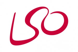
I’ve always found the London Symphony Orchestra’s logo to be visually intriguing. It’s unlike most orchestral logos in that the name of the orchestra is nowhere to be found. It relies simply on reputation and its initials. The LSO is one of the world’s leading orchestras and their prestige precedes them; they do not need to spell things out because there is really only one world class orchestra that could be attached to those letters.
The font seems to be unique to this logo and there is a continuous, uninterrupted fluidity in the design that I associate with the way that music flows. I like that the designer didn’t go with a traditional serif or sans serif font and instead chose a distinctive typography to make memorable impression.
The color is bold, but a more slightly subdued shade of red than the brighter reds that are typically utilized in marketing. Again, I see this as another element of simplicity. The red is striking and impactful, but it is not overt or in your face. It doesn’t need to be.
My favorite thing about this logo is the hidden visual. Not only does the single, fluid line form the initials of the orchestra, it also outlines an abstract form of a conductor. This logo is effective through its elegant simplicity and multiple layers of creativity. There is nothing stylistically formal or rigid about this logo. It is imaginative and artistic; inspiring a captivating sense of interest.
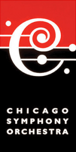
While very different from the LSO’s logo, the Chicago Symphony Orchestra’s logo is very appealing to me on several levels. My eye is first and foremost drawn to the ‘C’ that is used as their primary logo. The stylization of the ‘C’ is extremely reminiscent of the bass clef, although it’s flipped around and centered on the top line of what I would assume represents an (again, slightly modified) musical stave. Not only do the lines serve the purpose of solidifying the representation of the ‘C’ as a clef, they also balance things out.
I found the use of color to be very musically symbolic. After years of performing as a classical musician, I’ve always strongly associated black and white with music. Professional musicians are always dressed in concert black or tuxedos, music stands are black, some instruments are black, the music is printed in black on a white page…now, whether or now that was an intentional symbolic choice in the color scheme or purely for cost effectiveness, I don’t know. But to me, the black and white is visually significant in its (potential) abstract representation of music. The red at the top is purposefully eye catching. There is a boldness to it and an element of excitement. Red is prominently used in many well known, classic brands and that aligns with the orchestra’s reputation as one of the oldest, most well known American orchestras with a worldwide reputation for high musical excellence. The logo would still be clean and effective without the pop of red, but it elevates its effectiveness by subliminally drawing attention.
In its entirety, I think the logo projects a more inclusive, inviting atmosphere for the orchestra. This coincides with the trend to rebrand many of the premiere orchestras in the world in an attempt to promote accessibility and maintain cultural relevancy while still reaching new audiences. The CSO’s logo is visually intriguing without being too busy, yet it still maintains a clean, classic look through symbolic design, color choice, and the use of a neat sans serif font. The CSO’s logo successfully steers clear of the austerity found in some of the other premiere performing arts organizations.
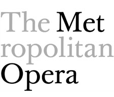
Speaking of organizations that project a sense of austerity, the Metropolitan Opera succeeds (in my opinion) in being visually alienating and projecting a sense of seriousness that is often negatively associated with classical music, specifically opera. Unlike with the LSO or the CSO, this logo is not particularly visually inviting. It is, however, intriguing in the sense that it seems to play on its nickname of sorts, The Met or Met Opera, by both splicing ‘Metropolitan’ and highlighting Met and Opera in black. This is not particularly balanced from a design standpoint, but it does invariably draw the eyes to The Met Opera. Visually, that’s the only way I could make sense of cutting metropolitan off after ‘met’. Also, judging by the fact that both logos emphasize Met and Opera, I can only assume that this was indeed the intention.
Oftentimes, I find opera to be the most reluctantly approached genre of classical music, likely due to the language barrier and sheer length that most opera productions run. Opera is typically viewed by the general public as the most stuffy, exclusive branch of classical music that exists. The Met’s logo in no way visually soothes any of those aforementioned reluctances. It’s almost as if this logo is saying “Yes. We ARE the most recognizable, premiere opera company in the world. We are a place of serious, world class music making.” And indeed, the logo is serious through and through; from its use of the classic Baskerville font to the absence of any color, The Met is clearly making a statement on its prominence and reputation in the classical music world. It is known internationally for being one of the best opera houses and it clearly does not see the need to rely on a trendy, highly modernized logo to entice people in. It’s not trying to be something it’s not, and on one hand, I can appreciate that. Opera is, and always has been a high art and The Met has consistently employed both world class musicians and the leading opera singers since its inception in 1880. This visually symbolic social commentary through branding and self representation piqued my interest and I was curious to see if this was trend across the board with other opera companies. It was. Almost all of the world’s leading opera houses employ similarly, if not more traditionally styled, classic logos. This said a lot to me about opera’s intention of remaining at the top of the classical music food chain and general disinterest in the social rebranding that many other performing arts organizations are wholly embracing. Opera knows that it’s slightly classist entertainment for the educated, musically knowledgeable or interested and it has no intention of cheapening itself or becoming downmarket by being trendy. It’s amazing what a simple logo can tell you.
1. Where did you move from to attend the UO? And, briefly describe how you landed on the UO AAD program. Any interesting, funny, anecdotal stories/details are welcome.
All the way from the East Coast of central Florida! I’m very interested in providing artistic opportunities at the community level and the program here really seems to adhere to and promote that ideology.
I also wanted to see if the West Coast was really, truly better than the East Coast (so far the West Coast is winning.)
2. Area of concentration in AAD?
Performing Arts and Nonprofit Management.
3. Describe your knowledge and use of technology systems. Responses should include the following:
I have a MacBook Pro, an iPhone 5s, and an iPod Touch. That’s about the extent of my technology collection. As for technological knowledge…well, let’s just say it’s about as expansive as my collection is large.
4. What software do you commonly use? Briefly describe purpose/application for software on your list.
I have a basic, working knowledge of the Microsoft Office Suite as well as a little bit of experience in WordPress. Microsoft Office has been mainly used for academic requirements as well as in all of the internship positions that I’ve held. I used WordPress to help update some website information during the marketing internship that I had this past spring.
5. Do you have any graphic design or media production/management experience? Have you taken any graphic design or media production courses?
None whatsoever.
6. Know anything about typography?
Other than Comic Sans is a terrible font choice? No.
7. Do you use Web 2.0 apps? Name those that you use or are familiar with.
I don’t.
8. Do you use Social Media (Facebook, Twitter, Instagram, Snapchat, Vine, Yelp, etc.)? Name those that you engage in.
I have personal accounts on Facebook and Instagram and I ran one of the Twitter accounts in my marketing internship.
9. Tell me something unique about yourself.
I play the French Horn. I have a bachelor’s degree in Orchestral Performance that I’m really hoping I’ll be able to use alongside the degrees I earn here in the AAD program at UO.
10. Anything else?
I’m really looking forward to expanding my technological capabilities and knowledge. Also, I’m pretty excited to be making my blogging debut!
© 2024 Andrea Kennard AAD ePortfolio
Theme by Anders Noren — Up ↑


Recent Comments