Oct
2014
Logo assignment
About my choices:
I choose three logos that I like from my country. They are not complicated and are vivid to understand. All of them are applied with red, one of the most representative color in China.
Logo 1.
BFA—Beijing Film Academy http://www.bfa.edu.cn/
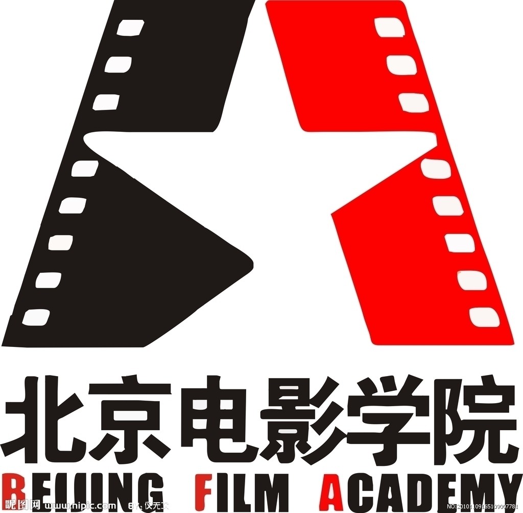
Bejing Film Academy is my undergraduate university, which built in 1950. So it’s not only a logo for me, but also have much deep feeling. This logo is very simple and easy to see. It only combines with three parts for color and icons. For color, just have black, red and white. I think black means respect and official. Maybe like a metaphor, the first sentence of BFA’s school motto “honour the teacher and respect his teaching” For film, black also means cinefilm. It is one of the most important things for film developing, although it has now quit the stage of history. In China, red means vitality, energy. This color represents active students, the same idea with last school motto “deliver to next generation” For icons, there are also three parts. On the top is composed with two segments of cinefilms. The middle of the empty places formed a five pointed star, which representatives it is famous and authoritative university. This is an open icon not closed that reflects the open education idea and free campus atmosphere. In the middle of logo is the Chinese name of school, in the bottom is its English name. Three red letters make up the abbreviation of Beijing Film Academy.
Logo 2
China Unicom http://www.chinaunicom.com.cn/
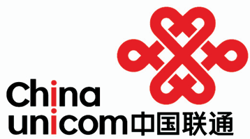
This is a sign of a Chinese communication company called China Unicom, like at&t, T-mobile in America. This logo is similar with Chinese knot, a symmetrical pattern, which is a symbol of Chinese traditional culture, represents peace and happiness. There are two up and down linked love hearts. It vividly shows the service purpose of China Unicom — communication and through the heart, that means the company will always be for saking users, be together with users. Red is the most representable color in China, so it’s also called Chinese red and means enthusiasm and good luck. This color represents the culture image of China Unicom, activity, innovative and keeps the same step with the world. Ink black is the most cohesive and comprehensive color, and symbolizes enterprise’s cohesion. As for the letters, applying red emphasizes double lowercase letters “ i ” and looks like people standing in the middle and convey a metaphor of the concept of people-centric. The Chinese pronunciation of “I” sounds like “love” and tell users China Unicom treats them as god. The logo, which utilities love as theme, conveys harmony and kindness to everyone.
Logo 3
sina weibo http://us.weibo.com/gb
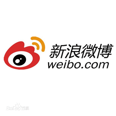
Sina weibo is a kind of social platform, similar with twitter, the most popular communication media in China. Sina was launched on 14 August 2009 and in 2014 it filed an IPO in America. The design of logo utilizes human’s eye as a core element and is watching what is happening in the world. Black eye is composed by three different sizes of ellipses and vividly shows sina is focus on fresh news and information about all over the world. On the outside of black eye is a red pattern like a torch. Black ellipse also symbolizes the whole universe and is surrounded by the torch, which expresses the concept of world is in your eyes. Torch means forever and seems to say sina will always be the world’s information exchange center. Two orange arc lines are on behalf of outward transfer signal, also like people’s ear and is listening to the world. This lovely logo stimulates people’s curious about internet world and is easily remembered by users.