 Data Visualization, Infographics, and other Cool Visual resources:
- Chris Jordan: Running the Numbers: An American Self-Portrait (2006 – Current) – Running the Numbers II: Portraits of global mass culture (2009 – Current)
I did not specifically address the design and creation of infographics, but check out these resources for helping you think about creating dynamic visualizations to go along with your presentation of your research.
- The 11 Best Infographics of 2015: http://blog.hubspot.com/marketing/best-infographics-2015
- Feast Your Eyes On The Most Beautiful Data Visualizations Of 2015: http://www.fastcocreate.com/3054064/feast-your-eyes-on-the-most-beautiful-data-visualizations-of-2015
- 5 Great Online Tools for Creating Infographics: http://www.coolinfographics.com/blog/2014/10/10/5-great-online-tools-for-creating-infographics.html
- 10 free tools for creating infographics: http://www.creativebloq.com/infographic/tools-2131971
- Edward Tufte: http://www.edwardtufte.com/tufte/ (where I got the visualization of Napoleon’s 1812 invasion of, and retreat from Russian)

Figurative Map of the successive losses in men of the French Army in the Russian campaign 1812-1813.
Drawn up by M. Minard, Inspector General of Bridges and Roads in retirement. Paris, November 20, 1869.
——————-
The numbers of men present are represented by the widths of the colored zones at a rate of one millimeter for every ten-thousand men; they are further written across the zones. The red [now brown] designates the men who enter into Russia, the black those who leave it. —— The information which has served to draw up the map has been extracted from the works of M. M. Thiers, of Segur, of Fezensac, of Chambray, and the unpublished diary of Jacob, pharmacist of the army since October 28th. In order to better judge with the eye the diminution of the army, I have assumed that the troops of prince Jerome and of Marshal Davoush who had been detached at Minsk and Moghilev and have rejoined around Orcha and Vitebsk, had always marched with the army.
- 2008 Election State Results. Source: The NY Times (Click on the image for a larger version.)
- 2008 Election County Leaders. Source: The NY Times (Click on the image for a larger version.)
- 2008 Election Voting Shifts compared to 2004. Source: The NY Times (Click on the image for a larger version.)
- 2008 Election County Bubbles adjusted to population density. 4. Source: The NY Times (Click on the image for a larger version.)

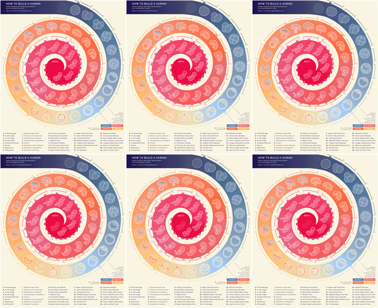
“How to Build a Human by Eleanor Lutz (Mini and Mobile Visualization) charts human embryo and fetus development from fertilization to birth through 44 animations that are nine frames each.”


