Tag: lecture

Jody Mohney Pene, IIDA, LEED AP | Forty Years : Looking Back and Looking Forward

Interior design by Jody Pene: Large conference room in the Conference Center of Dunn Carney Law Firm by Josh Partee, Photographer.

On Monday, November 12, 2012, interior architect, Jody Pene, IIDA, LEED AP, and former principal at GBD Architects, presented her lecture, Forty Years: Looking Back and Looking Forward, to a Portland, Oregon audience at the University of Oregon in Portland, White Stag Block. Pene is a visiting professor at the University of Oregon School of Architecture and Allied Arts Department of Architecture and the current University of Oregon Margo Grant Walsh Professor in Interior Architecture.


Pene gave her presentation as part of this year’s Gunilla Finrow Distinguished Lectureship in Interior Architecture for the University of Oregon School of Architecture and Allied Arts. Gunilla Finrow attended the lecture. Commenting on Professor Finrow’s attendance, Pene said,


I was very honored to have Gunilla Finrow, for whom the lecture series is named, come down from Seattle to attend my lecture. And pleased also to have many colleagues, students and friends both from the university and from the Portland community attending. Some of which were from GBD Architects and team members on many of the projects I presented. It was nice to be able to share the highlights of my career with both old and new acquaintances.
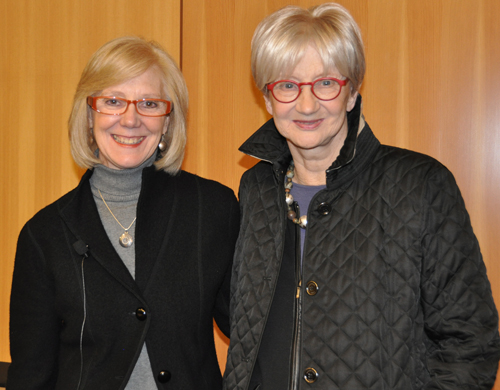
 

Jody Pene greeted by Gunilla Finrow just prior to Pene's Portland lecture at the UO White Stag.

Associate professor Alison Snyder from the UO AAA Department of Architecture introduced Pene, commending the visiting professor on a long and varied career that involved significant commercial and graphic design work and color expertise. Snyder remarked favorably on the opportunity to have Pene deliver her lecture both in Eugene (November 7, 2012) and in Portland; noting that it is a privilege to be able to “bring what we do in Eugene outside of Eugene to Portland and beyond—being seen and heard in places farther away” and to have the ability to provide lectures of this content and calibre to an interested community and metropolitan audience, such as that in Portland.Pene, in addition to her visiting professorship, is also on the UO AAA Board of Visitors. Professor Snyder thanked Pene for her ongoing and multi-tiered involvement with the UO School of Architecture and Allied Arts.


Beginning by illuminating her design philosophy, Pene spoke of several key factors that have played a major role in her career: the need for having a strong concept, recognizing an individual culture and goals, and being able to identify the appropriate environment of the business or client—these factors merge together in the creation of a project solution that is unique to each design venture.


Pene graduated from the University of Oregon in 1972 with a bachelor of interior architecture.  She immediately moved into her professional career relocating to Pittsburgh to work in graphic arts and interior design. At this early juncture, she found value in working with a team-based approach and discerned significant demand for her skills in signage and graphic design. In the 1970s, Pene relied on her, what she calls “old fashioned” handcrafting skills of drawing everything by hand and using tools such as pastels and pencil to convey ideas.


It was early in her UO studies and work career that Pene discovered her great love of “color and the play of patterns.” Calling upon this interest and her ability to bring together meaningful and attractive explorations of color and pattern once in a professional context, Pene’s career blossomed. She returned to the West Coast in the late 1970s to begin work with two highly significant Oregon architectural firms, Boora Architects (1978-1984) and GBD Architects Incorporated (1984-2010) where she held the position of principal for sixteen years and the principal-in-charge of interior design for twelve of those years.


Pene spoke of realizing the importance of collaboration in projects and of working with the entire team to create a strong concept. While her expertise would lie in the designing of the color palette and graphic arts component of the project, she consistently realized that it was vital everyone in the firm work together to pull the project together to create something remarkable.


Pene feels a pinnacle of her career came with her work on the renovation of Portland, Oregon’s Arlene Schnitzer Concert Hall. Here she worked on the interior to come up with fifty-four new colors that would accentuate the Italian Renaissance details and inform the aesthetic of the greater interior. Everything from overall carpet patterns and specific border patterns, to the overall interior design concept complete with soaring theatrical spaces culminates to present a space of intricate detail and graciously considerate historical appreciation.  It became a space uniquely suited to its culturally-grounded purpose.


During her lecture, Pene discussed her range of work incorporating independent interior projects such as those at elegant Portland accounting firms and law offices. Pene recalls that she remained true to her own design philosophy whether designing way-finding signage for a stadium or the exclusive interior of a highly prestigious law firm: the importance of designing to the individual personality of the firm or the business always remained at the forefront.


As time passed and her career continued, Pene began to realize changes in the field and practical changes in the greater societal situation that would have consequences for how she worked and what she designed. In the early 2000s, Pene saw a shift in how people would relate to a building and how the interior design could be used to create spaces conducive to stimulating creativity. The design work at Wieden + Kennedy’s Dekum Building illustrated to her how a more casual building “painted white and with playful sculptural forms” could be used to encourage innovation and creative work.


This was a change Pene had seen emerging about a decade earlier. As the 1990s had progressed, she noticed that there was a transition occurring from traditional design to design that was more responsive to change and to the creation of warmth in spaces –spaces that could foster person-to-person interaction, collaboration, and conversation.


The future of design, says Pene, was venturing into the realm of exploring flexibility and adaptability in the workplace. This new approach embraced the concept of an open office that can be re-configured to contribute more effectively and cooperatively to a collaborative workforce. Some of the initial big businesses to adopt this free and flexible design philosophy were places like Wieden + Kennedy, Columbia Sportswear, and Nike. Pene’s design theory, readily adopted by the aforementioned clients, forged ahead creating spaces that affirmed creativity while retaining corporate identity.


By establishing connections to the corporate ethos and maintaining strong ties to the sense of a unified whole or corporate campus, Pene was able to design spaces that respond to a human element, are comfortably sociable, and encouraging to innovative thought. In addition to being sensitive to place and her understanding of the humanistic component, throughout her career, Pene advocated for a palette of materials as well as colors that would allow a positive psychological emotional response, physically provide a comfortable space, and energize inventive behavior. Sometimes inspired by “aesthetically unconventional interiors,” Pene spoke of the ability of a space to encourage or foster creativity and innovation.


As changes occurred in the economy and global marketplace, Pene traced progressions in the way designs changed for her clients. Developments in environmental considerations brought new products and the desire for sustainable materials. Pene saw opportunities to integrate the newly renovated spaces of previously industrial buildings into simple and contemporary spaces blending the existing exposed structural elements as a beautiful, raw part of the entire concept. Patina-coated steel columns would become exposed, a testimony of history and permanence and be combined with a new concrete structure to produce a relaxed and informal atmosphere encouraging teamwork. [Such as with GBD’s new Pearl District building.]


These innovative design principles intentionally promoted client and staff intermingling which was a distinct shift from the decades previous where offices might be cubicle-style, isolated or closed off to integration and interaction with others. Pene explained the changes in the nation’s economy and the world led to a more competitive global economy. This, in turn, brought about another change in the needs of corporate and office design: with the new digital age was the demise of the on-site printed book or need for prodigious library-like rooms in design projects for law firms. Instead, research could now be done online, at desks with computers in shared spaces and more open places.


Another change, altered the ubiquitous conference room. Communication was more electronic and conference centers could have multi-purposes with the invention of privacy screens and glass (technological innovations that changed the needs of the space). With economic and financial considerations in mind, saving money and cutting costs was a definite concern, too. Consequently, only one floor needed to receive and be open to the public thus decreasing overhead costs. Spaces were becoming lighter and brighter. People were to be encouraged to work together, to create in a more warm and welcoming environment and to realize to potential of shared spaces and daily interaction.


Pene highlighted development of trends we might consider commonplace today: the on-site workplace cafe and simple, social gathering spaces. Both of these concepts encourage on-site lingering collaboration, conversations and teamwork. People stay together longer, have more conversations and work gets done leading to greater productivity and the exchange of ideas. Even the advent of more modular furniture in the workplace allows for more space and more efficiency letting departments grow and shrink, use space and easy-to-move furniture as needed, and be more flexible to the needs of people.


The interior designer described how previously high-end law offices began to transition to interior spaces that were “home-like in quality” rather than strictly formal, dark and heavy. Pene associates these specific developments with creating spaces that let people “linger, relate, converse, and exchange ideas.”


Summing up her recent projects with slides of the Meriwether towers on Portland’s South Waterfront and the Center for Health and Healing (OHSU), Pene discussed her continued exploration into a design philosophy that creates a “living room feel.” At the Health and Healing center, Pene designed an interior that was restorative and innovative while being LEED Platinum: she was stunningly successful. She spoke of her work with Camera World and how she limited the palette there to mirror the products relying on black, silver, and nods to technology as a overall theme.


With a full and productive career, Pene now plans to continue semi-retirement sharing her time between Oregon and her beloved home in Montone, Italy where she finds pleasure in photographing and drawing the fields and farmland. This rural Italian paradise provides Pene with plenty of time to discover history, art, architecture and landscape…..and she continues to enjoy depicting her environment (by hand) in pastel, appreciating and being “enthralled by the seasons, the colors, the patterns.”


Pene showed a series of her photographs and pastels: a collection of images including poppy fields, mustard fields, a field of onions in bloom, sunflowers, an olive orchard. She spoke with great affection for the natural and agricultural environment that surrounds her in Italy and explained the “sense of revealing, in color and texture and shape, the potential of light and shadow, the symmetry and order, the curve and line, even in a random, eclectic pattern of blooming poppies in a field.”


As she looks towards a future well-immersed in the things she loves and still active in a field she has made great contributions to, Pene noted that with her recent experience at the University of Oregon as an instructor, she has now discovered a new interest: teaching and working with students. She would like to teach abroad in Italy to exchange students traveling there for the first time. Her career, she says, has allowed her to see the importance of international study to enhance the forward progression of one’s design ability and knowledge, reviatlizing creativity and bringing fresh perspectives. She encourages all students to step into the international sphere of educational experience to ignite their creativity and expand their reference. And, even in an age of digital dominance, students, she recommends, still need to learn to draw by hand.


Regarding her own continual exploration of trends, and innovative design thinking, Pene says she relies on her photography, her sketching and various sources of media to help inform and expand her knowledge and bring inspiration. She also gratefully acknowledges her frequent world traveling and attendance at fairs such as the The Milan Furniture Fair (Salone Internazionale del Mobile di Milano) and NeoCan Chicago as key in continuing to fuel her creative energy and staying appraised, or even ahead, of trends. Keeping in touch with the pulse of the contemporary design field is further accomplished, she says, by reading a plethora of online sources and publications.


A current that continually flows through Pene’s design work and consistently infuses her ability to design meaningful, thoughtful and yet dramatic and captivating interiors, is her understanding of the importance of collaboration on her projects. While she acknowledges the design community has changed over her forty year career, she cites how important her graphic design experience has been in assisting her creative work from the beginning. There is “a strength and a clarity” to projects today, she remarked, to the way people work together which she finds quite beneficial and refreshing. Being conscious of patterns and color, and tying a project together by identifying what is required to accomplish the specific goals remains the main objective of Pene’s work ethic. She emphasized the interaction between all involved, but overall, it is the sense of collaboration that is the sine qua non of every project.


Remarking on the tremendous changes in the design field, both in approach and materials that has taken place during the last four decades, Pene recalled that as trends emerge, and change is inevitable, the observation of what is needed, and wanted and being able to adapt that to a design is a vitally important aspect of any project.


The years have defined a gradual progression in her work projects—projects that moved from the creation of formal spaces to the innovative and imaginative formulation of casual spaces. And along with this inventive approach to the workplace, human, and space interaction, Pene has seen that letting people be comfortable encourages interaction, bringing about more creative and worthwhile production, and, in the end, making a more successful product.
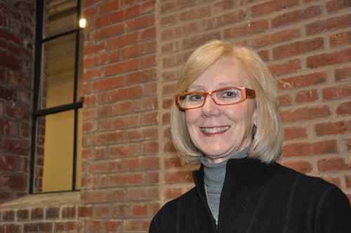
Jody Pene at the White Stag, UO in Portland to deliver her lecture, 40 Years: Looking Back and Looking Forward.


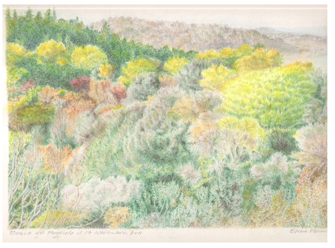
Jody Pene | Pastel sketch called "Poggiolo," a fall scene of the countryside at a villa in Chianti, Tuscany (Italy).

Read the UO AAA News Story here, for Eugene.  And for Portland.
Nudes and Nudities in Greek Art | A Lecture by Dr. Jeffrey Hurwit


© The Trustees of the British Museum 2012. All rights reserved

On October 28, 2012, Dr. Jeffrey Hurwit delivered his lecture, “Nudes and Nudities in Greek Art” to a public audience at the University of Oregon in Portland at the White Stag Block. Following his lecture, Dr. Hurwit led a tour of the newly opened exhibit at the Portland Art Museum, The Body Beautiful in Ancient Greece.  The lecture and tour were in collaboration with the Portland Art Museum and The Body Beautiful.


A world renowned expert in the field of ancient Greek art, Professor Hurwit had been asked by the University of Oregon in Portland School of Architecture and Allied Arts to lecture to a general audience and to focus on works of art on display in The Body Beautiful.

The Body Beautiful in Ancient Greece at the Portland Art Museum is an exhibit made possible by a collaboration with London’s British Museum. The exhibit, curated by Ian Jenkins and Victoria Turner, brings to Portland, Oregon what will be the only West Coast showing of the 120 objects usually on display as part of the British Museum’s collection of Greek and Roman art.

In what Professor Hurwit called “an extraordinary collection”, The Body Beautiful is an exhibit that has even managed to awe its curators with the striking majesty of its display at the Portland Art Museum.  Hurwit related hearing from the curator, Ian Jenkins that “‘Nowhere has this [exhibit] been displayed better than here in Portland.’ “  And, indeed, as Hurwit illustrated, taken together these works powerfully illuminate a breadth and depth of the Greek and Roman obsession with the human body.

Professor Hurwit’s lecture addressed specific works included in the exhibit and  introduced the topic of nudity in ancient Greek art as representational and containing differing meanings dependent upon context and the individual. Nudity, explained the professor is a costume used by Greek artists to depict a range of roles and connotation.   “In ancient Greek art,” commented Professor Hurwit, “there are many different kinds of nudity that can mean many different things….Sometimes they are contradictory.”

The content of the exhibit “speaks to us today” said Hurwit, and “reveals and celebrates our nature and physical being and bodies.”  Dr. Hurwit began by explaining how the pieces on exhibit in The Body Beautiful exemplify the ideals of the ancient Greek body.

In 440 BC the Greek philosopher, Protagoras wrote “man is the measure of all things.”  While much debate and discussion has surrounded this fascinating statement the general consensus is that judgments about qualities are subjective, truth is a relative thing, and the individual is the judge of all things.  To the ancient Greek mind, however, beauty was not relative.

Polykleitos Doryphoros. Image Courtesy of Professor Hurwit.

So comes the work of Polykleitos of Argos and his Doryphoros (made between 450-440 BC).  Polykleitos wrote a treatise on art called the Kanon and created the Doryphoros to demonstrate his theories.  The Kanon was based on the Pythagorean idea of symmetria, the notion that the parts of a form must have a proportional relationship to the whole, a mathematical formula that determines the perfect proportions of the ideal male body.

The Doryphoros is a study in contracts, in bent versus straight, right versus left, and in opposites.  Yet upon close study, all of these components are beautifully balanced in perfect equilibrium, right contradicts a flowing left, straight compliments bent, relaxed balances flexed, and stillness counters movement. This vision of highly charged repose collaborates to give the viewer a visual image of harmony.

The Doryphoros stands as a visual manifestation of the Greeks’ relentless obsession with structure and musculature, of the youthful male physique, and the male form defined by sharp lines and deep grooves counter-balanced with the exaggerated ridgey , almost-lovehandle-like quality of the hips (an interesting contradiction to the developed musculature of the rest of the form).  This is an idealized perception of what a man ought to look like.  It is the “perfect and the ideal,” a balance of curves and thick musculature.

But before the Doryphoros, Greek artists were producing Kouroi, those upright youthful males, perfectly idealized who blankly (except for that puzzling Archaic smile) and mindlessly stared past their observers and seemed to be all surface and restrained frozen movement.  The Kouroi and their neutral expression seemed to try to resist distracting the viewer by any indication of internal life of the mind.  Into this environment of  these Archaic era nudes, with their hands on their sides, left foot striding forward, arrived the Doryphoros and the impact was instanteous.

Even the marble sculptors working on the Athenian Acropolis began to alter their work—the youthful horsemen on the Panatheniac frieze of the Parthenon became more infused with movement, with the idealized and almost “Kanon”-like interpretation of the male body that we see in the Doryphoros. And, as Hurwit points out, it is an influence and a way of depicting the nude male figure that never really ends.  Just look at the Doryphoros-like stance in Durer’s the Fall of Man….

About a century after the Doryphoros was cast in bronze, a very different statue was made by Praxiteles of Athens.  Praxiteles was known for his depictions of the human body and for his figures’ elegant curved poses, relaxed appearance and a unique softness.  His Aphrodite of Knidos (330 BC) work stands as an innovative approach to the depiction of the female nude and set a precedent for the “ideal woman.”

For the most part, female nudity in ancient Greek art was unacceptable, shocking and somewhat revolutionary. As Professor Hurwit related, Praxiteles made two of these Aphrodite statues, one clothed, one nude.  One island, Kos purchased the dressed figure; the nude statue was bought by the island of Knidos.  The impact of this nude female figure, as Hurwit states, was “immeasurable.”

In the history of Greek art, the female form had previously been depicted with sparse detail or was clothed, in such pieces as the Folded Arm Figurines or the full-skirt wearing, bosom-bearing snake-goddess or abstractly on the surfaces of vases [Hirschfeld Krater, Athens, 990 BC].  And so begins what Dr. Hurwit refers to as a “double standard.”  The male body could be revealed but the female body would remain relatively hidden, clothed, abstract or only vaguely referenced.

And, of course, Greek artists were well versed in creating Kore or Korai, the definitive female representation.  Korai were always clothed, youthful, standing with one leg forward females.  When a female was depicted in the nude it was usually to denote slave girl, courtesan, or “call girl” status.  There existed a general banning or unacceptance of the female nude in most works, however, a notable exception existed in the depiction of the female nude in sculpture, for example with a work showing Apollo flanked by a nude Leto and Artemis [Relief from a temple at Gortyna, Crete, circa 640 BC].

With the study of the development of the nude in ancient Greek art, it is important to realize that Ancient Greece was not culturally homogeneous.  What was happening and acceptable in Athens, might not have been in Sparta, nor Crete.  However, it is Athens as a cultural center that helps us define the period from 600-340 BC.  From this era and a study of the works of art produced during this time, we can deduce that it was pretty much taboo to depict the female form naked.  Women, in art, are generally covered head to toe.

But in order to break through this taboo and this resistance to showing the female form au naturel, the artist, Praxiteles was very clever and thoughtful—he realized the necessity to create a narrative in order to justify the depiction of nudity.

Praxiteles’ Aphrodite of Knidos is shown bathing, modestly covering her pubis and blithely unaware of our presence.  We are in the position of approaching her, she knows not that we are there, watching her.  We are put in the position of voyeur, or voyeurese; we become the ones to blame for violating her privacy, seeing her in a compromising position, watching her while in the nude.

Voyeurs paid a heavy price in ancient Greek times.  Seeing a god or goddess without permission or consent or their knowledge was considered an anathema:  the violation would not go unnoticed nor unpunished.  The irresistible erotic power and sexuality of this statue was what lured viewers and made them its voyeurs.  A person approached this piece at his, or her, own risk (stories have been told of young men unable to resist the powerful sexual allure of this Aphrodite succumbing to and physically acting on their lust, and subsequently going mad, later throwing themselves from cliffs. )

The Aphrodite of Knidos was a liberating work as it essentially paved the way to release a torrent of female nudes and precipitated the onset of an acceptance of female form in Greek art as never before.  We see works like the Venus de Milo that explore how the addition of fabric can add a sensual layer to our view, enhancing the form within.

Suddenly the female form, post-Aphrodite of Knidos begins to experiment with a sense of allowable depictions that seem to encourage a sensual and sexual appreciation of the female form.  A winged Nike approaching Athena on the Temple of Athena Nike is in a full length clingy, dress-like garment, her body beautifully revealed by every thin fold of what must be a soft, flowing diaphanous fabric.  Curves of breasts and thighs seem almost celebrated beneath waves of revealing fabrics that cascade in anatomy clinging sensuality.  Dresses fall off bodies, and while these females are not completely naked, they might as well be—the sensuality and hedonistic visual we are given is nothing but entirely effective.  And, so the progression takes us from a cold, column-like hard, shaft clothed Kore to a new female nude defined as something almost always sensual, draped in folds and poses that accentuate her curves and softness. She bends to adjust her sandal.

The male nude remains another story and a much more complex one, at that.

Greek men strode about in the nude in private bedrooms, and at parties called symposia, sort of aristocratic drinking parties, if you will.  In the public sphere, male nudity was limited to the bathhouses, and the athletic games or gymnasia.  There was also the erotic nudity element in artistic depictions of homosexual and hetereosexual, both youth and adult liaisons—art limitating life, and vice versa.

In some cases, partial nudity of woman and girls was acceptable in the athletic games. In the Games of Hera, where virgins competed, females competed with one breast exposed but otherwise wearing a tunic. Hence, for the most part, full nudity was the privilege of men.

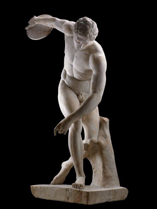
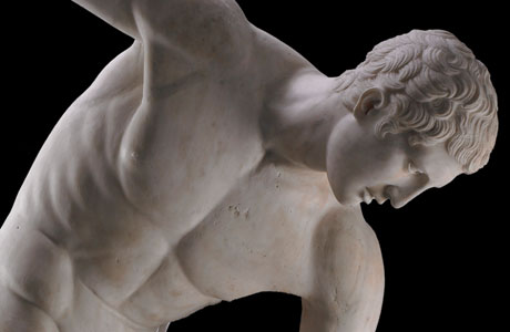
The Townley Discobolus. © The Trustees of the British Museum 2012. All rights reserved.

One of the centerpieces of The Body Beautiful exhibit, the Myron Diskobolos illustrates the aspect of nudity in athletics in ancient Greek art.   This nude body certainly asserts the beauty of the body and shows us an example of what is beautiful also being equated with what is good.  And, brings us further into our discussion of nudity in Greek art as having many different forms and meanings.

We have seen nudity with the male form as a way to define and show perfection and the ideal human form.  Nudity is also a custom of the gods, and therefore, a costume worn by god-like men.

The greatest of all civic heroes, we can say, is Pericles.  And our model of a hero par excellence, Theseus.  When we see these men depicted in the nude in war or battle, we can acknowledge that their physical prowess is being shown-off; but going into battle naked was not realistic, highly dangerous, and not the best way to fight.  Yet depictions of nudity in these battle-scenarios symbolizes an elevated and exhalted status, showing a sense of impending victory and courage, and of physical power.  This is “heroic nudity.”

We also see examples of “political nudity”—where political heroes are shown in the costume of democracy.  The removal of their clothes effectively distinguished them as “great leaders” and physically fit leaders in the political realm.

“Civic nudity” with the heroes as citizens (such as two brothers, The Tyrannicides, Harmodius and Aristogeiton, who plotted to murder and over throw the Peisistratid tyrant Hipparchus) are depicted in statuary nudes as heroes of the state, in a willingness to shed all, to trust all and to exemplify “democratic nudity.”

Common laborers can be depicted nude, as well.  Shown naked, their sweat and muscles revealing how hard they work.  Even nudity is used to show age from youth to the elderly: one nude illustrating the fresh, strength and slenderness of youth to the other revealing the sickness and weakness possible with the dead, dying and aged.  But both show us a vulnerablility, a fragility, if you will,—one of the young, one  of the old.

Nudity can give us a glimpse of suffering, defeat, and impending death as we see in Ajax as he prepares to throw himself on his own sword and take his own life: he is the fallen, isolated, tortured hero as nude.  [Black Figure Amphora, The Suicide of Ajax, Greek, 540 BC.]  Perhaps “pathetic nudity.”

We see a full frontal of a nude Cassandra in a Red Figure Hydria, [Naples, Kleophrades Painter];  or a naked Hector bound to Achilles’ chariot…both strong and emotional depictions of nudity.  [Attic Hydria, Achilles Dragging Hector, 520-510 BC.]

And, this brings us to the concept of the difference between sexual nudity, soft nudity, nudity for nudity’s sake and actual nakedness, as well as the comparison between male and female nudity.  Nudes and nudity in Greek art do not always divulge the same connotation or meaning.  We have the presentation of nude versus clothed and the revelation:  there is much more to a Greek nude than just perfect flesh and “heroic nudity.”

Following his lecture, Dr. Hurwit led a public tour of The Body Beautiful at the Portland Art Museum.  His tour continuing and illustrating points made in his lecture, provided insightful scholarly commentary on numerous works in the exhibit including the many iconic marble and bronze sculptures, vessels, and funerary objects most coming from the second and third millennium BC. For more information on the exhibit at the Portland Art Museum please refer to, The Body Beautiful.

[This article is a brief summary of the lecture Professor Hurwit gave on October 28.  A full recording of the lecture will be available shortly and will be linked to this article.

We extend a sincere thank you to Professor Hurwit for his lecture, Nudes and Nudities in Greek Art and his tour of The Body Beautiful in Ancient Greek Art.   Also, many thanks to the Portland Art Museum for their cooperation and assistance with this event.]

About Dr. Jeffrey Hurwit: Dr. Hurwit has degrees in Classical Languages and Literatures from Brown University and a Ph.D. in Classical Art and Archaeology from Yale.  He has taught at Yale, subsequently joining the UO faculty in the History of Art and Architecture.  He holds a co-appointment in the Classics Department and holds a Philip H. Knight Professorship.

A leading scholar of the archaic and classical periods in Greek art, Professor Hurwit has appeared in major documentary films and lectures at the world’s top universities, museums, and archaeological institutes.  The recipient of many prestigious awards, including a Guggenheim Fellowship and the University of Oregon’s Faculty Excellence Award,  Professor Hurwit is the author of many works on the art  and civilization of Archaic and Classical Greece. Among his many influential publications that are regarded as standards in the field, his recent book, The Acropolis in the Age of Pericles is considered the definitive work on the subject.

Professor Hurwit regularly conducts research in Greece and Italy, and has been selected four times to teach in the Northwest Council for Study Abroad programs in Siena and Athens.  He has spoken widely across the United States and Canada and has also served three times as a study leader for Smithsonian Institution tours of Greece and the Mediterranean. In 2000, he was appointed to the prestigious Martha S. Joukowsky Lectureship for the Archaeological Institute of America, and in 2003 became the inaugural Dorothy Burr Thompson Memorial Lecturer at University of British Columbia. He has also served on the editorial board of the College Art Association’s Art Bulletin and on the Publications Committee of the Getty Research Institute.

Professor Hurwit is also currently working on Palaeolithic cave-painting in addition to his studies in ancient art.

Read one of Dr. Hurwit’s articles on this subject, The Problem with Dexileos: Heroic and Other Nudities in Greek Art.

.


Thomas "Gunny" Harboe Keynote Speaker at 2012 McMath Symposium

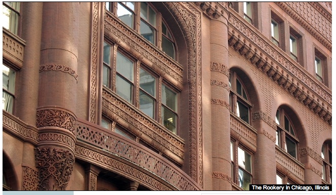
The Rookery | Image Harboe Architects, PC

Chicago architect and award-winning preservationist, Thomas “Gunny” Harboe, FAIA , was the inaugural keynote speaker for the George McMath Symposium on May 30, 2012 at the University of Oregon in Portland at the White Stag Block.  The lecture was held in conjunction with the presentation of the George McMath Historic Preservation Award.  This year’s 2012 award was presented to Portland architect, Hal Ayotte.

Harboe works with the firm of Harboe Architects in Chicago.  Harboe’s lecture, “Restoring Chicago’s Icons:  A Public/Private Partnership,” focused on describing Harboe’s fascination with the past, respect and passion for historic objects, and his work with some of Chicago’s most historically and architecturally relevant restoration projects. For over 20 years Harboe has played key roles in working to restore iconic structures of the Chicago cityscape, including the Rookery, the Mies van der Rohe apartments on Lake Shore Drive, and the Reliance and Marquette buildings.  “Preserving our collective cultural heritage is important to society,” commented Harboe, “we need to give it a life that will extend it beyond us.”

With a lifelong interest in conservation and preservation, Harboe credits his childhood experience of living in a New Jersey Revolutionary War-era home as fostering an early affection for history and objects.  It was in this historically relevant family residence that the young Harboe discovered an interest in found objects and gained an appreciation for antiques.  Harboe soon turned to an education steeped in historical study, spending a year in Denmark at the Royal Academy of Fine Arts in Copenhagen; and later earning a bachelor’s degree in history from Brown University and a master’s degree in historic preservation from Columbia.  His hands-on and practical skills were cultivated further with his work as a carpenter eventually leading to a job on the team that would restore the Frank Lloyd Wright Room at the Metropolitan Museum of Art in New York.  Harboe has credited that MoMa experience as being “where the epiphany happened.  I realized that the key decisions about what got done had already been made by somebody else: the architect.”  Hence, he turned his focus to pursue a master’s in architecture from MIT.

The Rookery | Image http://therookerybuilding.com/

Harboe, equipped with load-bearing quantities of academic, visionary and practical experience was soon working with the Preservation Group at McClier, the architects who would be commissioned by the Baldwin Development Company to restore The Rookery.  Considered the jewel in the crown of Chicago’s  architectural and commercial built environment, The Rookery is a 1888 Burnham & Root building that included a lobby by FLW.   As luck would have it, Harboe was the intern-architect-in-training at the firm, and he amusingly recalls “I was the guy who knew something about preservation.”  The rest, as they say, is history.  And so, began Harboe’s presentation to the UO audience.

Harboe initially presented his work with the Rookery, completed in 1992.  Revealing intriguing details such as how each window had to be removed, all original sashes put back in place, and having to cope with  4000 corners of fenestration where water had ample opportunity to leak in (and it had), Harboe walked us through the trials and tribulations of  careful, accurate and painstakingly detailed historic restoration and preservation.    Removing approximately 20 layers of black paint from the oriel staircase (removed and cleaned by crushed walnut shells under pressure), and having to rely on a creative interpretation of replicating single piece teardrop elements as two pieces glued together, the architect-preservationist confided aspects of the process to reconstruct the original LaSalle Street and Adams Street lobbies to the original [circa 1910] appearance.  Harboe spoke of the importance of finding sources to help recreate or restore elements to an historically appropriate form.  This might include the use of historic photographs, finding a small but original fragment of wall or flooring, or simply cleaning a surface down to a semblance of its historic original.  Graciously offering credit to the workers and craftspeople who joined him on the project, Harboe firmly advocated for the importance of hiring “the right people for the job,” saying “craftsman make a difference.”

The Reliance Building | Image Harboe Architects, PC

Harboe’s preservation, restoration and rehabilitation of  The Rookery was praised by both the architectural and historical preservation professional fields as well as the city of Chicago.  Having completed this very successful project, Harboe moved on to his involvement with the Reliance Building, also by Burnham and Company  (1891) and completed by Charles Atwood (DH Burnham and Company, 1896).  The Reliance Building is one of the most important early skyscrapers in America.  At this point, Harboe paused to address the importance of the Federal Tax Credit to his historic preservation work.  Harboe explained the effectiveness of the Federal Historic Preservation Tax incentive program as contributing to positive and cost effective public/private revitalization programs and, hence, directly influencing his projects.

The Reliance Building (renamed and converted to the Hotel Burnham in 1999) has been termed “proto-modern” by architectural historians. Its expansive and elegant fenestration and strip-like sections of white glazed terra cotta are distinctive and highly relevant to its design. Like all of Harboe’s projects he addressed during his lecture, the building is listed both as a National Historic Landmark and a City of Chicago Landmark.  Harboe noted the remarkable steel curtain wall that is made up of an internal steel two story-high column and provides all structural support for the building.  He also spoke of the importance of being creative and flexible when needing to find substitute materials. For instance, the windows in this building were beyond repair, they were replaced.  The original cornice that had been removed in 1948 was reconstructed in cast aluminum.  Even with these alterations, Harboe stayed persistently true to the original patterns. Harboe further emphasized his use of historic photographs, drawings and remaining fragments in the detective-like job to authentically replicate a structure.  Harboe also brought up another important issue in his historic preservation projects, that of the importance of place and infusing a place with renewed vitality.  The primary focus of this historic preservation project, he commented was to “give life to [the street] and that [was] the intention of the project, to revitalize.”

Sullivan Center | Image Harboe Architects, PC

Harboe’s work on the Sullivan Center (built 1898-1904) involved all exterior restoration, Federal Tax Credit Program consulting, and City of Chicago façade examinations.  A building best known for the elaborate cast iron storefronts and a curved rotunda, the project truly relied on the Tax Credit incentive; Harboe briefly discussed how his focus had to fixedly remain “not doing anything that would jeopardize the Tax Credit.”  In order to create the necessary elements for this building, Harboe turned to a sculptor to recreate the details characteristic of the original designer, Louis Sullivan.  Working with a craftsperson familiar with the techniques available to create ornamental work was of great importance.   With exceptional workers, Harboe maintained his team was able to place remarkable attention to exact detail and towards the investigation of existing parts to restore this building.  Speaking of the reconstruction of the ribbon windows, the matching of the colors for the glass elements, and the color matching for the terra cotta (working from found fragments buried deep within the walls), Harboe stressed the challenging aspects of his work.  Turning to an amusing anecdote of good fortune on-site, Harboe recounted the team finding a large fragment of paint that had been trapped under a canopy.  The fragment would consequently be used to attain a correct color match and be the most formative piece leading to an accurate hue.  Using and having a knowledge of forensic investigative-like techniques is very helpful in the restoration field, commented Harboe, noting that he relies on such investigative strategies for each project.

Much of the cast iron work for the Sullivan Center was done off-site. Harboe recalled how this turned the project into a gargantuan job with disassembly of parts that “in many cases were held in place by the friction of the corrosion.”    Harboe added that this campaign of difficult structural situations made each stage arduous especially with the added logistical difficulty of having to remove each piece to an off-site location.

Chicago Board of Trade | Image Harboe Architects PC

Harboe’s work on the Chicago Board of Trade Building (1929, Holabird and Root), one of the finest Art Deco style buildings in Chicago, began in 2004 with renovation efforts to restore the Art Deco aesthetic of the lobbies, improve elevator operations for 24 elevators, and modernize building systems.  The building was of particular importance to Chicago as it is viewed as a symbol of the city.  Harboe began this project by cleaning the exterior limestone surface of the structure simply with water.  He advocated for using “environmentally friendly substances whenever possible.”  Important features of this project included the interior lobbies with six varieties of marble, nickel silver metal trim and ornamental plaster as well as a luminous ceiling featuring a panel of light.  All of the lobbies were illuminated by stylized fixtures using nickel silver frames and glass, the challenge here was to recreate missing fixtures, and nickel silver features.  On this project, Harboe related finding some original treated elements that became key pieces to the restoration.  Harboe’s keen attention to detail and his willingness to really look, explore, observe and delve into the hidden pockets of a structure and find minute details of ornamentation, color, and materials has lead to many of his discoveries that end up being the pieces that put the puzzle of historic restoration together.  The necessity of being able to look and investigate, research and uncover is one of the most important aspects to any restoration project and cannot be underestimated.

Commenting on his experience with all these projects, Harboe again emphasized the importance of the workers who help realize the projects.  “The tradesman make the difference,” he asserted.  Concluding his lecture with this advice, Harboe took questions from the audience.