c o r r e l a t i o n s :
film and architecture
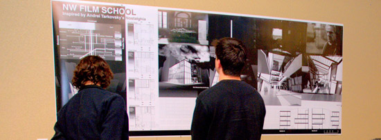
Fall 2010 Studio, Portland
Professor Robert Hermanson,
2010-2011 Adjunct Faculty, University of Oregon and
Professor Emeritus of Architecture, University of Utah
In Collaboration With
The Northwest Film Center School of Film and
Ellen Thomas (UO Alumna, ’85), Education Director, NWFC, Portland, Oregon
Displaying the research and work of
Will Ives, David Donaldson, Brian Schmidt, Tim Harkin, Herminio Hernandez, Caresse Lee, Alex Porter, John Hutton, Jessica Wallace, Caitlyn Cartlidge, Andrew Harmon, Sina Meier, Nathan Streib, Craig Race, Nan Kambhu, Nadia Kaso, Nick Byers, and Edwin Stanculescu
Students in Professor Hermanson’s studio were invited to use the frame of a video camera and the viewing and resulting interpretation of a specific film as a method to craft cinematic experience in architecture. The studio addressed how these two art forms, film and architecture, can corrupt one another, collide, instruct, and reconfigure one another. Encouraging his students “to draw on their own research and personal reflections and experience,” Professor Hermanson asked his students to investigate how film can originate the emergence of architecture, and how film and architecture influence one another as disciplines.
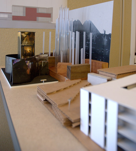
The studio course also aimed to expose the aspect of “virtual reality [beginning] to emerge as an ever more present part of our day to day experiences,” says Professor Hermanson. This begins to suggest, “the notion of creating, not discipline bound areas for investigation, but rather, the inter-relationship, and the correlation that might exist between multiple areas of knowledge.” Students in correlations: film and architecture participated in a studio where “perhaps, [they] can find new possibilities for further engagement, as well as new directions that challenge continually emerging specializations.”
Based on the current site of the Northwest Film Center in Portland, Oregon, the students researched, analyzed, and completed conceptual studies for a new experimental film center as an extension of the Northwest Film Center. Their research and resulting storyboards were crafted to display theory and practice that would involve the public in a hands-on setting where both the fabrication as well as screening of cinematic works would take place.
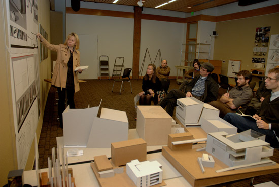
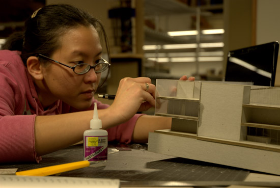
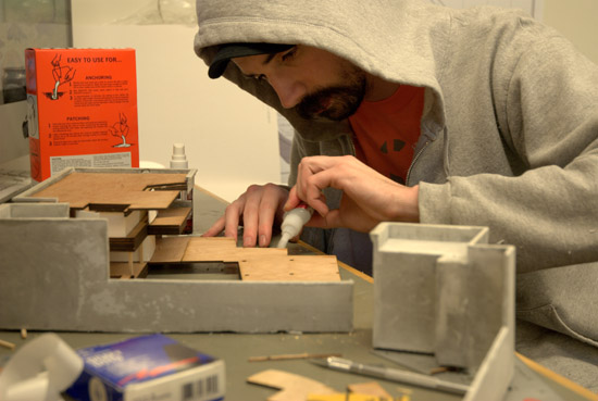
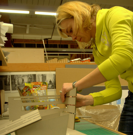
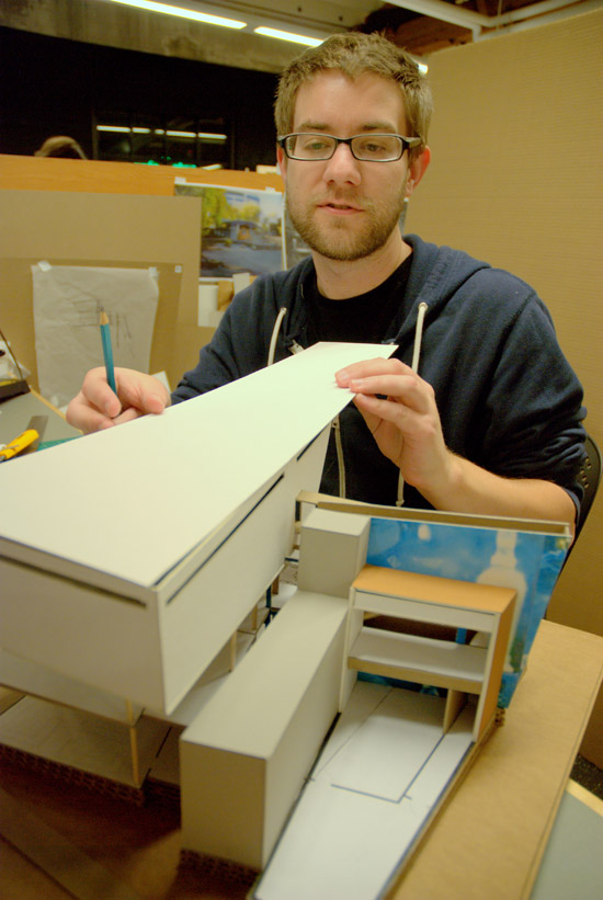
True to pedantic research practices, students were guided by Professor Hermanson on an intellectually based studio course completing readings (such as Juhani Pallasmaa’s The Architecture of Image: Existential Space in Cinema, a work detailing how directors use architectural image to create emotional states and reveal similarities between the landscape of paintings and cinematic imagery) as well as becoming motion picture fabricators and translating this into architectural models. Part of the studio involved students filming their own short films lending them hands-on experience as experimental filmmakers as well as architects and set designers. This experience allowed individual students to develop a perception of creating architecture using film as a medium.
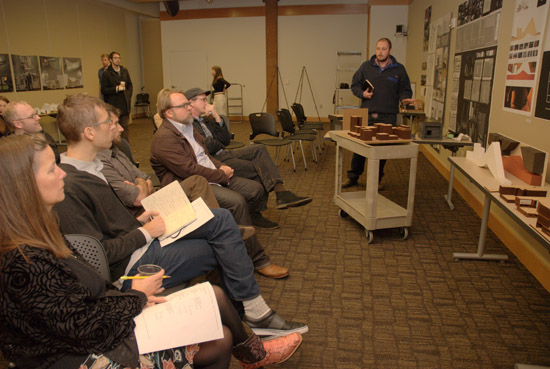
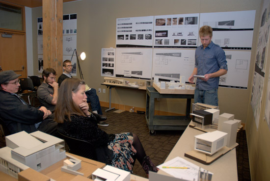
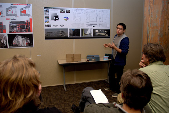
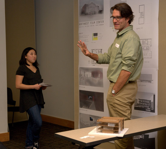
Collaborating with Professor Hermanson was Ellen Thomas, the Education Director for the Northwest Film Center School of Film, Portland. Thomas comments that she was “both a collaborator and ‘the client’” in a very cooperative project. As a collaborator, she worked with Professor Hermanson to design how the Film Center would be integrated into the concept of a film-architecture studio as projects needed to involve site analysis, project programming, and conceptualizations based on a real, existing site but with the added component of incorporating theories, principals, design progression and presentation from a selected film. Acting also in the role of “client”, Thomas was able to facilitate the students winding through the physical and programmatic needs of the Film Center on location. For final reviews at the term’s end, she juried the student designs alongside the invited members of Portland’s professional architectural community, including Paul Kinley (Opsis Architects), Stephen Tobler, AIA, Ian Flood (Michael-Willis Architects), Jeff Stuhr (Holst Architecture), Nick Smith (Thomas Hacker Architects), and others.
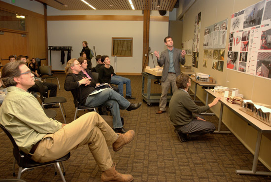
Professor Hermanson is fascinated by the juxtaposition of images to create architectural sequences and events. He recognized a need for students of “the media based-world” to experiment with films and their own experience as a flow towards cinematic experience and understanding of their own surroundings. Hermanson speaks to the “correlation between aspects of how one experiences the world in a film and how one then draws on that or parallels that in one’s own perspective and relation to the environment.”
Challenging his students to select a film and then to “take ideas from that film and translate them into architecture, and an expression and understanding of light, color and spatial relationships” proved a highly personal project for students as they tackled diverse and complex themes giving a framework to their explorations of reality versus illusion. Creating a new film center that would incorporate the viewing public and student/professional filmmaking, Professor Hermanson’s students placed their concepts and theories firmly on the physical ground of Portland, Oregon at sites such as NW 13th and Gleason, NW 12th and Hoyt, SW 3rd and Oak, SW 3rd and Stark as well as at the already existing locale of the Northwest Film Center. What they brought to the design table was an eclectic representation of film as having the capability of portraying reality and enhancing or exaggerating its image. Students explored how the built environment is compelled to represent the image, in itself, by building reality and lending it a physicality.
The films students selected to analyze and inspire their design work ranged from Andrei Tarkorsky’s Nostalghia to Victor Fleming’s The Wizard of Oz to other cinematic experiences such as Blade Runner, Blow Up, Run Lola Run and The Passenger, among others. Each film selection delved into ideas such as architecture as a metaphor to enhance the theme of the story (Nostalghia); architecture used as background set of the film and architecture of the future (Blade Runner); and films that incorporated similar artistic origins of composing space and time, such as Run Lola Run.
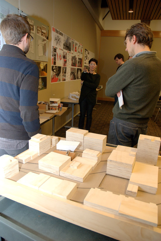
Brian Schmidt’s presentation involved an examination of the film, Blade Runner. He cites the most important facet of this film as being “the interaction between the main character [Deckard] and human-looking robots [Replicants].” His architectural concept took the idea of a “constant, Deckard, and translated that…to a datum.” In his final resolution and theory for the new film center, Schmidt builds a structure that incorporates “different wedges [that hold] distinctly different program types. Binding them together and making them more a part of a cohesive building is a wall that acts as a circular element….” The piece, continues Schmidt, winds throughout all the program wedges thereby exposing the attending public to all the aspects of the building: production, office, and, ultimately, the public viewing room, itself.
Sina Meier’s choice to analyze The Passenger, a film directed by Michelangelo Antonioni, lead her to identify distinct scenarios correlated with specific landscapes. She says she “noticed that landscape, sound or silence, the way that the scenes were shot, as well as the flow of information in the film all help expand or compress time….the concept of elongation and compression of time and space became [her] guiding principal.” Thus, her design for the Northwest Film Center is divided into three major parts: an “elongated arriving path; a dense, active, and open core; and a dark elongated departing passage.” Her concept leads one through “a long gallery walk” where “lines converge, with the looming volume” and one is forced to transcend from “an expansive to a compressed environment”.
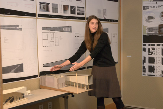
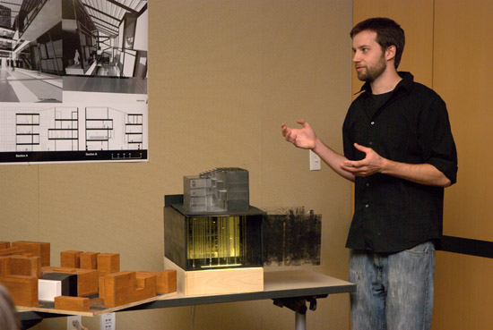
Investigating Andrei Tarkovsky’s Nostalghia, a film about existential loneliness, Caitlyn Cartlidge found contradictions that inspired her approach. Her presentation focused on aspects of the film such as “reality emancipated from realism” and “deliberate design and purposeless chance” to create a storyboard and model that is “largely about solid, void and texture.” Cartlidge explored ideas where entering the building would create “trepidation but also intense curiosity” and used materials in her construction specifications that would “allow the inside to see out and light to come in, but inhibit exterior views to the inside” (metal mesh) as the inhabitant is allowed to “experience the space, be curious about it, but not be able to reach it directly.” Her building would feel intensely “geometric and dark” yet on closer inspection “reveal [walls] constructed…as a type of rainscreen…[in a] translucent wall system.” Her design invokes the feeling of Nostalghia: “full of deep contradiction.”
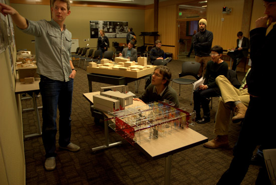
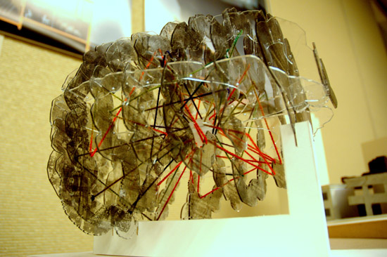
Undertaking an analysis of the film, The Wizard of Oz, Matthew Byers’s model takes ultra-modern materials (cut plexi) with interlaced yarn depicting the tornado-esque scene of the movie as static event. Words screened onto the plexi, quotes from the film, and a center core with “There’s no place like home” recall phrases from the world of Oz where endless spirals of corridors are put on display, chaos from one region is separated with fragility from chaos of another, and light perforates all layers. Byers’s model combines the whirling weather of the film as a time-based event, and existence in a clear transparent nest of synthetic material.
While all students created intricate studies translating their ideas into diagrams, building plans and elevations, some also chose to develop metaphysical, somewhat controversial and philosophical thoughts thereby testing new and provocative areas. One student, Jessica Wallace used her study of Blow Up to explore the idea of ontology. Blow Up is Michelangelo Antonioni’s 1966 neorealist film where as the film’s narrator tells us “Sometimes reality is the strangest fantasy of all.” Antonioni was a filmmaker heavily influenced by the French New Wave movement and on its deepest level this film is about the ontology of photography and cinema and the evidentiary power of the image. The very name of the film, Blow Up refers to the technique of enlargement, sometimes the camera has captured but that has quickly evolved to also distort that very image.
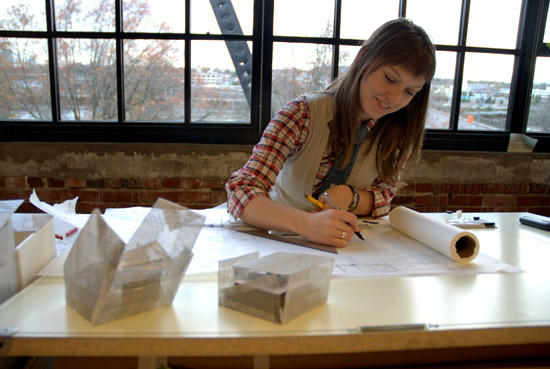
Wallace does most of her projects by hand still employing watercolor, pencil, ink on mylar. She comments that she was captivated by the ontological question of existence and being as it related to photography. With this film and subsequent model, Wallace would present her “two worlds” of the viewer and the students in a design for a fictional film center where participants are engaged in a “sequence of spaces so their paths intermingle.”
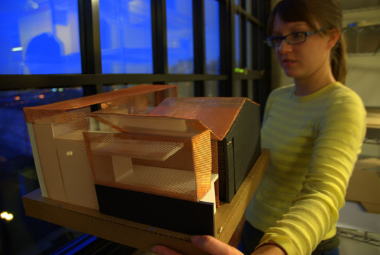
Her explorations (layers upon layers of ink on mylar) create a depth of materials where she says her hand-done approach allows her “to learn about the building by drawing and reworking….and visualizing the space.” On her final model, she made use of fine cooper mesh for the top that glimmered in the lights of the studio. Her reasoning for using copper: copper will fade and change with time, the weather, and various exposures to the natural elements. Wallace sees her use of this material as adding to the ontological questioning.
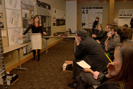
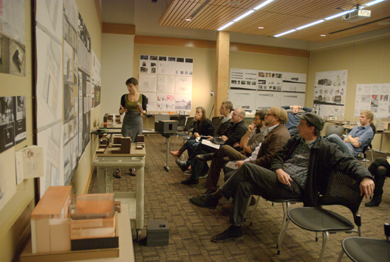
Ellen Thomas commenting after the review noted that “one of the take-aways for [the reviewers] was witnessing how powerful the jury critique process is for the students.” While the Film Center does not have that same tradition in film education, Thomas says that “now that I’ve seen it in action with architecture, I’m considering adding it as a component to our film school….” She continued by citing an appreciation for her experience in the studio and observing how the two worlds of film and architecture “are a lot closer together than most would think.”
Story and photos: Sabina Samiee