Nudes and Nudities in Greek Art | A Lecture by Dr. Jeffrey Hurwit


© The Trustees of the British Museum 2012. All rights reserved

On October 28, 2012, Dr. Jeffrey Hurwit delivered his lecture, “Nudes and Nudities in Greek Art” to a public audience at the University of Oregon in Portland at the White Stag Block. Following his lecture, Dr. Hurwit led a tour of the newly opened exhibit at the Portland Art Museum, The Body Beautiful in Ancient Greece.  The lecture and tour were in collaboration with the Portland Art Museum and The Body Beautiful.


A world renowned expert in the field of ancient Greek art, Professor Hurwit had been asked by the University of Oregon in Portland School of Architecture and Allied Arts to lecture to a general audience and to focus on works of art on display in The Body Beautiful.

The Body Beautiful in Ancient Greece at the Portland Art Museum is an exhibit made possible by a collaboration with London’s British Museum. The exhibit, curated by Ian Jenkins and Victoria Turner, brings to Portland, Oregon what will be the only West Coast showing of the 120 objects usually on display as part of the British Museum’s collection of Greek and Roman art.

In what Professor Hurwit called “an extraordinary collection”, The Body Beautiful is an exhibit that has even managed to awe its curators with the striking majesty of its display at the Portland Art Museum.  Hurwit related hearing from the curator, Ian Jenkins that “‘Nowhere has this [exhibit] been displayed better than here in Portland.’ “  And, indeed, as Hurwit illustrated, taken together these works powerfully illuminate a breadth and depth of the Greek and Roman obsession with the human body.

Professor Hurwit’s lecture addressed specific works included in the exhibit and  introduced the topic of nudity in ancient Greek art as representational and containing differing meanings dependent upon context and the individual. Nudity, explained the professor is a costume used by Greek artists to depict a range of roles and connotation.   “In ancient Greek art,” commented Professor Hurwit, “there are many different kinds of nudity that can mean many different things….Sometimes they are contradictory.”

The content of the exhibit “speaks to us today” said Hurwit, and “reveals and celebrates our nature and physical being and bodies.”  Dr. Hurwit began by explaining how the pieces on exhibit in The Body Beautiful exemplify the ideals of the ancient Greek body.

In 440 BC the Greek philosopher, Protagoras wrote “man is the measure of all things.”  While much debate and discussion has surrounded this fascinating statement the general consensus is that judgments about qualities are subjective, truth is a relative thing, and the individual is the judge of all things.  To the ancient Greek mind, however, beauty was not relative.

Polykleitos Doryphoros. Image Courtesy of Professor Hurwit.

So comes the work of Polykleitos of Argos and his Doryphoros (made between 450-440 BC).  Polykleitos wrote a treatise on art called the Kanon and created the Doryphoros to demonstrate his theories.  The Kanon was based on the Pythagorean idea of symmetria, the notion that the parts of a form must have a proportional relationship to the whole, a mathematical formula that determines the perfect proportions of the ideal male body.

The Doryphoros is a study in contracts, in bent versus straight, right versus left, and in opposites.  Yet upon close study, all of these components are beautifully balanced in perfect equilibrium, right contradicts a flowing left, straight compliments bent, relaxed balances flexed, and stillness counters movement. This vision of highly charged repose collaborates to give the viewer a visual image of harmony.

The Doryphoros stands as a visual manifestation of the Greeks’ relentless obsession with structure and musculature, of the youthful male physique, and the male form defined by sharp lines and deep grooves counter-balanced with the exaggerated ridgey , almost-lovehandle-like quality of the hips (an interesting contradiction to the developed musculature of the rest of the form).  This is an idealized perception of what a man ought to look like.  It is the “perfect and the ideal,” a balance of curves and thick musculature.

But before the Doryphoros, Greek artists were producing Kouroi, those upright youthful males, perfectly idealized who blankly (except for that puzzling Archaic smile) and mindlessly stared past their observers and seemed to be all surface and restrained frozen movement.  The Kouroi and their neutral expression seemed to try to resist distracting the viewer by any indication of internal life of the mind.  Into this environment of  these Archaic era nudes, with their hands on their sides, left foot striding forward, arrived the Doryphoros and the impact was instanteous.

Even the marble sculptors working on the Athenian Acropolis began to alter their work—the youthful horsemen on the Panatheniac frieze of the Parthenon became more infused with movement, with the idealized and almost “Kanon”-like interpretation of the male body that we see in the Doryphoros. And, as Hurwit points out, it is an influence and a way of depicting the nude male figure that never really ends.  Just look at the Doryphoros-like stance in Durer’s the Fall of Man….

About a century after the Doryphoros was cast in bronze, a very different statue was made by Praxiteles of Athens.  Praxiteles was known for his depictions of the human body and for his figures’ elegant curved poses, relaxed appearance and a unique softness.  His Aphrodite of Knidos (330 BC) work stands as an innovative approach to the depiction of the female nude and set a precedent for the “ideal woman.”

For the most part, female nudity in ancient Greek art was unacceptable, shocking and somewhat revolutionary. As Professor Hurwit related, Praxiteles made two of these Aphrodite statues, one clothed, one nude.  One island, Kos purchased the dressed figure; the nude statue was bought by the island of Knidos.  The impact of this nude female figure, as Hurwit states, was “immeasurable.”

In the history of Greek art, the female form had previously been depicted with sparse detail or was clothed, in such pieces as the Folded Arm Figurines or the full-skirt wearing, bosom-bearing snake-goddess or abstractly on the surfaces of vases [Hirschfeld Krater, Athens, 990 BC].  And so begins what Dr. Hurwit refers to as a “double standard.”  The male body could be revealed but the female body would remain relatively hidden, clothed, abstract or only vaguely referenced.

And, of course, Greek artists were well versed in creating Kore or Korai, the definitive female representation.  Korai were always clothed, youthful, standing with one leg forward females.  When a female was depicted in the nude it was usually to denote slave girl, courtesan, or “call girl” status.  There existed a general banning or unacceptance of the female nude in most works, however, a notable exception existed in the depiction of the female nude in sculpture, for example with a work showing Apollo flanked by a nude Leto and Artemis [Relief from a temple at Gortyna, Crete, circa 640 BC].

With the study of the development of the nude in ancient Greek art, it is important to realize that Ancient Greece was not culturally homogeneous.  What was happening and acceptable in Athens, might not have been in Sparta, nor Crete.  However, it is Athens as a cultural center that helps us define the period from 600-340 BC.  From this era and a study of the works of art produced during this time, we can deduce that it was pretty much taboo to depict the female form naked.  Women, in art, are generally covered head to toe.

But in order to break through this taboo and this resistance to showing the female form au naturel, the artist, Praxiteles was very clever and thoughtful—he realized the necessity to create a narrative in order to justify the depiction of nudity.

Praxiteles’ Aphrodite of Knidos is shown bathing, modestly covering her pubis and blithely unaware of our presence.  We are in the position of approaching her, she knows not that we are there, watching her.  We are put in the position of voyeur, or voyeurese; we become the ones to blame for violating her privacy, seeing her in a compromising position, watching her while in the nude.

Voyeurs paid a heavy price in ancient Greek times.  Seeing a god or goddess without permission or consent or their knowledge was considered an anathema:  the violation would not go unnoticed nor unpunished.  The irresistible erotic power and sexuality of this statue was what lured viewers and made them its voyeurs.  A person approached this piece at his, or her, own risk (stories have been told of young men unable to resist the powerful sexual allure of this Aphrodite succumbing to and physically acting on their lust, and subsequently going mad, later throwing themselves from cliffs. )

The Aphrodite of Knidos was a liberating work as it essentially paved the way to release a torrent of female nudes and precipitated the onset of an acceptance of female form in Greek art as never before.  We see works like the Venus de Milo that explore how the addition of fabric can add a sensual layer to our view, enhancing the form within.

Suddenly the female form, post-Aphrodite of Knidos begins to experiment with a sense of allowable depictions that seem to encourage a sensual and sexual appreciation of the female form.  A winged Nike approaching Athena on the Temple of Athena Nike is in a full length clingy, dress-like garment, her body beautifully revealed by every thin fold of what must be a soft, flowing diaphanous fabric.  Curves of breasts and thighs seem almost celebrated beneath waves of revealing fabrics that cascade in anatomy clinging sensuality.  Dresses fall off bodies, and while these females are not completely naked, they might as well be—the sensuality and hedonistic visual we are given is nothing but entirely effective.  And, so the progression takes us from a cold, column-like hard, shaft clothed Kore to a new female nude defined as something almost always sensual, draped in folds and poses that accentuate her curves and softness. She bends to adjust her sandal.

The male nude remains another story and a much more complex one, at that.

Greek men strode about in the nude in private bedrooms, and at parties called symposia, sort of aristocratic drinking parties, if you will.  In the public sphere, male nudity was limited to the bathhouses, and the athletic games or gymnasia.  There was also the erotic nudity element in artistic depictions of homosexual and hetereosexual, both youth and adult liaisons—art limitating life, and vice versa.

In some cases, partial nudity of woman and girls was acceptable in the athletic games. In the Games of Hera, where virgins competed, females competed with one breast exposed but otherwise wearing a tunic. Hence, for the most part, full nudity was the privilege of men.
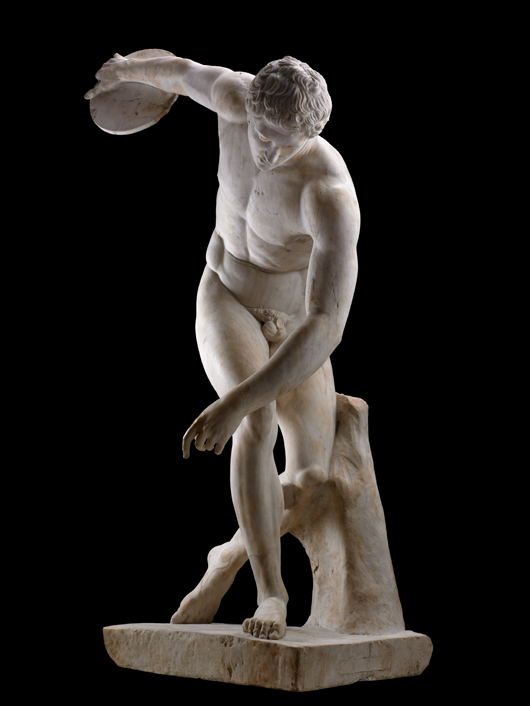
The Townley Discobolus. © The Trustees of the British Museum 2012. All rights reserved.

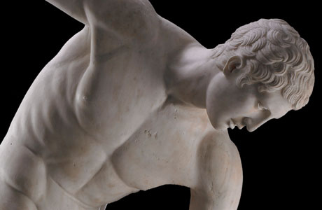
One of the centerpieces of The Body Beautiful exhibit, the Myron Diskobolos illustrates the aspect of nudity in athletics in ancient Greek art.   This nude body certainly asserts the beauty of the body and shows us an example of what is beautiful also being equated with what is good.  And, brings us further into our discussion of nudity in Greek art as having many different forms and meanings.

We have seen nudity with the male form as a way to define and show perfection and the ideal human form.  Nudity is also a custom of the gods, and therefore, a costume worn by god-like men.

The greatest of all civic heroes, we can say, is Pericles.  And our model of a hero par excellence, Theseus.  When we see these men depicted in the nude in war or battle, we can acknowledge that their physical prowess is being shown-off; but going into battle naked was not realistic, highly dangerous, and not the best way to fight.  Yet depictions of nudity in these battle-scenarios symbolizes an elevated and exhalted status, showing a sense of impending victory and courage, and of physical power.  This is “heroic nudity.”

We also see examples of “political nudity”—where political heroes are shown in the costume of democracy.  The removal of their clothes effectively distinguished them as “great leaders” and physically fit leaders in the political realm.

“Civic nudity” with the heroes as citizens (such as two brothers, The Tyrannicides, Harmodius and Aristogeiton, who plotted to murder and over throw the Peisistratid tyrant Hipparchus) are depicted in statuary nudes as heroes of the state, in a willingness to shed all, to trust all and to exemplify “democratic nudity.”

Common laborers can be depicted nude, as well.  Shown naked, their sweat and muscles revealing how hard they work.  Even nudity is used to show age from youth to the elderly: one nude illustrating the fresh, strength and slenderness of youth to the other revealing the sickness and weakness possible with the dead, dying and aged.  But both show us a vulnerablility, a fragility, if you will,—one of the young, one  of the old.

Nudity can give us a glimpse of suffering, defeat, and impending death as we see in Ajax as he prepares to throw himself on his own sword and take his own life: he is the fallen, isolated, tortured hero as nude.  [Black Figure Amphora, The Suicide of Ajax, Greek, 540 BC.]  Perhaps “pathetic nudity.”

We see a full frontal of a nude Cassandra in a Red Figure Hydria, [Naples, Kleophrades Painter];  or a naked Hector bound to Achilles’ chariot…both strong and emotional depictions of nudity.  [Attic Hydria, Achilles Dragging Hector, 520-510 BC.]

And, this brings us to the concept of the difference between sexual nudity, soft nudity, nudity for nudity’s sake and actual nakedness, as well as the comparison between male and female nudity.  Nudes and nudity in Greek art do not always divulge the same connotation or meaning.  We have the presentation of nude versus clothed and the revelation:  there is much more to a Greek nude than just perfect flesh and “heroic nudity.”

Following his lecture, Dr. Hurwit led a public tour of The Body Beautiful at the Portland Art Museum.  His tour continuing and illustrating points made in his lecture, provided insightful scholarly commentary on numerous works in the exhibit including the many iconic marble and bronze sculptures, vessels, and funerary objects most coming from the second and third millennium BC. For more information on the exhibit at the Portland Art Museum please refer to, The Body Beautiful.

[This article is a brief summary of the lecture Professor Hurwit gave on October 28.  A full recording of the lecture will be available shortly and will be linked to this article.

We extend a sincere thank you to Professor Hurwit for his lecture, Nudes and Nudities in Greek Art and his tour of The Body Beautiful in Ancient Greek Art.   Also, many thanks to the Portland Art Museum for their cooperation and assistance with this event.]

About Dr. Jeffrey Hurwit: Dr. Hurwit has degrees in Classical Languages and Literatures from Brown University and a Ph.D. in Classical Art and Archaeology from Yale.  He has taught at Yale, subsequently joining the UO faculty in the History of Art and Architecture.  He holds a co-appointment in the Classics Department and holds a Philip H. Knight Professorship.

A leading scholar of the archaic and classical periods in Greek art, Professor Hurwit has appeared in major documentary films and lectures at the world’s top universities, museums, and archaeological institutes.  The recipient of many prestigious awards, including a Guggenheim Fellowship and the University of Oregon’s Faculty Excellence Award,  Professor Hurwit is the author of many works on the art  and civilization of Archaic and Classical Greece. Among his many influential publications that are regarded as standards in the field, his recent book, The Acropolis in the Age of Pericles is considered the definitive work on the subject.

Professor Hurwit regularly conducts research in Greece and Italy, and has been selected four times to teach in the Northwest Council for Study Abroad programs in Siena and Athens.  He has spoken widely across the United States and Canada and has also served three times as a study leader for Smithsonian Institution tours of Greece and the Mediterranean. In 2000, he was appointed to the prestigious Martha S. Joukowsky Lectureship for the Archaeological Institute of America, and in 2003 became the inaugural Dorothy Burr Thompson Memorial Lecturer at University of British Columbia. He has also served on the editorial board of the College Art Association’s Art Bulletin and on the Publications Committee of the Getty Research Institute.

Professor Hurwit is also currently working on Palaeolithic cave-painting in addition to his studies in ancient art.

Read one of Dr. Hurwit’s articles on this subject, The Problem with Dexileos: Heroic and Other Nudities in Greek Art.

.


Bruce Wolf | Part II

Part II:  Bruce Wolf, Photographer

"I signed it with a Sharpie." Bruce Wolf's portfolio

[This is Part II of Sabina Samiee’s coverage on photographer Bruce Wolf, an adjunct instructor at the UO in Portland and instructor for Light and Color:  Tools of the Trade Workshop for Summer in the City 2012. You can read Part I Bruce Wolf | A Little Profile on a Big Photographer posted previously.]

Images | Bruce Wolf

Now it is fall 2012. Wolf is firmly entrenched in the Portland scene.  He is an adjunct instructor for the Summer in the City University of Oregon Portland program.   And from the projects he has taken on, it is evident he has graciously assimilated the culture and vibe of Portland, and has never looked back.  Granted he isn’t making the prodigious dollar amounts New York had bestowed upon him, but as he comments, “that really doesn’t matter.”  Whether he is shooting Pietro Belluschi’s architectural wonders, a stunning plated concoction at Yakuza for a scrumptious-looking website, or photos for a children’s book on food, Wolf’s images are powerful, captivating, emotional, and have that je ne sais qua any photographer worth her salt dreams about.   [See Bruce Wolf:  A Little Profile on a Big Photographer]


If you are here in the city next summer, look him up:  Summer in the City 2013—with a little luck and a fair wind, Wolf’s experience and knowledge will be back here again and yours for the taking at the UO in Portland.  This is an opportunity to learn methods and process, gain knowledge and insight from one truly great photographer.  And, as Wolf, himself puts it, he “[doesn’t] just want advanced photographers in [his] class,” not at all.  In fact, he welcomes and encourages a specific kind of person,  “Photographers at any level passionate about photography. . . .That’s what I’m looking for,” he states.  It was a late afternoon, mid-summer and we were happily into our second coffee talk– “interview” – meeting at Floyd’s coffee shop in Old Town. Wolf was beginning to feel like an old friend.  “Passionate about photography” and “photographers at any level:”  this sounded mildly provocative…I was caught on the “at any level” phrase.  It sounded so refreshing and open to possibility. I asked him to tell me more about his 2012 Summer in the City Light and Color workshop, the students he worked with, his expectations for the course and the students and his future plans.

Bruce Wolf

Wolf finds that being welcoming to photographers of any level with a passion for picture-taking attracts students who are eager to learn and listen.  And, photographers at any level can take insightful, thoughtfully composed images. Photographs should “say something about the person who took the photo, not just be an image of what that photographer captured.” In Wolf’s opinion, a photographer “needs to learn how to present the image so that it tells a story, leaves personal narrative and inhibitions behind, and freely exposes the photographer.”  This ability can be learned over time with work and experimentation.  Wolf aspired “to teach [his] students to tell us who they are, to expose their self.”

Bruce Wolf and his students in the Light and Color Workshop

Wolf continued, speaking softly and thoughtfully.  The intent of a photo is to translate a story and project a personal signature.  When students presented their work to him for critique and review, Wolf found it best to refrain from criticism and rather try and find what “they thought the process was, or had been, like a personal journey” he says.  Wolf wanted his students to learn how to use their photographs to “take us someplace” and to make their image a “personal reflection of what drives them to see what they see, and why they see it that way.”  He suggested that they experiment with light, color, angle, cropping and content to express this.


Equally intriguing is Wolf’s unique pedagogical approach that assumes his students are blissfully “unaware of anything.”   He continued, “I talk to them as if they know nothing.”   Not intending to be at all demeaning or condescending, Wolf means he strives to instruct as if his students are a blank slate, ready and receptive to challenge the components of their work to access a sense of both the art and the science of photography.  He finds this approach the least intimidating and the most encouraging to his students’ sense of free experimentation in the class.

Bruce Wolf

There is one area, however, where Wolf expects his students to have a working knowledge.  His Light and Color Workshop requested that students have an existing working familiarity with Photoshop, a technology Wolf feels “is essential to contemporary photography.”  In addition, he only allowed the students to use their cameras in Manual mode—a somewhat daunting prospect for many.  If a student needed help or instruction in the mode, Wolf gladly assisted. By using only Manual mode, Wolf encouraged each student “to regain control of the camera and the image.”


I asked Wolf his opinion on camera equipment.  Would someone with a prosumer camera be as welcome as someone with a simple point-and-shoot? Wolf assured me, regarding equipment, students were not criticized for the quality or technical hierarchy of their equipment. One student was welcome to use her father’s point-and-shoot, which she did for the entire duration of the course. When asked if he felt the quality of one’s camera had a great deal to do with the quality of the image, Wolf responded that “it is not the camera that is the final instrument of the image” but how that “image is interpreted or taken forward to create an intention.”  Here is where Photoshop becomes the somewhat indispensible tool of the contemporary photographer, the sine qua non that allows the artist | interpreter of the image to “sharpen the intention, to clarify and capture” what one has merged into pixels, and digitalized into a printable reality.  Photoshop will help ease a transition from a captured moment to a fully finished image. Today’s digital photographs, says Wolf, will not be worked on in a traditional darkroom, a place where the photographer used to transition an image and produce desired effects, experimenting with light and dark, saturation and hue. Thus, says Wolf, “Today’s darkroom is Photoshop.”

Bruce Wolf in Google search

With all his work, his reputation and his legacy, it is no wonder Wolf is carefully watched.  Coming to Portland in 2009, a blog post by his then rep, Stockland Martel declared “BW MOVES TO PDX and POSTS photos.” [I would show you the post but Stockland Martel has since removed it.] It was a series of photos posted on Wolf’s online social media presence that precipitated a small tempest of curiosity—Wolf was doing something new, something different.  Maybe Portland enabled Wolf to branch out into a new perspective, and explore that “loneliness” he talks about.  Whatever it was, we can read about the “guerrilla photography” Wolf and his wife, Laurie launched into.  Photographing over 70 Portland restaurants for Portland restaurant scene, Wolf found his way right into the delicious underbelly of some of Stumptown’s most coveted places.

Photographing 70+ Portland Restaurants..Food! Glorious Food!

As time has passed these last few years, Wolf has eased into a singular Portland aesthetic, appreciating and valuing a sense of independence, being in a league all his own, and valuing a certain obscurity for its own sake. He seems to have found meaning, and worth, and definitely his own Portland style of cool.  He’s become one of us.  He’s settled in with a new rep, Greenhouse, and released a new book, along with collaborator and wife Laurie Wolf, Portland, Oregon Chef’s Table .

Bruce Wolf

Things are looking bright and beautiful for this New York transplant. As evidence to his understanding of things Portland, whether due to the cagey arrangements of representatives or Wolf’s own propensity to find meaningful working relationships, halibut-sized printed monthly publications have been scooping him up and sending him back out to hone his forte with a uniquely Portland grind.  And, now that we can open up some of our favorite regionally-based magazines and see architecture from our own metropolitan backyard photographed by Wolf; get google-guided to a unique Portland restaurant and stumble upon images from a few of those places we head to for something uniquely delicious, we see Wolf’s light and color in new places.  Take a trip to our favorite bookstores and see Wolf’s images in lovely volumes available to grace our coffee tables and our kitchen bookshelves.   We can access Wolf’s Portland work almost daily and we can even take a university summer course from him.  When asked what his plans for future courses at UO might be and if he’s interested in teaching again, Wolf responded, pointblank, “I’d love to.”  In fact, he is interested in teaching photography at all levels, lower and upper division, beginners to advanced.  In any case, Portland and, indeed, Oregon is certainly richer and even more beautiful when we have Wolf’s imagery of our environment surrounding us—all in gorgeous light and color…. Let’s hope it stays that way, because he sure makes things look good.

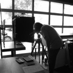
[As if it were not readily obvious, black and white photographs in this post –devoid of color and not much in the way of brilliant lighting, were taken by the author, who somewhat reluctantly posts her images in the same blog as BW images.  Images from Wolf were taken from his blog, and website, and provided to the author.]

ABOUT SUMMER IN THE CITY

In addition to photographer Bruce Wolf, Summer In the City has offered the teachings of  academic and creative  phenomena such as D’Wayne Edwards, James Cutler who directs the Summer Portland Architecture Program, and Bill Tripp, among others. It is an eclectic arts and architecture-based program, offering interdisciplinary courses, specialized studios, and a lower-division, requirement-satisfying class in cooperation with the new Urban Ducks program. In a come-one-come-all egalatarian manner, the UO opens its doors and lets the summer breeze in as Summer in the City welcomes both enrolled UO students, community members in the Academic Extension program and professionals seeking to enhance and expand their professional affiliation, network and expertise.  Above all, it is an opportunity to learn from experts.  Come join us next summer!


Bruce Wolf | Part I | Light and Color: Tools of the Trade Workshop | Summer in the City 2012

Bruce Wolf |  A Little Profile on A Big Photographer

All images in this post are courtesy of Bruce Wolf, and were taken by him.

Floyd’s coffee shop in Portland’s Old Town is a darkish place where wild things happen. Not fast, in the buff, debauched, and crazy things, but those quietly important things that might change lives, sway the course of simple histories, and have the potential to effect people in new and profound ways.  In a politely incognito sort of way, lattes are drunk, spicy Chai’s are nursed, dark espressos slide into mouths, the soothing pleasures of liquid darkness perking even the most exhausted. It is the perfect place to meet someone of great importance when being noticed is not the goal.


Into this den of caffeine bracketed by the establishment’s solidly brick walls, photographer extraordinaire, Bruce Wolf agreed to meet me one summer afternoon to discuss his recent course offering Light and Color:  Tools of the Trade as part of the UO in Portland School of Architecture and Allied Arts Summer in the City program. Wolf is known on a global scale for his work with light and color, so meeting him in a place where the light was incandescent dim and the color comfortably amber-to-russet seemed like an interesting prospect.  Maybe seeking someplace with a trifle more natural light, and after ordering our coffees, we decided to move out into the minimalisticly bland en plein air courtyard, where the daylight seemed a bit more of an appropriate place.


Let’s start with some background.  UO in Portland Summer in the City is the brainchild of Kate Wagle, director of the UO in Portland School of Architecture and Allied Arts and interim vice provost.  Familiar with Wolf’s reputation as a photographer, Wagle wasted no time incorporating Wolf into the summertime Portland programming.  Notable in many respects, the UO Portland Summer in the City program is the brooding place of many a lauded professional in the design fields reaching out to stretch their pedagogical wings, discover talent and share creative insight.  Instructing a course with the Summer in the City program assures a small, focused group of students eager to gather experience and expertise during a few summer weeks spent in the company of creatives otherwise unavailable. It might be a short season, (summer in Oregon usually is) but it is without a doubt a rare and wonderful opportunity to access a wealth of knowledge and experience these experts deliver.  Indeed, Wolf fit right in surrounded by other exceptional creatives who partner each summer with the UO to teach at the White Stag Block as their schedules and professional work permits.  Wolf’s first foray into instructing anyone but seasoned professional photographers (which he has done often having taught at The Maine Photographic Workshop, and the International Center for Photography in NYC, as well as guest lecturing for Harvard University’s Photography Department) began with Summer in the City 2011 and his “A Journey into Yourself with a Camera.”  This summer, 2012, he offered Light and Color:  Tools of the Trade, welcoming anyone with an open mind and an enthusiasm for photography.

Image | Bruce Wolf

And, so here I was this warm, sunny afternoon at Floyd’s, face-to-face with this photographer, and not just any photographer, but BRUCE WOLF;  I was eager to discover just who he is and what his work is all about.  Although his humble appearance, worn jeans and plain white tee shirt, might make him fade into the Portland Old Town crowd, his modest looks reveal little of his importance, an engaging counterpart to the work and reputation Wolf has. At Floyd’s, Wolf entered, and ordered our coffees.  No one applauded, no one rushed over for an autograph, no one stared, no one pulled out a camera to take his picture.  He is just a plain guy…..well, not really.  I asked Bruce to talk about his images from an aesthetic viewpoint and to chat about his extensive experience in the field of advertising photography.

Image | Bruce Wolf

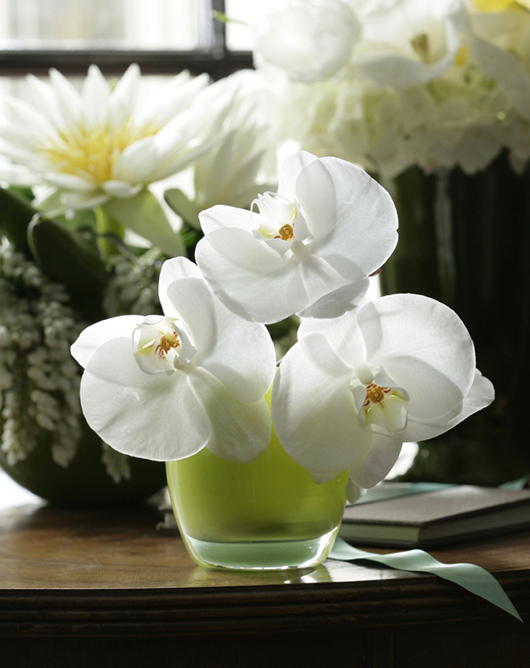
In print, Wolf is often referred to as “a legendary photographer,” “the master of believable artificial light,” and “truly one of the best.”  His work is praised as “timeless and creative” and as fusing “life, mystery, and narrative.” Look at any of Wolf’s photographs and you will see grace, and an exquisite and luxurious use of light, even if what you are looking at is only the inanimate objects of a well-equipped kitchen.  Each Bruce Wolf image incorporates a sense of photographic artistry while seamlessly blending a mastery of digital technology, an understanding intellect and a sense of discerning empathy. His images are of quiet and solitude, whatever is the subject is the focus, lucid and without distraction.

Image | Bruce Wolf

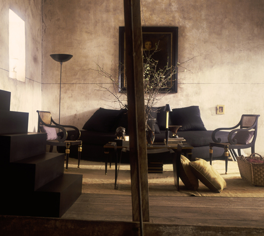
Perhaps existentially affirming, Wolf’s architectural and interior photos, in particular, are surreal in pristine perfection.  The more of Wolf’s work you examine and admire, the more you realize his preference for images intentionally devoid of human presence, literally.  There is space for a person, and an invitation to engage with the image, but usually no identifiable human within the image.  As viewer, you wander into his photographs by yourself, no one else is needed. These photos compel you to visualize yourself in the setting, a place where you feel you could fit comfortably alone.   A motorbike in a studio, a refrigerator in a kitchen, a chair in front of windows, a long country road in rainy navy-blue darkness, a gorgeous plate of food: each carefully planned image takes you to a place. You may have a look for yourself, here.

Image | Bruce Wolf

Wolf commented that he feels his images have a sense of “being lonely,” but is this loneliness or an opportunity to merge yourself with a product, a place, a meal?  Put yourself in the picture, with no one else yet there, it is without complications. Maybe that is the genius possessed by the brilliant commercial photographer: he takes us places, we put ourselves and our dreams in his sets.   It is that simple.  But how is Wolf such a master at the illusion of welcoming place, and of transporting us to that place with a two-dimensional image?  His ability to work with a palette of color, to infuse with light and to manipulate both to evoke a feeling is the stuff his legend is made of.

Image | Bruce Wolf

With over 40 years of experience to call upon, it is no surprise that Wolf’s eye for detail and mindfulness of the aperture’s cooperative capacity with the shutter to let in a fraction-of-a-moment’s flood of light-bathed, meaningful observation has been very keenly and benevolently developed.  The fact that his images seem to be coaxed with a sense of emotion, and delicate comprehension of both subject and setting through his lens, past any filter, and into waiting digital sensors is, really quite remarkable.  The emotional saturation of Wolf’s work becomes complete with touches from “today’s darkroom” says Wolf, graciously offering a nod to technological innovations as being a crucial part of his toolbox. He continues, “the interpretation of the moment is told” or gains that extra tinge of meaning and implication with thoughtful brushes from Photoshop, the program (or “darkroom”) allowing him to interpret an image to get it exactly to the point where the setting matches the intention of telling a story.  Long before the pixels are exposed to digital manipulation on Wolf’s computer screen, hours of set-up, preparation and contemplation have gone into a project.  Once the camera is poised, steadily mounted atop a tripod, flags or reflectors in place, and readings taken of light, color cards peered at through the lens, only then is the image ready to be captured.  Wolf takes a slow, methodical, and languishly unrushed amount of time to stare into his viewfinder, visualizing the subject, contemplating the final outcome.

On location at Yakusa with Bruce Wolf. Photo SS.

I know all this partly because following our coffee-talks, I asked Wolf if I could observe him on location, on a real assignment, commercial-style. Wolf allowed me to visit him while on location for a restaurant advertising project in North Portland at Yakuza.  He was meticulous….with everything.  Each press of the shutter release came across as a thoughtful and careful opportunity to capture something of greatness.  The process takes hours. Invariably, the outcome is stunningly beautiful: elegance saturated with sensuous quantities of light and color, but yet remaining “natural.”  [He let me steal peeks at his nearby laptop once he transferred images there.] It is this unique approach to the mixture of science and art, of light and color that pervades Wolf’s work and is testimony to a soulful understanding of elements we sometimes take for granted, the luminescence from the sun, and how that illuminousity reflects off a surface potentially bringing a sense of story-telling to an image.

Bruce Wolf Studio.com

Largely self-taught in the field of photography, Wolf partly credits his educational background in physics as enhancing his opinions and understanding of light (he earned his degree in physics from the Rennselaer Polytechnic Institute).  His lifelong passion for photography might have developed from an early childhood exposure to art history—namely the volume by Janson & Janson, The Story of Painting for Young People (1952).   Charmingly and honestly acknowledging a childhood interest in the paintings that depicted body parts and barbarity, Wolf recalls being even more impressed, visually awakened, if you will, by the paintings of Vermeer, Rembrandt, and Caravaggio.  Even as a young kid, in these masterpieces, Wolf recognized a use of light and color to show what was there, a hinting at what was underneath, what was in the shadow, or what could be gleaned from the play of light upon a surface.  In those moments of observation, the desire to find a medium he could translate a similar understanding of light and color to eventually led to a career in photography.  Apparently, Wolf became a photographer also “on the advice from ‘Bultaco’ Barney, motorcycle mechanic.”  But that’s a whole other story, that we will not go into here. In any case, apart from an interest in photography, Wolf cites his two “other great interests” as science and math:  forever inked into the underside of his burly forearms, a hydrogen atom on one (the first element in the periodic table), and the infinity symbol on the other (forever into perpetua).

Image | Bruce Wolf

I asked Wolf to comment on his work over the last 40 years.  His is a long career and no where near to winding down– spanning successes from his early days in his Manhattan studio, to his years in Paris shooting advertising and interiors for glossy European magazines, to decades as a photographer shooting projects for publications such as House and Garden and New York magazine.  The early years took up the decades fanning out of the 1970s.  The work poured in.  Wolf was in high demand with clients like Martex, Karasttan Carpets, Thomasville, Spiegel, Marlboro, Eve cigarettes, Viking, Jenn Air, G.E., and Acura, among others; and on the go-to list of renowned art directors, like Jim Sebastian, Cheryl Heller, Jerry Della Famina, Tommy Kane, Barbara Barnes, and more.  His magazine layouts expanded to include projects for Child Magazine, Metropolitan Home, Shelter, and Martha Stewart Living. He completed projects for Vogue, and Architectural Digest. Branching out from still life, interiors and architecture, Wolf was asked to do jobs where his expertise as a director for television commercials and cinematography were called upon.  His reputation for creating an exquisite visual environment for his subjects obtained a worldwide following.   In the 1990s, Wolf worked on projects alongside Helmet Newton and Bill Silano for a Johnnie Walker “Gallery Series,” an infamous poster project displayed on the walls of the Japanese subway system;  and created advertising campaigns for clients as diverse as Burger King and Perry Ellis.  The list of accomplishments goes on and on. He flourished in all areas, lending his unique sense of lingering observation, careful attention to detail and, that quality so recognizable in his work, an ability to “duplicate the sun.”


In 2009, with so much success and a career still going strong, Bruce Wolf gathered up his family and made the pilgrimage west to Portland putting a whole nation of Americana inbetween him and his connections and networks in New York.  But this is the age of enlightened communication and Wolf’s ties to the Big Apple were only really a quick electronic communication or airplane flight away.  If anything, he gave his work an opportunity to thrive in a new environment and to discover a Pacific coast audience. The requests to work would continue, the list of clients, too.


The Wolf family now call Portland their permanent home.  Moving to Portland, brought the Wolfs close to long-time family friend and Portland creative extraordinaire, John Jay, executive creative director and partner of the Wieden + Kennedy advertising agency.  Wolf also counts Jay among the art directors he has had the privilege of working with.

DeathbyCat | Bruce Wolf with Ying

In 2009, some of Wolf’s Portland work was introduced to an audience of gallery-goer’s who saw his much-debated “Oregon Journal” series.  It was described as “a mysterious series of landscape photos.”  That same year, Wolf’s images of the remains of small creatures killed and maimed by any one of his 33 cats mesmerized audiences in an eclectic Southern California exhibit  [See DeathbyCat, evoking a range of contexts:  taxidermy-cum-Smithsonian’esque natural history, that sort of it may be nature morte, but it is still life mood, the subjects having been tossed about and blessed by the love of Wolf’s own domesticated pets].  Transgressing from small deceased bloody vermin, to something more suburbanly perceived as sophisticated and urbane, Wolf has even aimed his lens across rooms with a view we thought we’d never glimpse (he was commissioned to document Martha Stewart’s own home remodel).

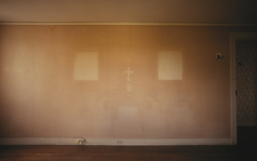
Image | Bruce Wolf, Martha Stewart's Farmhouse pre-restoration

With such an illustrious background, Bruce Wolf is something of an enigma.  He is a New Yorker, through and through telling me he is “from The Bronx.”  I was expecting a New Yorker blase attitude or a heavily tainted East Coast accent, a bit gritty and unpolished. But, he is delightfully pleasant. He is friendly and lowkey, approachable.  He is kind and conversant, with a strength in gentleness and calmness one imagines he has made good use of in the high powered, competitive world of commercial photography.  The opportunity to sit down and chat with Wolf made it pretty obvious how he has managed to achieve his “nice guy” reputation.  He is just that, nice.  He is easy to talk to, completely unpretentious.  We chatted those afternoons for some time:  Wolf revealing in anecdotal style snipets of adventure and encounters from the images contained in his vast portfolio, which at this point, was beginning to sound a little like a Who’s Who of the rich, famous and well-built, in both individuals and objects.  Wolf blends comfortably into a Portlandia proletariat ethos, artisanal and casually counterculture.  He will enthusiastically speak of being more down-to-earth hippie than fast-paced, big city materialist.  It was charming and endearing that the only technology he pulled out during our conversations was his smartphone, tapping and joggling it to retrieve family snapshots, which, I noted were exquisite even on the small screen of his smartphone.  He will discuss science, math, art, government, and society with a gracious intellect, a liberal charm and a humble aesthetic.  He will discuss photography on a level he senses his listener is comfortable with.


On this particular day, the sun was settling in behind the brick courtyard of Floyd’s, we’d been chatting the afternoon away.  Prompted by my inquisitive comments, he continues, I listen, somewhat enthralled, but definitely not starstruck and keeping a level head.  He offhandedly mentions, quietly, like he’s slipping in another order for a black coffee, “Oh, did I tell you about the time….” I lean in, this is going to be good, I know. I feel like Po the Panda, face-to-face with the sage wisdom of Shifu, I must keep quiet and listen.  Wolf doesn’t disappoint, I get to hear about when he photographed John Lennon, twice in the 1970s.  And President Ronald Reagan and First Lady Nancy Reagan, for a Christmas card.  With a sly and mischievous grin, Wolf’s “nice guy” personality shines through as bright and captivating as the light in any of his stunning architectural sets.  “Want to know what I said to them?”  he asks.  Of course, I do. . . .

To be continued. . . .

Image | Bruce Wolf