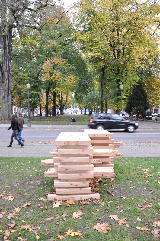
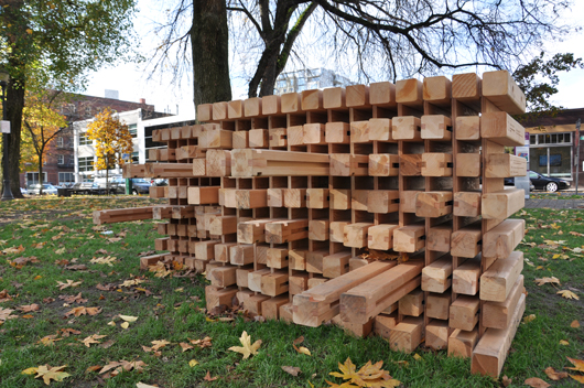
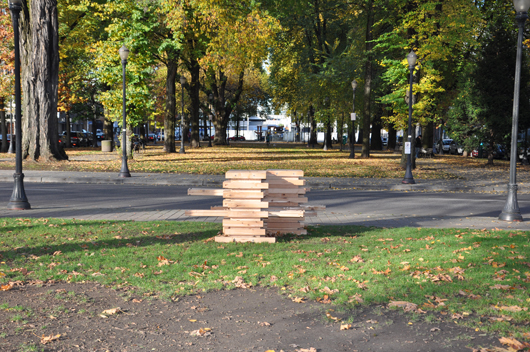
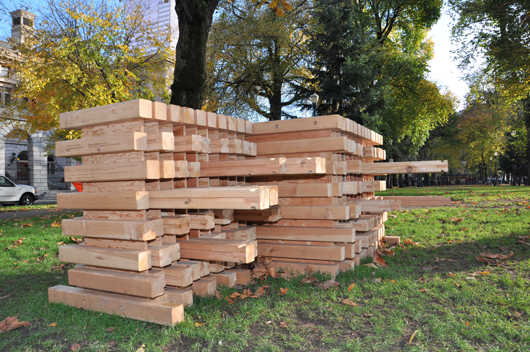
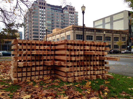
"Bridging" in Portland's North Park Blocks

You and I Belong in this Place: Bridging

In the winter of 2013, students in Philip Speranza’s Place Branding for Public Services studio collectively made a single, full-scale urban installation fabricated entirely by 4 x 4 boards.  The students’ finished work was presented to Portland’s Regional Arts and Culture Council and the proposal made that it be deployed in local parks as an object that would inspire “an urban intervention and evoke a conversation of the values of a city….that are based on the very compassion for one’s fellow citizen.”  Under Speranza’s direction, the studio investigated Bruno Latour’s idea of “attachment” as a way to connect a work to the live human context of a site over time.

The students involved in this project


Jesse Alvizar, Natalie Cregar, Vijayeta Davda, Sermin Yesilada, Tina Wong, Grace Aaraj, Charley Danner,Wilfredo Sanchez, Srivarshini Balaji, Timothy Niou, Oliver Brandt, Hanna Lirman, Haley Blanco, Jenna Pairolero, Eli Rosenwasser and Henry Smith

The entire installation lay dormant for several months housed in the UO in Portland’s Under the Bridge Space while Speranza worked tirelessly to obtain permits, and permissions.  On November 2, the piece, titled simply, Bridging successfully made its way into the public eye when a small group of students, along with Speranza, loaded up the boards on a rainy afternoon and re-constructed the piece on the damp grass of the North Park Blocks between Davis and Everett streets, firmly nestled in the greenway that unites the Pearl District and Old Town | Chinatown in Northwest Portland.

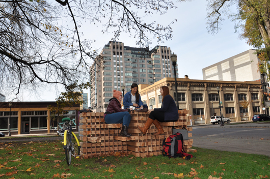
Architecturally-inspired and artistically-conceived, Bridging is a relatively approachable piece built entirely of 4 x 4 cedar boards that form a block-like structure about 4’ high and 9’ long and 2’ wide.  Boards 4’ in length slide in and out of the block to project from either side forming both places to sit and places that are desk or table-like….places to sit near a companion or places to be next to a stranger.  This human-scaled structure was conceived of by the sixteen architecture students named above (all from the School of Architecture and Allied Arts, University of Oregon in Portland at the White Stag Block) who designed and built Bridging during the winter term 2013.  The students had investigated ideas of place branding and public service in Portland, Oregon and Barcelona, Catalunya. Diagramming and parametric design methods led to the use of traditional and digital fabrication techniques in the White Stag Block Fab Lab and Woodshop with John Leahy.  Studio reviews conducted during the winter of 2013 term provided invaluable input from members of the Creative Corridor including partners and collaborators, Kristin Calhoun of the Regional Arts and Culture Council, wood crafts person and designer Richard Nelson, Corey Schreiber of UI Culinary Institute, Bob Hastings of Trimet, artist Tad Savinar, Brian Ferschweiler of Blanchet House, faculty from the University of Oregon and other members of the Portland community. The project came together with a strong sensitivity for the importance of community and keeping the audience (the people of the area) a crucial part of the partnership and involved in the process of imagining where and how Bridging would be integrated into the community.

Goethe wrote that architecture is “frozen music,” and Bridging is its own diminutive arabesque.  The piece is small and forte enough to make one wonder if it is meant to be climbed upon or simply observed; the pixel-like translation of the 4 x 4’s creates a rhythmic and tantalizingly predictable ornate patterning –visually making this piece captivating.  The spaces between the boards, channeling light through the piece with minuscule sense of regimented authority adds to this patterning further accentuating the idea of bridging—even light is taken from daylight and allowed to explore travelling through the installation and peeking out the other side with almost musical precision. Bridging cleverly bridges worlds we exist in from numerous insightful angles—that of the handmade and handcrafted to that of the computer-generated and rendered in pixel imagery.  It is by no means in error that the 4 x 4 squares grouped together in a predictable formation to create a greater whole remind us of the pixels prevalent in such massive yet imperceptible quantity on our computer screen and are responsible for concocting the digital images we are bombarded with daily.

For its premiere deployment, Bridging has been carefully placed in Portland’s Creative Corridor North Park Blocks where it will stay for the month of November.  To the very north, stands Lee Kelly’s magnificent (at 23’ wide, 11’ high and 6’ in depth) cor-ten steel monument, Memory 99 patiently waiting to majestically define future-Pacific Northwest College of Art’s courtyard entrance.  To the west, lies the bustling, affluent, and delightfully albeit understandably supercilious Pearl District; to the east, Old Town | Chinatown quivering with self-discovery, robust cultural history, and renewal, where the city’s homeless and destitute can find shelter, food and comfort and the winds of change have blown in to bring both economically refreshing merchant opportunities and significant, community-enhancing educational institutions (one of which is the UO’s own White Stag Block).  This entire area, fundamentally, is a place of change, of melding social stratospheres, and a place where a short walk of a few blocks will make it clear just how those who have can, and do, co-mingle with those who have very little.  Immediately to the south of Bridging, the North Park Blocks offer a well-used children’s playground, and Hao Baozhu’s generously donated life-sized bronze elephant. Indeed, the location is ideally suited to objects that encourage play, interaction and exploration and, due in large part to the efforts of Portland’s Regional Arts and Culture Council and executive director, Eloise Damrosch there already exists here a sort of city tradition of placing major artwork in the Park Blocks that began with the South Park Blocks and RACC’s public art projects.

Into this socially, economically and culturally vibrant environment, the semi-permanent, pristine Bridging might seem a bit overshadowed, its scale dominated by time-induced patinas of nearby permanent work, its wet and unfinished wood surface prone to the ravages of weather.  Indeed, even the towering elms with leaves seasonally adrift surrounding the installation with a framing like quality seem just a bit dwarfing.  In only the few days Bridging has been in situ and in the damp, discouraging gray of a Portland afternoon, passersby can’t help but stop and touch, look and wonder.  Possibly mostly due to a rain-drizzled surface, not many have ventured to sit down on the invitingly pulled-out boards, made ready to give one a place at the table.  However, judging from the top surface scuffed and imprinted with the dark marks of shoe treads, apparently, the piece has proven to have an exploratory “soap-box-like” appeal.

Stand next to Bridging for a little while, dry off a few of those boards, and actually invite people to touch and explore, show them how to sit, put down a coffee cup and something happens.  Now public art is not meant to come with directions nor suggestions on how to use the piece or what to do with it, this is in the hands, and delight, of the individual—the chance to explore, to look or to physically experience an object is diplomatically left to one’s own personal discretion.  Bridging is a captivating community piece and has so much potential to launch conversations powered by community in a non-rebellious and non-confrontational way that encouraging people to experience the sit-down-with-me connection and interacting with the audience for Bridging proves an illuminating undertaking.

I tried this one rainy afternoon.  With cappuccino in hand, I stood by Bridging, offering explanations and demonstrations to any interested passersby.  All were eager to listen.  Some asked why.  Others seemed to need no explanation as if simply a place to sit was explanation enough.  But when I tried the true social experiment,  asking the public to share the space with individuals from the community of varying backgrounds, (the reason behind Bridging), things got really interesting.


Philip Speranza writes:


Bridging, 2013 evokes understandings of identity and public service.  Citizens and visitors of Portland interact through this art piece to sit, eat, rest and converse, adapting the piece for individual uses.  The traditional boundaries of orientation and personal space are intentionally blurred to raise consciousness through unplanned social interactions. Interactions are bridged from one side to another by three types of 4×4 inch cedar units.  Long cedar units slide for seating. Shorter interior cedar units slide for play. The two sliding movements give over ownership of the form to the user. Outer cedar units are fixed.

When I had the opportunity to explain the intention of Bridging, people were interested; when I pulled out and gestured to the boards ready for them to sit, things were a little more tense.  With Speranza’s directive in mind, I purposefully welcomed anyone who walked by the installation to take a seat and learn about the piece. I offered, with equal hospitality, a place to gentlemen pushing tarp-covered grocery carts piled high with worldly possessions and to debonair, pipe-smoking urbane individuals.  Both seemed reluctant to acknowledge or sit close to the other.  Many times, if one sat down, the other left.  Admittedly, it is a tall order-to ask and to expect mere strangers to sit with each other as if acquainted.  Was it the social distance or the lack of familiarity with one another? Bridging was compelling us to recognize there are barriers, invisible, intangible, but barriers nonetheless.

Bridging being used by local residents.

Speranza says, “Subsequent installations will bridge unintended social interactions between citizens with regard to neighborhood orientation and will occur for approximately one month in each O’Bryant Park, Jameson Square and Holladay Park through the winter 2014.” One can’t help but wonder what the reception at these other places will be and what that will say about our own dear neighborhood.  Speranza and his group of students have mindfully moved past divisions and asked us to graciously move past them, too:  recognizing the socioeconomics of what surrounds us might be one of our most important observations.  Unquestionably, much of urban life allows us to exist in a bubble of our own comfort level.  It is places like the Creative Corridor, and the North Park Blocks where exploring these divisions can make a difference.

You can ask yourself how you would react in this situation, if asked in a pleasant outdoor park to sit down and share your space with a complete stranger, be he dressed similarly or vastly different from yourself and in varying degrees of cleanliness.  Would you sit down and share a conversation?  Would it be exhilarating or exhausting?  Awkward or illuminating?  Portland is a vibrant city, attractive to permanent residents and tourists;  the region spanning the Pearl District and Old Town | Chinatown accommodates feelings of belonging from diverse backgrounds and economic levels compelling solutions that embrace the real essence of a city:  the ability to cope with everything from hardship to success, from recession and homelessness to affluence and excess.  Bridging, in a small way, reflects these imperative ingredients—urging us to sit and engage in dialogue or proximity to every aspect of our city, from ethnic diversity, to economic hardship and the unhomed, to the luxury of high-priced retail shops and social opportunities in bars and clubs of varying clientele and challenges us to make something of an experience or recognize the need for a solution embracing tolerance and diversity.


Bridging gently encourages and challenges us to reach new conclusions about the people in our neighborhood, about us.  And it has provided a group of University of Oregon students an opportunity to experiment with how shared experiences and collaborations can be kindled and the possibility of inviting people to feel a sense of belonging.


Kristin Calhoun, Public Art Manager of the Regional Arts and Culture Council, commented,


The work is an open-ended invitation for people to come together and relate to each other on a very basic human level- sharing a meal together. I am looking forward to seeing and experiencing the work in the various locations and seeing how the stories unfold. That is part of the magic of putting work out into the public to me, seeing how it is received, used & interpreted by the broadest possible audience.


Speaking more towards how this project melds into the intentions of the UO School of Architecture and Allied Arts, administrative director of the UO AAA in Portland, Kate  Wagle lucidly articulates,


Bridging embodies the highest and best values of UO’s School of Architecture and Allied Arts. Intellectual speculation, hands-on experimentation, and open-ended social activism, applied in the service of ‘making good’, ideas, conversations and experiences in the context of real community.


This last week, protestors once again gathered in downtown Portland to bring attention to the Occupy movement, and the city was reminded of the importance of community, and the power of community.  As the waterfront of Portland was dotted with protestors, some of them masked, and mounted police stood by ready to subdue these contemporary insurgents, Bridging took on a new meaning.  Rather than such collisions of politics and people, of police and protestor, are there ways we can offer a better incubator to solutions by tolerance and diversity being invited to sit at the same table?  We have Portland—and this remarkable Creative Corridor—within which contains the components of a vital urban future—from the wandering nomadic-like unhomed, to the struggling recession-emerging businesses to economically vibrant shops, restaurants, world-renown places of creativity and innovation and the thriving intellectual university and college environment –all prevail along our streets effectively bringing us together. Sit at the table of Bridging and talk to your neighbor…. from unexpected collaborations, to unpredicted connections: so much is possible.


In the timeless words of American singer-songwriter, folk musician, Woody Guthrie, “this land is your land, this land is my land.”  Please take a moment to stop by Bridging and take your place at the table; because it is yours and it is mine, and we should all be talking.


[Bridging is installed in through the Regional Arts & Culture Council’s in situ PORTLAND which seeks to place challenging temporary works in public that will serve as a catalyst for dialogue about art and/or contemporary issues.]


Students involved in this project and their original project titles that culminated in Bridging, are:

Adaptable Interaction, Jesse Alvizar and Natalie Cregar
Enlightening Celebration, Vijayeta Davda and Sermin Yesilada
Philanthropy Mapping, Tina Wong
Framing Experience, Grace Aaraj and Charley Danner
Translucent Outreach, Wilfredo Sanchez
Visual Permeability, Srivarshini Balaji and Timothy Niou
Integrative Filter, Oliver Brandt and Hanna Lirman
Cognitive Exposure, Haley Blanco and Jenna Pairolero
Acoustic Interweaving, Eli Rosenwasser and Henry Smith

Link:

Place Branding of Public Service pdf available here.

http://placebrandingofpublicspace.wordpress.com/2013/11/03/north-park-blocks-installation-2/
 

Craig Hickman at the White Box with Portland Creative Community 1.0

Images of Life, Love, and Politics: Early Photography of Craig Hickman

“Portland Creative Community 1.0”
at the White Box, Fall 2013

Craig Hickman stands in front of one of the White Box walls displaying work from his Portland Creative Community 1.0 exhibition.

As a young man of 17 in 1960s Portland, Oregon, Craig Hickman carried around a camera—without much in the way of rigorous intention and devoid of a strict or limiting sense of an impending project.  Hickman, instead, gently wielded his Nikon- F pointing it at friends, lovers, places, and people, many times strangers, he saw around him.  The camera operated as an extension of himself, a way to casually document day-to-day life and a way to capture moments that intrigued him.  At times, fully immersed in a moment of fun and experimentation, he would hand his camera to a friend who would turn the lens on Hickman himself, producing an unprompted photograph of the photographer.

A photograph of the photographer: Craig Hickman takes a group photo of the PSU yearbook staff.

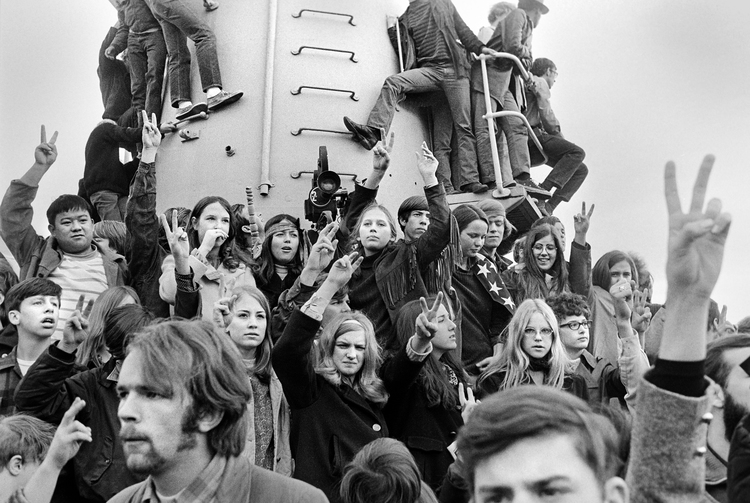
Hickman followed an early path that would continually fuel his passion for photography and would branch out to include his development of significant computer software (Kid pix), becoming a professor in the University of Oregon Digital Arts program (Department of Art) and a career as a successful, highly acclaimed photographer known for his playful and insightful integration of word and image, and the digital manipulation of images.  In the 1960s and 1970s as a student, Hickman worked on the Portland State University yearbooks (yearbooks that with the influence of Hickman and his core cadre of comrades at PSU were artistically designed and intended more as “photobooks” than conventional yearbooks).  These photobooks were lively publications rife with journalistic documentation of the assemblies and protests of 1960s, honest portrayals of student life and campus involvement, glowing and sensitive portraits of fellow students, at work, at play, in love.


Leaving PSU in the 1970s, Hickman continued his education and immersion in photography becoming a staff photographer at Evergreen State College (Olympia) and teaching courses at ESC in photography.  Intertwined in these pursuits, Hickman would find the time to commute back and forth from Olympia to Portland to initiate and help launch Blue Sky Gallery along with close friends, Chris Rauschenberg, Ann Hughes, Bob DiFranco, and Terry Toedtemeier.  Eventually, with Blue Sky set well on its way to emerging as an international, leading photographic gallery, Hickman decided to enroll in graduate school in the early 1980s and pursue studies towards a Master of Arts in photography from University of Washington.


From those early days of capturing unscripted, candid images, and from rarely being without a camera, Hickman’s circle of friends, his subjects, as it were, in most of his photos, explored Portland, New York, and the environs of the Pacific Northwest with an active and curious enthusiasm forming affections and attachments –some that would last and evolve over the next half century.  It was a group of close associates in their 20-and 30-something years that included people like Tom Taylor (who would eventually bring about the establishment of the Northwest Film Center); Frank Foster (first head of computer graphics division at Sony Pictures); Chris Rauschenberg (co-founder of Blue Sky, son of Robert Rauschenberg, and himself a renowned photographer); Terry Toedtemeier (co-founder of Blue Sky, Portland Art Museum photographer curator, and lauded photographer); musician Linda Waterfall (folk musician and singer-songwriter); Lynda Winman (co-founder of Lynda.com); Lauren Van Bischler (founder of Portland’s The Real Mother Goose); and many more. These people formed the core of Hickman’s work during this period from the 1960s to the 1980s. It is a collection of images of which the original pictures were never printed nor inspected, until now that is, having been pulled from Hickman’s early career photographs to blanket the walls salon-style at the University of Oregon in Portland School of Architecture and Allied Arts’ White Box visual laboratory.  The exhibition has been aptly titled, Portland Creative Community 1.0.  With a nod to the connections to sequence based-software versioning, that “1.0” is said, “one point ‘Oh’.”

Craig Hickman photo | From the Portland Creative Community 1.0 exhibition at the White Box.

While the importance of this early social context and history cannot be ignored this exhibition has many facets.  Undoubtedly, there is something so fascinating about images of some of Portland’s now well-lauded creatives captured on film some 40 years ago, capering about, full of youthful exuberance and the in the rudimentary stages of what would become remarkable careers.  Indeed, you will most likely never again stumble upon a photo of Terry Toedtemeier experimenting playfully with his very first camera en plein air or see individuals like Ann Hughes  or Chris Rauschenberg caught spontaneously in the moment, personality and visage bare and vulnerable.   Or even the day Craig Hickman was introduced to his very first computer…..yes, these images, and more, are all here.


Yet, the impact of this exhibition far outlasts a nostalgic recognition of faces and places or any sense of self-congratulatory Portlandia-like mythology.  Much of the beauty and power of this exhibition lies in the fact that many of its viewers will not recognize a single face, nor know a single name, and will have never have seen the preachers, teachers, intellectuals, leaders, policy makers caught here on film, or printed on paper.  And, that is fine.  As, with any great art and with any exhibition worth one’s time and contemplation, Portland Creative Community 1.0 will pique curiosity and encourage thought.  This is an exhibition of truly democratic proportions and Hickman by not captioning his images, nor titling them allows us to view the entire show from our own perspective.

Craig Hickman photo | From the Portland Creative Community 1.0 exhibition at the White Box.

Admittedly, this is the essence of Hickman’s work:  it has a current of life coursing through it, a quiet, unassuming joie de vivre, paired with a sensitive reflective quality (look at those close up portraits—the expressions are real, the moment of authenticity embraced by both photographer and his subject). The images of political protest are not so much angry or supportive but have an “I am standing here and seeing this” reflective quality or as Hickman says, these are images of “Whoever came my way and made the best picture.” The images of politicians stand not as propaganda neither scathing nor patriotically nationalistic; the images of Hickman’s friends not contrived, not staged; the images of women Hickman loved, not glamorous, but real, occasionally playful: women, you get a sense were appreciated, looked at with compassion and wonder.  These pictures tell a story—in a series of spontaneous moments unfolding with the purest of intentions—blown-up snapshots taken of life-sized humanity doused with a pervading sense of community.


And, so we come to the question of size.  You will immediately notice there is a size issue at play here.  Hickman boldly asserts that the selection of impressively large prints was intended as “fun—to not have the picture come to you—you get to walk into the situation.”  Indeed, the walls of the White Box are collaged with a significant number of Life-magazine-like, life-size prints both printed and projected compelling one to wonder if there is notable intention in such monolithic reproductions.  The emotional and visual quality delivered by the size of the images only lets us in closer….with a come hither temptation to sink our field of vision into one of these and see people, people just like us.  In large format, the expressions are closer, the glances accessible—we see anxiety in one man’s eyes, and, in another, can that possibly be a sense of trepidation in the faces of young sailors surrounding a navy propaganda poster where an illustration of a strapping young sailor salutes with confidence and vigor?  The message here is one of giving us the independence and courtesy to just look where we want. Hickman trusts his audience to see something of interest.  Let your gaze wander, or stare at one and lose yourself in a single image, either way you will be drawn down a path where you are visually compelled to form a new sense of connection to the people in the images before you.  Hickman’s photos have a warmth to them, a sense of understanding, of humility, of empathy.  Enhanced by the simple palette of black and white, Portland Creative Community 1.0 appeals to our emotional connections by way of this inherent connectedness to humanity.

Craig Hickman photo | From the Portland Creative Community 1.0 exhibition at the White Box.

A few years ago, something prompted Hickman to delve into boxes and boxes of his saved negatives—negatives that included his images shot decades ago at a time when Portland was a city contemplating urban growth boundaries, constructing freeways, grappling with controversial decisions made by the Portland Development Commission, and when students were sometimes more activist than academic, and our beloved Park Blocks could potentially play host to tumultuous scenes of riot police dragging resistant protestors.  Into this socio-political urban landscape strode Hickman, camera always in hand ready to capture the closest image that looked, to him, the most interesting.


Without flash, planned or artificial lighting, or contrived situations, Portland Creative Community 1.0 reveals a subtle honesty—a mastery of the manual camera managing to find a brilliant way to mingle human-controlled aperture and shutter speed with today’s computer-based digital camera and all the trappings of modern technology.  But that seems to add to the vitality and intrigue of this display of memory and reminiscence, so an explanation is in order.  Most of Hickman’s photos from this 1960s-1970s era were never developed, no contact sheets ever printed. A fact that makes the first-time exhibition of these photographs all the more meaningful.  For Hickman the last few years have been a journey into the past to see images he hardly recalled and certainly had no idea what would be found.  Perhaps it was a romantic sense of melancholy reflection or the simple existence of spare moments, or a basic desire to see what he had been packing around all these years (in, as Hickman calls it, his “deep archive”).  Whatever the impetus, Hickman began unpacking his deep archives, and literally hundreds of photos have now come to light.  Concocting ways to unearth these black and white celluloid treasures and bring them to a new audience has, in itself, been a curious study in merging 1960s camera equipment and developing methods with modern technology and the vast, immediate land of social media.  While the length of years has seen great movement in the technologies available to take pictures, a span Hickman has never stepped away from, it also produced the incredible opportunity to bring this series of images to life using techniques and process unknown when the images were themselves taken.  And, of course, the ability to “post” his newly digitalized photos on Facebook, tagging them with names of those within the images:  the subjects seeing the images for the first time, as well, effectively created quite a social media buzz.

Craig Hickman photo | From the Portland Creative Community 1.0 exhibition at the White Box.

The process of printing these photos and a placing them in a public place for eyes to view them beyond Hickman’s significant social media following has enveloped process and method unifying technologies and compelling Hickman to discover new ways of experimenting with images originally intended for the black depths of a darkroom.  Upon unpacking the negatives, Hickman would place them under the scrutiny of fluorescent light bulbs shining from beneath a layer of plexi—the ubiquitous light table—a piece of equipment that somewhat awkwardly finds itself still in use but not always to light negatives, slides or contact sheets but moreso a fine surface to place the modern images of today—a work surface bridging eras.  Onto this light table, the piece that would unify technologies, Hickman placed his negatives and proceeded to bring them to life.  Negatives that once would have never seen the light of day until printed and dried, now were exposed on a light table and infused with an existence by millions of pixels.  Hickman began by using a macro-lens on the light table and digitally photographed the negatives; he then reversed and restored the images to pristine condition using Photoshop, employing the tool to remove dust and scratches.  Hickman comments that the black and white negatives had no fading and were preserved in excellent condition. As an element of this show, the bold melding of technologies and the way Hickman wove the computer digital age into this exhibition stands as a commentary on the history of photography and the changing methods and process that leads to a finished and viewable image. Blending old with new, Hickman expands the process and displays his remarkable ability to interpret photography from a truly inclusive standpoint.  A stunning visual communicator, Hickman confidently embraces the best of both worlds using tools that exemplify an understanding of photographic technologies, and, perhaps more importantly, allowing his audience to glimpse his personality and feel a sense of integration with our past and our present.


There is a story embedded in each of Hickman’s images that you will be able to explore by flipping through and reading a printed and online catalogue of the prints in the exhibition.  But maybe you don’t need that—each picture alone is worth a thousand words, quite conceivably, more.

Many thanks to Craig Hickman…..ss


Rethink, Recycle, Regenerate: Imagining Portland Centennial Mills

Centennial Mills Redevelopment:
A Pedagogical & ‘Real Life’ Opportunity to Preserve and Play with History


University of Oregon Architecture Studio Engages Students in Real World Projects to
Rethink-Recycle-Regenerate:  Imagining Portland Centennial Mills
A Studio
With
Ihab Elzeyadi, Ph.D., FEIA
Associate Professor of Architecture | Department of Architecture
School of Architecture and Allied Arts
University of Oregon
Summer 2013 Studio | ARCH 484 /584

How can you make new life from the old yet create a 21st century public place for the city of Portland? What is the process of reusing historical buildings without getting locked-up in its relics? Which elements can we preserve, reuse, while sustaining the past, present, and future for the city of Portland by developing its Centennial Mills? –Ihab Elzeyadi

These are questions at the heart of a UO architecture summer studio–led by Profesor Ihab Elzeyadi and 14 students, armed with their sketchbooks, laptops, and eight weeks of an intense summer studio centered on Centennial Mills.

The Centennial Mills development project has been referred to as one of the largest sustainable redevelopments in the history of Portland.  Since being brought on board last spring by the Portland Development Commission (PDC) to redevelop the property, the project development team of developer Jordan Schnitzer and his Harsch Investment Properties has enthusiastically pursued input and design ideas for the Centennial Mills site from varying resources. [Scroll to the end of this article for background and a full list of partners.]

One important resource has been the engagement with UO Department of Architecture and the High Performance Environments Laboratory at the School of Architecture and Allied Arts.

Instrumental in establishing the connections to facilitate this project has been Tad Savinar, a civic catalyst on the consulting end of Schnitzer’s Harsch Investment Properties.  Savinar invited the University of Oregon Department of Architecture faculty to join Harsch and offer a summer 2013 design studio that would focus on the Centennial Mills property.  Nancy Cheng, director of and associate professor for the University of Oregon Portland Architecture Program was the Portland liaison teaming up with UO Eugene-based associate professor of architecture, Ihab Elzeyadi. Professor Elzeyadi initiated and taught the summer studio, Rethink-Recycle-Regenerate:  Imagining Portland Centennial Mills.

Tad Savinar and students at the final review, Centennial Mills Studio.

Elzeyadi comments on the partnership with Harsch and the UO Department of Architecture:

I [had] investigated the potential of offering a studio to rethink and re-envision the Centennial Mills for over a decade. We had worked on adaptive reuse studios in Portland for a number of years collaborating with the late Art DeMuro of Venerable Properties. This has led to a number of successful “real” projects.

The Centennial Mills project was always interesting yet wasn’t defined enough to tackle… Bottom line—it will be a great adventure… Pulling it together has not been as easy. When Tad Savinar contacted us and invited me to consider it for a studio in collaboration with Harsch, I felt an adrenaline rush to go for it. It felt to me that this was the right moment to intervene on a project I always valued not only because of its historical value but also due to its rich opportunity and great challenges.

The timing was also ideal since we are working in parallel with the design firm and Harsch.  We were also preceding them with some tasks and contributing a great deal of research to the design team.

Professor Elzeyadi’s studio engaged students: “in a real project to develop parallel research and conceptual development on the urban and building scale to adaptively re-use the site and its complex of buildings.  The process both was informed by the work undertaken by Harsch Development as well as informing the design team based on research and academic exploration in a process of collective intelligence.” [Course syllabus]

Reviewer with students, Melissa Anderson and Kathryn LaNasa.

In mid summer of 2013, during the studio’s midterm review, the students were joined by Jordan Schnitzer who intently listened to the students presentations, engaging in commentary and conversation about their designs and addressing them post-review with his own reflections on the project and moving forward.  Schnitzer, who has consistently promoted the project and the site as one that needs to be grounded in emotion and connectedness to Portland, takes a thoroughly humanitarian approach to the project’s overall conceptual approach.  He reminded the students that a useful thought here is to realize this is an opportunity to “preserve but play with history.” Schnitzer enthusiastically complimented the students on their “great ideas” and “the fabulous job” they had introduced with concepts for the Centennial Mills complex.

[View photos from the reviews here on Facebook.]

In what can be described as a rather stirring and heartfelt conversation of advice, Schnitzer continued by asking the students to “balance between dreaming and what is available…always dream, but remember to put yourselves in the shoes of the developer…the client.” In a moment of pedagogical delivery, Schnitzer expressed a sort of reverence for the students’ work, saying “when any of us are lucky enough to touch the land, [we] have an obligation  because [we] are doing something that will result in a better quality design..it is an honor to be an architect, to effect the land and have that responsibility…You have that responsibility.”

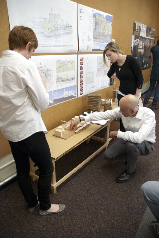
Model showing current buildings on the site, from river side.

Schnitzer encouraged the students to stay actively involved and encouraged their future input on making the Centennial Mills project rife with attractions and features that would appeal to all ages and activity levels encouraging engagement with the final outcome of the site.

Along with Schnitzer’s words of encouragement and inspiration, the students relied upon their professor to guide their projects to completion and the final review held August 12 on the Eugene campus.

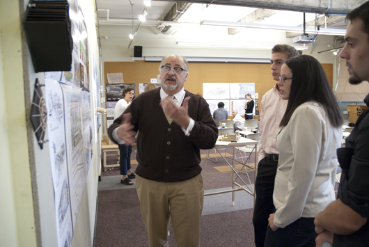
The University of Oregon architecture students enrolled in the studio have proved to be a significant part of the brain trust and logistical process for the project. At the final review, 7 proposals were pinned to the walls, with teams consisting of 1-3 students.  On site for the final review session was Gil Kelley (Harsch); Tad Savinar; and Gregg Sanders, David Wark, and Nick Byers (all of Hennebery Eddy Architects), among others.

Final Review of student work.

Professor Elzeyadi addressed the assembled group recalling to all the predominant aspects of the project:  to provide open space; to capture history and historic context; to define community focal points; to embrace sustainability; to strengthen connections; to link a riverfront greenway.  Elzeyadi also detailed aspects of the project that provided the guidelines and contextual framework within which the students had to develop their design concepts.  A few of these:  2030 Energy Benchmarks; providing for a hotel, a museum | arts center; utilizing the north-south axis of the complex; recognizing solar radiation modeling; daylighting ideas and micro-climate and cross ventilation opportunities; the integration of greenroofs, rainwater catchment, embodied energy; and context analysis incorporating energy and environmental benchmarks developed by High performance Environments Laboratory (HiPE) that he directs at the UO department of Architecture to integrate performance and experience as guidelines to develop sustainable place making

The students were to design within the following constraints and understandings of the site:  to recognize and envelope historical context of the flour mill, the feed mill, the grain elevator, and riverfront warehouse; to use existing site opportunities such as the greenway and the connections inherent to the site, 9th Avenue, and the existing city park; to work within the restrictions of the existing corridor, easements, setbacks, transit lines, and zoning, as well as within the context of a vibrant urban setting. And, to work with an understanding of the cultural context in addition to an architectural context that would study and embrace industrial, mixed use| retail, hotel and high rise condominiums.  The geographic context that students addressed included contaminated ground, metal debris and air pollution of methane chloride.  Climate context included the prevailing NW or SE winds, sun angle diagrams and sound levels.  Also to be considered was the folding in of elements to make a coherent complex—retail, office, residential and parking that balance a cultural program of a visitor center and a museum

Harsch's Gil Kelley with students.

Professor Elzeyadi relates that the studio was a challenging yet fundamentally rewarding experience:

I offered the students a rich design process and a rigorous work schedule. I’m proud of their professional attitude throughout the studio. Working in teams, they had to vent their decisions together, respond quickly to critiques offered by me in a short time frame as well as respond to feedback from the design team.


It was intense, quick, and rewarding. They learned a great lesson for this schematic phase of design and planning a site of complex multitudes. It has been a sort of midnight summer dream —and, we are looking forward to further engage with it in the next phases of the project through my fall-winter-spring thesis/terminal studio I’m offering in 2013-2014.

The following lists the students involved in this studio and the titles of their projects (a printed publication of their work is planned to be released in the fall of 2013)

  • The Anchor of Portland by CLINA (Claire Seger and Gina Auduong) | Using a vocabulary of solid and transparent, this team created a series of different gestures with a sense of an ebb and flow between addition and removal.  Termed “very evocative” by reviewers, this project “left a sculptural form.”
  • Playground for Portland by Melissa Anderson and Kathryn LaNasa | With a vision to make Centennial Mills into a place where the greenway joins to the complex uniting outside with inside and providing multiple vantage points; Re-uses many of the structures and a bridge that captivated reviewers. . .
  • Centennial Mills Park to Water Redevelopment by Carolina Trabuco and Kaitlyn Rowley | Focused on site connections to the Pearl District, the Willamette River and the greenway.  This plan advocates an “island” approach.
  • Centennial Mills  Sawing the Seeds of History by Elena Traudt | The central feature is the open space that draws in the park, the city, the water. A very organic approach that gives precedence to the landscape and the water, and will benefit from a sense of the “push and pull” of the design .
  • Envisioning Centennial Mills A System of Parks and Axis by Tudor Bertea and David Richards | Interweaving urban life with the site as a threshold.  Bridging nature with retail belts and a visitor center and the preservation of a story of place. “To introduce a northern city strongpoint by revitalizing historical facets of Centennial Mills while interconnectedness of the urban and natural life.”  Floating greenways lends a chance for a “water level view.”
  • Bookending Portland’s Waterfront:  Centennial Mills, Adapted by Carmen Ulrich and Emily Smietana | The bookend for the city center of Portland.  Incorporates marketplaces, underground parking, visitors center, interacts with nature and seeks to celebrate the Tanner Creek feature.  Would benefit from a grander gesture to Tanner Creek and a study of Halprin Fountain as inspiration.  The bike trails and resident profiles make this project stand out.
  • TuRBiNe by Alex Brooks and Chris Watkins | A focus on energy:  the urban energy of the city and the energy of the visitor to create an urban vitality.  This will be a place people want to go and use the street to bring the people in.  Inspired by the Vancouver landbridge and the urbanity of Seattle’s Olympic Sculpture Park, Pikes Place Market and connecting to the river.

Following the final review presentations, Savinar addressed the group and talked about the constraints and opportunities of the project (the submerged site area, the 20’ building line set back, the waterfront; Tanner Creek ; restoring the riparian zone, and the seawall; to name a few.  He continued by reiterating the key site features of the flour mill, grain elevators and feed mill.  Savinar noted the greenway trail is a new opportunity and there might be a way to preserve the warf buildings.  The review closed with high hopes on all sides and the momentum to continue this project adding, and adapting ideas.

I asked Professor Elzeyadi to reflect on the studio and moving forward:

The collaboration was interesting on multiple fronts:  we took a different approach to the problem by first researching the context extensively and through engaging my HiPE lab expertise. We developed some evidence based guidelines to sustainable design and the creation of a high performance buildings. This information was shared with Harsch and the design team to support their work.


We also benefited from great reviews and feedback through some of the planning and documentation that was produced by the design team.


In addition, I used a number of ways to breakdown the project so the students could bite the right size and be ready to investigate in a meaningful and manageable way. Towards that end,  we explored seven different proposals reflecting on the same issues that the design team is challenging. It corroborated what they are concerned with and engaged in and offered a different approach to the design problem in the same way.


This is the kind of triangulation and interaction that would fit the project and Harsch in the long term. It’s looking at the project from various perspectives and offering both a practical and academic perspective to developing and planning it.

The somewhat sprawling complex, even in the dusking evening skyline, is an imposing settlement of shape and context —its grand proportions and soaring features touching the sky like few other buildings on our city’s waterfront.  And with a project of somewhat unprecedented scale, and undeniable importance to our metropolis, the pedagogical opportunities afforded here are monumental. The partnerships blend new ideas and create new conversations within our capable community of those dedicated to a built environment that can unite so many elements vital to a healthy urban tapestry.

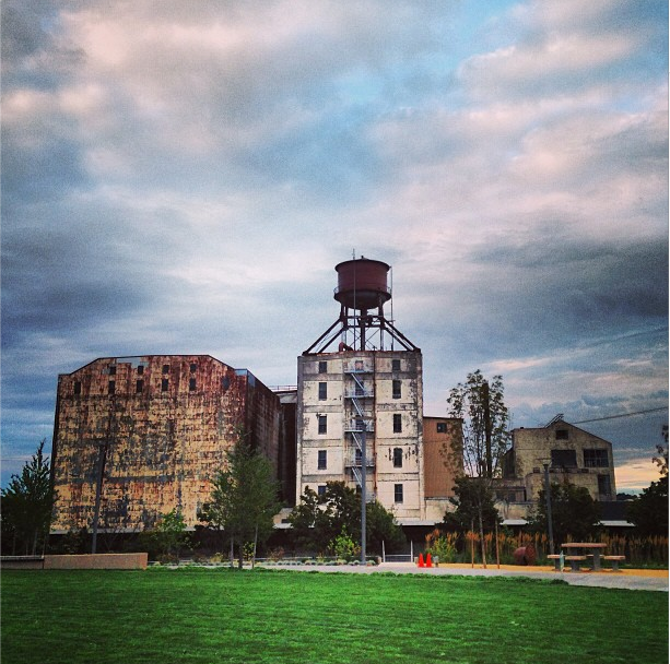
Gazing at the visibly deteriorating colossal structures from a stance anchored in the well-used park across Naito Parkway and just the other side of the glimmering tops of well-worn train tracks, lets one imagine and visualize the quiet beauty and inherent possibility of Centennial Mills.  An appreciation of the Ozymandia-esque melancholy of the project reaches far into an emotional and thoughtful consideration of Portland’s past—a monument of sorts, a reminder of inevitable decline to be gently halted, or re-invigorated mid-track by compassionate sensitivities with an keen sense of the importance of place, history, culture, and reuse.

And that, it seems, is the intention of this place’s most passionate advocate, Jordan Schnitzer, who along with the team he has so aptly brought together could very well transform what remains of this mighty place to rise again, with a bold melange of old and new.

Many thank yous to Professor Ihab Elzeyadi….

Background Context…

In 2013 the Harsch development | real estate firm received approval of a $350,000 loan from PDC to perform “predevelopment” assessment.  Under direction from Schnitzer, Harsch mindfully moved forward to examine the project’s financial possibility and to initiate preliminary design concepts.  In May of 2013, Harsch led tours of the Willamette riverfront | Pearl District Centennial Mills location and hosted an open house to introduce leading developers, preservationists, and community leaders to the dilapidated 11-building site.  It was an opportunity to glean ideas responsive to the site, both historic and public-minded, that would begin the process to transform the former flour mill into a bustling complex of office, housing, and retail development complete with a respectful inclusion of the historical character of the site.

Indeed, the goals of PDC have been to redevelop the site to be a center of “’cluster industry / traded sector employment’” encouraging industries such as “footwear, software, and clean energy that the city is courting and having success attracting.” [Portland Tribune.]  A further aspiration is to incorporate retail space, an arts-culture center, housing and parking facilities for approximately 295 vehicles. The current site, complete with the historic structures such as a four story feed mill, a five story flour mill and water tower, and grain elevators speaks of a relevant economic and social history that was a vibrant part of Portland’s past.

Working cooperatively, the PDC and Harsh have established a redevelopment team of experts well-versed in the vastly progressing realm of green design, building innovation, and sustainability.  The team, comprised of professionals from both PDC and Harsh have incorporated the expertise of Portland’s Hennebery Eddy Architects as the lead design firm. The long list that reads like pages from a who’s who of the Portland development and design universe, instantly conveys the impression that this is going to be a project with no stone, or aging timber, left unturned.

This post has been the story of how students at University of Oregon Department of Architecture were incorporated into the project. The inclusion of both graduate and undergraduate level students in UO architecture program has precipitated a design team that links UO to the following partners::

Harsch Investment Properties

·         Jordan Schnitzer

·         Gil Kelley

Studio of Tad Savinar

·         Tad Savinar

Hennebery Eddy Architects

·         David Wark

·         Gregg Sanders

·         Nick Byers

Other Project Team Members

·         Portland Development Commission

·         MS&R Architects

·         SERA Architects

·         OLIN

·         GreenWorks

·         CH2M Hill

·         KPFF Consulting Engineers

·         R&H Construction


Sources:

http://www.centennialmills.org/

http://www.oregonlive.com/front-porch/index.ssf/2013/05/developer_seeks_ambitious_idea.html

http://portlandtribune.com/pt/9-news/135707-schnitzer-tackles-centennial-mills-redevelopment

A piece by Randy Gragg in Portland Monthly on Centennial Mills

A piece by Brian Libby in Portland Architecture on Centennial Mills