Ruf•fle at the University of Oregon in Portland School of Architecture and Allied Arts White Box Visual Laboratory

Ruffled to Abstraction

A short essay on the work by Sara Huston and Jennifer Wall in Ruf•fle

Detail of Permanently Liminal, Sara Huston

Ruf•fle
Open at the White Box July 13-August 24, 2013


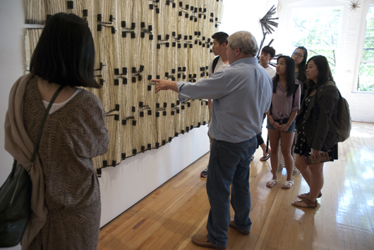
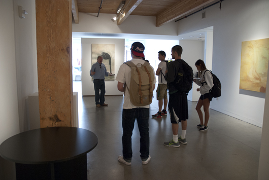
Open from July 13 to August 24, 2013 at the University of Oregon in Portland School of Architecture and Allied Arts White Box Visual Laboratory, Ruf•fle presents plenty of opportunity for White Box visitors to engage in an examination of perception, identity, and the meaning of objects, complete with psychological and cultural aspects.  The exhibition features work from a group of Portland-based women traversing opportunities uniquely afforded to interdisciplinary art and design dialogue.  The work in Ruf•fle explores individual inquiry within an overarching collective and shared conversation.  It is at once thought-provoking, unfamiliar and recognizable.


The inclusion of work in this exhibition by individuals Sara Huston and Jennifer Wall brings to the forefront the dynamic proximity of conversation and the representation of what it can mean to “ruffle.”  Huston and Wall, both UO adjunct instructors in the Portland Product Design Program presented pieces that authentically represent the “diversity and value of collaborative analysis through cross-disciplinary insight” in exhibited pieces, Tiny Parametric Ruffles by Wall and Permanently Liminal by Huston.


Wall’s pieces, painstakenly and metaphorically hung as if 2-dimensional with miniscule brass pins driven into predrilled holes in the four corners of fine book paper, present objects that “chase down the ruffled relationship between parametric modeling software and adornment.” (Wall, White Box  Ruf•fle catalogue).   Indeed, Wall proclaims herself to be “both metalsmith and designer, both maker and designer” which is a dichotomy that informs her work translating with material eloquence into her designs.  One might say, Wall’s work blends the rich and diverse worlds of modernity and antiquity simultaneously transitioning and questioning methods and process both ancient and contemporary.  Her works soar from the mere designation of “jewelry” although on first glance what one sees is exactly that: objects in shapes traditionally and culturally recognized as rings, necklaces, small keepsakes, perhaps.  But that is the peripheral, shallow view—look closer and see the materials ranging from the brilliant metallic allure of gold and silver, to white ABS plastic, to bronze, to aluminide and the natural, soft, shale-like layers of cuttlefish bone:  all materials utilized to explore and push the idea of functionality of the design.

Tiny Parametric Ruffles, Jennifer Wall

Wall begins her pieces within the technology of a CAD file using Grasshopper, she then moves to the 3-D printer (quite often using the equipment available in the UO PDX FabLab) creating her pieces in metals and plastics.  She also works with the ancient technique of cuttlefish casting advocating for the “relationship between the cuttlefish bone texture and the 3-D print.”  Wall sees in this collaboration an ambiguity hovering between the two—a pairing of “how things are made and how things appear.”  Upon close inspection, the layers of each technique are visible, drawing an almost daring comparison between the two methods. This contrast between process and production as well as the final product, provides the tangible and visual representation of “ruffle”, says Wall, the “use of the 3-D printer and the use of the cuttlefish casting: it’s modernity and antiquity; the ruffles are in the layers;  even the cuttlefish, as a living thing, ruffles its fins to propel itself through water.”

Detail of work in Tiny Parametric Ruffles, Jennifer Wall

This play between the textures and the surfaces of the work, encouraged Wall to explore scale and the relationship between culturally-anticipated sized pieces, and pieces diminished or expanded beyond traditionally accepted norms.  She also found a means to traverse the concept of adornment and how it functions as a symbol being both mediator and communication device between the wearer and the viewer.

Detail of work in Tiny Parametric Ruffles, Jennifer Wall

Wall’s work has been grounded in this method of exploration for some time.  She comments that she sees this body of work “….not as a departure but as pieces energized by the quality and diversity of 3-D printing. These are pieces that gain identity from materials—the color and reflectivity bringing a definition to the form.”  Wall envisions her future work as propelled forward from her venture into scale with the pieces exhibited in Ruf•fle . She sees the potential for future work to embrace larger scale and to investigate kinetics and the adornment of space and buildings, as well as humans.  Ruf•fle has also prompted her to observe her inherent fascination with two dimensional representation and the possibility of pieces made purely for the sake of display.  As Wall says, “the role of the arts is to shape culture, and as a jeweler I can shape culture….I can work with personal identity and shifting of scale.”  She continues, “I have a great interest in how culture can shift off the body, how adornment can be shifted from the body to the built environment, and onto buildings.”

Detail of Tiny Parametric Ruffles, Jennifer Wall

Jennifer Wall’s work represents an elegant dance between two worlds, one of  cutting-edge technology and one of ancient techniques.  Her blending of these elements enhanced by a quintessential relationship to the materiality of each piece, places her work into a dialectic process of method and understanding.  Discernable within her work are the mindful topics of change and interaction between form, shape, size, substance, and cultural meaning.  It is through a process of abstraction that meaning is attributed to her work, or the process by which we think about how her work changes and interacts with us and our expectations.


Burrowing deep into the questions of change, interaction, and how all things relate to or define other things (including her work and her own self image and identity), merges Sara Huston, whose work also graces the White Box Ruf•fle space.  Part of a self-professed “collaborative, interdisciplinary, avant-garde studio called ‘the last attempt at greatness,”  Huston saw her integration into the Ruf•fle exhibition, (an exhibition she was instrumental in securing and curating for the group), as an opportunity to investigate her own feelings of struggle.  Huston talks of a dichotomy between the interdisciplinary discussion:  the idealistic yet not fully embraced concept of interdisciplinary work.  She asserts “there has never been a separation between art and design, in my own work. . . .and this exhibition was a chance “to look into talking about this discussion, exploring it and how to validate it to [her]self and others.”  Huston explains her work is “about [her] identity and how [she] identifies as a creative individual” resisting the public penchant to label her as either a designer or an artist—labels she feels she does not neatly fit into.  Ruf•fle gave her a chance “to examine the space inbetween artist and designer and to push [her]self with a new medium.”

Detail of Permanently Liminal, Sara Huston

Having been involved in furniture (from the very literal and naïve definition) “making” projects, Huston’s work, Permanently Liminal was sparked by a sense of frustration from being called a “furniture maker” and the thought that she desired to reach far beyond the limitations of standard creative labeling or as she puts it, “I needed to exorcise or remove the theme of ‘furniture designer’ so as not to be pegged as one or the other.”  Indeed, from her work (some viewable on her website), pieces such as  Expectation 01 come across as what most would define as “furniture.”  But the failure of her audience to look above and beyond the design aspect and not recognize the artistic component, was driving Huston to want to “rediscover how art and design and the space in between are like a religion and a mantra to [her].”  Huston says, with a shy smile, “I am a provocateur.”  A sense of wanting to question who she is and what she does, prompted her to create Permanently Liminal, a work that makes strong use of audio to get Huston’s point across.

Detail of Permanently Liminal, Sara Huston

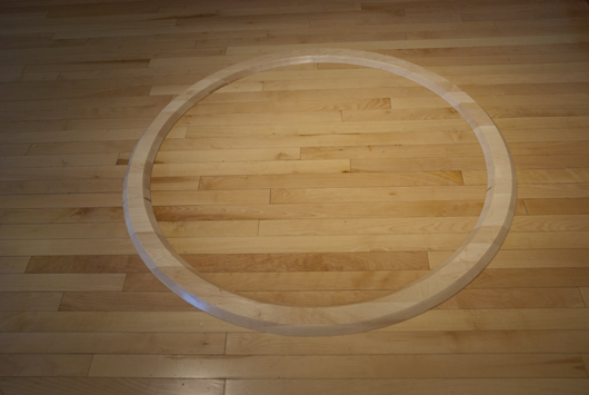
Permanently Liminal demands a closer inspection.  The circular threshold, at once familiar and yet oddly inappropriate, confronts the viewer with conflicting invitations:  can one step over this threshold?  And, to do so, where are you except in a confined and very limited space?  Have you traversed some boundary or simply caged yourself within the halo of Huston’s finely sculpted sphere? This element of the circular liminality echoes back to a state of being on the precipice, existing in-between two or more acknowledged, perhaps, unclear, difficult, complex, and real situations.  The threshold creates an environment for the individual to experience uncertainty, to be ruffled, to question what happens next, to be temporarily uncomfortable.

Permanently Liminal, Sara Huston

In one sense, Huston compels us to think about reality and what we need to do to break it down into comprehendable parts.  She puts us in a static ring, unnervingly similar in color and material to the White Box floor, and subjects us to an audio and physical redundancy of her voice telling us what she is and is not; the circumference facing us with the same position from all positions.  Huston boldly questions her surroundings by separating out specific features and focusing on and categorizing them in ways she wants her audience to pay attention to.


This confrontational method of abstraction, (“abstract” is from the Latin “abstrahere” meaning “to pull from”) diligently gives us a slice of her, at this stage, somewhat sullen art and creative angst.  Huston comments that Permanently Liminal “completely disrupted [her]” and “confirmed [her] senses of who [she] [is].”  The creation of this work forced her to examine how she “relates to the professional fields, the idea of interdisciplinary work, and what ways [she] can work with both industry and marketing to create a space for [herself] that is new.”


Maybe yet undefined,  Huston’s own arcadian space without the classifications of artist, designer, or furniture-maker but confined only by the blonde circlet defining the grounded component of her installation, compels her to seek clarity by confrontation.  Constructed into this installation are the elements of audio, visual, textural as the senses are called upon to test the limits of understanding and tolerance.  Permanently Liminal is a collaboration of disciplines, a mélange of experiences.  The multidisciplinary approach Huston show us has led her to a “whole new sense of [her]self, blown away the boundaries of media and audio and made [her] comfortable enough to want to manipulate and work within the digital realm.”  Installing Permanently Liminal and reacting to it in the White Box space, Huston asserts that she now considers audio to be “a material” and she hopes to explore the medium as a tangible, physical experience “integrating it into the human psyche and conscious as well as subconscious.”


Both Huston and Wall expressed the sentiment that from experiencing their work and the work in the Ruf•fle exhibition, they anticipate their audiences being ruffled enough to gain new ways of looking at the world, at themselves, and at the boundaries, or lack thereof, in artistic and design disciplines.  Presenting work like this in an environment receptive to change and experimentation creates opportunities for discovery of the arts and design as socially and environmentally anchored.  And, as Huston reminds us, we must never forget the crucial human component and its importance to art and design, and life, influencing our reactions and how we interact and react to work.  While we might abstract to attain meaning and relevance from this exhibit, the utmost value of challenging norms and experiencing situations that compel thought and contemplation, is to remember the Socratic philosophical mantra and remind ourselves,  “the unexamined life is not worth living.”  It is with exhibitions like Ruf*fle that we are provided the moments, spaces, objects and time to question, to pursue answers, to think to the best of our ability, to examine our lives.


Ruf•fle also includes work by:


Albertha Bradley

Ali Gradisher

Diane Pfeiffer

Flo & Goose

JJ Wright

Kari Merkl

Kate MacKinnon

Lydia Cambron

Natalie Barela

Noelle Bullock


Arts and Administration Program Offers Art and Visual Literacy Course for Urban Ducks

Learning to Look:  Visual Literacy

~A Photo Essay~


Summary:  A Group of Urban Ducks Tour Portland’s Oldtown | Chinatown Galleries and Explore Public Art as Part of the Arts and Administration Program’s Arts and Visual Literacy. Urban Ducks are newly accepted and admitted University of Oregon students who have the opportunity to take courses at the White Stag Block.

Students in David Bretz’s Arts and Administration Program course, Art and Visual Literacy came to the University of Oregon in Portland’s White Stag location on July 12 for a special tour of art galleries and public art in the region.  The course is geared to encourage

Students [to] explore the interactions of the physical, perceptual, affective, and cognitive modes of learning elements of experience, and how [these elements] come together in creating interpretations and forming judgments about the visual world.

The course is part of the UO Urban Ducks program, the Summer in the City courses, and the School of Architecture and Allied Arts, in addition to being offered by the Arts and Administration program.

The Friday, July 12 convergence began with a lecture by Bretz to introduce the students to the importance of noticing and observing their environment, to “start seeing and looking more and more at [their] personal environment and to recognize the culture of another.” [Instructor David Bretz].  Bretz continued, emphasizing that “artists are always coming up with new ideas and ways of expressing ideas” —letting us, as the audience, know “we are not alone in our (or their) feelings.”  We, as the observers of culture and art, noted Bretz, are being “[pushed] as an audience to see more than what we would normally see” by art, architectural decoration | embellishment and design.

After the tour, I asked the instructor to comment on the course thus far and to summarize his reflections not only regarding the objectives of the course but also in relation to his students.  What follows is instructor Bretz’s response:

Art and Visual Literacy is a course that is designed to assist individuals in becoming more conscious of and more adept at using visualization as part of their intuitive intelligences. This course draws upon the cultural matrix of ideas and practices associated with the arts to develop a broader understanding of the visual world and our interactions with the innumerable things we see. In addition, students are introduced to a set of conceptual skills for actively shaping and creating meanings in their visual culture.

The objective of the tour was to have students experience looking at a variety of visual phenomena within a specific cultural environment of China Town and the Pearl District in downtown Portland. I thought the students were attentive and interactive with the various visual images we observed. I thought it particularly interesting to observe the students looking at and using the terms of the elements and principles of design in their descriptions and discussions of various architectural details on buildings in this area of Portland. In addition to looking at signage, wall murals, sculpture and landscaping in this urban center, the students visited three art galleries, Butters Gallery LTD, Augen Gallery, and Froelick Gallery.

I have a culturally diverse class with European Americans, Vietnamese, Chinese, and Korean students. An objective was to have students look at a variety of objects and art within a specific area noting the culturally influenced architecture, sculpture and landscape decorations and to analyze and make meaning from what they perceive. I remember discussing an image under a street-side sculpture, where there was a carved granite stone with an image of a fish and an abacus. I asked the students to identify what these images were. There was no problem with the image of the fish, but only the Asian students knew about the image of the abacus. They called it a “calculator”…

I noticed that the students were beginning to use their descriptive and interpretational skills when they viewed the art in the three galleries we visited. It is very gratifying to observe students using newly discovered skills when viewing art. I believe the students were engaged in viewing the variety of visual art and objects, asking questions and contributing to discussions during the tour. I believe their willingness to explore art and culture and to express opinions and personal perspectives in this regard is commendable.

Images from July 12, 2013.

Instructor David Bretz addresses students in his course, Art and Visual Literacy at the UO in Portland.
Students learn to notice decoration and embellishment in the built environment, here on the White Stag Block.
Instructor Bretz pauses to have students consider the graphic design elements of the Old Town mural and how it works to convey a feeling, mood and overall, aesthetic.
The tour included encouraging students to look at all aspects of their environment.
The use of fonts in branding was considered as students were asked to regard how a font used in a logo conveys identity, history, and mood.
In Chinatown, instructor Bretz urged students to look at the elements that conveyed a feeling of what makes this place "Chinatown."
Looking at the public art, the "abacus" familiar to some of the students is in this piece.
Gesturing to the lamp posts, the public art and the exterior facades of the surrounding buildings, Bretz's guidance introduced students to greater understanding of their environment.
At Butters Gallery.
Butters Gallery.
Butters Gallery.
Butters Gallery.
Butters Gallery.
Butters Gallery.
Butters Gallery.
Looking at public art: Nepenthes by Dan Corson
Instructor Bretz teaching about the ability of the public to touch, handle and directly have contact with public art---not so the case with art in galleries where the etiquette is much different. Here, Dan Corson's Nepenthes.
Looking in shop windows and noticing the use of fonts, display of art and various other visual "cues."
Froelick Gallery.
Froelick Gallery.
Froelick Gallery.
Froelick Gallery.
Froelick Gallery with gallery director, Rebecca Rockom.
Froelick Gallery.
Augen Gallery.
Augen Gallery.
Augen Gallery.
Augen Gallery's Bob Kochs talks to students about the current international art market.
Augen Gallery.
Augen Gallery.
Students gathered brochures for art exhibitions in Portland from the galleries.
Watching Regional Arts and Culture Council install permanent plaques for the public art installation by Dan Corson: Nepenthes, Davis Street in Old Town | Chinatown.
Reading the public art plaques installed by the Regional Arts and Culture Council for Dan Corson's Nepenthes on Davis Street.

Lead Pencil Studio and Portland's Inversion: Plus Minus Public Art Project with Annie Han and Daniel Mihalyo

Inversion: Plus Minus | “Looking Through the Past Into the Present”

This is a story about art.  About public art — a public installation of grand, yet grounded proportions.  It is a story of architecture.  Of science and of history.  Of a way of looking at an environment and a landscape with a poetic understanding.  Of blending inspiration, appreciation, and idea with the realities of weather, structure, and observation and of seeing grace and beauty in the forgotten and the abandoned– in a cityscape of low-profile commercialism, traffic rushing to destinations elsewhere, and the utilitarian harshness of streets dominated by warehousing.  It is also about what is left when something is gone as a place evolves through time.  And it is about connecting to people, their sense of place and their capacity for appreciation.


It is about Inversion: Plus Minus, the filigree-like corten steel structures that now rise up to define the eastern finishing point of Portland’s Hawthorne Bridge.  Conceived of, designed, and built by Seattle-based Lead Pencil Studio’s artist-architects, Annie Han and Daniel Mihalyo (both are UO Department of Architecture alumni), the installation is a public art project administered by the Regional Arts and Culture Council and part of the city’s 2% for Art ordinance and Portland Streetcar’s expansion to the central eastside..

Inversion: Plus Minus sits comfortably within the ethos and reputation of oeuvre recognized and accomplished by Seattle’s Lead Pencil Studio—a studio renowned for the blending of art and architecture or as UO architecture professor Howard Davis explains, a “blending of the intellectual experience of art with the physical | visceral experience of a building.”  Which, is, indeed the initial step to observing and understanding these structures:  Davis, continues, “that physical experience (as a work of architecture) is tactile, haptic, temporal, environmental; and because it at the same time defies architectural expectations (as a work of art) it provokes thought about the idea of building itself.  Art becomes architecture, and architecture becomes art….the installation [Inversion: Plus Minus] clearly does this splendidly.”

Selected by a RACC-assembled public art panel in 2011, Lead Pencil Studio’s Han and Mihalyo saw the pre-Inversion: Plus Minus Hawthorne Bridge location as a “ruthless pedestrian environment” immersed in a region of  “old billboard structures, warehouses, and a density of commercial [buildings]” that had defined and shaped the area for over a century.  Han and Mihalyo visualized the environment as predisposed to inspiration they derived from shipyard-scaffolding, and a poignant sense of industry left behind once the production was completed.

The actual physical east Portland location, imagined from an historic perspective and from a vision that acknowledged a past of industrial and commercial ebb and flow, gave the artist-architect team the sense that “it had a life already” and that life required expression and appreciation.  Thus, Inversion: Plus Minus can be said to provide a glimpse of what had existed, and a reference to a past, of buildings that once stood in this place with rooflines discernable in the silhouettes of Inversion: Plus Minus.  By presenting the idea as a void or a shadow of a building, not solid, but permeable, with the wind and the rain having full access, this tumbleweed-like aesthetic gives viewers an opportunity to imagine and to “capture a sky, a volume, a gesture, and to give one an experience,” describes Han.

Both Han and Mihalyo confide that it is futile to try and control the meaning of their work:  “providing a narrative—confines the work too much.”  Their goal, they say, is for the individual to “come to their own conclusions: it is more meaningful that way.”  And while the quizzical form of the installation, its spiny composition of right-angle welded small pieces, from afar appearing digital in form, pixelesque in repetition fascinates the eye, Han and Mihalyo point to the questions it might raise and the discussions it might precipitate as being the most important.  Inversion: Plus Minus succeeds in capturing a void, a series of spaces otherwise lost in the ethereal upper stories atmosphere blanketing a busy streetscape.  The structure frames a memory bringing recognition to a history and a concept of all things existing, somehow connected to our present and bridging that gap between emptiness and purpose.

University of Oregon Department of Architecture | Portland program director, Nancy Cheng comments on the installation:

By recreating the edges of the former industrial buildings, the art piece pays homage to ordinary workers’ lives.  The anonymity of the building forms speaks about the dignity of common person’s mundane existence.


The composition of metal strips recalls the static of a not-quite-in-tune television set, evoking the ephemeral quality of a dream.  The disciplined orthogonal order creates a random weave texture that reveals the contemporary origin of the artpiece.  Because these members catch the light in different ways, the appearance of the piece changes according to the lighting condition and viewing angle.  I first saw the piece in silhouette, which muted its spatial characteristics.  Photos show how that direct sunlight brings out the more literal architectural features, and reveals a rich depth of layering.

Years ago, Portlanders passed by, worked in, and interacted with structures at the Hawthorne Bridge | Grand Avenue location that resembled the roofline and height of Inversion: Plus Minus.  From the 1930s-1950s, businesses bustled and people came and went in a dense urban environment.  Prosperity eventually waned and the area shifted focus transitioning to a much more car-oriented comfort level.  Buildings once here disappeared: torn down, removed, simply altered to fit a new aesthetic, different requirements, and modern commercialism.  The environment morphed, materialistic things came and went, replaced by new buildings, new business, new people.   A sense of curiosity remains, however, with a love of a place, aren’t we compelled to wonder what happened to what was before, after all, did it not influence our present and effect our future?  Does it simply disappear?  Seeking to explain or justify or even just satisfy a sort of questioning of the past in a way reminiscent of Roman poet and philosopher Titus Lucretius Carus’ epic poem, On the Nature of Things, who writes “all things flow –the things thus grow.”  It is an approach that fits rather well with Lead Pencil Studio’s ideology.  The original structures are long gone, disunited, but what remains or has replaced the emptiness is represented with affection and a weathered rust-orange patina of nostalgia that has become evocatively representational.  Han comments that Inversion: Plus Minus sought to “repair the fabric of the city;” and that the desire was “to let Inversion: Plus Minus exist as a reference point similar in size to buildings that were here historically.” Lead Pencil Studio’s installation reaches into the skyline in an attempt “to relate to the city and the scale of the city, to walk between the presence and the absence….” says Han.  It stands as a series of right angle outlines that forge a description of history, and summon a memory.

“Public art is blood after it has been oxygenated, coursing through our bodies providing a necessary component for survival.”  —Ms. Lynette Hanson, member of the public on Inversion: Plus Minus


The idea of this public art installation as a work of memory, a piece meant to acknowledge something that existed in our past is captivating.  But as a piece of public art, how does it function?  What does it bring to our community?  I set out recently to gather concentrated community responses to this work from the public as I felt that would help to anchor Inversion: Plus Minus to the community and foster a dialogue that accepted the piece as permanent piece of our landscape.

I decided to begin at the beginning: with the people who were watching the installation in situ from the get-go, and would be looking at it daily for a very long time.  What I came across were some wonderful surprises and a delightful treasure, Lynette Hanson; her co-worker Steve Wright (both employees with the Multnomah County Sheriff’s Office); and the west-facing office window-side employees of the Multnomah County Information Technology offices.


Hanson works on the third floor of the Multnomah Building in the Multnomah County Sheriff’s Office.  Across the street, her office window looks directly towards Inversion: Plus Minus. She has no formal art or architecture background, and works as an office administrator.  She does have an enthusiastic love of photography, and an appreciation for all things Portland.


As she says,

“I ….watched and photographed the installation of Inversion from the third floor of the Multnomah Building where I work, it was on the SE Grand sidewalk one January evening after work that it dawned on me that I could see the downtown skyline through the supports.  I could look through the past into the present.”

I asked her how the installation has changed her view of the city:

Hanson replied,

“Since I moved to Portland in June, 2006–thrilled to be in the city my sons had come to call home–I’ve been on a quest to know more about Portland. Up until January, 2011, my work day commute took me through downtown, between home in the Alphabet District and the Central Eastside. Ever curious about downtown’s mix of venerable architecture and public spaces, plus accessible mass transit and the public art that goes with it, I walked the sidewalks, seeking sights to savor and investigate through the Internet and books and the Architectural Heritage Center, a few blocks north of the Multnomah Building. So, I was excited when I realized that the Portland Streetcar would bring not only more access to mass transit for my new workday commute—I now live in Northeast Portland—but also public art to its new route, the Central Loop. Little did I know that Inversion Plus Minus would be installed on the street corners right outside my workplace. For me, public art is blood after it has been oxygenated, coursing through our bodies providing a necessary component for survival. So, I’m excited to see the Central Eastside embrace public art.”

The reflections of Hanson express appreciation and a realization that this piece of public art enhances the community. It was a sentiment I would begin to hear over and over as I pressed on and asked for more input from the Inversion: Plus Minus’ captive audience at the Multnomah Building.  Sheriff’s Office worker, Diane Hutchinson was happy to show me “the best view in the building”—she unlocked the main conference room so I could get a pristine look at Inversion: Plus Minus—the view seen by some of the sheriff’s office most important officials:  third floor, west-facing full fenestration eye-level view of Inversion: Plus Minus.   Across the street—turned out to be an excellent vantage point to a much better impression of the connectedness of the components, and the maze-like quality of the fused steel. Hutchinson’s co-workers were equally enthusiastic.  Steve Wright, the Sheriff’s Office representative to the Multnomah County Green Team, among other things, proudly and graciously took me up on the building’s blustery wildflower-planted ecorooftop to be able to photograph and look at Inversion: Plus Minus from “a different angle.”  He spoke with reverence and a sense of pride for being in such close proximity to the structure and even commented on looking forward to seeing how it might be used by all “neighbors” (birds, included) as it assimilates the regional ecology.

I was consistently and pleasantly surprised by the willingness of all to show me their “view” as my “tour” continued on the upper floors of the Multnomah building–employees eagerly walking me over to share their window views (Stan Mason and Tim Kurilo) and encouraging me to photograph varying angles of the structures framed by office cubbies and window sils.

We have all become rather accustomed to seeing this installation from a street view, and there is really much more to to be discovered, especially with how this installation contributes to the Portland skyline.

“….And indeed, embraced it will be.”—Beth Sellars, Suyama Space

Obviously, these 50’ high structures of 12 tons of steel are growing on their public audience and branching out to connect with the community.  This is not a new progression for how the work of Lead Pencil Studio is perceived.  Beth Sellars, curator of Suyama Space in Seattle (a place where work by Lead Pencil Studio has been exhibited) comments that whenever Lead Pencil completes a major art project, it is certain to be thoughtful, sensitive, and smart and will resonate with the public to the point of prideful ownership.

Sellars continues,

As a curator with a long history of their work, I am constantly intrigued with their inventive approach to large scale projects.  Their Inversion: Plus Minus promises to be their most innovative to date and I’m envious Portland will be the home for it….


Lead Pencil Studio’s thoughtful reminder of the disappearing history of the industrial East Portland neighborhood, the actual 1900’s iron foundry that was destroyed to make way for bridge construction, and the mindless stream of vehicular traffic separating the neighborhood from the rest of the city will coalesce in community-wide pride of place once the work is completed and embraced.  And indeed, embraced it will be.

Quite so, projects like Inversion: Plus Minus contribute to the growing and expansive definition of our city, as Nancy Merryman, FAIA and on the board of directors for the Architecture Foundation of Oregon says,


[Projects like Inversion: Plus Minus] contribute by the fact that their conception grew out of local/regional history and knowledge. I believe that anything that responds to – and contributes to – our unique environment and sense of place helps deepen our identity. That said, I am personally not fond of many of the public art pieces that have been done because I don’t feel that they contribute in a positive way. But this is the age-old conundrum…beauty and meaning is in the eye of the beholder. I do appreciate the use of permanent materials and the sense of quality in “Inversion”; from my perspective, those are two required characteristics for the success of public art.


The importance of public art pieces throughout Portland cannot be denied –their capacity to ignite conversation and debate, without doubt.  In her recent introduction to Han and Mihalyo’s May 6th, 2013 “Peripheral Vision” lecture at the University of Oregon in Portland School of Architecture and Allied Arts, Kate Wagle (UO in Portland AAA administrative director and UO in Portland interim vice-provost) gently reminded the audience:


….intellectual integrity and curiosity [of Annie Han and Daniel Mihalyo] has kindled a passionate debate, a volatile context in which to address the interdisciplinary overlap of architecture and site-specific art. However, while politics may be a condition for the work, it’s not the subject tonight…that’s the art and the artists.


Moving forward as a community with the soon-to-be expected completion of Inversion: Plus Minus, the focus needs to remain on the art and the artists.  The project has been bestowed upon us to adopt and embrace as part of our growing public art collection.  With Wagle’s gracious segue into the importance of the Lead Pencil Studio and Regional Arts and Culture Council’s public art project, she set the stage for a mindful discussion with a lens pointed confidently in the direction of process, the bridge and the gap between art and architecture, and the discovery of inspiration.  Wagle also reinforced the musings of the Regional Arts and Culture Council’s executive director, Eloise Damrosch, who later commented, offering insightful explanation and context to the entire project:


Portland and Multnomah County’s Public Art Programs have been in place for 33 years, so the collections represent many different phases of our region’s growth through the eyes of artists working in many media and taking widely diverse points of view. They also represent the critical work of countless selection panels members who are artists, architects, bureau people, neighborhood representatives, citizens who care deeply about building the art component of this remarkable place. It is hard to image Portland without its public art. It’s in the streets and sidewalks, inside and outside public buildings, parks, fire and police stations, libraries, clinics, transit lines and courthouses.


Inversion:Plus Minus is the result of the selection  panel, created specifically for the eastside streetcar line, deciding that the near eastside deserved major, large scale artworks.  The selected artists (Lead Pencil Studio) were inspired to bridge a modern commitment to connect east and west sides of the river with a new streetcar line and the area’s industrial past.


This piece (currently half finished) is both bold in scale and ambition and poetic in its abstracted reference to buildings once in those places. They surprise and in some cases startle passersby. They promote curiosity and dialogue, which is part of why public art is important in our city.


This piece is also intriguing in that while some artworks are integrated into architecture – and become a part of the building, such as Ed Carpenter’s window in the west facade of the downtown Justice Center – these sculptures are architectural in themselves, yet are not buildings. They are contemporary and old, architectural and sculptural, large scaled and lacy.–Eloise Damrosch, executive director, RACC


One thing is certain, Inversion: Plus Minus offers to its viewers an opportunity to envision scale, experience material, and explore light, space and height in a purely public forum.  It seems to suggest a deeper understanding of our universe to those considerate of the philosophical wanderings of ancient thought and scientific inquiry.  If we are to wonder, “things are their quality, things are their form” as Carus’ moving On the Nature of Things encourages us, with Inversion: Plus Minus we are given a beautiful concept, and one that evokes a sense of permanence and foreverness despite a physical disappearance.  Science teaches us that nothing is ever created nor destroyed, that atoms and molecules never disappear but continue on within our universe, becoming our environment, being incorporated into a system of nature and being, the ultimate in sustainability.  It is a scientifically-based concept that enthralled the thinkers of ancient times and is expressed so eloquently in On the Nature of Things.

Taking Annie Han’s and Daniel Mihalyo’s reposeful poetic way of offering that we relate to the city, and to the scale of our city; that we “walk the line between presence and absence,” and notice that which has disappeared, I will leave you with an excerpt from Carus’ On the Nature of Things, realizing that “all things flow….” and, in its purest form, Inversion: Plus Minus might compel us to think about and discuss the transitory nature of our environs, the concept of sustainability, and, simply, the nature of things….


And certainly anything that encourages thought, is a good thing.

Many thanks to….

Annie Han of Lead Pencil Studio

Daniel Mihalyo of Lead Pencil Studio

Lynette Hanson, see her blog here Portland Oregon Daily Photo and Lynette_1_2_3 Flickr Set Art, Inversion Plus Minus

Steve Wright | Multnomah County Sheriff’s Office

Diane Hutchinson | Multnomah County Sheriff’s Office

Tim Kurilo | IT Multnomah County Oregon

Stan Mason | IT Multnomah County Oregon

Beth Sellars | Suyama Space, Seattle

Howard Davis | Professor, UO Department of Architecture

Nancy Cheng | Professor, UO Department of Architecture

Jane Jarrett | Executive Director, Architecture Foundation of Oregon

Nancy Merryman, FAIA | Board of Directors, Architecture Foundation of Oregon

Eloise Damrosch | Executive Director, Regional Arts and Culture Council

Kristin Calhoun | Public Art Manager, Regional Arts and Culture Council

Links:

Regional Arts and Culture Council

Portland Architecture’s blog post on Inversion: Plus Minus

Lead Pencil Studio

University of Oregon Department of Architecture


No Single Thing Abides | On the Nature of Things

By Titus Lucretius Carus (99-55BCE)


No single thing abides; but all things flow.

Fragment to fragment clings–the things thus grow

Until we know and name them. By degrees

They melt, and are no more the things we know.

II

Globed from the atoms falling slow or swift

I see the suns, I see the systems lift

Their forms; and even the systems and the suns

Shall go back slowly to the eternal drift.

III

Thou soo, oh earth–thine empires, lands, and seas–

Least, with thy stars, of all the galaxies,

Globed from the drift like these, like these thou too

Shalt go. Thou art going, hour by hour, like these.

IV

Nothing abides. The seas in delicate haze

Go off; those moonéd sands forsake their place;

And where they are, shall other seas in turn

Mow with their scythes of whiteness other bays.

V

Lo, how the terraced towers, and monstrous round

Of league-long ramparts rise from out the ground,

With gardens in the clouds. Then all is gone,

And Babylon is a memory and a mound.

VI

Observe this dew-drenched rose of Tyrian grain–

A rose today. But you will ask in vain

Tomorrow what it is; and yesterday

It was the dust, the sunshine and the rain.

VII

This bowl of milk, the pitch on yonder jar,

Are strange and far-bound travelers come from far

THis is a snow-flake that was once a flame–

The flame was once the fragment of a star.

VIII

Round, angular, soft, brittle, dry, cold, warm,

Things are their qualities: things are their form–

And these in combination, even as bees,

Not singly but combined, make up the swarm:

IX

And when the qualities like bees on wing,

Having a moment clustered, cease to cling,

As the thing dies without its qualities,

So die the qualities without the thing.

X

Where is the coolness when no cool winds blow

Where is the music when the lute lies low

Are not the redness and the red rose one,

And the snow’s whiteness one thing with the snow

XI

Even so, now mark me, here we reach the goal

Of Science, and in little have the whole–

Even as the redness and the rose are one,

So with the body one thing is the soul.

XII

For, as our limbs and organs all unite

to make our sum of suffering and delight,

And without eyes and ears and touch and tongue,

Were no such things as taste and sound and sight.

XIII

So without these we all in vain shall try

To find the things that gives them unity–

The thing to which each whispers, “Thou art thou”–

The soul which answers each, “And I am I.”

XIV

What! shall the dateless worlds in dust be blown

Back to the unremembered and unknown,

And this frail Thou–this flame of yesterday–

Burn on, forlorn, immortal, and alone

XV

Did Nature, in the nurseries of the night

Tend it for this–Nature whose heedless might,

Casts, like some shipwrecked sailor, the poor babe,

Naked and bleating on the shores of light?

XVI

What is it there? A cry is all it is.

It knows not if its limbs be yours or his.

Less than that cry the babe was yesterday.

The man tomorrow shall be less than this.

XVII

Tissue by tissue to a soul he grows,

As leaf by leaf the rose becomes the rose.

Tissue from tissue rots; and, as the Sun

Goes from the bubbles when they burst, he goes.

XVIII

Ah, mark those pearls of Sunrise! Fast and free

Upon the waves they are dancing. Souls shall be

Things that outlast their bodies, when each spark

Outlasts its wave, each wave outlasts the sea.

XIX

The seeds that once were we take flight and fly,

Winnowed to earth, or whirled along the sky,

Not lost but disunited. Life lives on.

It is the lives, the lives, the lives, that die.

. . . . .