Architects Should Build Things
By Ashley Koger, guest blogger
“The actual construction of a design provides invaluable experiences,
putting all presumptions, ideations, and concepts to the true test”.—Karl Burkheimer, OCAC
[In fall 2011, Architecture 4/584 Architectural Design: Modular Making in the Age of Digital Craft was offered to students in the University of Oregon School of Architecture and Allied Arts Department of Architecture program in Portland. Instructed by Nathan Clark Corser, AIA, LEED AP, Design Principal of IDC Architects and contributing instructors, Karl Burkheimer, head of Oregon College of Art and Craft (OCAC) Wood Department; and partners Mark Anderson and Peter Anderson of Anderson Anderson Architecture, San Fransicso, the studio sought to explore “the place of Arts and Crafts in the 21st century.” Collaborating with the OCAC, UO students worked in an interdisciplinary manner with Burkheimer and 5 OCAC students to envision and design an on-campus full-scale modular structure that would respods to, support and reinforce the needs, functions, mission and goals of the forested hillside OCAC campus. The collaboration was enhanced by the participation of Anderson Anderson Architecture with both Andersons joining the studio and guiding the design-build construction. The studio represented a close integration of hands-on building and the possibility of interdisciplinary architectural design methods. I asked Ashley Koger, a student in the studio, to guest write the following article for us and to describe her experience. –Sabina Samiee, editor]
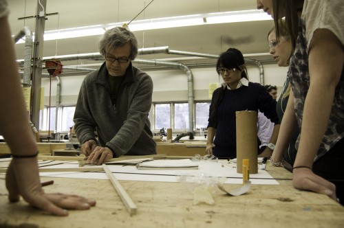
On the first day of class, instructor Nathan Corser asked his students, ‘Why are you here?’ Student Jim Lutzke quickly piped in, ‘I think we all just really want to build something.’ Jim was right. Architecture school is a diverse education that teaches how to convey ideas in a creative and visual way. But, for the most part school offers limited opportunity to build what we design. We often use popsicle sticks as a scaled substitute to Doug Fir beams in the miniature representations we create of our buildings. When a 2×4 is used as a real 2×4, design becomes real and building becomes tangible.
The opportunity to both conceptualize and construct a building is rare, and the University of Oregon Design Build studio was the first studio of its kind at the Portland satellite campus. The studio was a collaboration in which 16 University of Oregon students, adjunct professor Nathan Corser, and Anderson & Anderson Architects from San Francisco were brought together with professor Karl Burkheimer of the Oregon College of Arts and Crafts (OCAC) and five students from the college.
The studio concept came from the need for a pavilion where OCAC students could mingle- a welcoming place where a ceramicist, a painter, and a metal worker could meet to escape the long hours in the design studio. In addition, the pavilion needed to improve the sense of entry to the campus and promote human interaction on the underutilized steep site.
The design process began with the OCAC students teaching UO students how they use their campus and what type of structure would benefit the students. We learned that they spend long days in the classroom and love to escape to the outdoors for a break. While touring the campus we observed the rustic nature of existing buildings and the intimacy of the in-between spaces- small art installations strewn about gave character and charm to the collection of wood shingled buildings that create the campus.
We knew that whatever we created needed to be a structure that over time would begin to appear as if it had always been there. We wanted a structure that students would grow fond of, make their own, and could seamlessly blend into the existing character of the campus.
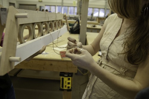
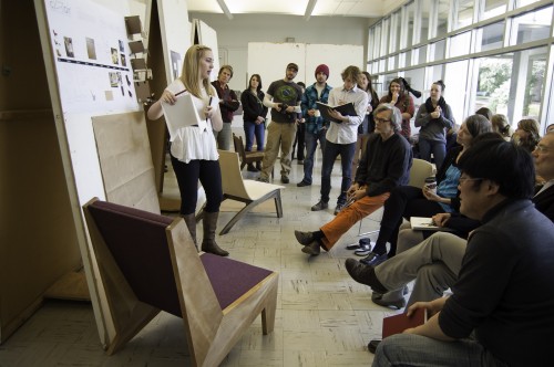
Our first design charrette brought forward many diverse ideas, so we categorized the ideas and moved forward in three groups with three strong concepts. We explored an undulating ribbed structure in which a series of ribs created a linear seating area. We looked at a pavilion of multiple levels that could act as a treehouse and an entry beacon for the campus. We also investigated a stacked wood structure that grew out of the hillside. The impending deadline of a meeting with the OCAC facilities committee pushed us to focus our attention and make decisions about the separate designs.
When we received input back from the facilities committee, it was clear that the pavilion of stacked wood construction had won them over. The interesting thing was that the design had won us over as well. The stacked wood had a structural integrity and simplicity that meshed with the wood framed buildings of the campus. The form was grounded and integrated with the steep topography of the hillside. And, the construction process the wood stacking required was achievable by our team of unskilled craftsmen. We all saw the benefits of the stacked wood pavilion and were excited to figure out the design details and begin building.
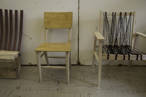
We each gravitated toward our design interests. I was interested in how the wooden wall would undulate and how the wood connections could be concealed, so I joined the framing team. Michael Prohov was eager to design the interior space and create a pleasant environment for the students, so he joined the furnishings team. There was also a group that worked on the site and pathways, and a fourth group that focused on the skin of the building-how we would protect the wood and keep the water out of the interior.
With this design approach, the parts began to form the whole. This process worked surprising well, but it was because by this point in the design process, we trusted each other. We had discussed our project goals and collaborated for five weeks and we respected each other in a different way. Seth Dunn, who worked with the furnishings team to create the concrete hearth explains, “People think differently, and we forget that. When we finally embraced that, working together became a lot easier.” We had an overall vision for what the building would be, but we came to that vision through a process of discovery.
Building the BurnBox was not streamlined, linear, or fluid, but it was fun, and the greatest learning emerged from allowing ourselves to make mistakes. We poured a footing that we did not end up needing for the foundation. We did not plan properly for the entrance to the pavilion, so we had to design a retrofit front step and entry platform. We forgot to secure the floor in some places and had to crawl underneath the structure and create additional bolt connections. But these mistakes were quickly forgotten: the unused footing was covered up, the front step appears as if it was planned, and the pavilion floor is sturdy and solid.
We truly learned by doing. We knew that building before completing the design had major implications. We worked only with a crude foundation plan and we neglected to make any specific construction drawings along the way. This made the process cumbersome and lost at times, but the result of our complex efforts is the beautiful, together, thoughtful object that now sits on the OCAC campus.
The result of our hard work is BurnBox: a 10’ x 20’ wooden object built of 4×4 Doug Fir posts, 1/2” threaded rods, nuts, and washers. The wood is finished using the ancient Japanese wood charring technique of shou-sugi-ban. Shou-sugi-ban preserves the Doug Fir and creates the contrast between the interior and exterior of the structure.
The beauty of BurnBox is the process of making stacked within it. Each layer of the structure represents countless hours of labor intertwined with hours of discussion and problem solving. The BurnBox aesthetically fits with the campus- the charred wood is similar in texture and color to the cedar shingles that side the existing buildings; the scale appropriately addresses the hill that the pavilion is built against. But, more importantly, the process of making the pavilion is what places it so eloquently and appropriately in the landscape of the Oregon College of Arts and Crafts. The visual imperfections and the handcraft bring the object to life and give it meaning on a campus that truly believes in the art of learning through making. Being a perfectionist, I am surprised that I find the most joy in spotting the imperfections in the structure: the scattering of holes we drilled too large, the gaps between the floor deck that are slightly wider than the others. It is the flaws that make me grin and remember the best experiences from the six weeks spent crafting BurnBox.
To view images of the project as it progressed over the fall 2011 term, see the Facebook album.
Students Ashely Koger and Seth Dunn have created a book on the BurnBox project, view the book online at the BURNBOX.
[About Ashley Koger: Ashley Blake Koger will complete her M.Arch at the University of Oregon at the White Stag Block in Portland this year, 2012. Her thesis focuses on integrating the craft of boatbuilding into the industrial SE of Portland and supporting improved recreational access to the Willamette River. Ashley’s design interests include learning through the design/build process, reclamation of post-industrial landscapes, and mapping as a tool for understanding human interactions with space.]


