Centennial Mills Redevelopment:
A Pedagogical & ‘Real Life’ Opportunity to Preserve and Play with History
University of Oregon Architecture Studio Engages Students in Real World Projects to
Rethink-Recycle-Regenerate: Imagining Portland Centennial Mills
A Studio
With
Ihab Elzeyadi, Ph.D., FEIA
Associate Professor of Architecture | Department of Architecture
School of Architecture and Allied Arts
University of Oregon
Summer 2013 Studio | ARCH 484 /584
How can you make new life from the old yet create a 21st century public place for the city of Portland? What is the process of reusing historical buildings without getting locked-up in its relics? Which elements can we preserve, reuse, while sustaining the past, present, and future for the city of Portland by developing its Centennial Mills? –Ihab Elzeyadi
These are questions at the heart of a UO architecture summer studio–led by Profesor Ihab Elzeyadi and 14 students, armed with their sketchbooks, laptops, and eight weeks of an intense summer studio centered on Centennial Mills.
The Centennial Mills development project has been referred to as one of the largest sustainable redevelopments in the history of Portland. Since being brought on board last spring by the Portland Development Commission (PDC) to redevelop the property, the project development team of developer Jordan Schnitzer and his Harsch Investment Properties has enthusiastically pursued input and design ideas for the Centennial Mills site from varying resources. [Scroll to the end of this article for background and a full list of partners.]
One important resource has been the engagement with UO Department of Architecture and the High Performance Environments Laboratory at the School of Architecture and Allied Arts.
Instrumental in establishing the connections to facilitate this project has been Tad Savinar, a civic catalyst on the consulting end of Schnitzer’s Harsch Investment Properties. Savinar invited the University of Oregon Department of Architecture faculty to join Harsch and offer a summer 2013 design studio that would focus on the Centennial Mills property. Nancy Cheng, director of and associate professor for the University of Oregon Portland Architecture Program was the Portland liaison teaming up with UO Eugene-based associate professor of architecture, Ihab Elzeyadi. Professor Elzeyadi initiated and taught the summer studio, Rethink-Recycle-Regenerate: Imagining Portland Centennial Mills.
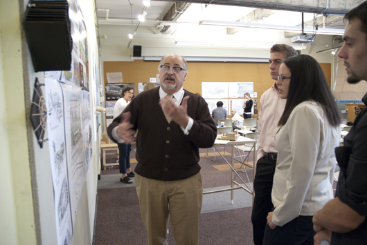
Elzeyadi comments on the partnership with Harsch and the UO Department of Architecture:
I [had] investigated the potential of offering a studio to rethink and re-envision the Centennial Mills for over a decade. We had worked on adaptive reuse studios in Portland for a number of years collaborating with the late Art DeMuro of Venerable Properties. This has led to a number of successful “real” projects.
The Centennial Mills project was always interesting yet wasn’t defined enough to tackle… Bottom line—it will be a great adventure… Pulling it together has not been as easy. When Tad Savinar contacted us and invited me to consider it for a studio in collaboration with Harsch, I felt an adrenaline rush to go for it. It felt to me that this was the right moment to intervene on a project I always valued not only because of its historical value but also due to its rich opportunity and great challenges.
The timing was also ideal since we are working in parallel with the design firm and Harsch. We were also preceding them with some tasks and contributing a great deal of research to the design team.
Professor Elzeyadi’s studio engaged students: “in a real project to develop parallel research and conceptual development on the urban and building scale to adaptively re-use the site and its complex of buildings. The process both was informed by the work undertaken by Harsch Development as well as informing the design team based on research and academic exploration in a process of collective intelligence.” [Course syllabus]
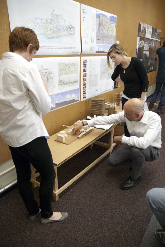
In mid summer of 2013, during the studio’s midterm review, the students were joined by Jordan Schnitzer who intently listened to the students presentations, engaging in commentary and conversation about their designs and addressing them post-review with his own reflections on the project and moving forward. Schnitzer, who has consistently promoted the project and the site as one that needs to be grounded in emotion and connectedness to Portland, takes a thoroughly humanitarian approach to the project’s overall conceptual approach. He reminded the students that a useful thought here is to realize this is an opportunity to “preserve but play with history.” Schnitzer enthusiastically complimented the students on their “great ideas” and “the fabulous job” they had introduced with concepts for the Centennial Mills complex.
[View photos from the reviews here on Facebook.]
In what can be described as a rather stirring and heartfelt conversation of advice, Schnitzer continued by asking the students to “balance between dreaming and what is available…always dream, but remember to put yourselves in the shoes of the developer…the client.” In a moment of pedagogical delivery, Schnitzer expressed a sort of reverence for the students’ work, saying “when any of us are lucky enough to touch the land, [we] have an obligation because [we] are doing something that will result in a better quality design..it is an honor to be an architect, to effect the land and have that responsibility…You have that responsibility.”

Schnitzer encouraged the students to stay actively involved and encouraged their future input on making the Centennial Mills project rife with attractions and features that would appeal to all ages and activity levels encouraging engagement with the final outcome of the site.
Along with Schnitzer’s words of encouragement and inspiration, the students relied upon their professor to guide their projects to completion and the final review held August 12 on the Eugene campus.
The University of Oregon architecture students enrolled in the studio have proved to be a significant part of the brain trust and logistical process for the project. At the final review, 7 proposals were pinned to the walls, with teams consisting of 1-3 students. On site for the final review session was Gil Kelley (Harsch); Tad Savinar; and Gregg Sanders, David Wark, and Nick Byers (all of Hennebery Eddy Architects), among others.

Professor Elzeyadi addressed the assembled group recalling to all the predominant aspects of the project: to provide open space; to capture history and historic context; to define community focal points; to embrace sustainability; to strengthen connections; to link a riverfront greenway. Elzeyadi also detailed aspects of the project that provided the guidelines and contextual framework within which the students had to develop their design concepts. A few of these: 2030 Energy Benchmarks; providing for a hotel, a museum | arts center; utilizing the north-south axis of the complex; recognizing solar radiation modeling; daylighting ideas and micro-climate and cross ventilation opportunities; the integration of greenroofs, rainwater catchment, embodied energy; and context analysis incorporating energy and environmental benchmarks developed by High performance Environments Laboratory (HiPE) that he directs at the UO department of Architecture to integrate performance and experience as guidelines to develop sustainable place making
The students were to design within the following constraints and understandings of the site: to recognize and envelope historical context of the flour mill, the feed mill, the grain elevator, and riverfront warehouse; to use existing site opportunities such as the greenway and the connections inherent to the site, 9th Avenue, and the existing city park; to work within the restrictions of the existing corridor, easements, setbacks, transit lines, and zoning, as well as within the context of a vibrant urban setting. And, to work with an understanding of the cultural context in addition to an architectural context that would study and embrace industrial, mixed use| retail, hotel and high rise condominiums. The geographic context that students addressed included contaminated ground, metal debris and air pollution of methane chloride. Climate context included the prevailing NW or SE winds, sun angle diagrams and sound levels. Also to be considered was the folding in of elements to make a coherent complex—retail, office, residential and parking that balance a cultural program of a visitor center and a museum

Professor Elzeyadi relates that the studio was a challenging yet fundamentally rewarding experience:
I offered the students a rich design process and a rigorous work schedule. I’m proud of their professional attitude throughout the studio. Working in teams, they had to vent their decisions together, respond quickly to critiques offered by me in a short time frame as well as respond to feedback from the design team.
It was intense, quick, and rewarding. They learned a great lesson for this schematic phase of design and planning a site of complex multitudes. It has been a sort of midnight summer dream —and, we are looking forward to further engage with it in the next phases of the project through my fall-winter-spring thesis/terminal studio I’m offering in 2013-2014.
The following lists the students involved in this studio and the titles of their projects (a printed publication of their work is planned to be released in the fall of 2013)
- The Anchor of Portland by CLINA (Claire Seger and Gina Auduong) | Using a vocabulary of solid and transparent, this team created a series of different gestures with a sense of an ebb and flow between addition and removal. Termed “very evocative” by reviewers, this project “left a sculptural form.”
- Playground for Portland by Melissa Anderson and Kathryn LaNasa | With a vision to make Centennial Mills into a place where the greenway joins to the complex uniting outside with inside and providing multiple vantage points; Re-uses many of the structures and a bridge that captivated reviewers. . .
- Centennial Mills Park to Water Redevelopment by Carolina Trabuco and Kaitlyn Rowley | Focused on site connections to the Pearl District, the Willamette River and the greenway. This plan advocates an “island” approach.
- Centennial Mills Sawing the Seeds of History by Elena Traudt | The central feature is the open space that draws in the park, the city, the water. A very organic approach that gives precedence to the landscape and the water, and will benefit from a sense of the “push and pull” of the design .
- Envisioning Centennial Mills A System of Parks and Axis by Tudor Bertea and David Richards | Interweaving urban life with the site as a threshold. Bridging nature with retail belts and a visitor center and the preservation of a story of place. “To introduce a northern city strongpoint by revitalizing historical facets of Centennial Mills while interconnectedness of the urban and natural life.” Floating greenways lends a chance for a “water level view.”
- Bookending Portland’s Waterfront: Centennial Mills, Adapted by Carmen Ulrich and Emily Smietana | The bookend for the city center of Portland. Incorporates marketplaces, underground parking, visitors center, interacts with nature and seeks to celebrate the Tanner Creek feature. Would benefit from a grander gesture to Tanner Creek and a study of Halprin Fountain as inspiration. The bike trails and resident profiles make this project stand out.
- TuRBiNe by Alex Brooks and Chris Watkins | A focus on energy: the urban energy of the city and the energy of the visitor to create an urban vitality. This will be a place people want to go and use the street to bring the people in. Inspired by the Vancouver landbridge and the urbanity of Seattle’s Olympic Sculpture Park, Pikes Place Market and connecting to the river.
Following the final review presentations, Savinar addressed the group and talked about the constraints and opportunities of the project (the submerged site area, the 20’ building line set back, the waterfront; Tanner Creek ; restoring the riparian zone, and the seawall; to name a few. He continued by reiterating the key site features of the flour mill, grain elevators and feed mill. Savinar noted the greenway trail is a new opportunity and there might be a way to preserve the warf buildings. The review closed with high hopes on all sides and the momentum to continue this project adding, and adapting ideas.
I asked Professor Elzeyadi to reflect on the studio and moving forward:
The collaboration was interesting on multiple fronts: we took a different approach to the problem by first researching the context extensively and through engaging my HiPE lab expertise. We developed some evidence based guidelines to sustainable design and the creation of a high performance buildings. This information was shared with Harsch and the design team to support their work.
We also benefited from great reviews and feedback through some of the planning and documentation that was produced by the design team.
In addition, I used a number of ways to breakdown the project so the students could bite the right size and be ready to investigate in a meaningful and manageable way. Towards that end, we explored seven different proposals reflecting on the same issues that the design team is challenging. It corroborated what they are concerned with and engaged in and offered a different approach to the design problem in the same way.
This is the kind of triangulation and interaction that would fit the project and Harsch in the long term. It’s looking at the project from various perspectives and offering both a practical and academic perspective to developing and planning it.
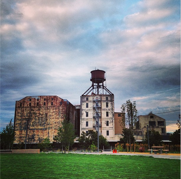
The somewhat sprawling complex, even in the dusking evening skyline, is an imposing settlement of shape and context —its grand proportions and soaring features touching the sky like few other buildings on our city’s waterfront. And with a project of somewhat unprecedented scale, and undeniable importance to our metropolis, the pedagogical opportunities afforded here are monumental. The partnerships blend new ideas and create new conversations within our capable community of those dedicated to a built environment that can unite so many elements vital to a healthy urban tapestry.
Gazing at the visibly deteriorating colossal structures from a stance anchored in the well-used park across Naito Parkway and just the other side of the glimmering tops of well-worn train tracks, lets one imagine and visualize the quiet beauty and inherent possibility of Centennial Mills. An appreciation of the Ozymandia-esque melancholy of the project reaches far into an emotional and thoughtful consideration of Portland’s past—a monument of sorts, a reminder of inevitable decline to be gently halted, or re-invigorated mid-track by compassionate sensitivities with an keen sense of the importance of place, history, culture, and reuse.
And that, it seems, is the intention of this place’s most passionate advocate, Jordan Schnitzer, who along with the team he has so aptly brought together could very well transform what remains of this mighty place to rise again, with a bold melange of old and new.
Many thank yous to Professor Ihab Elzeyadi….
Background Context…
In 2013 the Harsch development | real estate firm received approval of a $350,000 loan from PDC to perform “predevelopment” assessment. Under direction from Schnitzer, Harsch mindfully moved forward to examine the project’s financial possibility and to initiate preliminary design concepts. In May of 2013, Harsch led tours of the Willamette riverfront | Pearl District Centennial Mills location and hosted an open house to introduce leading developers, preservationists, and community leaders to the dilapidated 11-building site. It was an opportunity to glean ideas responsive to the site, both historic and public-minded, that would begin the process to transform the former flour mill into a bustling complex of office, housing, and retail development complete with a respectful inclusion of the historical character of the site.
Indeed, the goals of PDC have been to redevelop the site to be a center of “’cluster industry / traded sector employment’” encouraging industries such as “footwear, software, and clean energy that the city is courting and having success attracting.” [Portland Tribune.] A further aspiration is to incorporate retail space, an arts-culture center, housing and parking facilities for approximately 295 vehicles. The current site, complete with the historic structures such as a four story feed mill, a five story flour mill and water tower, and grain elevators speaks of a relevant economic and social history that was a vibrant part of Portland’s past.
Working cooperatively, the PDC and Harsh have established a redevelopment team of experts well-versed in the vastly progressing realm of green design, building innovation, and sustainability. The team, comprised of professionals from both PDC and Harsh have incorporated the expertise of Portland’s Hennebery Eddy Architects as the lead design firm. The long list that reads like pages from a who’s who of the Portland development and design universe, instantly conveys the impression that this is going to be a project with no stone, or aging timber, left unturned.
This post has been the story of how students at University of Oregon Department of Architecture were incorporated into the project. The inclusion of both graduate and undergraduate level students in UO architecture program has precipitated a design team that links UO to the following partners::
Harsch Investment Properties
· Jordan Schnitzer
· Gil Kelley
Studio of Tad Savinar
· Tad Savinar
Hennebery Eddy Architects
· David Wark
· Gregg Sanders
· Nick Byers
Other Project Team Members
· Portland Development Commission
· MS&R Architects
· SERA Architects
· OLIN
· GreenWorks
· CH2M Hill
· KPFF Consulting Engineers
· R&H Construction
Sources:
http://www.centennialmills.org/
http://www.oregonlive.com/front-porch/index.ssf/2013/05/developer_seeks_ambitious_idea.html
http://portlandtribune.com/pt/9-news/135707-schnitzer-tackles-centennial-mills-redevelopment
A piece by Randy Gragg in Portland Monthly on Centennial Mills
A piece by Brian Libby in Portland Architecture on Centennial Mills
