Work by Meagan Dickemann | Alex Jackson | Dan Nowell | Jodi Hanson
University of Oregon | Portland Programs
School of Architecture and Allied Arts | Department of Architecture
Portland Urban Architecture Program: Arch 683 | Fall 2010
Professors Gerry Gast and Suenn Ho
[Note: Student projects from this studio will be on exhibit in Old Town | Chinatown on April 8, 2011 (5pm-7pm) and April 9 and 10, 2011 (1pm-4pm), 117 NW Second Avenue, Portland. The public is invited to this free event; sponsors include The Bill Naito Company and MulvannyG2 Architecture.]
The Old Town | Chinatown studio examined issues of “collective space and social space” as detailed in Herman Hertzberger’sSpace and the Architect, a series of essays on architecture which explore “in between space” and the city. Offered in the fall of 2010, Professors Gast and Ho led an introduction studio for students in the Portland Option II Graduate Architecture Program. The studio combined aspects of architecture, urban design and the design of public spaces as all integral ingredients of what defines “urban architecture.” The studio addressed building tectonics as supportive and reinforcing to design concepts. True to the University of Oregon’s Graduate Program ideals, this course emphasized a comprehensive design process: the essential combination of theory, history, design skills, human factors, sustainability and tectonics (structure, construction and environmental systems) in design studio work.

The project was designed to concentrate on the conception of a Cultural Center in the Old Town | Chinatown neighborhood of Portland, Oregon. This area just off of Northwest 4th and Burnside in the Waterfront Blocks Redevelopment Area (Portland Development Commission), a part of the Portland River District, and centrally located to downtown Portland, is “one of the city’s most socially diverse neighborhoods– a reviving community representing people of many ethnicities and walks of life.” Culturally and historically, the area has a colorful past embracing Chinese, Japanese, Jewish and Greek communities. Overall, the studio project was purposed to be a “‘catalyst’ to advance Old Town | Chinatown’s [recent] revitalization efforts.” The proposed Cultural Center is to be “accessible and open to both community residents and visitors from throughout Portland” and would accentuate the “diverse nature of the present community and its multicultural history.”
Given the Chinatown context and the importance of diversity, students also studied the writing of Richard Sennett, historian and sociologist. Sourcing Sennett’s works, The Conscience of the Eye, The Fall of Public Man and The Uses of Disorder, the goal was to observe and magnify diversity, obscurity and underlying pressures of metropolitan existence. By relying on Sennet’s perspective, students were encouraged to develop a city-vision where all people regardless of ethnicity or socio-economic background would have ample opportunity to interact and come into contact with one another in a designed environment. The primary objective would be to compel all individuals to experience their differences and semblances. This perception compelled students to create spaces where the humanity of this city would learn to co-exist and cooperate thereby fostering a “healthy tension” within the metropolis and, in turn, promoting a “healthy city”.
The studio further advocated for environmentally healthy design placing a high priority on sustainable design practices to “[conserve] energy resources, [reduce] carbon emissions, and [promote] the use of non-toxic and recyclable building materials.”
Below is an excerpt from the course syllabus that further illuminates the intent of the studio:
The Old Town – Chinatown Cultural Center is envisioned as a new public “catalyst” to advance regeneration of the Old Town-Chinatown neighborhood. Although Old Town – Chinatown has made solid progress on its revitalization during the past five years, the district remains a struggling corner of Downtown Portland. While Portland’s central Downtown and Pearl District have witnessed remarkable recent regeneration, Old Town – Chinatown has not kept pace with the rest of the city center in attracting new investment, activities, residents and visitors.
Although public and private investment in the River District (the combined Pearl District and Old Town – Chinatown) has totaled well over $ 1 billion in the last 15 years, the district has a need for more public places, especially indoor public places that can be used in all seasons, in all weather, and at all times, day and night.
Remarkably, the only major new indoor public place in this large district is the Armory Theater. North of Burnside and east of Interstate 405 (the approximate boundaries of the River District), there are no public libraries, community centers, recreation centers, major museums or cultural centers. This poverty of “cultural infrastructure” has resulted in a somewhat monolithic district of affluent housing, high-end retail/commercial and expensive restaurants/entertainment uses in the western part of the River District – the Pearl District. In contrast with the upscale Pearl, a separate district of primarily low income housing and social services characterizes much of Old Town – Chinatown. This west-east gradient has produced separated social, economic and racial enclaves. The reasons for these planning shortcomings are numerous and complex, but the reality of the separated urban landscape is undeniable.
Recent development projects, including the University of Oregon and Mercy Corps, have introduced major new attractions in Old Town – Chinatown. However, these are only partially public venues. A recent positive trend has been the opening of many new small businesses such as Floyd’s, several restaurants, and a healthy nightlife scene..
Despite the River District’s segregated social pattern, there is an opportunity to create a more integrated and diverse neighborhood (socially, economically, physically) within the remaining undeveloped areas of Old Town / Chinatown. One of the most opportune ways to accomplish this goal is to develop new public places open to all residents and used by all, places where people of diverse origins, social and status “rub shoulders”, see and meet persons unlike themselves, and participate in common activities and events. A cultural center with a strong participatory program can further this goal.
Students were asked to create approximately 22,000 square feet that would incorporate an entry, a public event space, a multi-purpose or performance space, an exhibit or art gallery, a childcare center, a library area, a research and media lab, space for community education classrooms, a cooking studio, dance and drama performance studio, numerous small-scale work or meeting spaces, an administration office and a cafe. Designs were to consider realistic zoning frameworks and development standards.

Adopting the requirements and suggestions for ancillary spaces such as a commercial bookstore, offices and space for the Northwest China Council offices, most students also made allowances for highly desirable site spaces like courtyards, rooftop terraces or other socially and physically pleasant outdoor spaces.
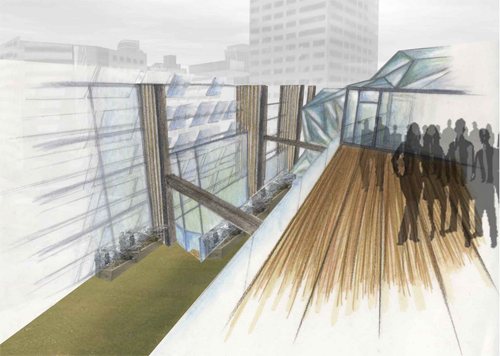
Commenting on her vision for the Cultural Center, a plan that incorporates the extensive use of glass to connect the building users to their outdoor environment, Dickemann says:
“I greatly enjoyed working on a site in downtown Portland. I feel like this studio was a great introduction to …..the city since our site was just down the street and most of us were new to Portland. I feel that [the instructors] really pushed us to keep designing until we had developed a concept that was worth exploring and evolving. The studio also pushed us to design outside of our building’s footprint and examine the greater contextual influences and also the community for which we were designing. I think one of the programs’ strengths is the focus on the urban environment and examining the greater picture when designing. The things we design and build can have a great influence and great consequences that extend far beyond simple property lines.”
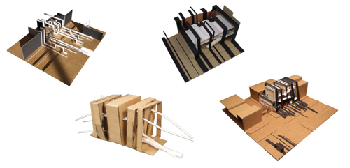
Architecture graduate student Dan Nowell’s project embraced the idea of Old Town | Chinatown as an extremely culturally diverse region. “The essence of this area,” he writes, “requires the support of every combined influence brought upon it by various different peoples over the course of time to adequately portray its story.” Nowell’s proposal for the Cultural Center “conveys this need for all peoples to join together in support of their community.” He continues, “Every nationality is expressed through an architectonic ribbon with the language of the given nationality prominently enscribed upon it. These ribbons flow from the sidewalk bordering Burnside and climb up and over the site to create a framework for the programatic spaces of the center.”
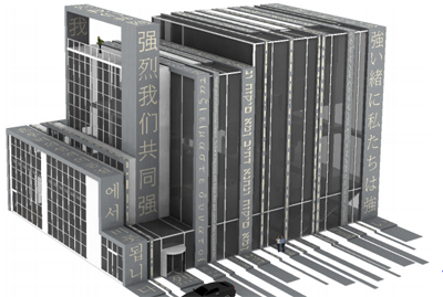

In a thoughtful and planful interpretation of the ribbon concept, Nowell comments that “one ribbon alone would not be able to support the cultural center in this manner, it requires a consolidated effort by all of the ribbons to achieve this end, just as Old Town | Chinatown requires the input of several different peoples to adequately portray its history.” With a decidedly abstract and artful approach to his innovative plan, Nowell says that the original application of the series of ribbons across both the “project site and surrounding context was born out of a concern for the automotive dominated presence of Burnside Street…..the ribbons, running perpendicular to traffic flow on Burnside, were meant to abstractly represent a visual slowing of the traffic and guiding of the eye into Chinatown…”
Student Alex Jackson writes that the process of designing a Cultural Center presented a challenge to “create a building and an urban environment which embraces a diverse population—a place where people of all cultures, ages, and resources will want to go to meet, learn, play and work.” Jackson provides more detail to his approach when he acknowledges his goal was to “create a design which [would] be a resource to the neighborhood [as well as] a magnet for attracting visitors from the whole of Portland to the Old Town | Chinatown area. He envisions a building designed for “the greater sense of community and [that will] invite new families, businesses, and individuals into the community.” Ultimately, Jackson planned for the creation of “a stoop for the entire neighborhood and, in fact, all of Portland.”
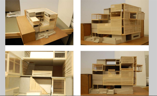
Viewing the “stoop” as a traditional area for “brief, incidental social encounters…..a place to sit and relax, greet neighbors, enjoy the fresh air, and see what is going on in the neighborhood,” Jackson moved forward with his plan to create a Cultural Center that feels accessible as a neighborhood hub of social interaction coupled with concepts of a marketplace and playground. As his models illustrate, plentiful areas for human presence are creatively interwoven with spaces that contribute to innovative and business-minded communities, or as Jackson says, “a giant urban stoop.”
As seen in Jackson’s models and drawings, his concept of the stoop is gestural in providing public space for the humanitarian aspect of the community to congregate adjacent and within the built environment of the Cultural Center. Jackson sees this stoop aspect as ” a very social space and very public” as well as pleasantly “informal so people can take or have a sense of ownership.”
Mindful of sustainable design, Jackson’s proposal incorporates such elements as bamboo rainscreens and interior partitions, maximal daylighting, abundant southern exposure, natural light diffusion, water collection systems, natural ventilation, and accessible alternative transportation.

Visible in the elevation above, the rainscreen of darkened bamboo panels gently shelters the side of the building providing diffused light as well as having great cultural relevance embracing the Asian culturally-grounding aspect of the neighborhood. The presence of the bamboo screen is also visible and tactile in the interior elevation seen below:

Jackson relies heavily on the cultural connotations of the bamboo screens using this feature for both its sustainable advantages as well as its nod to the symbolism of the region. His concept relates a fusion of both environmental considerations and historical and cultural reflections.
Student Jodi Hanson also chose to adopt both the historical and the cultural considerations into her project to enhance her design aesthetic. Visualizing the Cultural Center as a “vertical timeline that is anchored to its place….[and tells] the story of the neighborhood,” Hanson utilized an unfolding concept effectively layering idea remants of people, events, and culture. Anchoring her structure with a gradual upwardly diminishing terra cotta brick screen, her proposal steps skyward with block-like progression into the cityscape silhouettte solidly achieving a shift in focus from the heaviness of the terra cotta lower floors to a floating sensibility with the addition of glass top floors. Hanson refers to this effect as “growing from the ground to the sky, the experience through diverse vertical space informs the passage through time and a shift in focus from inward to outward.”
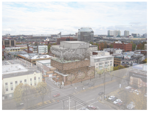
Hanson sees her “disparate layers [as being] imperfect and, at times, unstable, creating drama with which the current community interacts.” Prior to creating her model and plan, Hanson engaged in an extensive study of the areas history. From this historical perspective, she developed a timeline of events definitive to the region and this helped shape her vision for the Cultural Center: it had to have “a lot of cultural history,” she said, “and this history had to evolve into other things…into this vertical timeline.” Hanson saw the history of the neighborhood as “being so much a part of the area” as to be a major influence in forming her urban plan; she also perceived of the “Chinese Lion gate” as one of the definitive features of this geography.
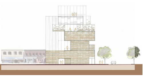
Using the rooflines from the surrounding existing buildings to define the planes of her structure’s first and third floors, Hanson related the new Center to the neighborhood context and the built history of the streets. The terra cotta cladding she employed as her primary exterior material relates to the predominant use of warm reddish brick tones on the surrounding historical buildings drawing a connection both historically and physically to what already exists and what existed historically.

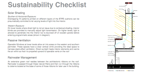
Turning her attention to sustainability issues, Hanson incorporated elements into her proposal such as green roofs as outdoor space, and the use of natural light with a mostly transparent north side of the building as well as plentiful use of light boxes, operable windows to aid in ventilation, and access to roof spaces for additional ventilation sources. Overall, considerations in Hanson’s design and plan draw upon the historical past of the area, a diverse past she lauds as her inspiration to create a built environment at this location that “has a focus on more of a wholistic urban plan” and still retains a sense of closeness to the waterfront and the urban nature of the site. By linking the sustainable aspect, the connection to the historical context, and the acknowledgement of fused yet distinct cultural influences, Hanson sought to draw upon the past and use this to inform and interact with the present, using the existing surroundings to infuse her project with “the energy that this [idea] produces.”
Post | sabina. Thank you to the students, Alex, Dan, Jodi and Meagan for speaking with me about their projects and to their instructor, Professor Gast for providing information on the course.
