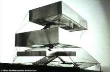
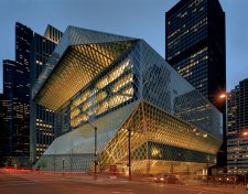
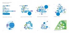
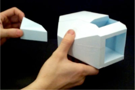
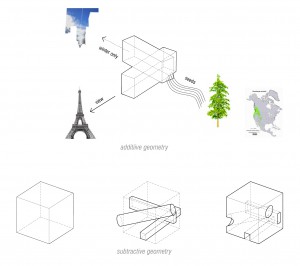
Diagramming as an instrument of design is used for analysis of an existing relationship. Points and lines as derived from El Lissitsky is one visual language of transformation. Diagramming may also be used an a generative tool to sythesize, create, new relationships. The following list of of relationships types will be demonstrated through different visual languages of first abstraction but then used to synthesize new relationships as test of possible outcomes for design architecture.
- Circulation, from Existing
- Program
- Spatial Modulation
- Structure, ‘Stupid but Smart’
- Parti, Volume
- Circulation, New
- Lighting
- Fit to Human Body
The following readings will help:
Between Diagrams and Matter (required) by Alejandro Zaera-Polo
Give Me a Gun and I Will Make All Buildings Move (required) by Bruno Latour and Albena Yaneva
Diagrams_Envisioning_Architecture_Fraser (optional, maybe view images and skim read)
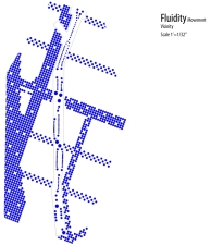
figure 1, Frameworks for Participation, Philip Speranza
The idea of systems as unit, organization over change (variation) is relevant for these types of drawings. The backgrounds may be seen as the organization (see figure 1), the diagramming language as the unit and the graphic differentiation (size, line weight or line type) may be seen as the variation. The unit and how it varies in the examples above as people is not necessarily created by the designer but predicted as probable scenarios (Schwartz, The Art of the Long View). Together these two element make up life.
figure 2, “Life” Diagram, Seattle Public LIbrary, OMA Rem Koolhaas
,
CIRCULATION, EXISTING
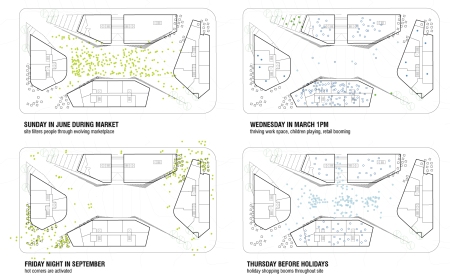
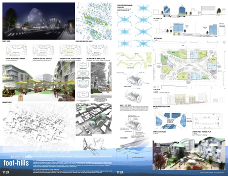
This example begins by mapping existing using to determine new locations with the site of a design competition to locate scenarios of uses at specific times. The structure or organization provides a framework for four variations of use to occur at different times, locking into the human participation (units varied) across the week.
figure 3, Time-base scenario diagrams, Finalist Market Value Competition, Speranza Architecture
figure 4, Competition boards, Finalist Market Value Competition, Speranza Architecture
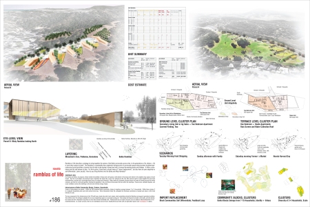
figure 5, Scenarios Diagrams and Ramblas of Life, Speranza Architecture
figure 6, Circulation Diagram, Jasmine Alcaide, NJIT
.
PROGRAM
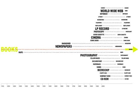
Programs are often provided by a client and provide a depth of information of client teams and expected uses of space and their respective areas. Programs maybe be transformed into graphics through measured area in Autocad or by hand, as associated with color, and typography varying text size color and form. Consider: 1) a language of abstraction; 2) differentiation of this abstract transformation; 3) callibration until patterns emerge…and then 4) change the system and test new possibilities.
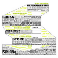
figure 7, Media Timeline Diagram (2nd degree Cataloging), Seattle Public Library: OMA, Rem Koolhaas
1. http://www.archdaily.com/11651/seattle-central-library-oma-lmn/
2. http://www.spl.org/prebuilt/cen_conceptbook/page2.htm
3. http://www.oma.eu/projects/2004/seattle-central-library
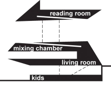
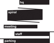
figure 8, Programming Reshuffling Diagram (Cataloging then Testing Patterns), Seattle Public Library: OMA, Rem Koolhaas
figure 9, Inside-Outside Section Synthesis Program Diagram (“3rd/4th degree Testing Patterns), Seattle Public Library: OMA, Rem Koolhaas
figure 10, Media Synthesis Diagram, Seattle Public Library: OMA, Rem Koolhaas
Models are diagrams.
figure 11, Inside-Outside 3D Synthesis Program Diagram, Seattle Public Library: OMA, Rem Koolhaas
figure 12, Seattle Public Library: OMA, Rem Koolhaas
Mansilla + Tunon
figure Plan Program Diagra, Mansilla + Tunon
http://mansilla-tunon-architects.blogspot.com/
http://www.moma.org/explore/multimedia/audios/25/568
.
SPATIAL MODULATION
Differentiation in diagrams may consider the most fundamental of architectural relationships, namely the modulation of space. The example below of Escorial shown in images shows the variation of the unit of room from large formal facade to enclosed transitional space to enclosed courtyard.
figure 13, Real Monasterio de San Lorenzo de El Escorial, 16th Century
(http://www.monasteriodelescorial.com/)
figure 14, Casa da Muscia, Porto, OMA Rem Koolhaas
http://oma.eu/projects/2005/casa-da-musica
figure 15, Casa da Muscia, Porto, OMA Rem Koolhaas
.
STRUCTURE (‘SMART BUT STUPID’)
Structure may also be diagrammed and analyzed. Structural systems are often chosen from these diagrams. These systems are often chosen for efficiency of a type but the work of Structural Engineer Cecil Balmond and the term coined by him and Rem Koolhaas “Smart but Stupid” explains the intentional irrational use of various structural systems to make evident to visitors this poetic celebration.
figure 16, Casa da Muscia, Porto, OMA Rem Koolhaas
figure 17, Kunstal, Rotterdam, OMA Rem Koolhaas
.
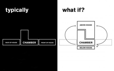
PARTI DIAGRAM
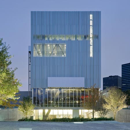
Slide 18, Photo Elevation, The Wyly Theater: OMA
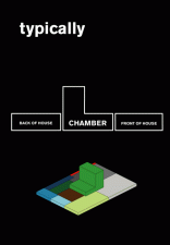
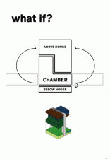
figure 19, Program Reshuffle Diagram, The Wyly Theater, OMA
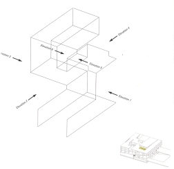
figure 20, Section Program Diagram, The Wyly Theater, OMA
The ‘Smart but Stupid’ idea of expression through inversion of rational understanding was previously used by Mies van der Rohe in examples such as the decorative steel profiles of the Seagram Building.
1. http://www.archdaily.com/12521/wyly-theatre/
2. http://www.oma.eu/projects/2009/dee-and-charles-wyly-theater
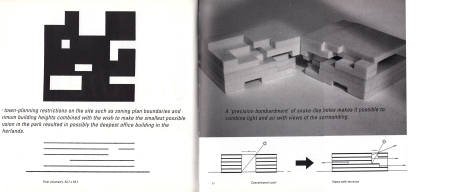
Another example volumetric diagrams are those done by MVRDV’s for the VPRO, seen below in diagrammatic polystyrene models and digital 3D models saved as line drawings.
figure 21, VPRO, MVRDV
.
CIRCULATION, NEW
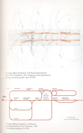
figure 21, No Return Circulation Diagram, Foreign Office Architect, Alejandro Zaera-Polo and Farshid Moussavi
.
LIGHTING
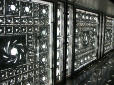
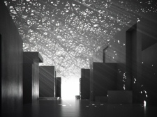
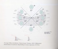
An important aspect to measure is lighting. While the lighting criteria may vary by program and use the site orientation, location and surrounding environment may also affect the lighting of architectural space and thusly be diagrammed.
figure 31, Institut du Monde Arabe, Paris, Attelle Jean Nouvel and Louvre, Abu Dhabi, Attelle Jean Nouvel
Foreign Office Architect using lighting data from Charlie Brown’s UO ESBL
figure 32, FOA
.
FIT TO HUMAN SCALE
Sou Fujimoto
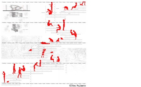
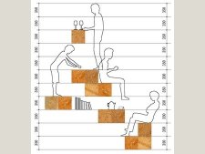
figure 22, Primitive Futures House: Sou Fujimoto: Section Human Diagram
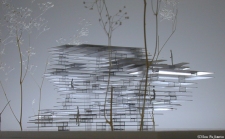
figure 23, Primitive Futures House: Sou Fujimoto: Section Human Photo Diagram
1. http://thisisrealarchitecture.blogspot.com/2012/08/primitive-future-improvised-spaces-of.html
Le Corbusier
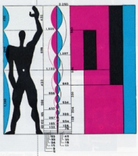
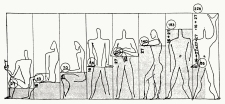
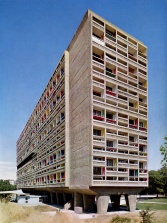
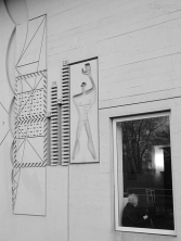
figure 24, Unite d’Habitation: Le Corbusier: Modulor Diagram
figure 25, Unite d’Habitation: Le Corbusier: Perspective Photograph
http://en.wikipedia.org/wiki/Unit%C3%A9_d’Habitation
http://www.archdaily.com/85971/ad-classics-unite-d-habitation-le-corbusier/
http://www.bbc.com/culture/story/20130423-design-icon-or-concrete-horror
.
Sou Fujimoto
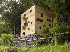
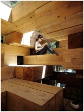
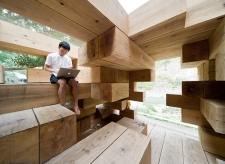
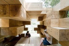
figure 26, Perspective Photos, Wooden House: Sou Fujimoto
1. http://www.archdaily.com/7638/final-wooden-house-sou-fujimoto/
figure 27, Wooden House: Sou Fujimoto: Section Program Diagram
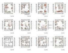
figure 28, Wooden House: Sou Fujimoto: Plan Diagrams
figure 29, Perspective Photo, Wooden House: Sou Fujimoto
figure 30, Perspective Photo, Wooden House: Sou Fujimoto.
///
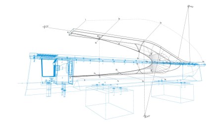
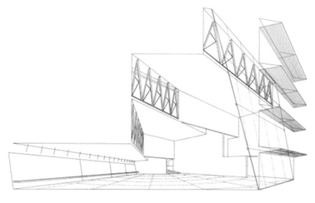
Line drawing as 3D geometry backgrounds for diagrammatic information
Make2D from Rhino 3D
- line weights (post processing in Illustrator)
- some hidden lines from Make 2D, some wireframe
- addition of notes, dimensions and numbers
Pentagon Memorial
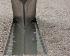
figure 33, Memorial Bench, Pentagon Memorial
2. http://kbas.co/?fluxus_portfolio=pentagon-memorial
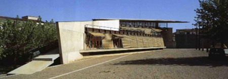
figure 34, Centro Civico Hostalets, Miralles Pinos


