

Social Interaction and Cohesion, Urban Ecology and Placemaking in Downtown Eugene

Cities as collections of fixed infrastructure has given way to an assemblies of urban processes. How do we understand this? How do we measure this?
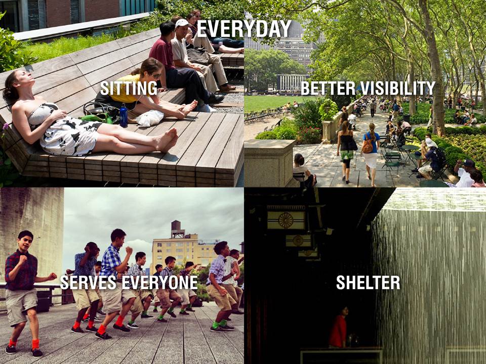
**Cities want spaces like this***
Urban design and urban ecology are broad. Urban planners traditionally relate land use, transit, open space, housing and public policy
How to create SOCIO-COMPUTATIONAL METHODOLOGIES to understand these integrated processes?
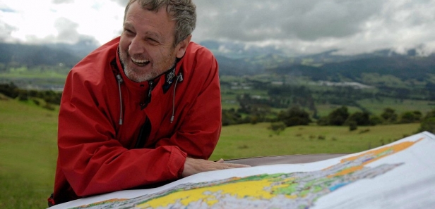
Salvador Rueda, Director Agency of Ecological Urbanism. Credited in 1995 first used the term in his book Ecologia Urbana, Urban Ecology.
Urban Ecological models of complex interconnected urban systems. Salvador’s educational background is in biology. He first directed department of urban waste. City metabolism.
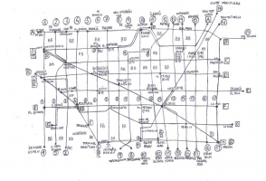
New orthogonal RET-Bus system.

“Methodological Guide of the Systems of Auditing, Certification or Accreditation of the Quality and Sustainability in the Urban World.” – (Everything is complex!!)
Coding translation from qualitative understanding to quantitative information, and development of a visual language…
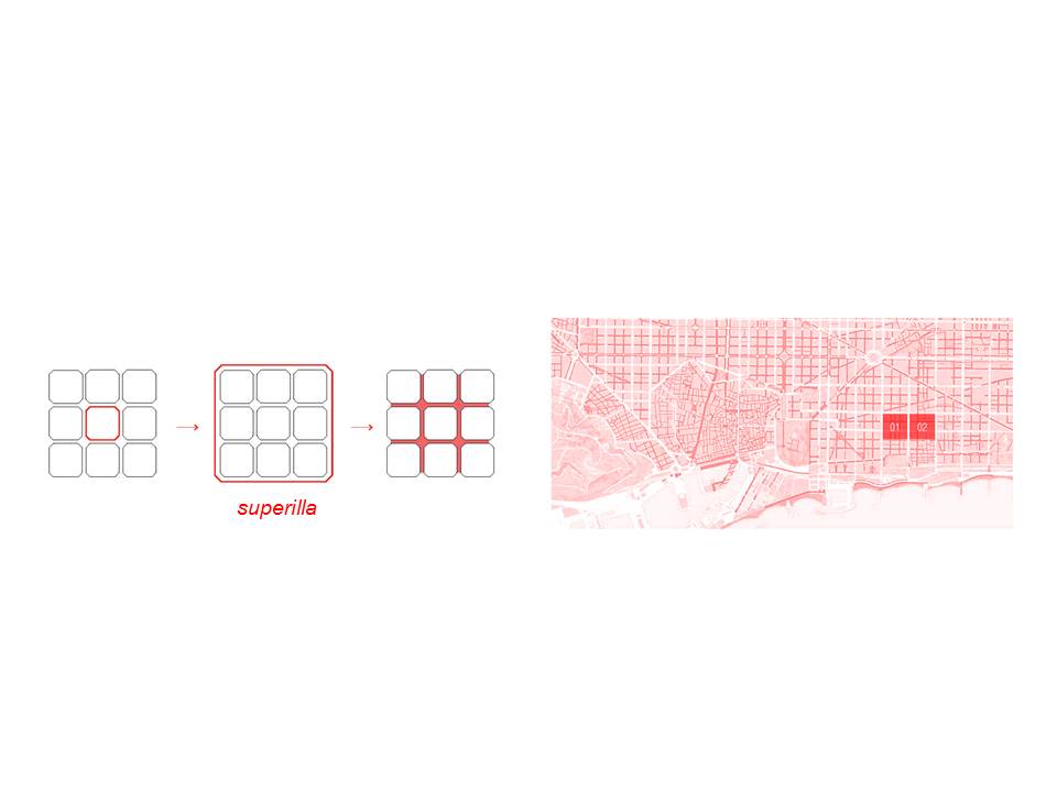
Superilla, Plan Cerda of 1859: mobility, social equity and the distribution of public and private space.
More ‘Pleasurable’ pacified or livable public space
Barcelona’s PM, annual particulate matter index exceeds that of Los Angeles.
New scale of open GIS visualization for this new multi-layer urban ecological approach.
Walkscore, Yelp and Zillow (limited geospatial analysis and overall scores)
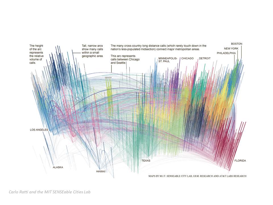
Carlo Ratti and the MIT SENSEable Cities Lab data access: (1) VARIYING data, 2) singular data like cell data, and 3) new data from scratch. Later used for most accessible data.
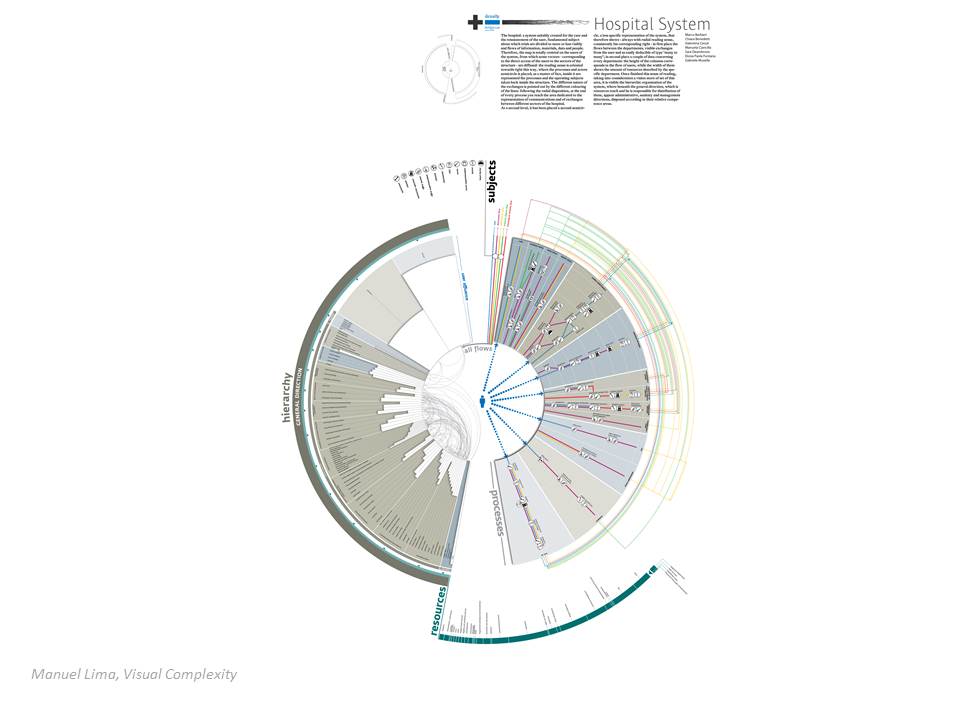

Bradley Cantrell and Justine Holzman, Synthetic Ecologies
Simulation models to understand natural phenomena.

Meetings with Salvador in 2013.
+ jobs / + IT / – education
Example, SOCIAL SPACE / PRIVATE: 3rd Places, Ray Oldenberg
Time-based phenomena. *measure the ability of the built urban environment to support phenomena of social interaction. **measure traces. Not direct phenomena.
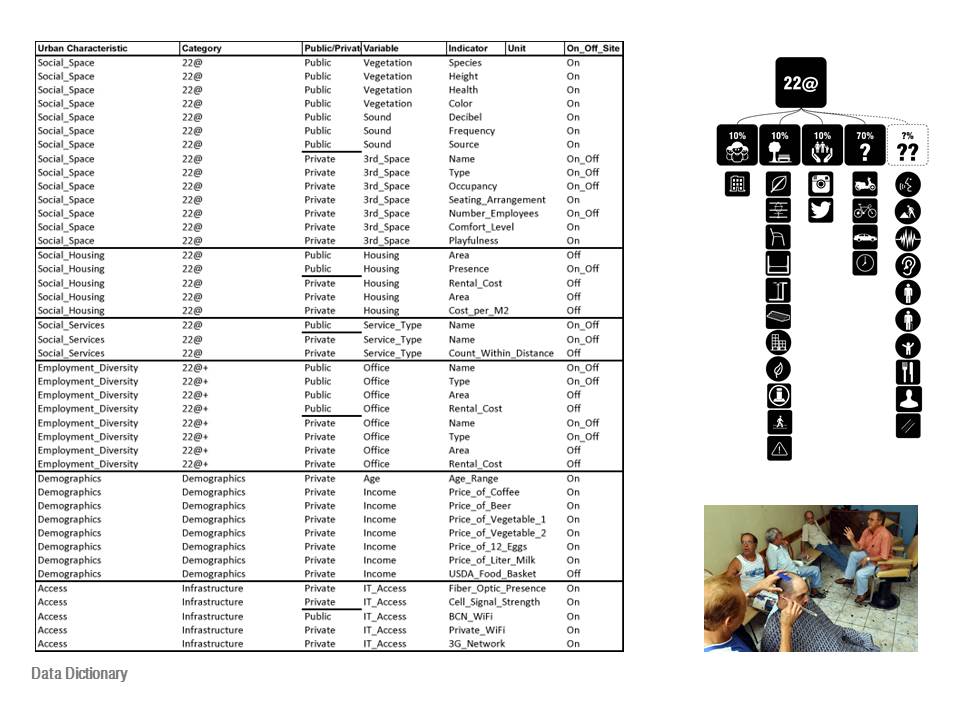
Ex. Social Space: indicators of the quality of public space: senses of smell, sound, colors
Ex. Cultural background – place of birth, parents place of birth, name of business.
Indicators of Public and private
Income: beer, coffee, USDA index of 2 vegetables, gallon milk and dozen eggs.
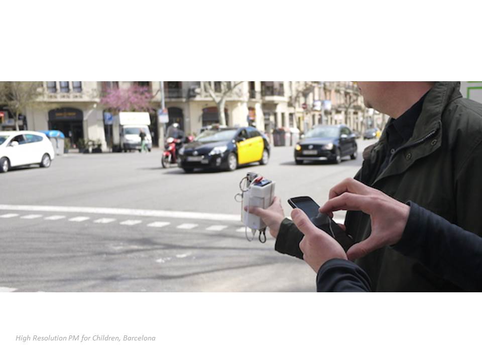
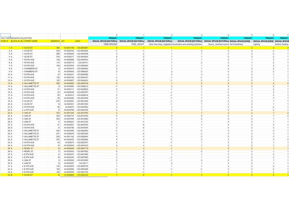
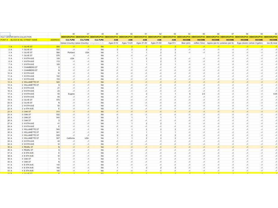
Non-site Data collected in iterations to test data gathering methods.
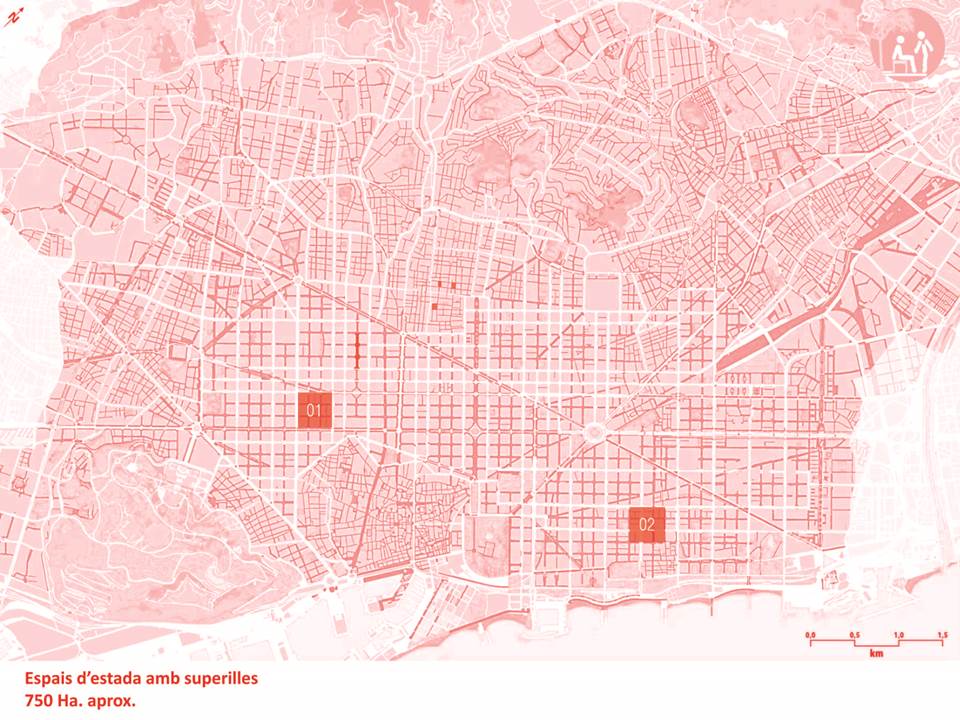
690 sidewalk locations, 3 x 3 area: 30,000+ data ratings for 1 superblock

Spider diagram: 8 indicators (qualitative). Not flattened.
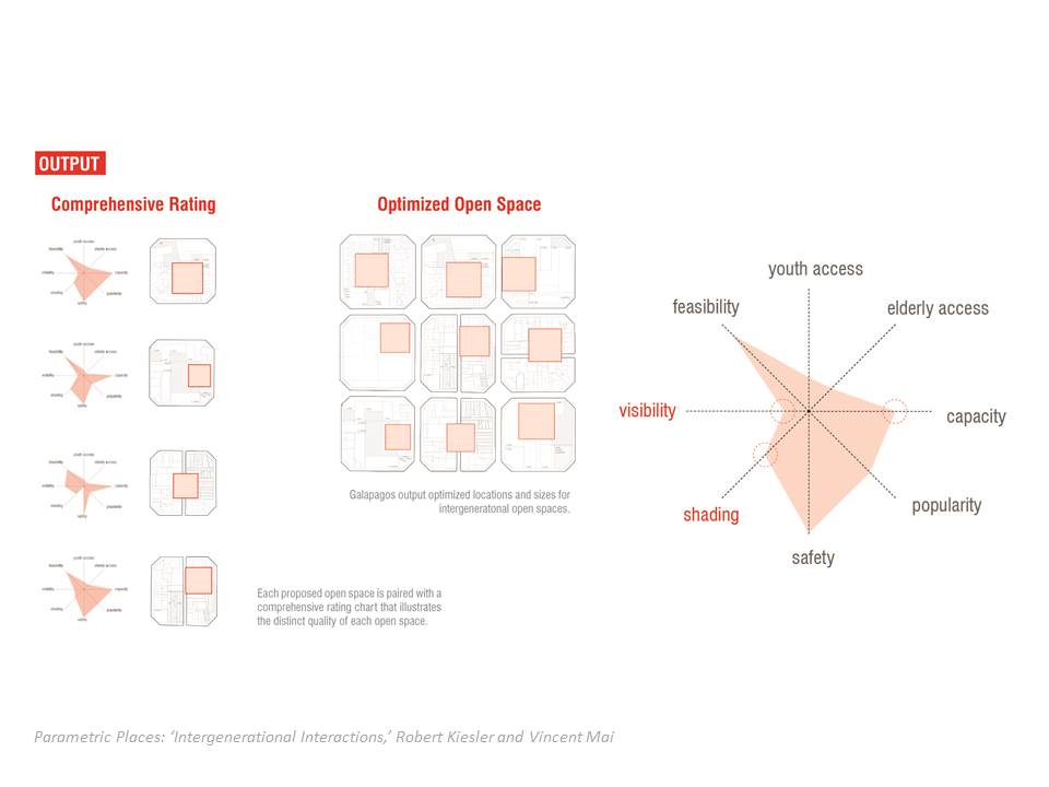
Identifies deficiencies

‘Coding’- yes/no (0/1), ratings (1-5), numbers, monetary amounts, means and averages, indexes and syntax matches.
**Rueda principles of diversity of choices.
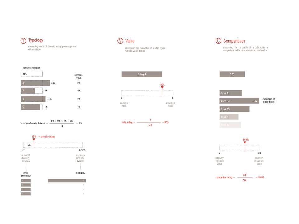
How to contextualize numbers. **RELATIVE / ABSOLUTE (theory)
-Relative means.
-Standard deviation.
-Absolute thresholds based on theory.
**live data capture. **Google Doc. Off-line
**live data capture. **Google Doc. Off-line. GH Leafcutter


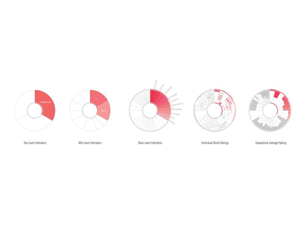
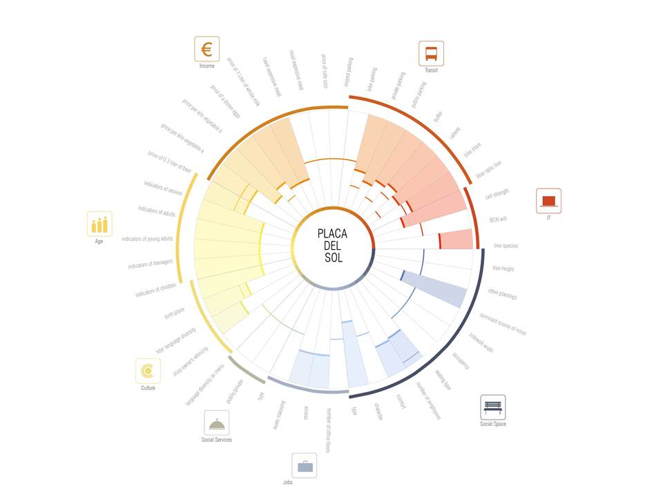
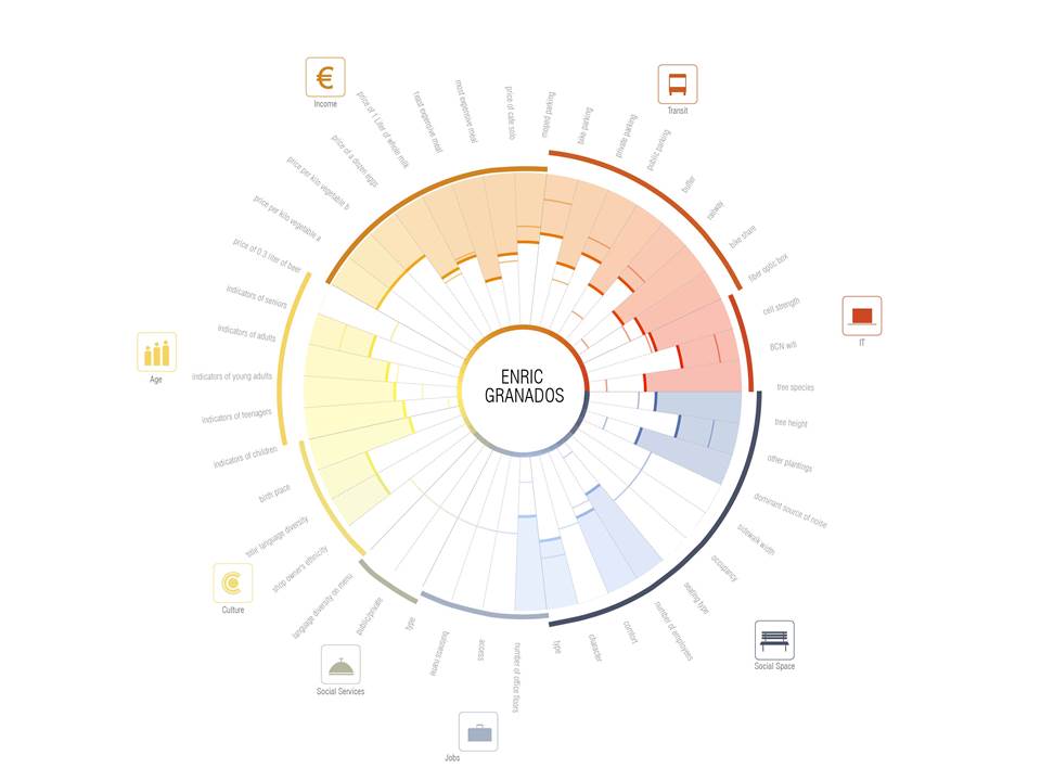
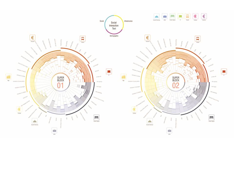
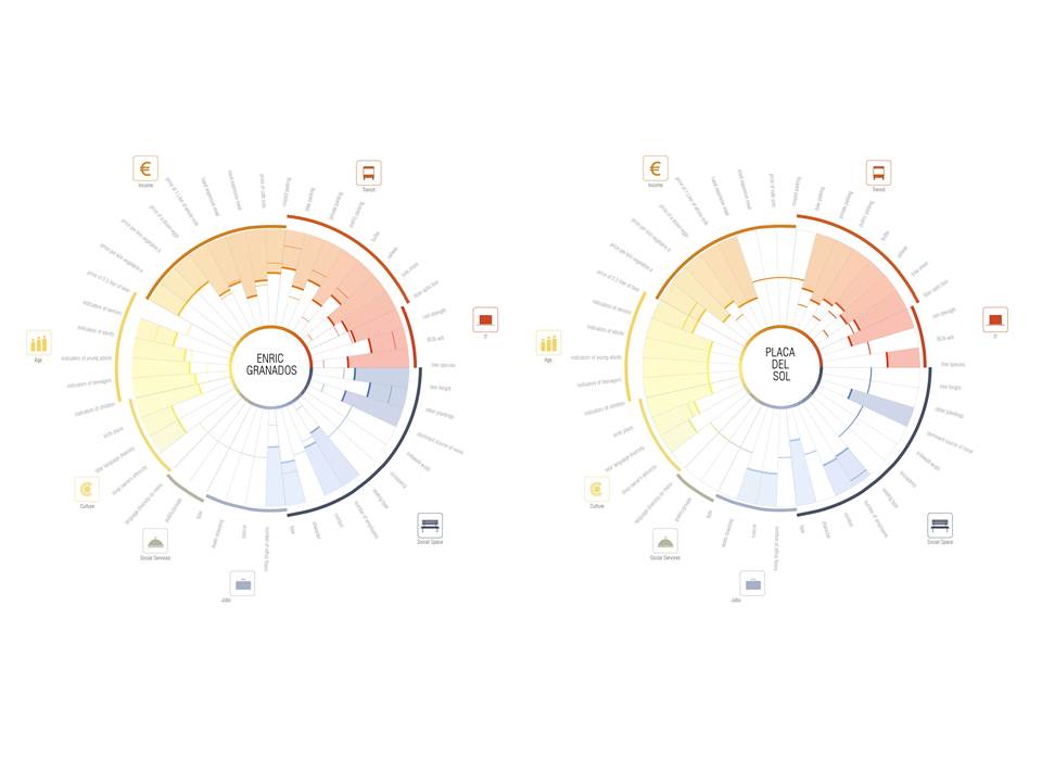
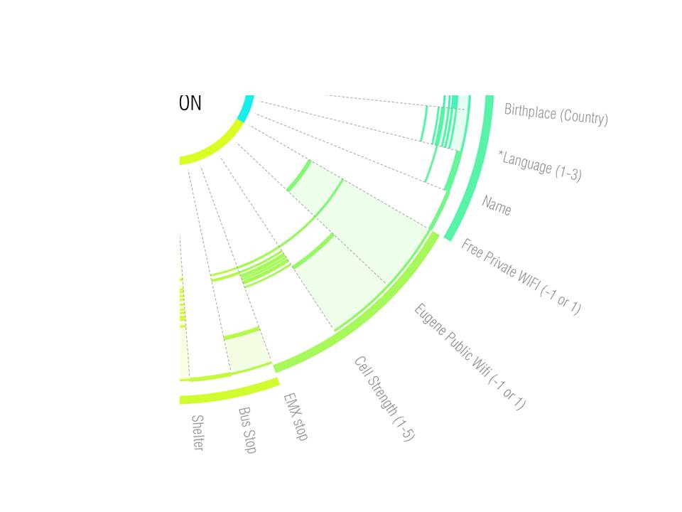
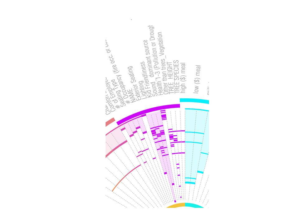
We have collected point data from over 690 locations across the eighteen blocks of the two super block. These data are mapped on to a circular diagram to provide a clear understanding of the information collected. To do so, we need structure and hierarchy. As you can see, the circle is broken down into three equal parts to represent the 3 top level indicators. Each indicators are divided again into its sub indicators and ultimately to the base level indicators. Each tick mark within the same branch represents individual data from all 9 blocks, while the color fill indicate the average data across the entire super block.

Here’s an output of the data computed across super block 01. Each indicator is color coded to help facilitate visual hierarchy. Because of the qualitative difference of each data, no base indicators has been merged. As you can isolate a single catagory, such as car parking, and be able to read the data of each individual blocks as well as the average of the super block as a color fill. The richness of these image provide a both aggregate and holistic understanding of the information collected.

Here, we tested a different way to visualize the data, in which case the same data is mapped onto the shape of a super block

And all 18 individual blocks from the two super blocks are spatially arrange in order to reveal geo-spatial pattern behind the data collected.

Going back to the circle diagram. Here we are showing in real time, the diagram update itself as you start to input different geo-spatial data on a block level, on a street level and ultimately the super block level. Animation: 1) block, 2) street, 3) another street, and 4) superilla, 3×3.

UNIT. Sequential language logic.
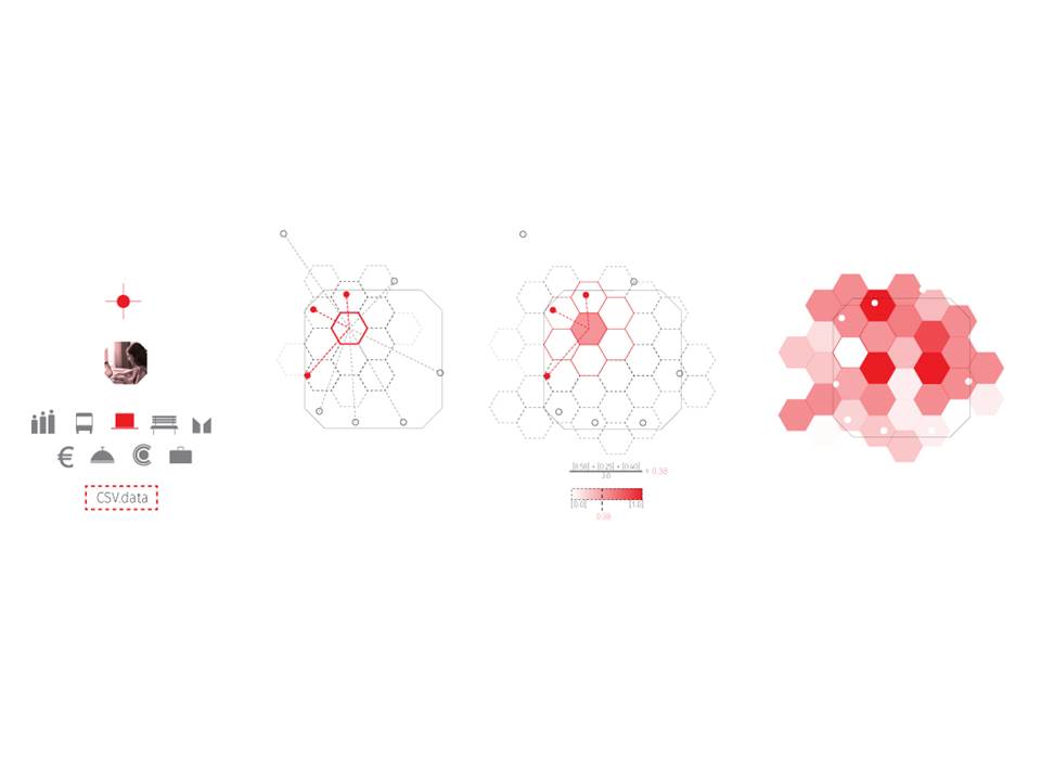
We began to generate a more fine grained spatially specific set of diagrams as the vast number of individual data points provided an ability to look at the very human scale of occupation of the superilla spaces.
In Order to access this dense set of data, a gradient tool was created that isolates the closest points to each cell [assembly] and computed average scoring based on a defined indicator or set of indicators, converting this information to a colored mesh Gradient.

Testing. 1) continuous gradient blend, 2) squares and 3) hexagons.
Understand information.
In doing so the emerging patterns across each street, block, and superblock could quickly be isolated.
Apart of the development of this investigation involved the study of how to best visually present this complex set information. Color blending vs Color pixelation, combined with variations in cell sizing were tested at all scales to understand how this abstract geometric system could best translate data point information to geospatial understanding.
In the images above the same IT infrastructure information is presented on the same block with three different modes of visualization, a continuous gradient, a larger square grid and a hex gradient.

Transition – three street morphologies
This same style of visualization allows for analysis at larger scales as well, dense congregations of highs or lows helps to paint a picture of specific urban conditions across the city
the uses of different maps in tandem, superimposed help to understand the relationship between indicator data sets within a spatial context inside each superblock and between each superblocks.
At this scale of superblock analysis we feel comfortable presenting the gradient as a pixelated blanket like mesh on top of the entire data collection area. by spanning the interiors of the block to aid in clarity.
BLOCK TO STREET
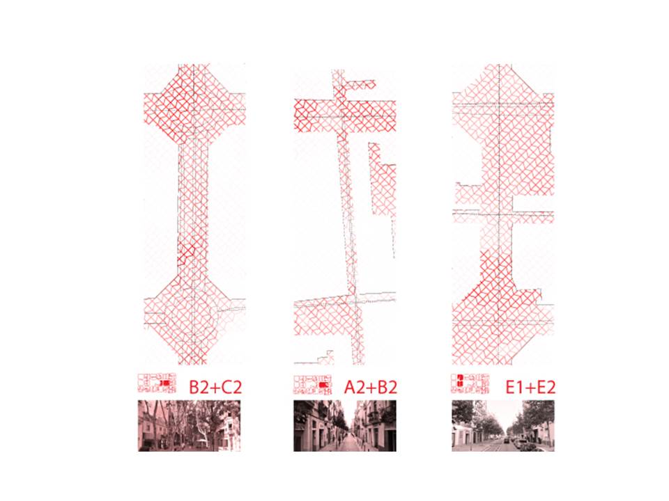
Transition – three street morphologies 1) 13th Century Maria Aguilo; 2) 19th Century Rambla Poblenou and 3) 21th Century 22@ Carrer de Llacuna.
However, as we use this analysis tool at the individual street scale we begin to mask the unperceivable interiors of the block out of the visualizations. The human experience of the street condition is limited to to the 40 m urban room defined by the right of way. in doing so we isolate only only a fine grain gradient mesh directly influenced by the data points and to be more accurate to the
choosing to only show Blocking out interior block information helps to isolate just most delicated previcabel street conditions at each data point.
Comprehensive understandings between both Superilla scale and point/block scale.
Neither tool gives a completely comprehensive understanding of the social interaction in an urban environment, rather they complement each other. by providing both a way to compare all 46 indicators to each other and to visualize the scoring of specific indicators across their spatial context.
They are meant to be used in tandem to begin drafting conclusions and eventually aiding in the design of socially interactive and cohesive spaces.
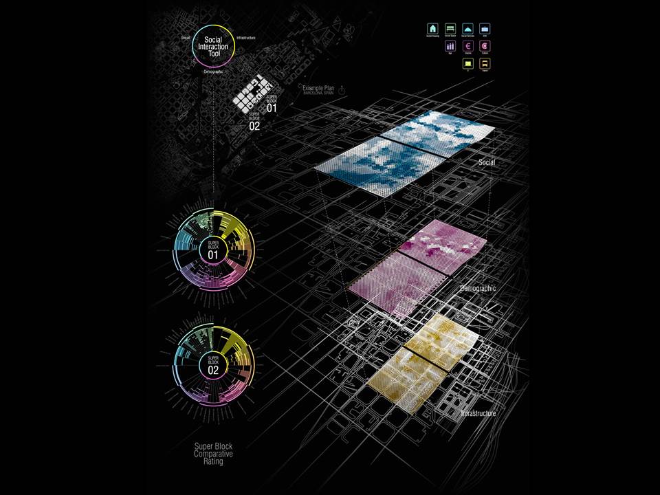
Here alongside the the superblock 01 and 02 circle diagrams, we see three primary levels of the of the social cohesion tool represented in hexagonal gradient meshes pulled apart helping us to draw on geospatial relationship between social use of space, infrastructure, and demographics

Smallest scale GIS understanding (food, business and architecture)
Rhino Grasshopper + GIS (Elk) and custom projection (Stephen Maher and Timothy Logan):
1) Air Pollution Tool
2) Food Carts Food Trucks, with Sociologist Karen Franck at NJIT and Stephen Maher, previously UO, ICD and now NBBJ.
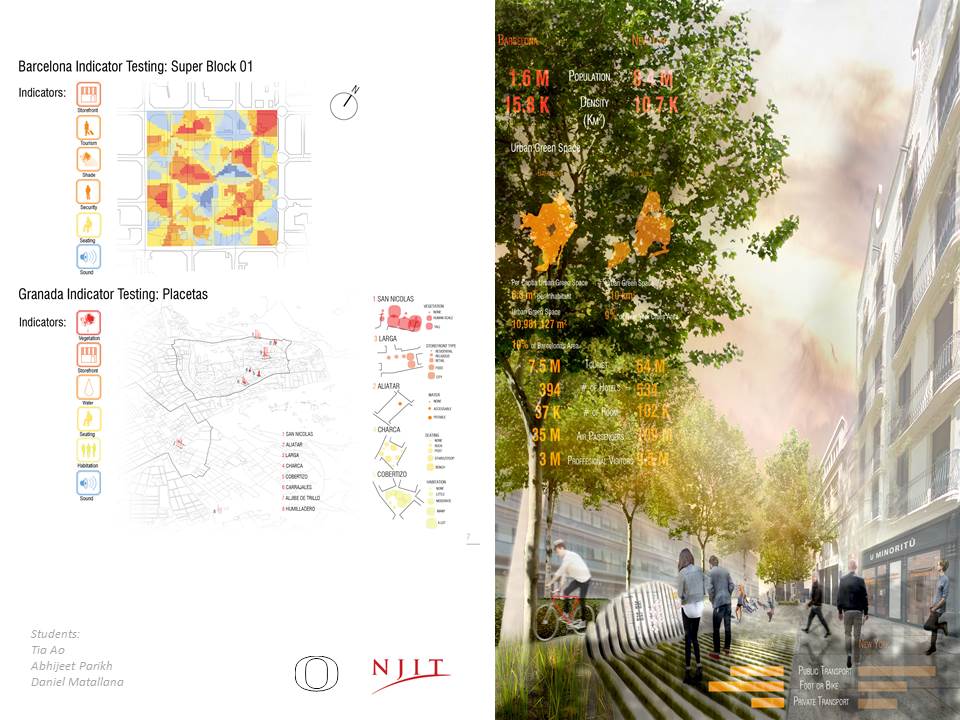
NJIT AND UO: Tia Ao (NJIT) , Abhijeet Parikh (NJIT) and Daniel Matallana (UO)


URBAN STRUCTURE: Identity / Context of the place
– DIFFERENCES of morphology and urban models

Eugene: New Indicators
– SOCIAL EQUITY and INCLUSION

Eugene: New Indicators
– SOCIAL EQUITY and INCLUSION
USES: Social Space

INFRASTRUCTURE: Transit Access + Basic Needs

– CULTURE + RESIDENTIAL low data for housing and food sources (not shown here)
**Next step: model area of Whiteaker Neighborhood (accepted location of social interaction)
PROGRAM and ACTIVITIES

PROGRAM and SPACE

The Delicacies of Socio-Computational Workflow
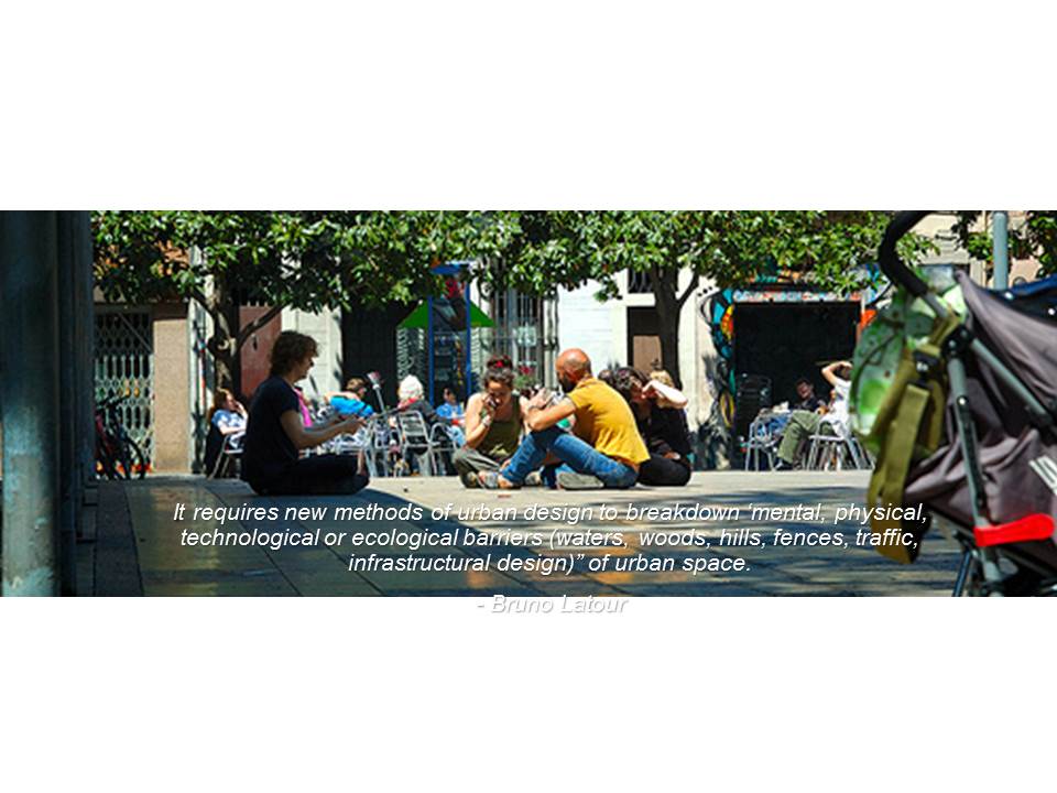
BRUNO LATOUR “Science in Action” – It requires new methods of urban design to breakdown ‘mental, physical, technological or ecological barriers (waters, woods, hills, fences, traffic, infrastructural design)” of urban space (Labout 1987).
