figure 1, “A Bird Ballet,” by Neels CASTILLON, more
figure 2 (jump to 4:21m), “Baraka” by Ron Fricke 1993, more info
Figure 3, “Flight Patterns,” by Aaron Koblin
- http://www.aaronkoblin.com/work/flightpatterns/index.html
- Mapping data to visualize emergence of patterns.
- Discovery through mapping of unit to whole.
- Data visualization.
2020 (today)
2025 (UO graduation)
2035 (Design leadership)
1999/2000…. (Philip at UVa, 94-97 all hand media / Columbia GSAPP, 00-02 paperless studios)
COURSE OVERVIEW
.
I. Diagramming: Abstraction + Synthesis
II. Analog Parametric Design
III. Digital Parametric Design
.
1.1 /// Diagramming
1.2 /// Time-based Diagrams
1.3 /// Generative Diagrams + Precedent
2.1 /// 2D Tiling
2.2 /// 3D Tiling
2.3 /// Lighting and Mapping
3.1 /// Parametric Material Experience
2 /// Final Presentation
3.3 Media Event 1:1 Mockup Digital Fabrication
.
ABSTRACTION
Abstraction + Synthesis
Abstraction
- What is abstraction?
- What is the purpose of abstraction?
Abstraction / Representation
- What is the difference between abstraction and representation?
- What is the difference between diagrammatic and representational?
figure: Napoleon’s March to Moscow, Charles Joseph Minard (1790-1870), Paris, 20 November 1869
https://bigthink.com/strange-maps/229-vital-statistics-of-a-deadly-campaign-the-minard-map
It integrates 6 types of data:
- Geographic features
- Path of travel
- Invasion and retreat in color
- Number of troops in width
- Temperature
- Time
• Geography: rivers, cities and battles are named and placed according to their occurrence on a regular map.
• The army’s course: the path’s flow follows the way in and out that Napoleon followed.
• The army’s direction: indicated by the colour of the path, gold leading into Russia, black leading out of it.
• The number of soldiers remaining: the path gets successively narrower, a plain reminder of the campaigns human toll, as each millimetre represents 10.000 men.
• Temperature: the freezing cold of the Russian winter on the return trip is indicated at the bottom, in the republican measurement of degrees of réaumur (water freezes at 0° réaumur, boils at 80° réaumur).
• Time: in relation to the temperature indicated at the bottom, from right to left, starting 24 October (pluie, i.e. ‘rain’) to 7 December (-27°)
What data is embedded in the diagram? Is it abstract, diagrammatic, representational?
The individual unit actually has very little meaning by itself because it doesn’t lend itself to any greater understanding that the synthesis of units acting together.
figure x, “Pithoprakta” by Iannis Xenakis, http://www.inderscience.com/jdr/backfiles/articles/issue2004.02/Art2.html
Big Data
- Data driven design decisions
- Role of data in discovery of design strategies
- Data sources
figure x, Visual Complexity, Manuel Lima, great repository for complex diagrams based on data, also http://www.fundacionpalazuelo.com/
figure. Mapping of Paris
The unit is individuals taking photographs and their geolocation, whole is the delineation of tourist photos and versus non-tourist photos
Suspended Particles and Urban Design Criteria, Speranza-Viader, Urban Design and Computing
Natural Systems
- Drawing Water
- http://sansumbrella.com/works/2011/drawing-water/
- Wind Animation
- http://hint.fm/wind/index.html
.
System = Unit + Organization / External Force
- Relationship of unit to whole
- Impact of external force has on unit variation and system
figure, Echelman Sculpture Unit and Force Diagram
- Unit – diamond
- Whole – sculpture
figure, “Her Secret is Patience” by Janet Echelman, Philip Speranza and Buro Happold (Ian Keough, Dynamo developer for Revit) et al
figure, “Sky Garden” by Janet Echelman, Philip Speranza and Buro Happold, Richmond-Vancouver 2010 Olympic Oval
.
GEs Courtney Sigloh and Cary Chu
Labs with lab notes page tab
.
Exercise 01
figure, “Sendai Media Center,” Toyo Ito,
Figure, Agnes Denes (images from Shed exhibit, NYC)
figure, Peter Eisenman
figure, Stan Allen
figure, Iannis Xenakis
- http://www.iannis-xenakis.org/xen/
- http://people.mills.edu/toda/chance/noframes.html
- http://www.youtube.com/watch?v=sWdQBblec0M&list=PLFy0d5qEa3gj1_lNQzVFeL9cHjjCihyT3
.
Measured Lines
Use Rhino to carefully control the measurement of lines and their arrangement in space.
Use Illustrator to control line weight, line type and other design communication characteristics.
Diagram, by Stan Allen
Enric Miralles and Carme Pinos
Enric’s wiki here. A google search will also provide some great images for exploration especially now as we explored measured drawing. EMBT is the current office headed by his wife Benedetta Tagliabue.
Click here for a good interview with Alejandro Zaera.
Additional article on Miralles and lines
figure x, Plaza de Bergonya, by Carme Pinos
figure x, Parti Diagrams, by Carme Pinos Estudio
figures x, Mercat de Santa Caterina by Enric Miralles and Benetta Tagliabue, EMBT, Barcelona, Catalunya
figure X, Gas Natural by Enric Miralles and Benetta Tagliabue, EMBT, Barcelona, Catalunya
figure X, Palafolls Public Libary, by EMBT
figure x, Piso en Mercador, by Enric Miralles, Barcelona, Catalunya
figures X, Archery Range for the 1992 Olympic Games, Enric Miralles and Carme Pinos.
The elegant single-line drawings of the section are of particular value. Lines!
figure X, Igualada Cemetery by Enric Miralles and Carme Pinos, Igualada, Catalunya
figure x, Usonian Addition, by Sassi Speranza Architects, Mt. Pleasant, NY
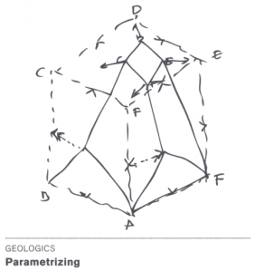
figure, Drawings from the book Geo-Logics and Towards a Self-Sufficient Habitat, by Vicente Guallart, more, presentation


