The task to hand is to pick three existing logos and to explain why I find them appealing.
First, the logo for internet shopping hub Amazon. I love hidden meanings in logos, especially in this one. The arrow not only looks like a smile, but points from the letter A to the letter Z, in a way of saying that they sell everything ‘from A to Zed’. The logo is a simple mix of typographic and iconographic, having become so well-known that often just the arrow is printed onto the sides of their shipping boxes.
Next up I have the logo for Pixar. A popular animation production house, many people might not realise that they were not always such. In the beginning they developed systems and software for use by other productions houses. They developed an animated short, using that now iconic lamp, as a means to demo their software. It was after this that they decided to start producing films in-house. This logo tells that story in a sense: reaching to the roots of what got them started as the company they are known to be today.
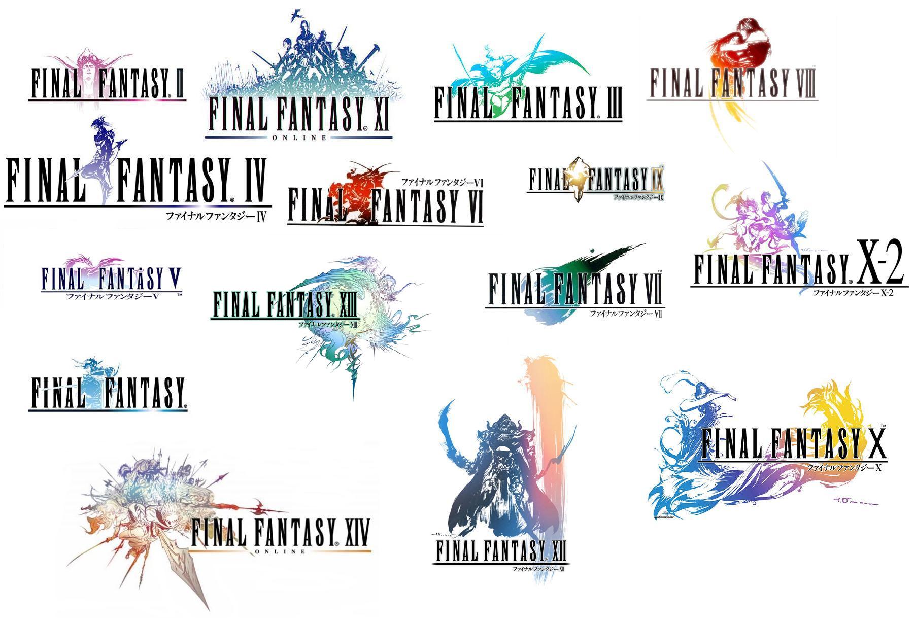
This is a little bit of a departure as these are not for a company, but for entries in the Final Fantasy franchise, but allow me to elaborate. These logos, each one unique but similar, all hold hidden meanings for the games they belong to (though the meaning becomes clear when you’ve played the game). Each depicts a character, a scene, an important element in the stories the games weave. All of the title artwork was designed by Yoshitaka Amano, who was the concept artist for the first six games in the series.
Hello, thank you for sharing this info about logo pick task. Comment from All Shops Business Directory webmaster.