Krisztian Megyeri [Consumed]
The growing demand for renewable energy is a trend necessary for a sustainable future. However, it is clear that there is no “magic” source of power that could possibly support the levels of consumption of Western societies. While there is tremendous interest and investment in finding cheaper and cleaner sources of energy, there is not much of a dialogue about how we could simply consume less.
Perhaps the thoughtless and wasteful use of energy is due to the general disconnect between its production and consumption. How much energy does my laptop use? And how much of a natural resource does it actually take to generate that energy?
Consumed investigates how land-art can be used to communicate these ideas while providing aesthetic intrigue. A path in the forest leads through a series of installations that can be interpreted as infographics about resource and energy consumption. The three-dimensionality of the pieces aims to heighten the visitor experience by making the information more poignant and relatable.
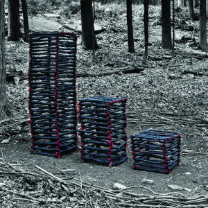
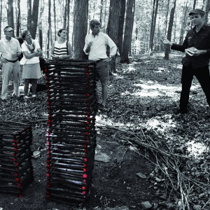
Installation One
The first installation on the path is a bar graph conveying multiple layers of information. The charred wood is a tangible, relatable representation of the volume of biomass required to power certain aspects of our lives.
Each column has a weight that corresponds to a calculated amount of potential energy. The largest column weighs 20kg, enough to power a window A/C unit for 1 hour. The middle column weights 10kg, equal to the amount of power required to operate a television for 2 hours. And the smallest column weighs 5kg, equivalent to the amount of energy required to power a laptop for 4 hours.
The second layer of information is represented with a more conventional interpretation of a bar graph, where column heights are proportional to the values that they represent. To illustrate that a high standard of living can be attained at a fraction of U.S. consumption levels, this graph compares residential electricity use between the U.S., Japan, and the global average.
Installation Two
As the path winds around and through the trees, the second installation is revealed in a clearing framed by the surrounding forest. The smaller globe, woven together with twigs and vines, represents our planet.
According to ecological footprint calculations by the Global Footprint Network, if everybody in the world consumed at U.S. levels, we would need 4.1 Earths to sustain our lives. Thus, the larger, gaudy, artificial globe represents the planet we wish we had.
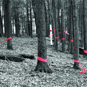
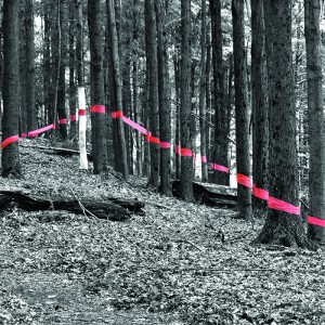
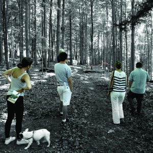
Installation Three
The final installation also has multiple layers of information. Orange bands are tied around 24 trees scattered throughout the forest. It was calculated that this amounts to approximately 15 metric tons of dried wood biomass, which is just enough to power an average U.S. home for two years. The purpose again, is to provide a clear representation of the amount of natural resources required for our daily lives.
While the marked trees appear random and scattered, when viewed from a marked spot, the bands join to form a continuous line graph which represents the historic and projected amounts of global fossil fuel production.
A pile of anthracite coal marks the beginning of the fossil fuel graph. The tree wrapped in white represents where we are on this graph. It is well known and agreed upon that we have nearly reached the peak of fossil fuels. What is not known is how we will continue at current energy needs when our current fuel sources start to decline.
-KM