Tag: photography

Craig Hickman at the White Box with Portland Creative Community 1.0

Images of Life, Love, and Politics: Early Photography of Craig Hickman

“Portland Creative Community 1.0”
at the White Box, Fall 2013

Craig Hickman stands in front of one of the White Box walls displaying work from his Portland Creative Community 1.0 exhibition.

As a young man of 17 in 1960s Portland, Oregon, Craig Hickman carried around a camera—without much in the way of rigorous intention and devoid of a strict or limiting sense of an impending project.  Hickman, instead, gently wielded his Nikon- F pointing it at friends, lovers, places, and people, many times strangers, he saw around him.  The camera operated as an extension of himself, a way to casually document day-to-day life and a way to capture moments that intrigued him.  At times, fully immersed in a moment of fun and experimentation, he would hand his camera to a friend who would turn the lens on Hickman himself, producing an unprompted photograph of the photographer.

A photograph of the photographer: Craig Hickman takes a group photo of the PSU yearbook staff.

Hickman followed an early path that would continually fuel his passion for photography and would branch out to include his development of significant computer software (Kid pix), becoming a professor in the University of Oregon Digital Arts program (Department of Art) and a career as a successful, highly acclaimed photographer known for his playful and insightful integration of word and image, and the digital manipulation of images.  In the 1960s and 1970s as a student, Hickman worked on the Portland State University yearbooks (yearbooks that with the influence of Hickman and his core cadre of comrades at PSU were artistically designed and intended more as “photobooks” than conventional yearbooks).  These photobooks were lively publications rife with journalistic documentation of the assemblies and protests of 1960s, honest portrayals of student life and campus involvement, glowing and sensitive portraits of fellow students, at work, at play, in love.


Leaving PSU in the 1970s, Hickman continued his education and immersion in photography becoming a staff photographer at Evergreen State College (Olympia) and teaching courses at ESC in photography.  Intertwined in these pursuits, Hickman would find the time to commute back and forth from Olympia to Portland to initiate and help launch Blue Sky Gallery along with close friends, Chris Rauschenberg, Ann Hughes, Bob DiFranco, and Terry Toedtemeier.  Eventually, with Blue Sky set well on its way to emerging as an international, leading photographic gallery, Hickman decided to enroll in graduate school in the early 1980s and pursue studies towards a Master of Arts in photography from University of Washington.


From those early days of capturing unscripted, candid images, and from rarely being without a camera, Hickman’s circle of friends, his subjects, as it were, in most of his photos, explored Portland, New York, and the environs of the Pacific Northwest with an active and curious enthusiasm forming affections and attachments –some that would last and evolve over the next half century.  It was a group of close associates in their 20-and 30-something years that included people like Tom Taylor (who would eventually bring about the establishment of the Northwest Film Center); Frank Foster (first head of computer graphics division at Sony Pictures); Chris Rauschenberg (co-founder of Blue Sky, son of Robert Rauschenberg, and himself a renowned photographer); Terry Toedtemeier (co-founder of Blue Sky, Portland Art Museum photographer curator, and lauded photographer); musician Linda Waterfall (folk musician and singer-songwriter); Lynda Winman (co-founder of Lynda.com); Lauren Van Bischler (founder of Portland’s The Real Mother Goose); and many more. These people formed the core of Hickman’s work during this period from the 1960s to the 1980s. It is a collection of images of which the original pictures were never printed nor inspected, until now that is, having been pulled from Hickman’s early career photographs to blanket the walls salon-style at the University of Oregon in Portland School of Architecture and Allied Arts’ White Box visual laboratory.  The exhibition has been aptly titled, Portland Creative Community 1.0.  With a nod to the connections to sequence based-software versioning, that “1.0” is said, “one point ‘Oh’.”

Craig Hickman photo | From the Portland Creative Community 1.0 exhibition at the White Box.

While the importance of this early social context and history cannot be ignored this exhibition has many facets.  Undoubtedly, there is something so fascinating about images of some of Portland’s now well-lauded creatives captured on film some 40 years ago, capering about, full of youthful exuberance and the in the rudimentary stages of what would become remarkable careers.  Indeed, you will most likely never again stumble upon a photo of Terry Toedtemeier experimenting playfully with his very first camera en plein air or see individuals like Ann Hughes  or Chris Rauschenberg caught spontaneously in the moment, personality and visage bare and vulnerable.   Or even the day Craig Hickman was introduced to his very first computer…..yes, these images, and more, are all here.


Yet, the impact of this exhibition far outlasts a nostalgic recognition of faces and places or any sense of self-congratulatory Portlandia-like mythology.  Much of the beauty and power of this exhibition lies in the fact that many of its viewers will not recognize a single face, nor know a single name, and will have never have seen the preachers, teachers, intellectuals, leaders, policy makers caught here on film, or printed on paper.  And, that is fine.  As, with any great art and with any exhibition worth one’s time and contemplation, Portland Creative Community 1.0 will pique curiosity and encourage thought.  This is an exhibition of truly democratic proportions and Hickman by not captioning his images, nor titling them allows us to view the entire show from our own perspective.

Craig Hickman photo | From the Portland Creative Community 1.0 exhibition at the White Box.

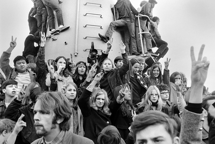
Admittedly, this is the essence of Hickman’s work:  it has a current of life coursing through it, a quiet, unassuming joie de vivre, paired with a sensitive reflective quality (look at those close up portraits—the expressions are real, the moment of authenticity embraced by both photographer and his subject). The images of political protest are not so much angry or supportive but have an “I am standing here and seeing this” reflective quality or as Hickman says, these are images of “Whoever came my way and made the best picture.” The images of politicians stand not as propaganda neither scathing nor patriotically nationalistic; the images of Hickman’s friends not contrived, not staged; the images of women Hickman loved, not glamorous, but real, occasionally playful: women, you get a sense were appreciated, looked at with compassion and wonder.  These pictures tell a story—in a series of spontaneous moments unfolding with the purest of intentions—blown-up snapshots taken of life-sized humanity doused with a pervading sense of community.


And, so we come to the question of size.  You will immediately notice there is a size issue at play here.  Hickman boldly asserts that the selection of impressively large prints was intended as “fun—to not have the picture come to you—you get to walk into the situation.”  Indeed, the walls of the White Box are collaged with a significant number of Life-magazine-like, life-size prints both printed and projected compelling one to wonder if there is notable intention in such monolithic reproductions.  The emotional and visual quality delivered by the size of the images only lets us in closer….with a come hither temptation to sink our field of vision into one of these and see people, people just like us.  In large format, the expressions are closer, the glances accessible—we see anxiety in one man’s eyes, and, in another, can that possibly be a sense of trepidation in the faces of young sailors surrounding a navy propaganda poster where an illustration of a strapping young sailor salutes with confidence and vigor?  The message here is one of giving us the independence and courtesy to just look where we want. Hickman trusts his audience to see something of interest.  Let your gaze wander, or stare at one and lose yourself in a single image, either way you will be drawn down a path where you are visually compelled to form a new sense of connection to the people in the images before you.  Hickman’s photos have a warmth to them, a sense of understanding, of humility, of empathy.  Enhanced by the simple palette of black and white, Portland Creative Community 1.0 appeals to our emotional connections by way of this inherent connectedness to humanity.

Craig Hickman photo | From the Portland Creative Community 1.0 exhibition at the White Box.

A few years ago, something prompted Hickman to delve into boxes and boxes of his saved negatives—negatives that included his images shot decades ago at a time when Portland was a city contemplating urban growth boundaries, constructing freeways, grappling with controversial decisions made by the Portland Development Commission, and when students were sometimes more activist than academic, and our beloved Park Blocks could potentially play host to tumultuous scenes of riot police dragging resistant protestors.  Into this socio-political urban landscape strode Hickman, camera always in hand ready to capture the closest image that looked, to him, the most interesting.


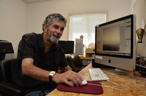
Without flash, planned or artificial lighting, or contrived situations, Portland Creative Community 1.0 reveals a subtle honesty—a mastery of the manual camera managing to find a brilliant way to mingle human-controlled aperture and shutter speed with today’s computer-based digital camera and all the trappings of modern technology.  But that seems to add to the vitality and intrigue of this display of memory and reminiscence, so an explanation is in order.  Most of Hickman’s photos from this 1960s-1970s era were never developed, no contact sheets ever printed. A fact that makes the first-time exhibition of these photographs all the more meaningful.  For Hickman the last few years have been a journey into the past to see images he hardly recalled and certainly had no idea what would be found.  Perhaps it was a romantic sense of melancholy reflection or the simple existence of spare moments, or a basic desire to see what he had been packing around all these years (in, as Hickman calls it, his “deep archive”).  Whatever the impetus, Hickman began unpacking his deep archives, and literally hundreds of photos have now come to light.  Concocting ways to unearth these black and white celluloid treasures and bring them to a new audience has, in itself, been a curious study in merging 1960s camera equipment and developing methods with modern technology and the vast, immediate land of social media.  While the length of years has seen great movement in the technologies available to take pictures, a span Hickman has never stepped away from, it also produced the incredible opportunity to bring this series of images to life using techniques and process unknown when the images were themselves taken.  And, of course, the ability to “post” his newly digitalized photos on Facebook, tagging them with names of those within the images:  the subjects seeing the images for the first time, as well, effectively created quite a social media buzz.

Craig Hickman photo | From the Portland Creative Community 1.0 exhibition at the White Box.

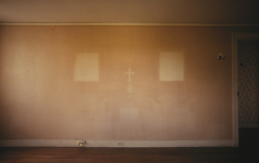
The process of printing these photos and a placing them in a public place for eyes to view them beyond Hickman’s significant social media following has enveloped process and method unifying technologies and compelling Hickman to discover new ways of experimenting with images originally intended for the black depths of a darkroom.  Upon unpacking the negatives, Hickman would place them under the scrutiny of fluorescent light bulbs shining from beneath a layer of plexi—the ubiquitous light table—a piece of equipment that somewhat awkwardly finds itself still in use but not always to light negatives, slides or contact sheets but moreso a fine surface to place the modern images of today—a work surface bridging eras.  Onto this light table, the piece that would unify technologies, Hickman placed his negatives and proceeded to bring them to life.  Negatives that once would have never seen the light of day until printed and dried, now were exposed on a light table and infused with an existence by millions of pixels.  Hickman began by using a macro-lens on the light table and digitally photographed the negatives; he then reversed and restored the images to pristine condition using Photoshop, employing the tool to remove dust and scratches.  Hickman comments that the black and white negatives had no fading and were preserved in excellent condition. As an element of this show, the bold melding of technologies and the way Hickman wove the computer digital age into this exhibition stands as a commentary on the history of photography and the changing methods and process that leads to a finished and viewable image. Blending old with new, Hickman expands the process and displays his remarkable ability to interpret photography from a truly inclusive standpoint.  A stunning visual communicator, Hickman confidently embraces the best of both worlds using tools that exemplify an understanding of photographic technologies, and, perhaps more importantly, allowing his audience to glimpse his personality and feel a sense of integration with our past and our present.


There is a story embedded in each of Hickman’s images that you will be able to explore by flipping through and reading a printed and online catalogue of the prints in the exhibition.  But maybe you don’t need that—each picture alone is worth a thousand words, quite conceivably, more.

Many thanks to Craig Hickman…..ss


Bruce Wolf | Part I | Light and Color: Tools of the Trade Workshop | Summer in the City 2012

Bruce Wolf |  A Little Profile on A Big Photographer

All images in this post are courtesy of Bruce Wolf, and were taken by him.

Floyd’s coffee shop in Portland’s Old Town is a darkish place where wild things happen. Not fast, in the buff, debauched, and crazy things, but those quietly important things that might change lives, sway the course of simple histories, and have the potential to effect people in new and profound ways.  In a politely incognito sort of way, lattes are drunk, spicy Chai’s are nursed, dark espressos slide into mouths, the soothing pleasures of liquid darkness perking even the most exhausted. It is the perfect place to meet someone of great importance when being noticed is not the goal.


Into this den of caffeine bracketed by the establishment’s solidly brick walls, photographer extraordinaire, Bruce Wolf agreed to meet me one summer afternoon to discuss his recent course offering Light and Color:  Tools of the Trade as part of the UO in Portland School of Architecture and Allied Arts Summer in the City program. Wolf is known on a global scale for his work with light and color, so meeting him in a place where the light was incandescent dim and the color comfortably amber-to-russet seemed like an interesting prospect.  Maybe seeking someplace with a trifle more natural light, and after ordering our coffees, we decided to move out into the minimalisticly bland en plein air courtyard, where the daylight seemed a bit more of an appropriate place.


Let’s start with some background.  UO in Portland Summer in the City is the brainchild of Kate Wagle, director of the UO in Portland School of Architecture and Allied Arts and interim vice provost.  Familiar with Wolf’s reputation as a photographer, Wagle wasted no time incorporating Wolf into the summertime Portland programming.  Notable in many respects, the UO Portland Summer in the City program is the brooding place of many a lauded professional in the design fields reaching out to stretch their pedagogical wings, discover talent and share creative insight.  Instructing a course with the Summer in the City program assures a small, focused group of students eager to gather experience and expertise during a few summer weeks spent in the company of creatives otherwise unavailable. It might be a short season, (summer in Oregon usually is) but it is without a doubt a rare and wonderful opportunity to access a wealth of knowledge and experience these experts deliver.  Indeed, Wolf fit right in surrounded by other exceptional creatives who partner each summer with the UO to teach at the White Stag Block as their schedules and professional work permits.  Wolf’s first foray into instructing anyone but seasoned professional photographers (which he has done often having taught at The Maine Photographic Workshop, and the International Center for Photography in NYC, as well as guest lecturing for Harvard University’s Photography Department) began with Summer in the City 2011 and his “A Journey into Yourself with a Camera.”  This summer, 2012, he offered Light and Color:  Tools of the Trade, welcoming anyone with an open mind and an enthusiasm for photography.

Image | Bruce Wolf

And, so here I was this warm, sunny afternoon at Floyd’s, face-to-face with this photographer, and not just any photographer, but BRUCE WOLF;  I was eager to discover just who he is and what his work is all about.  Although his humble appearance, worn jeans and plain white tee shirt, might make him fade into the Portland Old Town crowd, his modest looks reveal little of his importance, an engaging counterpart to the work and reputation Wolf has. At Floyd’s, Wolf entered, and ordered our coffees.  No one applauded, no one rushed over for an autograph, no one stared, no one pulled out a camera to take his picture.  He is just a plain guy…..well, not really.  I asked Bruce to talk about his images from an aesthetic viewpoint and to chat about his extensive experience in the field of advertising photography.

Image | Bruce Wolf

In print, Wolf is often referred to as “a legendary photographer,” “the master of believable artificial light,” and “truly one of the best.”  His work is praised as “timeless and creative” and as fusing “life, mystery, and narrative.” Look at any of Wolf’s photographs and you will see grace, and an exquisite and luxurious use of light, even if what you are looking at is only the inanimate objects of a well-equipped kitchen.  Each Bruce Wolf image incorporates a sense of photographic artistry while seamlessly blending a mastery of digital technology, an understanding intellect and a sense of discerning empathy. His images are of quiet and solitude, whatever is the subject is the focus, lucid and without distraction.

Image | Bruce Wolf

Perhaps existentially affirming, Wolf’s architectural and interior photos, in particular, are surreal in pristine perfection.  The more of Wolf’s work you examine and admire, the more you realize his preference for images intentionally devoid of human presence, literally.  There is space for a person, and an invitation to engage with the image, but usually no identifiable human within the image.  As viewer, you wander into his photographs by yourself, no one else is needed. These photos compel you to visualize yourself in the setting, a place where you feel you could fit comfortably alone.   A motorbike in a studio, a refrigerator in a kitchen, a chair in front of windows, a long country road in rainy navy-blue darkness, a gorgeous plate of food: each carefully planned image takes you to a place. You may have a look for yourself, here.

Image | Bruce Wolf

Wolf commented that he feels his images have a sense of “being lonely,” but is this loneliness or an opportunity to merge yourself with a product, a place, a meal?  Put yourself in the picture, with no one else yet there, it is without complications. Maybe that is the genius possessed by the brilliant commercial photographer: he takes us places, we put ourselves and our dreams in his sets.   It is that simple.  But how is Wolf such a master at the illusion of welcoming place, and of transporting us to that place with a two-dimensional image?  His ability to work with a palette of color, to infuse with light and to manipulate both to evoke a feeling is the stuff his legend is made of.

Image | Bruce Wolf

With over 40 years of experience to call upon, it is no surprise that Wolf’s eye for detail and mindfulness of the aperture’s cooperative capacity with the shutter to let in a fraction-of-a-moment’s flood of light-bathed, meaningful observation has been very keenly and benevolently developed.  The fact that his images seem to be coaxed with a sense of emotion, and delicate comprehension of both subject and setting through his lens, past any filter, and into waiting digital sensors is, really quite remarkable.  The emotional saturation of Wolf’s work becomes complete with touches from “today’s darkroom” says Wolf, graciously offering a nod to technological innovations as being a crucial part of his toolbox. He continues, “the interpretation of the moment is told” or gains that extra tinge of meaning and implication with thoughtful brushes from Photoshop, the program (or “darkroom”) allowing him to interpret an image to get it exactly to the point where the setting matches the intention of telling a story.  Long before the pixels are exposed to digital manipulation on Wolf’s computer screen, hours of set-up, preparation and contemplation have gone into a project.  Once the camera is poised, steadily mounted atop a tripod, flags or reflectors in place, and readings taken of light, color cards peered at through the lens, only then is the image ready to be captured.  Wolf takes a slow, methodical, and languishly unrushed amount of time to stare into his viewfinder, visualizing the subject, contemplating the final outcome.

On location at Yakusa with Bruce Wolf. Photo SS.

I know all this partly because following our coffee-talks, I asked Wolf if I could observe him on location, on a real assignment, commercial-style. Wolf allowed me to visit him while on location for a restaurant advertising project in North Portland at Yakuza.  He was meticulous….with everything.  Each press of the shutter release came across as a thoughtful and careful opportunity to capture something of greatness.  The process takes hours. Invariably, the outcome is stunningly beautiful: elegance saturated with sensuous quantities of light and color, but yet remaining “natural.”  [He let me steal peeks at his nearby laptop once he transferred images there.] It is this unique approach to the mixture of science and art, of light and color that pervades Wolf’s work and is testimony to a soulful understanding of elements we sometimes take for granted, the luminescence from the sun, and how that illuminousity reflects off a surface potentially bringing a sense of story-telling to an image.

Bruce Wolf Studio.com

Largely self-taught in the field of photography, Wolf partly credits his educational background in physics as enhancing his opinions and understanding of light (he earned his degree in physics from the Rennselaer Polytechnic Institute).  His lifelong passion for photography might have developed from an early childhood exposure to art history—namely the volume by Janson & Janson, The Story of Painting for Young People (1952).   Charmingly and honestly acknowledging a childhood interest in the paintings that depicted body parts and barbarity, Wolf recalls being even more impressed, visually awakened, if you will, by the paintings of Vermeer, Rembrandt, and Caravaggio.  Even as a young kid, in these masterpieces, Wolf recognized a use of light and color to show what was there, a hinting at what was underneath, what was in the shadow, or what could be gleaned from the play of light upon a surface.  In those moments of observation, the desire to find a medium he could translate a similar understanding of light and color to eventually led to a career in photography.  Apparently, Wolf became a photographer also “on the advice from ‘Bultaco’ Barney, motorcycle mechanic.”  But that’s a whole other story, that we will not go into here. In any case, apart from an interest in photography, Wolf cites his two “other great interests” as science and math:  forever inked into the underside of his burly forearms, a hydrogen atom on one (the first element in the periodic table), and the infinity symbol on the other (forever into perpetua).

Image | Bruce Wolf

I asked Wolf to comment on his work over the last 40 years.  His is a long career and no where near to winding down– spanning successes from his early days in his Manhattan studio, to his years in Paris shooting advertising and interiors for glossy European magazines, to decades as a photographer shooting projects for publications such as House and Garden and New York magazine.  The early years took up the decades fanning out of the 1970s.  The work poured in.  Wolf was in high demand with clients like Martex, Karasttan Carpets, Thomasville, Spiegel, Marlboro, Eve cigarettes, Viking, Jenn Air, G.E., and Acura, among others; and on the go-to list of renowned art directors, like Jim Sebastian, Cheryl Heller, Jerry Della Famina, Tommy Kane, Barbara Barnes, and more.  His magazine layouts expanded to include projects for Child Magazine, Metropolitan Home, Shelter, and Martha Stewart Living. He completed projects for Vogue, and Architectural Digest. Branching out from still life, interiors and architecture, Wolf was asked to do jobs where his expertise as a director for television commercials and cinematography were called upon.  His reputation for creating an exquisite visual environment for his subjects obtained a worldwide following.   In the 1990s, Wolf worked on projects alongside Helmet Newton and Bill Silano for a Johnnie Walker “Gallery Series,” an infamous poster project displayed on the walls of the Japanese subway system;  and created advertising campaigns for clients as diverse as Burger King and Perry Ellis.  The list of accomplishments goes on and on. He flourished in all areas, lending his unique sense of lingering observation, careful attention to detail and, that quality so recognizable in his work, an ability to “duplicate the sun.”


In 2009, with so much success and a career still going strong, Bruce Wolf gathered up his family and made the pilgrimage west to Portland putting a whole nation of Americana inbetween him and his connections and networks in New York.  But this is the age of enlightened communication and Wolf’s ties to the Big Apple were only really a quick electronic communication or airplane flight away.  If anything, he gave his work an opportunity to thrive in a new environment and to discover a Pacific coast audience. The requests to work would continue, the list of clients, too.


The Wolf family now call Portland their permanent home.  Moving to Portland, brought the Wolfs close to long-time family friend and Portland creative extraordinaire, John Jay, executive creative director and partner of the Wieden + Kennedy advertising agency.  Wolf also counts Jay among the art directors he has had the privilege of working with.

DeathbyCat | Bruce Wolf with Ying

In 2009, some of Wolf’s Portland work was introduced to an audience of gallery-goer’s who saw his much-debated “Oregon Journal” series.  It was described as “a mysterious series of landscape photos.”  That same year, Wolf’s images of the remains of small creatures killed and maimed by any one of his 33 cats mesmerized audiences in an eclectic Southern California exhibit  [See DeathbyCat, evoking a range of contexts:  taxidermy-cum-Smithsonian’esque natural history, that sort of it may be nature morte, but it is still life mood, the subjects having been tossed about and blessed by the love of Wolf’s own domesticated pets].  Transgressing from small deceased bloody vermin, to something more suburbanly perceived as sophisticated and urbane, Wolf has even aimed his lens across rooms with a view we thought we’d never glimpse (he was commissioned to document Martha Stewart’s own home remodel).

Image | Bruce Wolf, Martha Stewart's Farmhouse pre-restoration

With such an illustrious background, Bruce Wolf is something of an enigma.  He is a New Yorker, through and through telling me he is “from The Bronx.”  I was expecting a New Yorker blase attitude or a heavily tainted East Coast accent, a bit gritty and unpolished. But, he is delightfully pleasant. He is friendly and lowkey, approachable.  He is kind and conversant, with a strength in gentleness and calmness one imagines he has made good use of in the high powered, competitive world of commercial photography.  The opportunity to sit down and chat with Wolf made it pretty obvious how he has managed to achieve his “nice guy” reputation.  He is just that, nice.  He is easy to talk to, completely unpretentious.  We chatted those afternoons for some time:  Wolf revealing in anecdotal style snipets of adventure and encounters from the images contained in his vast portfolio, which at this point, was beginning to sound a little like a Who’s Who of the rich, famous and well-built, in both individuals and objects.  Wolf blends comfortably into a Portlandia proletariat ethos, artisanal and casually counterculture.  He will enthusiastically speak of being more down-to-earth hippie than fast-paced, big city materialist.  It was charming and endearing that the only technology he pulled out during our conversations was his smartphone, tapping and joggling it to retrieve family snapshots, which, I noted were exquisite even on the small screen of his smartphone.  He will discuss science, math, art, government, and society with a gracious intellect, a liberal charm and a humble aesthetic.  He will discuss photography on a level he senses his listener is comfortable with.


On this particular day, the sun was settling in behind the brick courtyard of Floyd’s, we’d been chatting the afternoon away.  Prompted by my inquisitive comments, he continues, I listen, somewhat enthralled, but definitely not starstruck and keeping a level head.  He offhandedly mentions, quietly, like he’s slipping in another order for a black coffee, “Oh, did I tell you about the time….” I lean in, this is going to be good, I know. I feel like Po the Panda, face-to-face with the sage wisdom of Shifu, I must keep quiet and listen.  Wolf doesn’t disappoint, I get to hear about when he photographed John Lennon, twice in the 1970s.  And President Ronald Reagan and First Lady Nancy Reagan, for a Christmas card.  With a sly and mischievous grin, Wolf’s “nice guy” personality shines through as bright and captivating as the light in any of his stunning architectural sets.  “Want to know what I said to them?”  he asks.  Of course, I do. . . .

To be continued. . . .

Image | Bruce Wolf


Interview with an art faculty member: Dan Powell

From January 21 to April 8th, the UO art faculty members will be showing their work in The Long Now, an exhibition at the Jordan Schnitzer Museum of Artfrom January 20 to April 8 in Eugene. Selected works by six art faculty members will be shown at the White Box in Portland from January 24 to March 24. To highlight the artists behind the art, I’m having conversations with several of the faculty in the show to hear more about their practice.

This interview is with Dan Powell, a photographer who received his BA degree in 1972, an MA degree in 1976 from Central Washington University, and his MFA degree from the University of Illinois, Champaign-Urbana in 1980. Powell taught photography in the Art Department at the University of Northern Iowa from 1980-1987 before beginning his current position teaching photography at the University of Oregon in 1988.

Powell has received numerous grants and fellowships including University of Oregon research awards, Polaroid Corporation purchase awards, a Maine Photographic Workshops grant, and in 1981 he received an Emerging Artists Grant from the National Endowment for the Arts. His work appears in collections at the Henry Art Gallery, Seattle, WA; Portland Art Museum, Portland, OR; Lightwork, Syracuse, NY; Museum of Fine Arts, Houston, TX; and Art Institute of Chicago. Powell’s work has been reviewed in prestigious publications including Art Week, New Art Examiner, Art News, Afterimage, and the New York Times. A comprehensive archive of Powell’s work is being collected by Special Collections, Knight Library at The University of Oregon.

This interview has been edited for clarity and length.

Dave Amos, A&AA writer: What drew you to the medium of photography?

Dan Powell: That was a long time ago. In 1972 I took a basic photography course and really enjoyed it for the same reason it’s so seductive for so many people. You feel your creativity oozing out of your pores and that’s a wonderful thing. And it led to a study in photography.

DA: I looked through your portfolio and there seems to be a division between your landscape work and your constructed work. Why both?

DP: The manipulated work I did as a product of where I went to undergraduate school, which really encouraged a conceptual or constructed approach. Rather than taking straightforward pictures out there in the world, images were constructed and highly manipulated, treated as much as a surface for marking as an image. That work was continuous from when I went to school to get a masters degree in the mid 70s all the way through the early 90s. It evolved over a period of years and was in keeping with how photography was critically recognized during that time. That was the kind of work that constituted my practice as an artist; that was what I exhibited. The work in the landscape and images shot on European travels were really more side ventures at the time. I never really showed that work much at all. In my later years as an artist that work has become more interesting to me than all the constructed work because it is tied to place and time and personal history.

Virginia City, Nevada, 1990

DA: Did you go to Europe to take those photos, or were you traveling and decide to take photos?

DP: What came first was the western landscape work. I am from the west and after living in the Midwest for 9 years I acted upon my affection for the land here photographically. Then came photographing during travels overseas, in the 90s mostly. I loved to travel and my wife and I traveled a great deal in the Mediterranean region. I would always take a camera and then I applied for a few grants to travel. Within a very short time photography and travel became a part of the same activity, impossible to separate. It was a wonderful union to make and I miss that a great deal.

I didn’t have any preconceptions about what I was going to shoot. We used to drift a lot when traveling. We had a general route, of course, but specifics were left open and we came and went according to our desires at the time. Photographing was much the same way, just what presented itself to me.

Plakias, Crete, 1996

DA: What catches your eye? Is it light, or composition, or what?

DP: The whole idea of drifting pertains to the camera too. It is making visual sense out of what you see, or better put, seeing something that makes visual sense to you. The idea of seeing and finding something that lies outside the ordinary. Sometimes that’s very formal. Photographing itself is to create some kind of formal construct around what you see, to organize a space. It was the idiosyncratic in many cases, but not all. In my portfolio, many images may be very painterly in form; others might be more idiosyncratic, as in ‘how could that be?’ Images depend on different sets of considerations, and I always like that eclecticism in my work.

DA: There is a section of your portfolio where you juxtaposed two images. I kept thinking about what the pairs were trying to say. Is that what you were aiming for?

DP: Definitely. That work came from the early trips traveling in Europe in Greece, Turkey, Italy, and Croatia and going to these fine museums where you could photograph. There was natural light and it was beautiful to photograph these antiquities. So I took it upon myself to create my own collection from that collection. To collect the collected, in a sense; to photograph books in a library or something like that. That’s why I often combine those images of antiquities with book images. They are both a text, an evolution of human consciousness through time, in statuesque form and written form. What this work was about, “The Keeping of Record” (below) was photographing an archive; this vast archive of western consciousness, a western origin myth. So I’d photograph these objects and there they were but you can’t see through them into the time itself. We can’t go there from the constraints of the time we live in. We can’t escape our present cultural skin. I took it upon myself as an artist, instead, to put another image up against it, to correlate something with it. To provide my response to the image with another image. To play with it, in a sense, in contemporary terms. To make sense out of this past archive according to the present time that I live in. This work was a culmination of the European travel photographs that I made.

The Keeping of Record Series, 2000

DA: How has your work evolved through your career?

DP: Both activities [constructed images and travel/western land images] went on simultaneously, and one played off of the other. For instance, “The Keeping of Record” series, those dualities that were created there, are from individual images from which I had no plans to make that work. They were just other images that I shot in Europe and then later when I came home the idea occurred to me to juxtapose those images. That spawned the creation of that constructed work. One really rose out of the other, and that is true all the way through my work. Even the other constructed images, they all came from actual images, either made in the studio or out in the world. One sort of derived from the other. And many times the images from out there in the world just remained distinct. They were born whole.

DA: Besides travel, do you have other influences?

DP: In the last 15 years or so, I’ve been interested in language and cultural theory. Certainly language theory has played very heavily into my work. Word as a sign, language as a sign. It’s not just what it says but what it represents in the form of connotation. All the way through my work, even in the constructed work, a clashing of signs and symbols, words and images were important. I used to do a lot of dumpster diving when I was in graduate school. It was the beginning of the sprocket driven computer age, so you’d find these reams of computer read-outs that said phrases that made no sense. It’s language gone astray, gone awry, but you can still read it and create meaning, as in “The Flow Chart” series.

One of my foremost interests in photography is its use as a language. Of all the art media it’s probably most akin to the spoken word because of its relationship between representation and reality. A word is a replacement for the actual thing. The thing is not here to show you so I used the word to describe that thing. A photograph is the same thing. They both stand in; they’re surrogates. I’ve always enjoyed mixing those signs and symbols in my constructed work and that certainly carries over into my travel photographs and even the landscapes. Even the single images, oftentimes are complex in terms of a mix of things.

Study from Gray to Black, in "The Long Now" faculty art show

DA: Do you feel like a Northwest artist, whatever that may mean?

DP: Not at all. But I was born in the Northwest, and other than a nine-year stint in the Midwest and a year in New York, I’ve lived here. I love the West. It’s a fine place to live and a person is fortunate to live here for many, many reasons. When I came back here, I was delighted to come back from the Midwest largely because I was interested in photographing the land here. At that particular time in my career I was really involved in that, really interested in that. That was ‘86 through ‘90; they were really big years for me for photographing in the land and photographing the Northwest. Then I started traveling overseas more.

As far as being a quintessential Northwest artist, no, I don’t feel that affinity anymore since my days photographing in the land here.

DA: The Knight Library at the UO is collecting your work and creating an archive. Could you tell me more about that? It must be an honor.

DP: The Knight Library, starting four or five years ago, started collecting my work, my archive, in a sense. Over that course of time, I have donated work and they purchased others that are representative of all the series I’ve done and all the phases of work I’ve done. They’ve collected probably 1600 pieces at this point and more to come. I feel fortunate and honored. I think it fits my work more than others because of the quality of document that much of it holds; particularly there is a lot of work in Oregon and of the west. That’s mostly what they’re interested in, but in collecting me they’ve also collected all of my other work. I feel fortunate to be able to leave my work with them.

DA: Should work stand for itself, or is something gained hearing from the artist?

DP: Both things are true. I think the work should be able to operate on its own merit. That doesn’t mean it might not be combined with language, with words, as a part of imagery or in the process art making. A lot of conceptual art uses words. The work that I have in this show is heavily dependent on the title. In fact, you wouldn’t understand it completely without the titles. The titles explain the work, and I want the titles to explain the work. They’re a part of the piece.

On another token, reading about someone’s involvement in their art and why they make it and how they view it, can really inform you a lot and help you understand the work in different ways than you might otherwise. If you go into a museum and you see work and it hits you and you like it, you think certain things about it. If you go read the words, the work expands, and you probably will think different things about it and have a richer sense of the experience.

So, yes and no. I think different kinds of art work in different ways that way too, and that’s very important. One piece may need to stand on its own, and another piece must absolutely need words with it. If you see a great film and then read all about the director and the process of making it, their intention in making it, it maybe doesn’t make it a better or worse film, but it informs you and gives you more information to feed into the work.